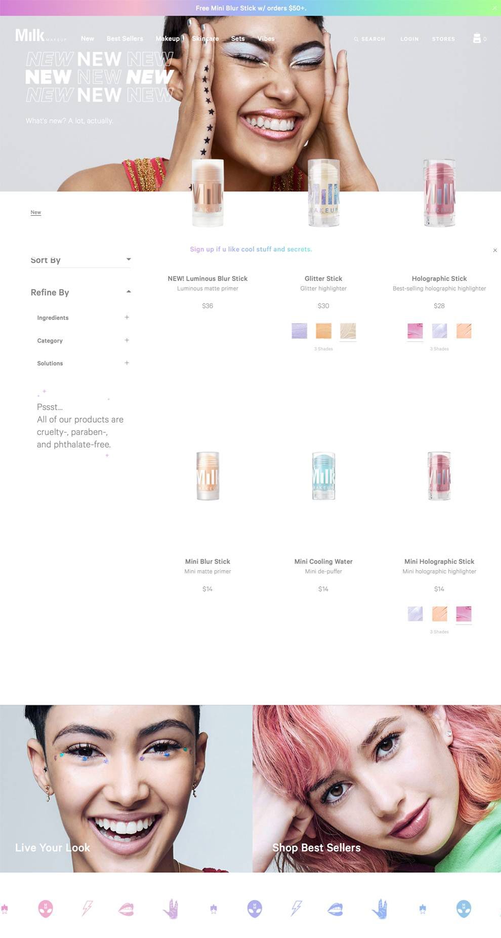
Milk Makeup's website combines creativity with ingenuity. The bright colors, minimalistic format, and simple menu bar enhance the user experience. Their design allows users to interact with their product by offering a website that's more about aesthetics than content. The design uses a basic CSS and Javascript program to strengthen its UI and UX. Milk Makeup uses close-ups and profile shots to personalize their product, improving user experience and encourages site exploration.
When a user first enters the site, a modal window materializes to offer viewers access to Milk Makeup’s community mailing list. Unlike other websites, Milk Makeup’s modal window introduces a straightforward call to action. The short form it presents is easy for users to complete. The blank white background, gray typeface, and “Join” make the module window pop, but it doesn’t take away from the overall vibe of their website.

The testimonial page, called “Live Your Look,” sets Milk Makeup’s website apart from others in the industry. The “Live Your Look” gallery features headshots of people that uses their products, each with a captioned blurb beneath their picture. Users can click on their image to visit that reviewer’s profile, which is specific to each person. For example, viewers can learn about Jeffrey, where he’s from, what he does, and which products he uses. They'll have access to a few paragraphs written by Jeffrey about his experiences with Milk Makeup’s products.
Milk Makeup’s website is playful, and it uses UI and UX to push their product. Its inventive colors and minimalist style makes it a unique web design.
Milkmakeup is a great website design in the E-commerce & Retail and Fashion & Beauty industries.


