
Lancaster Brewery’s Website Fosters An Enjoyable Brand Identity
Lancaster Brewery is a regional brewer in the Northwest of England. This award-winning brewery crafts a small batch of quality, sophisticated beers. They have four core beers with a variety of monthly and seasonal specials.
The brewery is dedicated to creating sensational and stimulating beers, and they want the whole world to get the chance to try them. Currently, their beer is available in cask and bottle form in the UK and in some locations in Latvia and China.
We do brewing properly. No fuss, no shortcuts, just proper old fashioned brewing using Freshly milled malt (milled on site the same day that we brew), whole-leaf hops and live yeast that, combined with our expertise, produces some of the best beer in the country.But this brewery doesn’t just care about beer, they care about sustainability and the environment. They create their beer using solar panels and local, all natural ingredients. They take the environment, as well as the community they’re immersed in, extremely seriously. And they want to show others their commitment and dedication.
Their brewery is open for tours and tastings. It’s a tap house where people can come, relax and enjoy a pint and a history lesson.
This brewery has a heart and soul. They have goals and dreams and aspirations. They have a purpose that’s bigger than just brewing beer.
And their website aids in driving that point home.

The Lancaster Brewery Website Is Organized And Fun
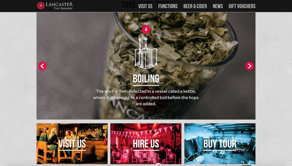
The Lancaster Brewery website is laid out in a simple, subtle but creative way. The homepage is made up of a photograph that sits above the fold and slides from image to image. There's also a movement to the image, it zooms in slowly pulling you in and making you feel like you're getting closer.
CTAs and header text live on these images in bold, white copy.
Below are blocks that offer a variety of calls to action -- Visit Us, Hire Us and Buy Tour. These boxed CTAs are exciting and fresh. They include an image that is overlaid in a funky, bright color that adds a cool vibe to this design as a whole. Rolling over these boxes, the image disappears and the bright color remains.
Beneath that is the beer list, which is displayed in regal badges that are sophisticated and refined. They're classic but at the same time edgy. And all of these elements sit against a wood-paneled background that's stamped with the Lancaster Brewery logo.
Beneath this is a photo collage or gallery of images all in different sized square and rectangular shapes with similar bold copy overlaid. It's creative but in a simple way.
The entirety of the website is laid out in similar ways. There are a lot of box buttons with copy and CTAs -- urging you to join a tour, visit the space and learn more.
The layout is clean and simple, letting the more creative elements pop -- like the animations and the videos that show how beer is made in the brewery.
There's a nice balance of images and text as well. This brewery does want to inform as much as it wants to entice. And they do that by combining more simple, edgy and modern elements like flashes of color and dynamic movement with classic illustrations and a vibe that oozes English aristocracy.

Lancaster Brewery’s Creative Imagery And Clear CTAs Encourage Users To Click
There's a simplicity and a royal quality to the layout of this design -- from its aged wooden background to its unique logo design and the badges used to display information. There's also modern flair.
You can see this in the overlaid colors on the CTAs, and the way they move when you hover over with your mouse. The dynamic elements of this website make it pop -- quite literally.
CTAs help users navigate this design in an efficient way. Headers are strong and bold, sitting atop the header image in a strong and authoritative way. This shows the brand's dedication to both having fun, and informing their audience. This is another example of a mixture of modern and antique elements.
There's a freshness to the combination of crisp photography, classic illustrations and easy navigation.
Lancaster Brewery’s Online Platform Perfectly Balances Modern And Classic Elements To Create A Website Fit For The 21st Century
From the subtle movement on the homepage to the rollover effects and the bold organization and CTAs, this website shines with a bubbly demeanor that gets you in the best mood possible.
This brewery combines fun and flirty design elements like bold, white CTAs and headers, funky and colorful rollover effects, and a creative layout with a soft and gritty, almost textured background, strong images and regal illustrations like it’s classic logo to create a website that’s full of old and new design elements. And instead of these elements clashing, they work together wonderfully to connect the past with the present — the old age of brewing with the new.
This website design is timeless. It’s simple and effective. There are just enough exciting elements for this design to catch your eye, but not enough to take away from its purpose. It’s a brewery, after all. And the beer should always come first. This website knows that and outlines the beers, the process and its history in a stunning and sophisticated way.
The Lancaster Brewery's digital destination is regal, smart and clear. It’s a beautiful design that informs, enlightens and tantalizes all at the same time.


-preview.jpg)
