Pinterest’s website redefines user engagement through a meticulously crafted browsing experience designed to empower users as they explore, save, and shop for ideas. Merging visual appeal with ease of navigation, the redesigned interface prioritizes accessibility, personalization, and inspiration — all tailored to enrich every user’s creative journey on Pinterest.
Key Insights for Brands:
- Use grid layout and vibrant images to captivate users
- Employ intuitive search functions and filters to enhance content discovery
- Incorporate minimalist design and clear calls–to–action to encourage exploration
Pinterest’s Dynamic Homepage Offers a Visual-First User Experience
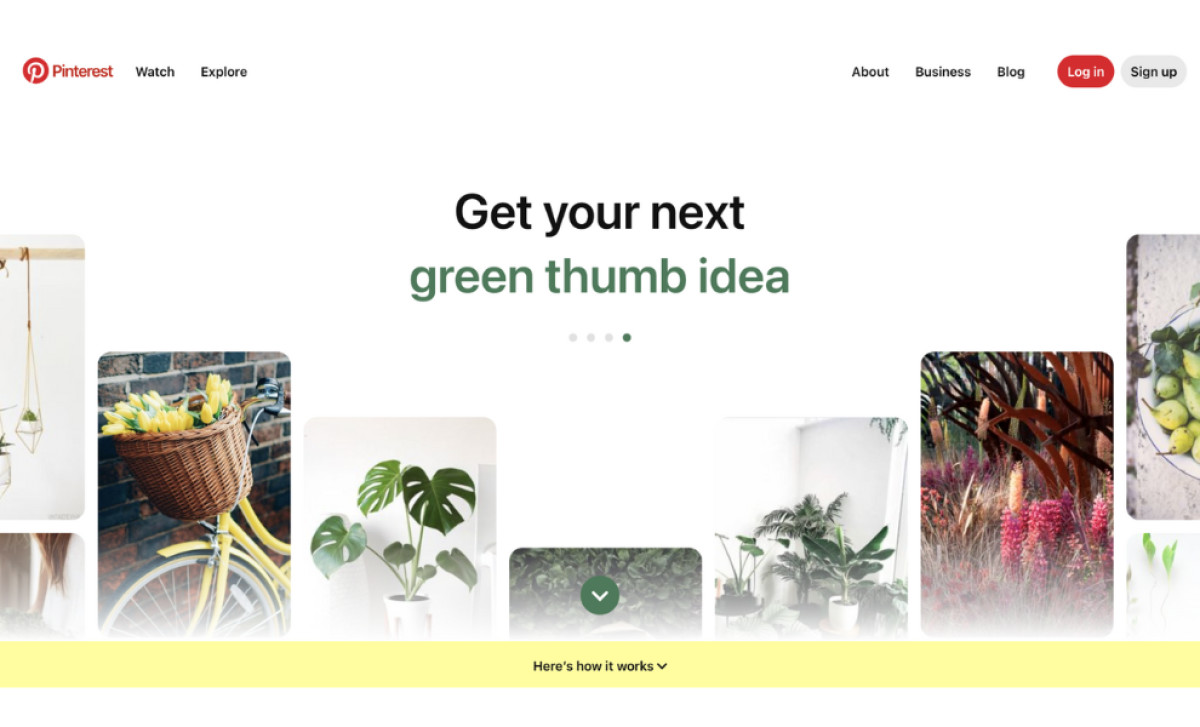
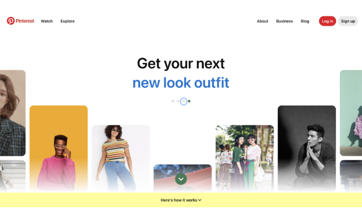
Pinterest’s homepage captivates users with a visually driven experience that’s both inviting and seamlessly organized. A grid-style layout immerses visitors in rich, colorful visuals, instantly showcasing the diverse content available on Pinterest. Each section is dedicated to inspiring users with ideas, like the prominent “Get your next green thumb idea” banner, inspiring users and inviting them to explore their interests through targeted suggestions.
Furthermore, the subtle animations on Pinterest's homepage add a layer of dynamism that feels both engaging and natural. The sleek slider view of the hero banners transitions smoothly from one featured idea to the next, catching the user’s eye without overwhelming them. This gentle sliding motion gives users a preview of the variety of content Pinterest offers, subtly encouraging them to explore further.
Each banner shifts unhurriedly, allowing users to take in each message — such as getting ideas for weeknight dinners — before the next slides into view. This restrained, seamless animation style aligns with Pinterest’s clean, visual-first approach, enhancing user engagement while maintaining a relaxed, welcoming atmosphere.
Pinterest's Sleek and Minimalist Look Encourages Longer User Engagement
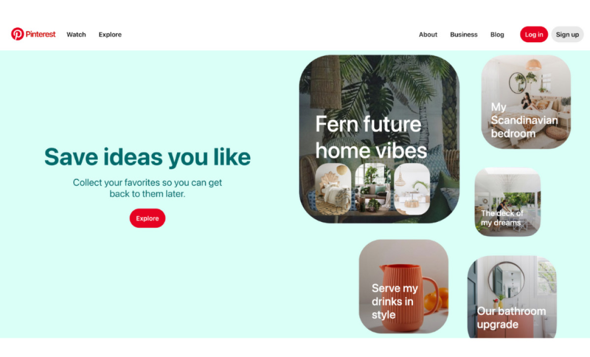
Pinterest's homepage design balances minimalism and visual engagement, crafting an inviting and streamlined user experience. Soft pastel background colors provide a refreshing, unobtrusive canvas highlighting vibrant content blocks featuring lifestyle images and inspirations for anything from DIY crafts and technology website design.
The website typography is simple yet bold, with the main message, “Save ideas you like,” displayed in a large, easy-to-read sans-serif font. This font style reflects a modern and approachable tone, inviting users to explore and personalize their journey on Pinterest. Red buttons, like the prominent “Explore” call-to-action, contrast effectively against the muted background, strategically guiding users and enhancing navigation.
Learn what website typography is and how it improves your online platform.
Additionally, rounded corners on image blocks lend a friendly feel, while maintaining a structured, easy-to-follow grid layout. The imagery showcases popular Pinterest themes, like home decor and lifestyle, catering directly to user interests.
Overall, Pinterest’s design is thoughtfully crafted to support its purpose as a discovery platform — inviting users on an endless, visually engaging journey while providing a clean and intuitive interface.
Pinterest’s Personalized Search Results Improve Discoverability
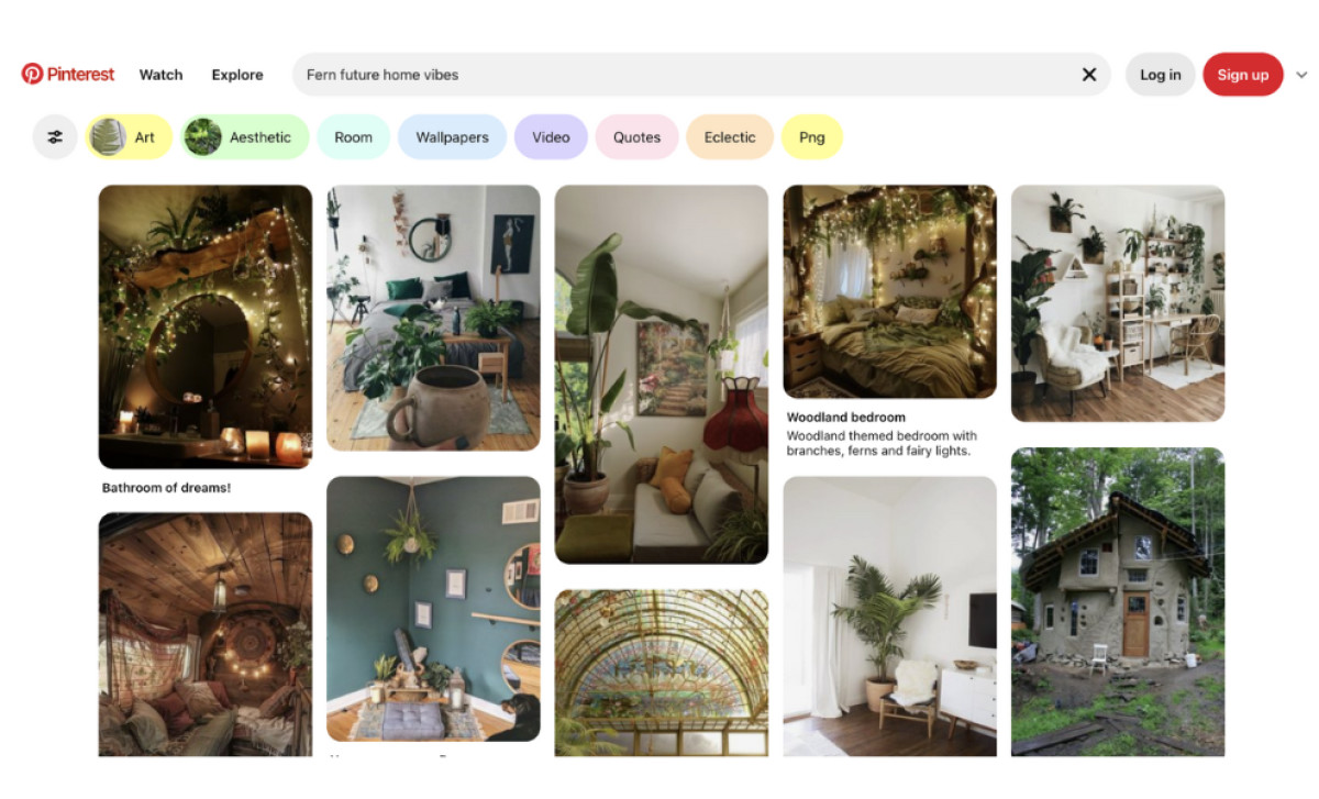
Pinterest’s search functionality emphasizes personalized discovery with a prominently placed search bar that encourages exploration. Its intuitive auto-complete feature suggests relevant keywords, making it easy for users to find specific content or browse trending topics without typing full terms.
This feature streamlines the search process and introduces users to trending topics they may not have considered, gently guiding them into a more personalized discovery journey — much like what professional web design agencies aim to achieve for their clients.
Once a search is initiated, Pinterest's visually appealing search results page uses an infinite scroll to display a vast array of pins, boards, and topics. Users can further refine their search with filters for content type, ensuring a tailored experience.
Further enhancing the experience, Pinterest offers filtering options that allow users to narrow searches by content type, such as pins or boards. Smart, algorithm-driven recommendations personalize results based on individual behavior, aligning with Pinterest’s mission to create a unique and meaningful journey for each user. This fosters deeper engagement and a strong connection to the platform.
Strategically Positioned Sign-Up Forms Contribute to a Seamless Customer Journey
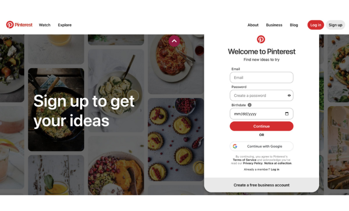
Pinterest’s strategic integration of sign-up and sign-in forms at the bottom of the page is pivotal in enhancing the user experience. This prominent positioning streamlines account access, making it convenient for both new users eager to join and returning users looking to dive back into their curated content.
This attention to the customer journey demonstrates an understanding of user needs and behaviors. By reducing barriers to entry and facilitating quick access to accounts, Pinterest encourages more users to engage with the platform, ultimately fostering a community where users feel empowered to explore, share, and connect through visual inspiration. This strategy aligns with Pinterest’s goals of expanding its user base and community.
In conclusion, Pinterest stands out as a prime example of exceptional website design, one that blends thoughtful aesthetics with user-friendly functionality. Its intuitive platform cultivates an immersed community, setting the bar high for what engaging and inspiring web design can achieve.


