The Fundrise Brand Gives Its Identity An Approachable Edge With Its Web Design
“We’re looking to reinvent the way people invest their money.”
That’s the mission of Fundrise. An investment company that strongly encourages consumer relations, Fundrise is reaching out to get to know you however they can.
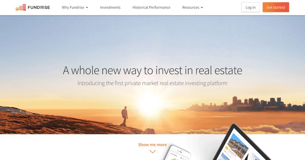
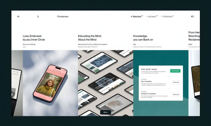
Needing to build a connection with their consumers, Fundrise creates a user-friendly website design that focuses on visual stimulation and easy use.
Their homepage is the perfect testament to this.
Set on a wide-open background, the page employs a combination of large and medium-sized font to list out specific statements and ideas they find important.
Images, infographics, and design accents complement the font combination. When all of these elements combine, you’re given a visually splendid homepage that not only serves to be informational as you go through it, but the layout lets you fly through each section with ease. It’s a perfect combination that keeps the user in mind.
And this image-focused design, matched with clever color usage and clean organization makes for an experience that was built to connect with users on a personal level. There’s an approachability here thanks to these elements that shift this website from a simple, corporate site to one that has a personality.
And that’s something different for a banking brand — which usually steers towards the straightforward and boring in its design. But here, there’s a touch of creativity and effervescence that breathes life into the design and makes it a brand that users can interact with, knowing they will be taken care of by real, passionate individuals.

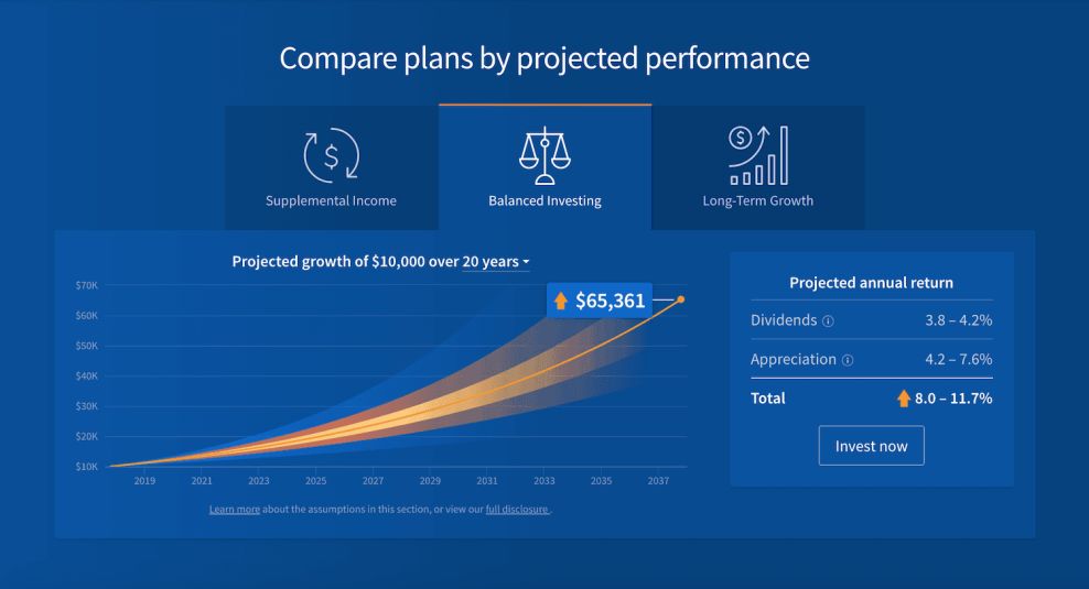
Charts And Graphs Convey Complex Information In A Digestible Way
As you’re getting to know and understand Fundrise on their About page, take note of the two timelines the company incorporates to help drive home the point they’re trying to make.
The first timeline uses transitionary colors from yellow to red to outline what the company has been doing for the past seven years.
Points along the timeline connect to different images outlying around the timeline. Lines are drawn between the two, laced in coordination with additional information, to create a multifaceted timeline that’s highly informative and hits every visual and literary sense.
The secondary timeline is a chart graph, which outlines the impact Fundrise has had on investors over the years. The timeline speaks for itself, showcasing the growth of the company in undeniably vivid coloring. It makes you stop and acknowledge just how impressive Fundrise is.
The use of these two timelines creates a vital tool for you as you’re learning about the company for both informational purposes as well as design purposes.
There are a variety of charts and graphs used throughout the site. They condense complex information and sway users into trusting them as a brand based on facts, figures and hard-hitting research.
And these images are an exciting way to appeal to consumers without forcing them to read boring lines of text.
Graphs, charts and illustrations overall are more engaging. Users would rather see these concepts in action as opposed to just reading about them. And by relying so heavily on these figure-focused images, the brand is holding onto its integrity and authority while simultaneously telling consumers that it knows that you might not innately understand it — but that’s OK. Fundrise does and that’s what matters.
Fundrise's Brand Identity Is Promoted Through Transparency And Color Choice
The Fundrise brand wants to change how people think about investing — that’s one of its core values, and it’s an integral part of its branding. You can see this in the content and structure of the site as a whole — but especially in its comprehensive and passionately-written blog.
Self-educating oneself is a thing these days and Fundrise makes it easy for you to do so. Employing a blog that’s entirely set on helping you help yourself, Fundrise offers a wide array of resources for you to utilize whenever you feel you want to.
With no real sense of rhyme or reason, the page fills up with blog articles. Certain areas are more organized than others, but the overall goal is to fill the page with resources for you, and Fundrise accomplishes that.
But it’s not just the infusion of this brand messaging and passionate backbone that keeps branding consistent.
Big, easy to read titles are shown off in vivid orange colors, complementing the Fundrise logo by doing so. Some articles are partnered with photographs and others are not, which builds variety and adds a fresh spin to their blog. It makes it easy for you to pick an article and dive right in to explore!
Pulling from the Fundrise logo design, the Fundrise website heavily incorporates the use of red and orange to accent each page you’re viewing. This color additive makes for a lively, fun atmosphere that makes visiting Fundrise a pleasant user experience.
And it’s a main color for the Fundrise brand, keeping branding cohesive throughout the entire process.
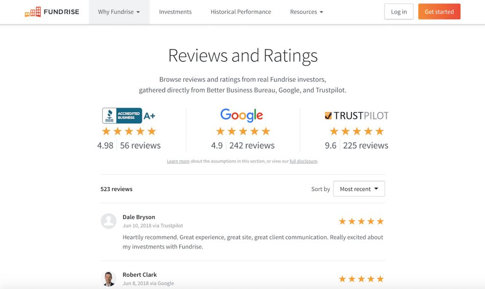
But there’s also transparency here that comes from the easy and straightforward integration of reviews to show consumers that this is a brand they can trust. There’s an entire landing page dedicated to this content, showing the brand’s supremacy in the industry by showing users what other people — just like them — have experienced.

Comprehensive Information Enlightens Users And Gives The Brand More Authority In The Industry
There’s a lot of information in this website — the brand makes sure visitors know innately who and what this company is all about, providing them with an extensive “About” section equipped with testimonials, reviews and informative imagery that works to enlighten and dissuade fears.
There’s also a fully-functioning blog that helps give users more approachable insights into investment as a whole — taking their services out of the conversations entirely so that it can also align itself as a brand that wants to inform and inspire overall, not just in the hopes that it will increase conversions.
Each landing page is packed with content — graphs, timelines, images, service explanations and more. If you come to the site with questions, this site will answer them by the time you’ve surfed the entire web design.
And this is an exciting integration. It’s a professional brand with a persona that is relatable, but it doesn’t sacrifice content for style.
It still informs. It still gets its message across. And it does so in a way that heightens the brand's authority in the industry and aligns it as a leader because it can take all of this information and display it in a way that keeps you engaged.
What Is Fundrise?
Fundrise is a real estate investment startup dedicated to transforming people’s perceptions about investing. Their goal is to open the market to everyone, dissuading fears and stigmas and showing people the power of investing — and the power every individual has all on their own.
This US-based fintech startup was founded in 2010, and it’s an online investment platform that quickly gained traction soon after its conception thanks to its consumer-facing messaging and ambitious backbone.
By the end of 2017, the company had amassed almost $344 million in equity and debt investments, with property values of $1.9 billion.
Here’s the Fundrise story:
We started Fundrise with a simple idea: give everyone the opportunity to invest directly in high quality real estate, without the middlemen. Our idea definitely had its skeptics. Industry professionals told us that it was impossible. Well, they were wrong. After nearly a year of working with the Securities and Exchange Commission, we launched our first online offering, ending up with 175 individual investors. Then we did it again and again. Today, there are more than 80,000 members of Fundrise and we’ve invested in nearly $3 billion worth of real estate. The idea is simple yet powerful. It’s caught on because it’s a good investment strategy. Fundrise offers the first low-fee diversified real estate investment available directly to anyone online. We make the process of investing in the highest quality commercial real estate from around the country simple, efficient, and transparent. Welcome to the future of investing.And Fundrise is still on a roll — with a prominent presence in the industry that is rapidly changing the world of real estate investing.
With a web design like this one, it’s no wonder the brand has grown so quickly, making an impact that has stuck with the people it’s worked with.

What Makes The Fundrise Site So Effective
Fundrise is so effective because it takes traditional design and turns it on its head.
This is a corporate banking site, which means it should look boring, bland and uninspiring. But instead, it infuses a liveliness and an effervescence in a stunning and creative way that aligns it as one that consumers can look to and trust because it's made up of real people.
Branding is on point, with bright colors, clever imagery and an upbeat tone on display on every landing page and every piece of content.
And the brand’s reliance on graphs and charts shows their dominance, using facts and figures to display powerful information in an easy-to-digest way.
Transparency is also front and center, with the brand using reviews to build trust, awareness and authenticity.
All of these design elements work together to create a corporate website that steals the show.
Ready to upgrade your investment offerings? Join forces with the top fintech development services that maximize returns and redefine investor experiences.


-preview.jpg)


-preview.jpg)