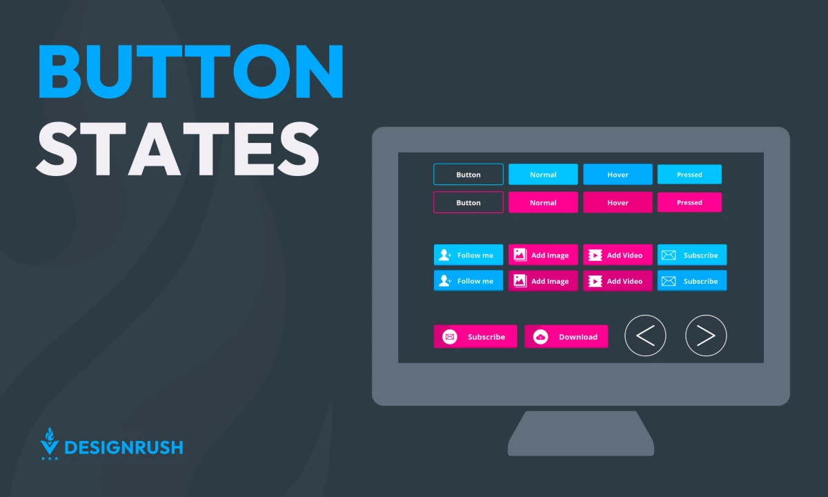
Button states visually show how a user can interact with a button in a user interface. They serve as key communication tools that indicate which actions are available, in progress, or completed. Let’s take an in-depth look at the various button states and demonstrate how their thoughtful implementation can significantly enhance user interaction.
What Are Button States Used For?
Button states act as a dynamic bridge between users and the interface. These states communicate the button’s current condition, such as whether it is interactive or inactive.
For instance, a button with hover effects signals that it is clickable, while a grayed-out design indicates inactivity. Such visual cues reduce confusion and improve user flow. Each state must look consistent yet distinct to ensure users can easily understand the different actions they can take.
Types of UI Button States
The most essential button states include active, enabled, disabled, focused, and hovered. More advanced states, like loading indicators and success notifications, improve the user experience in complex applications.
Default State (Enabled)
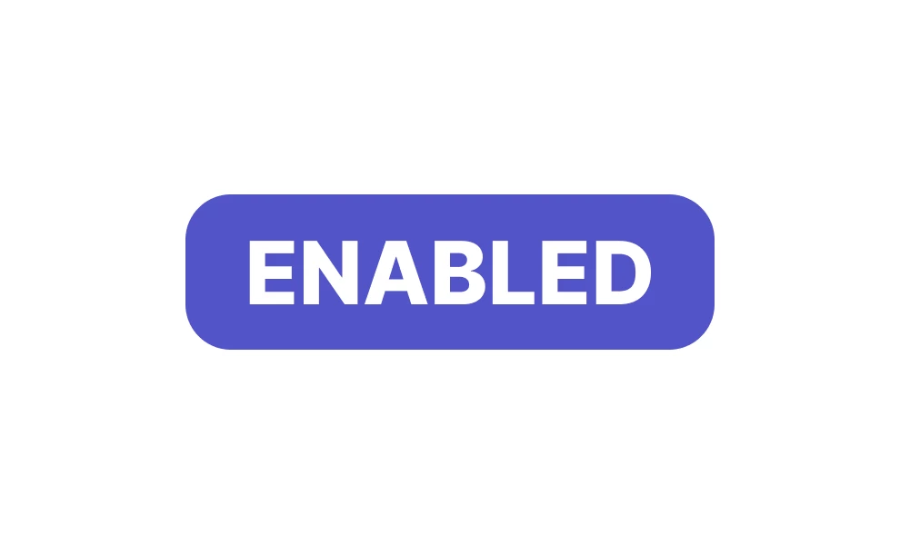
This is the way a button usually appears. It visually shows the user that the button can be clicked and is ready to be used. Designers can use colors and shapes that align with your branding while maintaining accessibility standards. For instance, a blue "Sign Up" call-to-action (CTA) button on a clean white background is inviting and straightforward.
Disabled
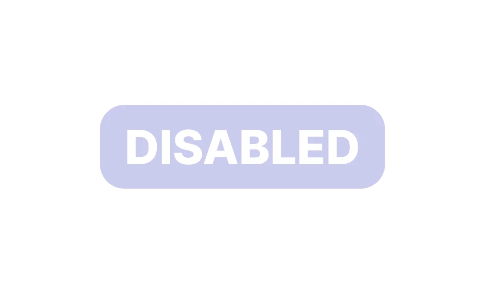
A disabled button indicates an inoperative element, signaling that certain conditions must be met before it becomes actionable. Disabled buttons should be distinguishable from active ones. Using muted colors without hover effects is a good way to show a button is inactive. For example, a light gray "Submit" button signals that a task must be completed before proceeding.
Hovered (Highlighted)
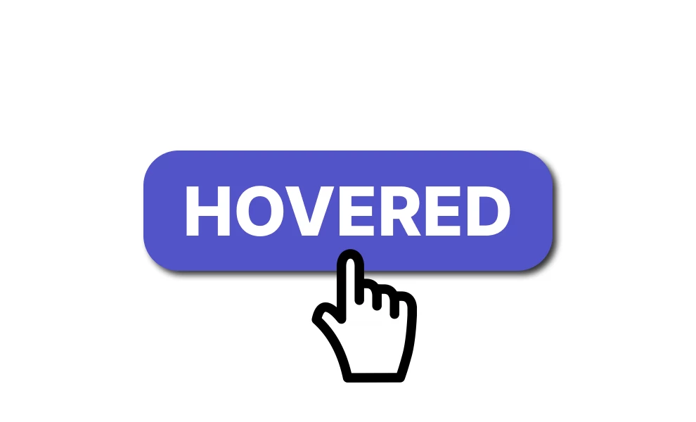
When a user's cursor moves over the button, it changes to the hovered state. This usually means the button's color or border changes, showing the user it can be clicked. Hover effects should be subtle yet noticeable, like a slight change in color or a shadow effect. For instance, "Add to Cart" buttons on the top e-commerce mobile websites often become darker upon hover.
Focused

Focused states highlight the button a user has selected using input methods such as a keyboard, usually by showing a border or outline around it. This helps direct the user's attention to the currently active element, which is especially important for keyboard and assistive technology (AT) users.
Active (Pressed)
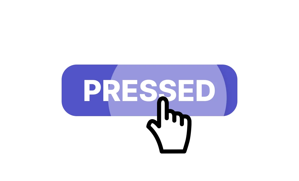
The active state occurs momentarily when the user clicks a button. The visual design changes — such as a color shift or a brief animation — to confirm the button is being pressed. Active states benefit from immediate visual feedback, such as a "pressing in" effect. For instance, a darkened background or quick animation can signal the user’s click.
Selected
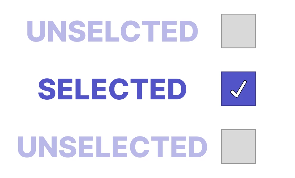
Selected states indicate user choices, such as within button groups. They highlight the chosen option while distinguishing it from unselected alternatives. Use distinct color fills or icons to highlight selections and differentiate them from other buttons. For example, a "selected" filter button on a photo-editing app might turn bold with a checkmark. Similarly, in architecture website design, selected projects might be emphasized through enhanced visual cues such as a different background or a standout frame.
Dragged
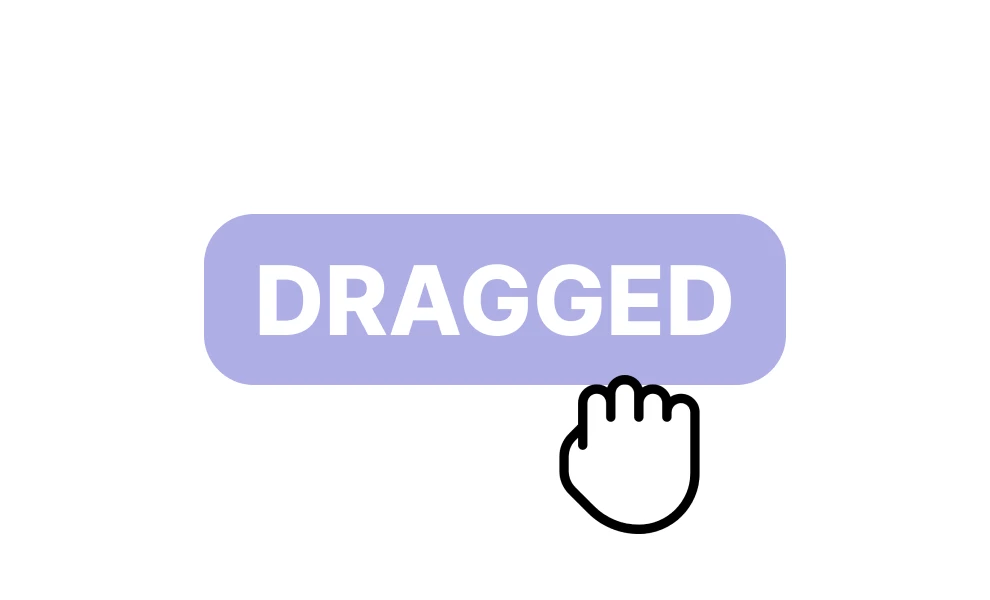
A dragged state visually communicates that a button or element is being pressed and moved, which is helpful for actions like dragging files. The dragging is often communicated with movement effects or slight opacity changes. For example, draggable items in file management tools usually appear semi-transparent during the action.
Loading

This state appears when a system processes an action triggered by a user. To do this, professional website designers implement spinners or progress bars within buttons to show ongoing processes. A "Loading..." state on a checkout button reassures users that their action is being processed.
Success

The success state confirms task completion, like submitting a form or buying an item. It often uses a checkmark or a green highlight to show this. You can also use cheerful visuals to indicate successful outcomes. For instance, a "Payment Successful" button might display a brief animation before redirecting users.
Toggled (On/Off)
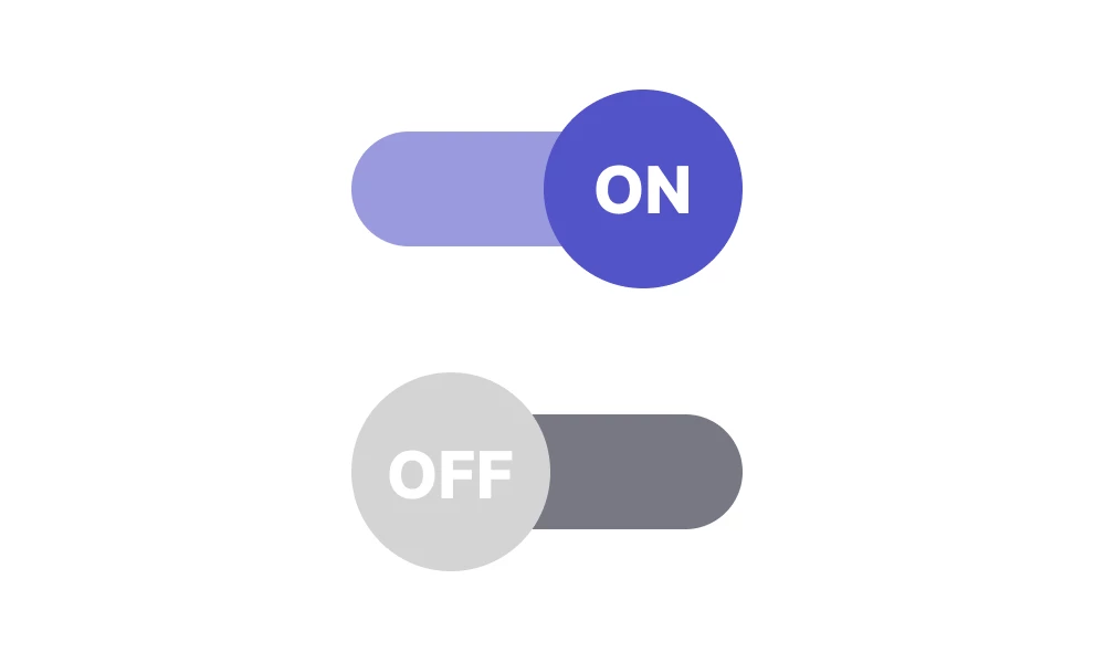
Toggle buttons represent binary choices, such as enabling or disabling a feature. These states indicate whether the button is "on" or "off." Toggle buttons should provide clear feedback when switching states. For example, a "Dark Mode" toggle could change from gray to blue when enabled.
Error
Error states communicate mistakes, such as invalid form inputs. Error buttons should grab attention with bold, contrasting colors like red. Pair these with descriptive messages to guide users in resolving issues.
Key Design Principles for Button States
Designing button states goes beyond simple aesthetics; it requires a thoughtful approach to ensure optimal user interaction and seamless navigation. By adhering to principles like distinctiveness, cross-platform and cross-browser compatibility, and consistency, designers can craft button states that are both functional and visually appealing.
Distinctiveness
Distinctiveness ensures that each button state is recognizable and serves its purpose. Each state should employ unique design elements like color, shape, or animation to maintain clarity. This approach minimizes confusion and improves usability, making it easy for users to identify a button's status.
Cross-Platform and Cross-Browser Compatibility
Ensuring buttons perform effectively across various platforms and browsers is vital for creating a reliable user experience. On mobile devices, touch interactions eliminate the need for hover states, while desktop platforms utilize hover and focus states for better navigation.
Testing button states across popular browsers help identify inconsistencies and ensure functionality remains intact. To maintain visual and functional harmony, designers can implement subtle adaptations, such as customized CSS for browser-specific quirks. This practice guarantees seamless interaction regardless of device or browser preferences.
Consistency
Consistency across button states is crucial for a cohesive user interface. Employ uniform visual styles and UI elements — such as rounded corners, color palettes, and typography — across all states to foster familiarity and trust.
Additionally, employing consistent transitions, such as a fade effect when moving from hover to active states, promotes a seamless flow. Adhering to accessibility standards, like ARIA roles, further ensures that buttons perform reliably across platforms and devices.
Button States: Takeaways
Effectively using button states is essential for crafting intuitive and engaging user interfaces. These states clarify the current functionality, guide user actions, and provide feedback, ensuring a seamless and enjoyable experience.
The thoughtful design of these states boosts accessibility and reduces user frustration, making your application or website more user-friendly.
Button States FAQs
1. Are button states necessary for mobile app designs?
Yes, but with adjustments. Mobile designs omit hover states, as touch interactions replace mouse input. However, active, disabled, and loading states remain essential for effective feedback and usability on touchscreens.
2. How can designers test the effectiveness of button states?
Designers should test usability with real users to ensure button states are intuitive and accessible. Additionally, cross-browser and cross-platform testing helps identify and resolve inconsistencies before deployment.
3. What are common mistakes in designing button states?
Common mistakes include insufficient visual distinction between states, inconsistent styles, ignoring accessibility features, and failing to test states across devices and browsers. These issues can confuse users and degrade the overall user experience.