If you’re on a mission to build an online presence that your audiences and potential customers can rely on, it’s time to familiarize yourself with the types of website designs.
From static pages to fluid and responsive layouts, these tried-and-tested design principles (established by some of the most renowned web design companies on the market) will enable you to create a seamless and intuitive experience for your site visitors.
Get this: 94% of people say that bad design is one of the reasons they lose trust in certain websites and 48% of consumers consider it the number one factor in deciding a business’s credibility.
This article will discuss the most popular types of web designing, their distinct features and where they fit best among the different site categories – including yours!
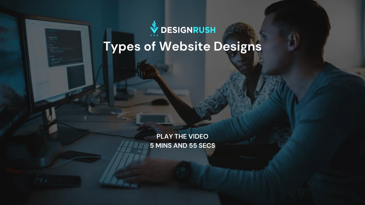
The Six Types of Website Design
Every website has a unique, functional, and solid design as its foundation. To help you build yours, let’s break down each kind of web design and its characteristics.
1. Static Website Design
A static website works as it seems: steady and unchanging. It’s one of the simplest types of web designing since it uses “fixed” or basic code. All site dimensions and elements have been pre-configured, so the layout remains the same across all platforms.
In other words, it offers little to no user interaction at all.
Think of it like a printed flyer or brochure. You can read through all the essential information about a brand or organization in a standard and straightforward fashion.
Unless the developer modifies the design, all website content will stay consistent regardless of the browser or device.
When Should You Use It?
Static web designs are great for read-only websites such as portfolios, journals, online brochures and landing pages. Its purpose is to inform rather than sell goods or services.
Also, static pages are the cheapest to create among all the web design types. Its simple structure and minimal design don’t require much development time and resources. However, visitors should expect limited UI/UX features from its simple interface.
If you’re on a tight budget and a simple informational site would suffice for your needs, a static web design is your best bet!
2. Dynamic Website Design
Where static webpages leave little room for interaction, dynamic websites are designed precisely for that. In this design, site visitors can interact with the content, paving the way for a more engaging user experience.
It’s one of those web designs requiring a little more flexibility in its structure.
Needless to say, a more versatile code is required to make this design. Think PHP, JavaScript, or ASP. This will enable the site to deliver information differently depending on the user and the platform it’s being viewed on.
When Should You Use It?
A dynamic web design would fit into websites that involve more user action. eCommerce websites, search engines and social media platforms are just some of the key types of websites where this design is utilized.
However, keep in mind that dynamic sites usually load slower than static webpages. It's because they generally have a complex coding structure. A more complicated design means more site elements, so pulling it off requires a little more work.
3. Liquid Website Design
What happens when water is poured across a flat surface? It spreads.
That’s how a liquid web design or fluid design behaves when put into platforms of different sizes. Along with the site's elements, this web design type expands or shrinks the webpage according to the device's screen size.
To do that, it uses flexible units that allow the website to fill the width of the platform. Its columns are built-in percentages, allowing the website to increase or decrease in size accordingly.
When Should You Use It?
Almost all types of websites can rock this design since its sole purpose is to keep information viewable across all devices. With this build, you can rest assured that no content gets cut off from your website.
However, it's important to note that liquid designs can sometimes appear too stretched out or warped. Because the site shifts the layout as a whole, the content may look odd when adjusted to particular screen size.
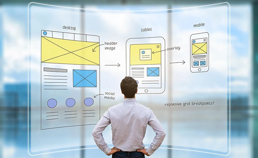
4. Responsive Website Design
Among the many types of website designs, this is the most versatile one. Like how a chameleon adapts to the environment, a responsive website changes itself according to the browser, layout and display.
Be it a smartphone, tablet, computer, or desktop; you can rely on this layout to manipulate itself and deliver the optimal viewing experience. It wraps the text, scales the images and adjusts the overall navigation to fill the screen perfectly regardless of size.
When Should You Use It?
If mobile visibility is among your top priorities, your best choice is a responsive design. It offers a seamless experience for mobile users, especially those who frequently visit blogs, tech websites, online shopping portals and community websites.
Remember that similar to dynamic and liquid websites, they have a more complicated design model. So, you should expect that a responsive web design will take more time and resources to develop.
5. Adaptive Website Design
Adaptive design is one of those types of web designing where flexibility matters most. Like a responsive website, this design detects the screen size and adjusts the page layout accordingly.
But what’s the difference?
Here, there are pre-set parameters for how the site will adapt to the platform. In this case, designers will create an adaptive site for the usual screen widths, such as 480, 960, 1200, etc.
When Should You Use It?
Adaptive designs are relatively easier and faster to develop compared to responsive designs. But here’s the downside: If someone who uses a different screen size (outside the pre-set screen widths) visits your site, your website might appear to have extra or insufficient whitespaces.
6. Single Page Website Design
As the name suggests, a single-page design packs all your site information on one page. It presents a linear, no-frills user experience to your viewers. They can scroll down the webpage to learn about your business or organization.
When Should You Use It?
Single-page designs are great for online resumes, one-off landing pages and comprehensive product pages.
It can be as long as you need it to be but be careful not to over-pack it. A one-dimensional experience with too much scrolling can drive site visitors away!
Website Layouts Perfect for Your Web Design
Now that we’ve discussed the numerous types of web designs, let’s unpack the other building block of a well-constructed website: the layout.
Did you know that 38% of people will stop engaging with a website if the layout is unattractive?
Little things like clunky navigation or a confusing menu can instantly drive site visitors away from you. A good site layout can save you from this. It’s what makes your content accessible, digestible and intuitive!
So, take a look at these examples that will surely keep your site visitors happy.
1. Single Column
This layout is one of the simplest formats to follow and can fit in almost all types of website designs. Here, the site information is displayed in a single, vertical column. Viewers can scroll through the site to explore.
Because of its simplicity and ease of use, a single-column layout best suits a mobile screen.
2. Split Screen
A split screen is a great choice to display two pieces of content that are distinctly different from each other but are equally important. Dividing your website into two sections is a great way to streamline the user journey without confusing the viewer with contrasting navigations.
For example, a split screen is fitting for a site offering two key features or categories, like a men’s or women’s shopping section.
3. F-shape Layout
Another variant that complements most web design types is the F-shape layout. Studies have shown that users instinctively move their eyes in an F pattern. So, web designers arrange their site elements to match that behavior.
This template works best when you have a lot of information and elements on your website.
4. Grid of Cards
Grid of Cards is another good layout for content-heavy sites or websites that offer various media options.
We’re talking about video streaming sites like YouTube and Netflix that display content in bite-sized previews or Cards. They serve as containers for clickable information, arranged in a grid system for an organized view.
Each card features a preview image, so users can easily find what they’re looking for.
5. Boxes
If you want to keep things in order, use boxes!
This layout features a large box as the main container, which consists of two to five smaller boxes housing additional content. Each box can lead the user to another page with more information and options. It can take the form of images, descriptions, CTA buttons, etc.
eCommerce portals and personal websites often use boxes to display their content or products in a more organized way.
How to Choose from the Different Types of Website Designs
Now you know plenty of ways to design your website uniquely and effectively. The next question is, which web designs will look and work best for your business?
Consider these three essential factors:
Your Business Type
From portfolio websites to the best financial website design, each web design variant works for particular businesses and niches.
For example, having a static design for your e-commerce site can be a setback due to a lack of interactive elements. Or, you could be overspending on a responsive design for a simple instructional webpage.
Consider the nature of your business, product and service offerings, and branding strategy when figuring out the best design template for your website.
Your Target Audience
Know your target audience: are they tech-savvy? Do they appreciate fluid navigations or animated elements? Or do they prefer simple navigation with more straightforward functions and presentation?
Choosing the right one from the different web design types all comes down to the kind of experience you want to give your site visitors, one they can easily and intuitively engage in.
Your Platform of Choice
Lastly, it’s vital to identify the platforms where your website will be most visible and accessible. Whether it’s purely on desktop, mobile, tablet, or all devices covered, considering this aspect will ensure an optimal site viewing experience.
Key Takeaways on the Various Types of Website Designs
With a handful of web design types to choose from, it can be challenging to figure out which mold your website will fit right into. But now that you’ve explored each one’s distinct characteristics, purposes and use cases, you are well on your way to creating the perfect website for your business! A professional web design agency can be of help here.

Our design experts recognize the most innovative and creative designs from across the globe. Visit Design Awards to see the:
- Best Logo Designs
- Best Website Designs
- Best Video Designs
- Best Print Designs
- Best Packaging Designs
- Best App Designs
Our team also ranks agencies worldwide to help you find a qualified agency partner. Visit our Agency Directory for the top Logo Design Companies, as well as:
- Top Web Design Agencies
- Top Video Production Companies
- Top Print Design Companies
- Top Packaging Design Companies
- Top Mobile App Development Companies