
Tech buying moved onto the website years ago. Whatever a salesperson used to handle, a page handles now, which turns design questions into sales questions. Who is reading this? What do they need to see first? Where do they actually decide?
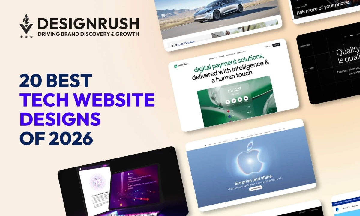
Whether you are briefing an agency or fixing a site you already have, learn from the 20 best tech websites here, including their design decisions, the commercial reason behind it, and what it costs to build.
Tech Website Designs: Key Findings
- DesignRush web design pricing data puts SaaS and tech website projects at $10,000 to $100,000+, the widest band of any tracked industry apart from healthcare and financial services.
- HTTP Archive's 2025 Web Almanac, built on 17.2 million websites, found the median home page ships 697 KB of JavaScript while only 48% of mobile origins pass all three Core Web Vitals.
- WebAIM's 2026 Million report found detectable WCAG failures on 95.9% of the top million homepages, up from 94.8%, with low-contrast text on 83.9%, the first reversal after six consecutive years of improvement.
What Makes a Good Tech Website Design?
The window to earn a visitor’s attention is narrow. Users take about five seconds to form a reliable first impression of a site, and visual complexity shortens that further by making it harder to work out what the page is even for.
Marina Marsh of Web Loft Designs, drawing on more than 2,000 builds, puts it bluntly: "It's like speed dating, but for websites."
Great tech web design answers what does this do and who is it for before it asks for anything. The strongest designs share four traits:
- Headlines that read like product specs. Not a promise, a description. A buyer should be able to repeat your value proposition to a colleague after one screen.
- Demonstration carrying the explaining. A configurator, a live template, a rendered telemetry layer. Something the visitor operates rather than reads about.
- Proof landing where judgment forms. Certifications and customer logos on the pricing page, not a credentials page nobody opens.
- A publishing architecture marketing can run alone. If a new landing page needs a developer, the site decays between releases.
The upside is real when you get this right. Web design is one of the highest-leverage line items a technology company controls.
Across DesignRush's internal agency data from 2020 to 2025, web design and funnel restructuring projects produced conversion increases ranging from 94% to 900%, with many of the high-impact lifts landing under $20,000.
But miss those and the cost is not abstract. Design factors alone explain between 29% and 68% of how trustworthy people judge a webpage to be, depending on category. This means a technology company selling technical competence is being scored on its own homepage before a single claim is read.
Beyond that, 88% of consumers are less likely to return to a site after one bad experience, 55% cut ties with a company after several, and in eCommerce roughly 35% of potential revenue is lost to poor UX outright.
How These 20 Tech Website Designs Were Selected
We looked at four things across all 20:
- Who the site is written for. Some sort visitors into groups. Others pick one visitor and write for them. Both approaches work. Sites addressing everyone at once tend to reach nobody.
- Whether the design explains anything. On the strongest sites, animations and configurators carry information. Effects with nothing behind them counted against a site.
- Where the proof sits. Certifications and customer logos do the most work on the page where a decision happens. On a separate trust page, far less.
- How the build performs. Contrast and mobile speed both factored in. For a tech company, the site itself reads as evidence of technical quality.
Nine of the 20 carry a DesignRush Design Awards evaluation under a published evaluation process.
Every submitted design is scored out of 10 by the in-house jury, and that score appears next to the live design. Anything at 7.5 or above is shortlisted for external judges, and individual juror scores are published whether a design wins or not.
Criterion | Weight | What it measures |
Design | 30% | How well the design commands attention and elicits action |
Usability | 30% | Whether the design achieves its purpose and improves the user experience |
Creativity | 30% | Whether the design was unique and resourceful in its techniques, tools, and concepts |
Content | 10% | Whether the design was detail-oriented in execution and presentation |
The DesignRush Design Awards jury panel spans creative directors and strategy leads, and each entry is scored independently by three or more of them.
The remaining 11 on this list are not award entries, but tech sites selected on merit and assessed against the same four criteria by the DesignRush design team, including Branko Dimitrijević, a senior designer with 33 design awards and more than 165 web projects delivered.
1. Phia by Lounge Lizard
Standout Features:
- Circular visuals inspired by the company logo
- People-focused imagery instead of cybersecurity clichés
- Short navigation paths to services and careers
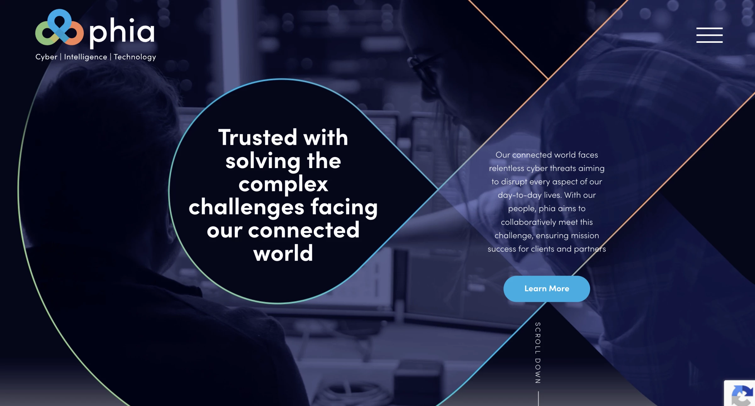
Phia provides cybersecurity, intelligence, and technology services to US federal agencies. Lounge Lizard transformed its outdated one-page website into a full platform that serves prospective clients, partners, and job candidates.
The design builds on Phia’s three-sided Celtic logo. Circular photographs, video masks, and graphic elements repeat its shape throughout the website, creating a consistent identity without relying on the locks, code streams, and dark interfaces common across cybersecurity sites.
This people-first direction also supports recruitment. Team imagery and the “phia phamily” messaging present company culture alongside technical capabilities, while separate sections make services and open positions easy to reach.
Behind the design, Lounge Lizard used a custom WordPress CMS, shortened click paths, improved mobile performance, and made the website Section 508 compliant.
The agency reports that its design and SEO work increased organic search traffic by 108% and informational search visibility by almost 60%.
Why it works: The website communicates technical credibility without making the company feel anonymous. Clients can assess Phia’s expertise, while prospective employees see the people and culture behind it.
See how Lounge Lizard redesigned Phia’s cybersecurity website to improve accessibility, search visibility, and recruitment.
2. Emerald24 by Goodface
Standout Features:
- Uppercase nav against lowercase headings
- Products stack as a scroll-linked stepper
- Frosted balance cards on emerald gradient
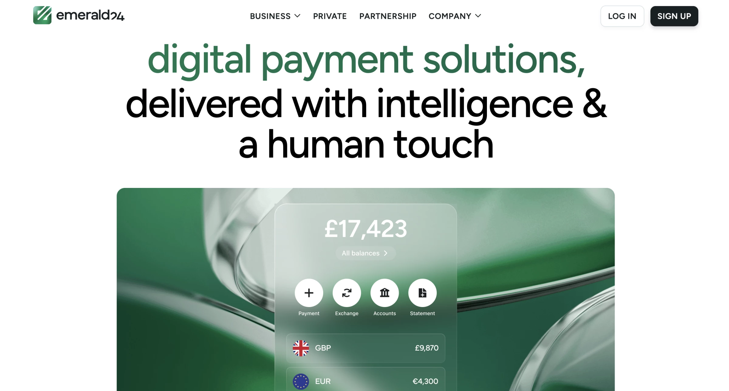
Emerald24, a UK payments company, provides multi-currency accounts and cross-border payments for international businesses. Goodface recently redesigned the company website to focus on clear typography and color hierarchy.
This new layout uses text styling to guide your eye. The main navigation relies on bold uppercase letters for primary categories. As you scroll down, lowercase headings appear alongside forest green text over a black subheadline.
The green color scheme serves a controlled purpose across the site. Product mockups sit on emerald gradient panels with frosted glass overlays.
The accent hue only reappears on small details like confirmation checkmarks and the arrow inside the sign-up button.
Beyond visual updates, the structure helps you browse available offerings easily. Five main products display as a scrolling stepper. You click through sections at your own pace. The accounts section opens first while the remaining features wait below as collapsed headings.
Goodface reports that replacing the old, fragmented legacy platform resulted in faster client decisions from the restructured architecture.
Why it works: A finance director comparing five payment products is doing work a sales call used to do.
Gartner's 2026 survey of 646 B2B buyers found 67% prefer a rep-free experience. When nobody takes the call, the website has to run the comparison.
Read the complete Emerald24 fintech website design breakdown.
3. Apple by Apple's In-house Design Team
Standout Features:
- Bento grid carrying product hierarchy
- Sticky per-product sub-navigation
- Photography supplies the only colour
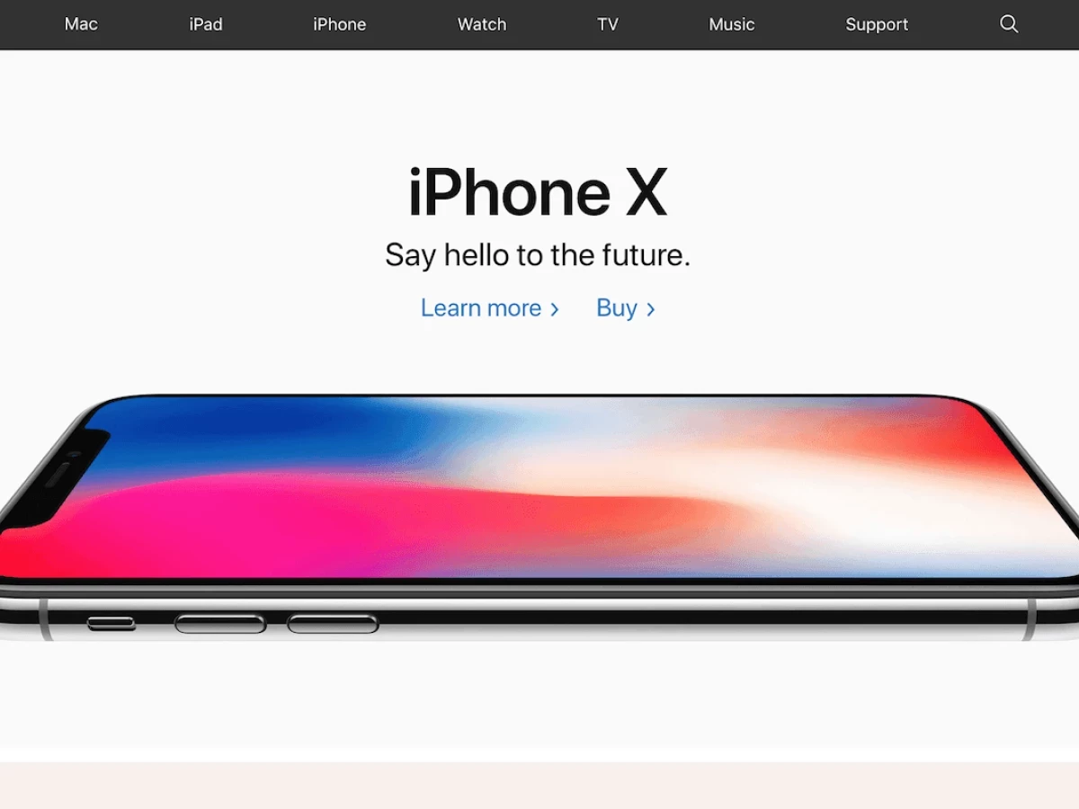
Most hardware companies publish the exact same spec sheets. Apple designs their site to settle your decision before you even see those numbers.
They handle the initial sorting for you by using a bento grid. The uneven boxes point your eye to the items they want you to see first. You figure out the product ranking without staring at a comparison table, and the plain background ensures the colorful photography stands out.
That simple structure continues when you click on a specific product. A local menu follows you down the page to keep the purchase button visible at all times. If you scroll through twelve screens of phone details, you can still buy it instantly.
Why it works: Speed drives these decisions on a commercial level. Visitors form a first impression of a website in about five seconds.
The visual hierarchy guides you within this brief window, and more often than not, you end up making a choice before you open a single document.
4. Surge AI by Konpo
Standout Features:
- Customer logos directly beneath the CTA
- Angular gradient facets as background
- Custom emoji set as brand system
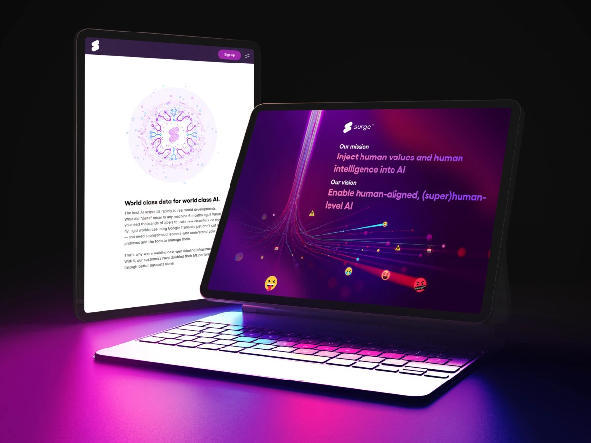
Engineers shopping for data vendors tune out standard AI marketing. Surge AI got around that by bringing in Spanish studio Konpo at the start, so founder Jean Massad had the marketing pages and core software built as one system.
The brief asked for something that broke the rules on purpose. Konpo dropped the cold corporate playbook and went with massive white text over a fractured magenta-to-violet gradient. A single outlined "Get Started" pill is the only button on the page.
The page opens with a blunt headline, "Data Labeling 2.0." A short paragraph underneath lists use cases next to a quiet text link for project help, which catches visitors who want a look around first.
Scroll past the fold and a logo band drops Amazon, Twitch, and Stanford.
One detail costs nothing to copy. Konpo drew a custom emoji set and wrote the product's empty states as copy. The login tab says "we missed you," and an unused project area says "Nothing's going on here. Try creating a new project!" writing did the work a render budget usually does.
Reported outcome: Founder and CEO Edwin Chen credits the design work as a foundational pillar through hyper-growth.
Why it works: Names an engineer already trusts sit above the fold, right under the only button on the page.
Gartner found 69% of B2B buyers run into gaps between what a supplier's site says and what its sellers say. Third-party proof is the one thing that can’t drift.
Read the full Surge AI website design analysis.
5. Tesla by Tesla’s In-house Design Team

Standout Features:
- Configurator as the primary destination
- Navigation hidden until requested
- Price updates live with each choice
Tesla built no advertising department, hired no CMO, and franchised no dealers. It still delivered 936,172 vehicles in 2021 against $53.8 billion in revenue. Specification, pricing, financing, and delivery scheduling all resolve inside the configurator.
In fact, in several US states, franchise law stops Tesla's own store staff from closing a sale on the floor, so the transaction moves online by statute. That makes the configurator the heaviest page on the site and the only one that takes money.
A buyer specifying a five-figure vehicle with no dealership conversation attached needs the site to do everything a salesperson would.
Tesla built the whole experience around that single constraint, while keeping everything efficient, aesthetic, and still very responsive.
Why it works: Deloitte and Google's 2020 Milliseconds Make Millions study, covering 37 brands and 30 million sessions, found a 0.1-second mobile improvement lifted retail conversions 8.4%.
6. Existence by eDesign Interactive
Standout Features:
- One colour per life domain
- Scroll advances only on user input
- Text appears only where it adds
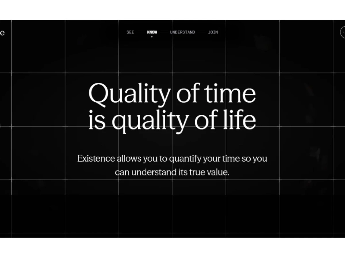
Selling an app that organizes time around who you want to become means making an abstract idea feel physical before anyone reads a feature. Existence, an AI planning tool from Rob Dyrdek, had exactly that problem at launch.
eDesign Interactive built a scroll-based page on dark textured grounds where gradients arrive gradually and mark the transition between ideas.
Typography stays quiet and functional, spacing runs generous, and copy appears only where it earns its place.
The colour system is the mechanism worth copying. Deep navy stands for Sleep, muted gold for Life, dark blue for Work, and rich green for Health, so the visitor tracks which part of the framework they are in without reading a label.
Interaction is deliberately sparse, and the page moves when the reader decides to move it, which is the same premise the app sells.
Why it works: WebAIM's 2026 Million report found detectable WCAG failures on 95.9% of the top million homepages, the first rise after six years of improvement.
A dark, quiet, gradient-led page is precisely where those failures hide, so a color system carrying meaning has to clear a checker or the meaning goes with it.
Read the full Existence website design analysis.
7. Made by Google by Google’s In-house Design Team
Standout Features:
- Products grouped by ecosystem
- Comparison built into the product page
- Checkout free of upsell interstitials
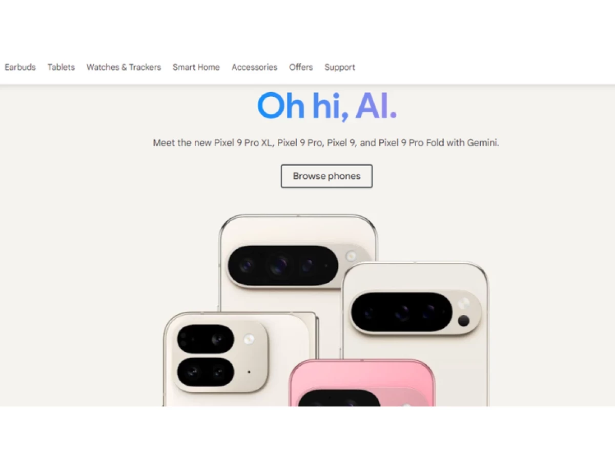
Phones, watches, earbuds, and home hardware are worth more together than apart. Grouping by device type would bury that, so the Google Store groups by what a customer already owns.
Comparison sits inside each product page instead of behind a separate compare tool. Someone deciding between two Pixel tiers resolves it without opening tabs, which removes the step where most hardware shoppers leave to read a review.
Checkout runs without interstitial upsells, too. Accessories are offered once, in line, and the path from selection to payment stays short enough that a decision made three screens earlier survives to the end.
The store's visual register, coral hardware on saturated lifestyle photography rather than product-on-white, descends from a hardware design language that has earned more than 240 global design awards since 2017 under chief design officer Ivy Ross.
That system is what lets a product page carry comparison inline instead of shunting it to a separate compare tool.
Why it works: Every removed interstitial is one fewer place to frustrate someone who already decided.
Contentsquare's 2025 Digital Experience Benchmark, built on 90 billion sessions across 6,000 websites, found organizations working against frustration signals saw 4.5x less visitor churn.
8. ADDVERB.AI by Metikulous
Standout Features:
- Two pills, two audiences, one fold
- Single robot render holds the screen
- Graduated grey studio ground
Addverb builds warehouse robots, the software that runs them, and complete automation systems. That's more products than a homepage can show at once.
Metikulous, a design studio in Dubai, sorted the full range into structured sections down the page and left the top of the site clear.
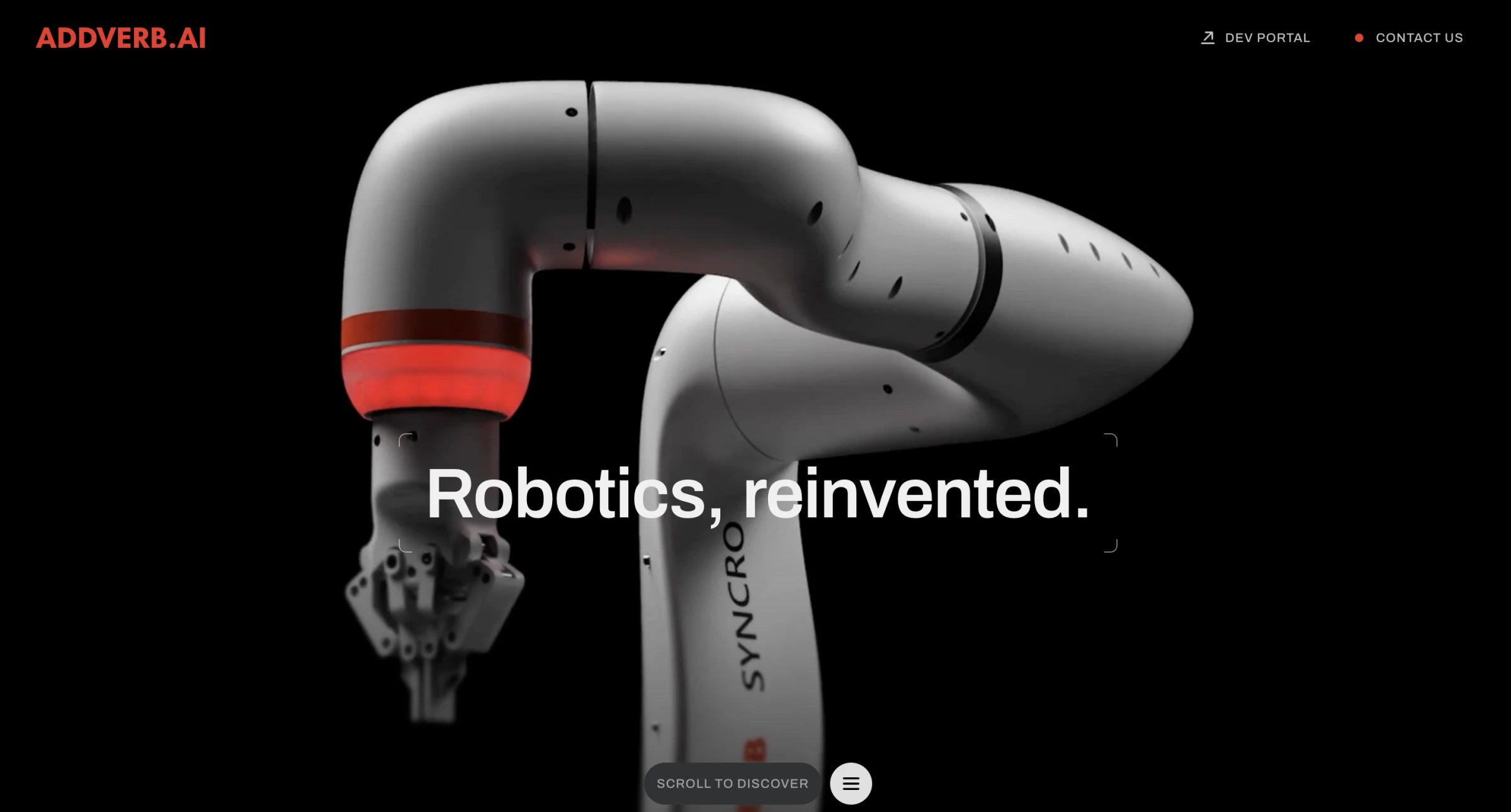
The hero gives everything to a single humanoid render in white, black, and Addverb red. It sits on a graduated grey studio ground with "Robotics, reinvented." set across its chest. Nothing else competes for the screen.
Two pills carry the routing. A Dev Portal sits top right for the engineer who wants API access straight away. A Scroll to Discover pill sits at the bottom edge for the buyer who needs the story first.
Neither audience reads past the other, and modular layouts with controlled motion carry the rest of the ecosystem below.
Why it works: A full-screen render is a performance decision before an aesthetic one.
HTTP Archive's 2025 Web Almanac put the median mobile home page at 2,362 KB, with 1,059 KB in images, up 202.8% since 2015. It pays here since the render is the product.
Explore the ADDVERB.AI robotics website design in full.



9. PayPal by Paypal’s In-house Design Team
Standout Features:
- Personal and business split in the nav
- Blue reserved for verification moments
- Security stated inside the flow
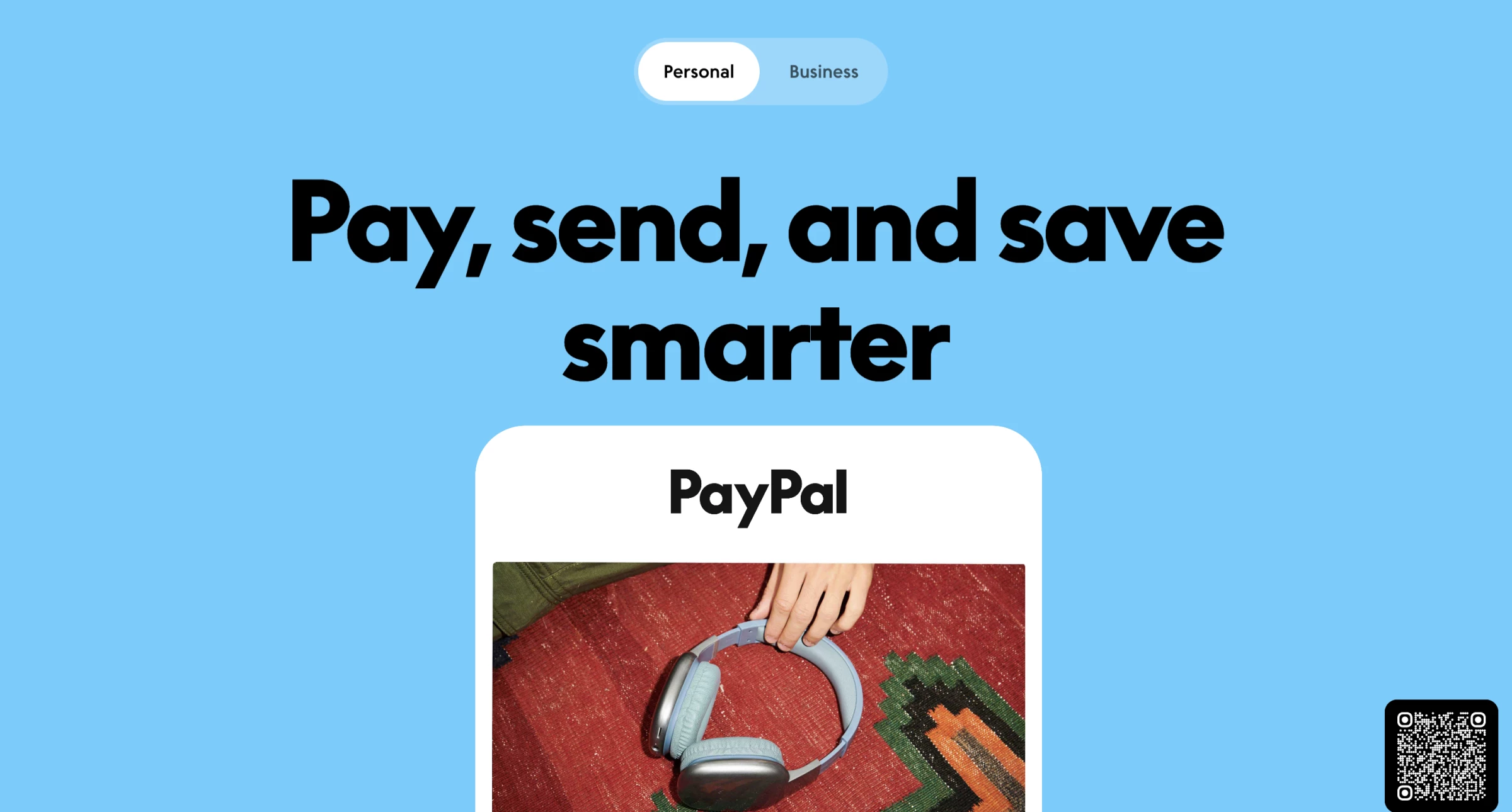
A friend splitting a dinner bill and a developer wiring up a payments API both land on paypal.com. They need completely different pages, but PayPal sorts that at the top level of the navigation.
The split happens in the menu itself, not behind a solutions dropdown, so a merchant never reads consumer copy on the way to developer documentation.
Each branch then carries its own hierarchy and its own primary action.
Colour does specific work here. Blue anchors the identity and appears sparingly enough that it still reads as a signal when it marks a security or verification element, which is the moment the brand most needs to be believed.
Why it works: Traffic keeps getting more expensive. Contentsquare measured the cost of an online visit rising 9% in a single year, a 19% climb across two.
Push two audiences through one funnel and you waste half of what you paid for.
10. Sony by Sony’s In-house Design Team
Standout Features:
- Divisional hubs under one shell
- Menu behaviour identical across divisions
- Hardware photography at display scale
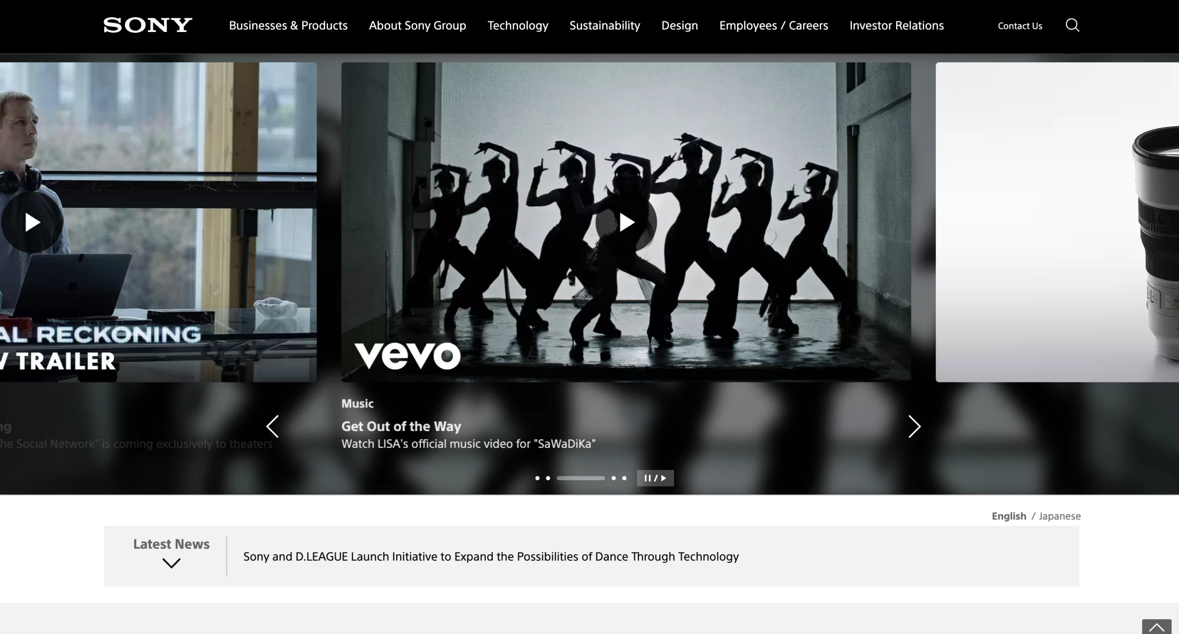
Sony sells cameras, PlayStation consoles, headphones, films, and insurance. No single design covers all of that, so each division gets its own site with its own look.
The menu is what stays the same. Same position at the top, same dropdown behaviour, same interactions, whether you're on the camera pages or PlayStation. Learn it once and you can use any Sony site without thinking about it.
Product photos run large on every division. A lens or a pair of headphones fills the screen at close to real size, which tells you more about the object than a spec list would.
Why it works: The WebAIM Million put the average homepage at 1,257 elements in 2025, up 7.1% in a year and 61% over six.
A consistent navigation shell is what keeps that density navigable when the content underneath refuses to be uniform.
11. Deed Delivery by Outcrowd
Standout Features:
- Isometric city as the whole hero
- Theme flips from light to dark by section
- One CTA on the entire first screen
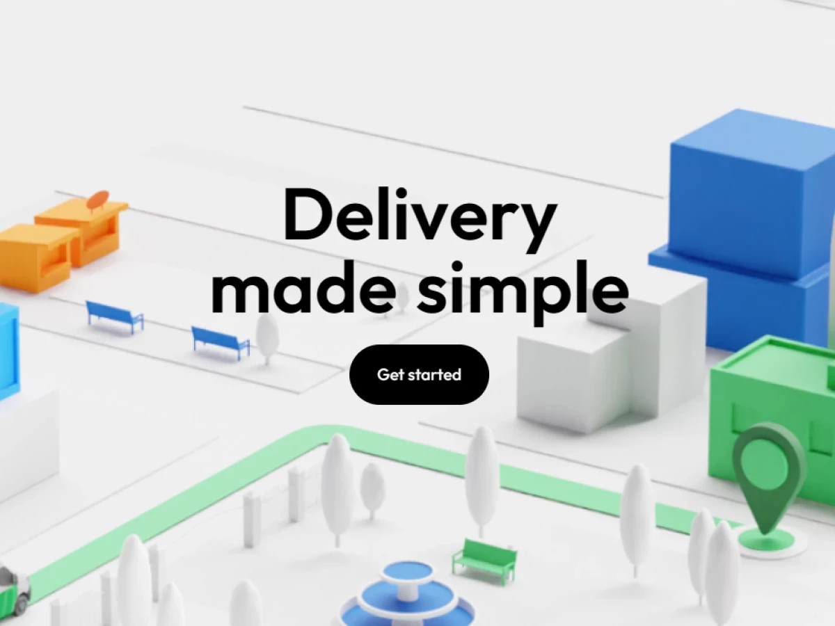
Logistics companies usually fill their homepages with route maps, delivery stats, and photos of trucks. Outcrowd built Deed Delivery's as a small 3D city instead.
The first screen is a near-white isometric cityscape: pale grey buildings, a blue office block, an orange warehouse, and a green depot with a map pin on it.
A mint route line threads between benches and trees. "Delivery made simple" sits in heavy black geometric sans in the middle, with one black pill button reading Get started. That's the only thing you can click.
The city moves as you scroll. The camera angle shifts as you go down, and one horizontal section sends a green-and-white Deed van along the mint route while animated lines trace the path ahead of it. A lime-yellow circular Play button marks the only other click on the page.
Backgrounds switch from light to dark partway down. The early sections explaining what Deed does sit on white. The technical detail sits on near-black. You feel yourself going from overview into specifics without a heading telling you. Colour only appears on objects inside the 3D scenes.
Why it works: Nobody can photograph a logistics network, so most competitors describe theirs in a features list.
The isometric city shows you the whole thing at once: warehouse, depot, route, van. One black button sits on that screen and nothing else competes for the click.
Read the full Deed Delivery website design analysis.
12. Squarespace by Squarespace’s In-house Design Team
Standout Features:
- Templates render live in the page
- Type specimen doubles as the hero
- Trial action repeated at each depth
Squarespace sells website building, so its own website has to be better than anything a customer could make with it. Any flaw on the page is a flaw in the product.
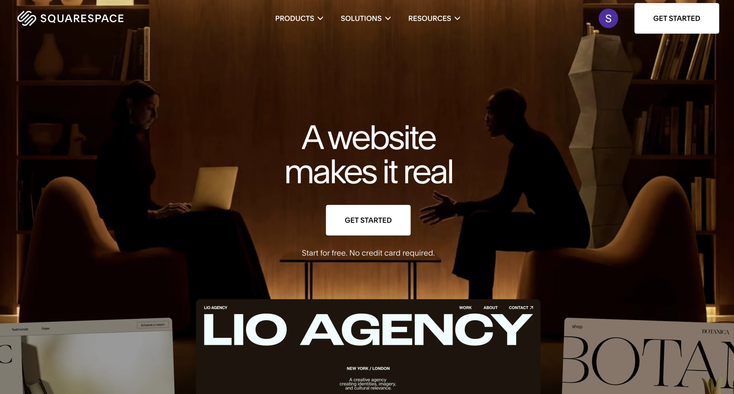
Templates load as real, working pages instead of screenshots. Scrolling the gallery means you're already using the thing you're deciding whether to buy. The hero sets its headline in editorial type at poster size, which shows you what the tool can do to type before you read a feature list.
The trial button repeats at every depth of the page. Decide at the template gallery and it's right there. Decide at the pricing table and it's there too. Nobody scrolls back to the top.
Why it works: Loading real templates means someone comparing website builders is already using Squarespace before paying anything. That's a trial with no signup form in front of it.
The trial button then repeats at every scroll depth, so whoever decides at the template gallery converts right there instead of going to find a pricing page.
13. Conreality by Bambuk Studio
Standout Features:
- Leader lines from body to live stats
- Wireframe terrain under the figure
- Hardware and software split in the nav
Conreality sells a system for live-action shooting games like airsoft and paintball. Arena operators buy hardware and software together, and what they're really paying for is a data layer over a physical game. That's hard to photograph.
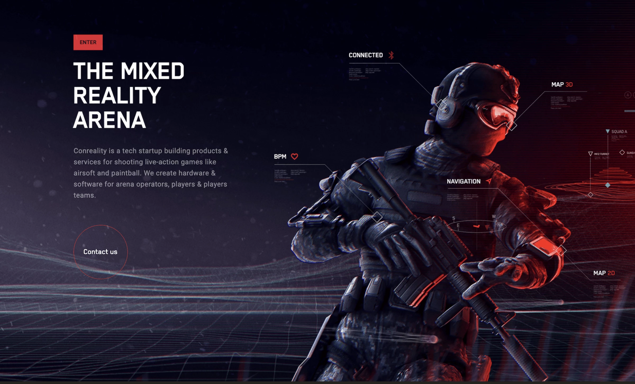
Bambuk Studio put the data on the homepage. A player in tactical gear stands against a near-black field of wireframe terrain.
Thin lines run from his body out to floating readouts: CONNECTED, MAP 3D, BPM next to a heart icon, NAVIGATION with an arrow. You're looking at what the product actually produces.
Red shows up four times. It lights the player from one side against cool blue from the other, marks the active menu item, fills the ENTER button, and circles the Contact us prompt where a small low-poly avatar stands.
Everything else is white or grey on black, with "THE MIXED REALITY ARENA" in heavy uppercase sans down the left edge.
The navigation runs as one page from software through to hardware, which lets operators and players each find their part without a "choose your role" menu.
Why it works: An arena operator can't see a data layer in a product photo, so most vendors here fall back on bullet points.
Conreality puts the live readouts on the homepage and lets an operator watch the system run before booking a call. That leaves price and installation as the only things left to discuss.
Read the full Conreality website design analysis.
14. Netflix by Netflix’s In-house Design Team
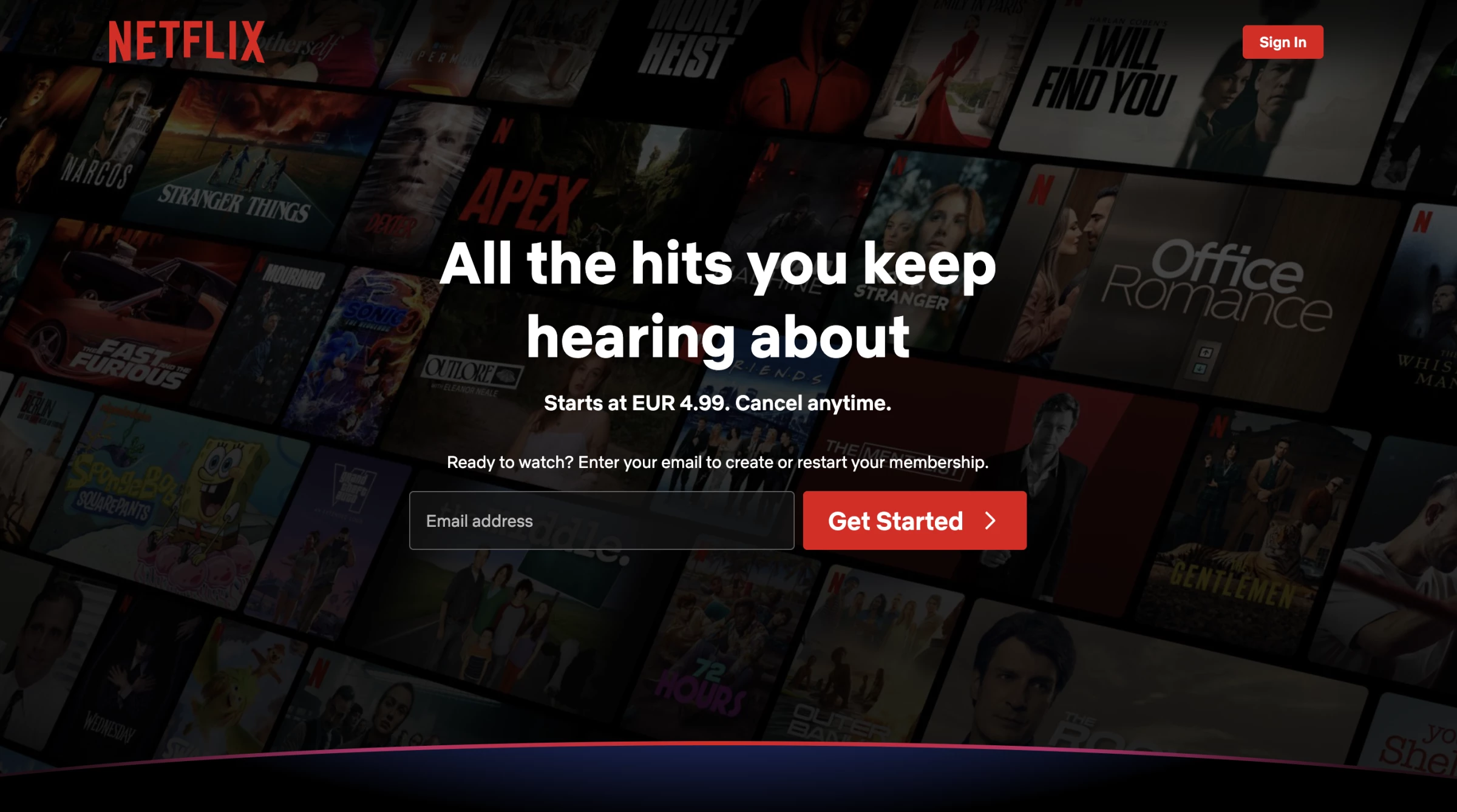
Standout Features:
- Signup collapsed into the hero
- Title artwork as the argument
- One objection answered per screen
Nobody needs Netflix explained to them. The logged-out homepage only has to close the sale.
Every step between someone arriving and starting is multiplied by tens of millions of sessions, which is why the email field sits in the hero rather than behind a signup page and why every objection section closes with the same field.
Scroll below the fold, and the layout knocks out a single objection per screen. It smoothly tackles common worries about device limits, downloads, cancellations, and kids.
Each section closes with the exact same signup field found in the hero area. A visitor never has to hunt for another page just to finally convert.
Why it works commercially: Netflix ranked #27 among the most-visited US websites in May 2026, up 9.7% in a month. At that traffic, one removed step multiplies across tens of millions of visits.
15. Asana by Asana's In-house Design Team
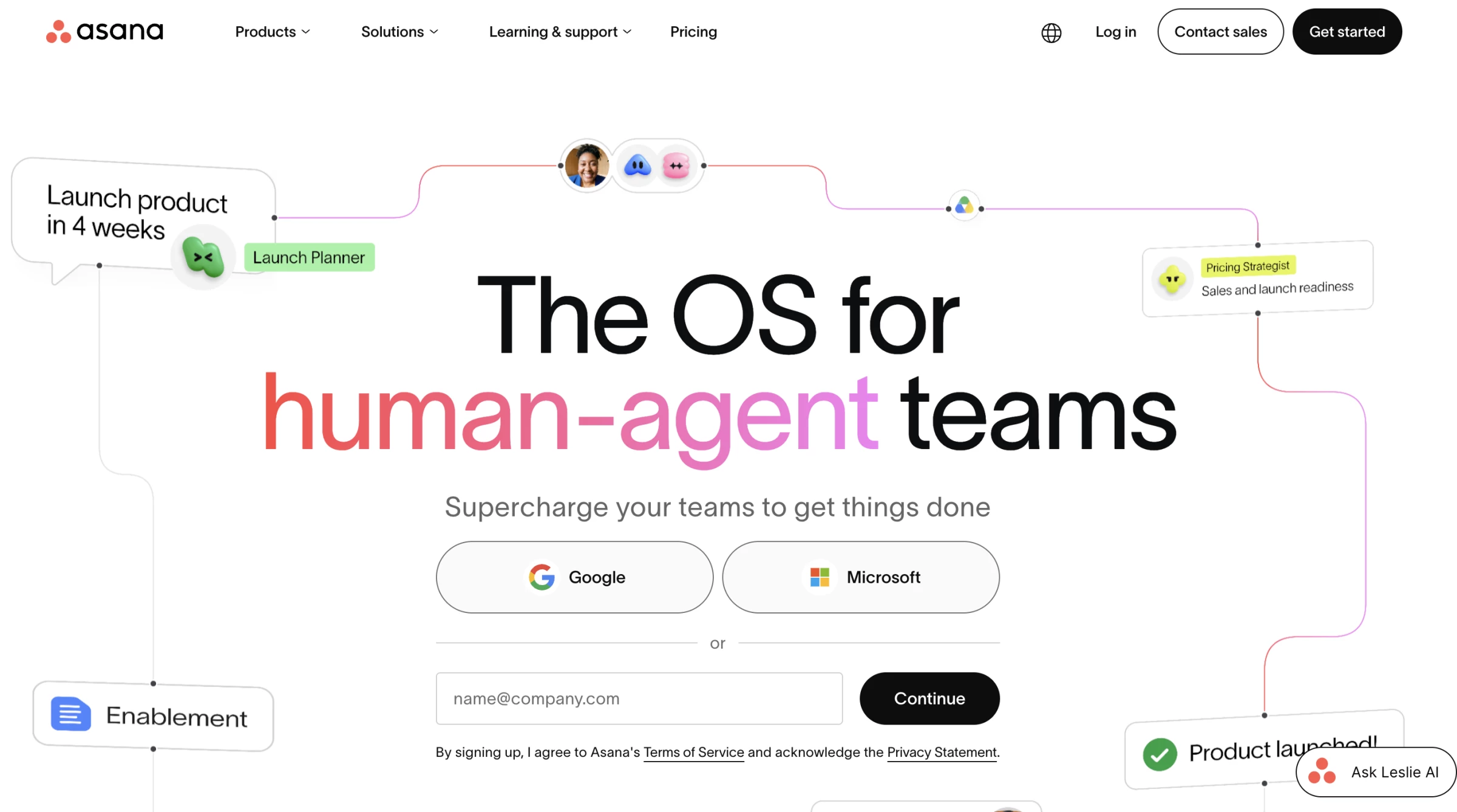
Standout Features:
- Routes by use case, not by feature
- Gradient marks section boundaries
- Workflow diagrams over screenshots
Every work-management tool has the same features now, so listing them proves nothing. Asana sorts its menu by what teams are trying to do instead.
Menu items name jobs rather than product areas, so a marketing lead and an engineering manager click different things from the same menu and land on pages written for them.
Gradients mark where one section ends and the next starts. On a long page, you can tell you've moved on without a heading announcing it.
Diagrams do the explaining where competitors use interface screenshots. A screenshot shows you what the software looks like. A diagram shows you how the work changes, which is the thing being bought.
Why it works: Contentsquare found sites raising session depth 10% or more saw a 5.4% conversion lift. Use-case pages earn those extra screens because the visitor chose the one that matched them.
16. Voltpile by Type and Space LTD
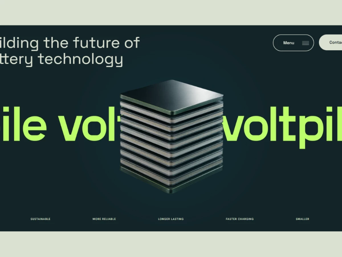
Standout Features:
- Lime wordmark marquee behind the render
- Seven claims fixed to the fold
- Menu collapsed to a single pill
Voltpile makes solid-state batteries, and the investors it needs read white papers and distrust anything that looks like advertising.
Type and Space LTD ran the page on a near-black teal background inside a pale sage border, with the headline in light geometric sans. A 3D render of a stacked battery cell sits in the middle.
Behind it, an oversized lime-green "voltpile" wordmark scrolls sideways, so the brand name runs along underneath the product.
The claims sit in one row pinned to the bottom of the first screen: safer, sustainable, more reliable, longer lasting, faster charging, smaller, lighter.
An investor gets the entire pitch without scrolling. The reveals that follow break the problem and the solution into paced sections for anyone who wants the detail.
Navigation collapses to a Menu pill and a Contact pill, which keeps the render uninterrupted. DesignRush juror Andrea Owsinek-Brucker noted that "the scroll reveal was very appealing" in her published scoring.
Why it works: Pinning the claims to the first screen means an investor sees the whole pitch before deciding whether to keep reading. Everything below becomes optional detail instead of a wall you have to get through.
Read the complete Voltpile website design breakdown.
17. Strava by Strava’s In-house Design Team
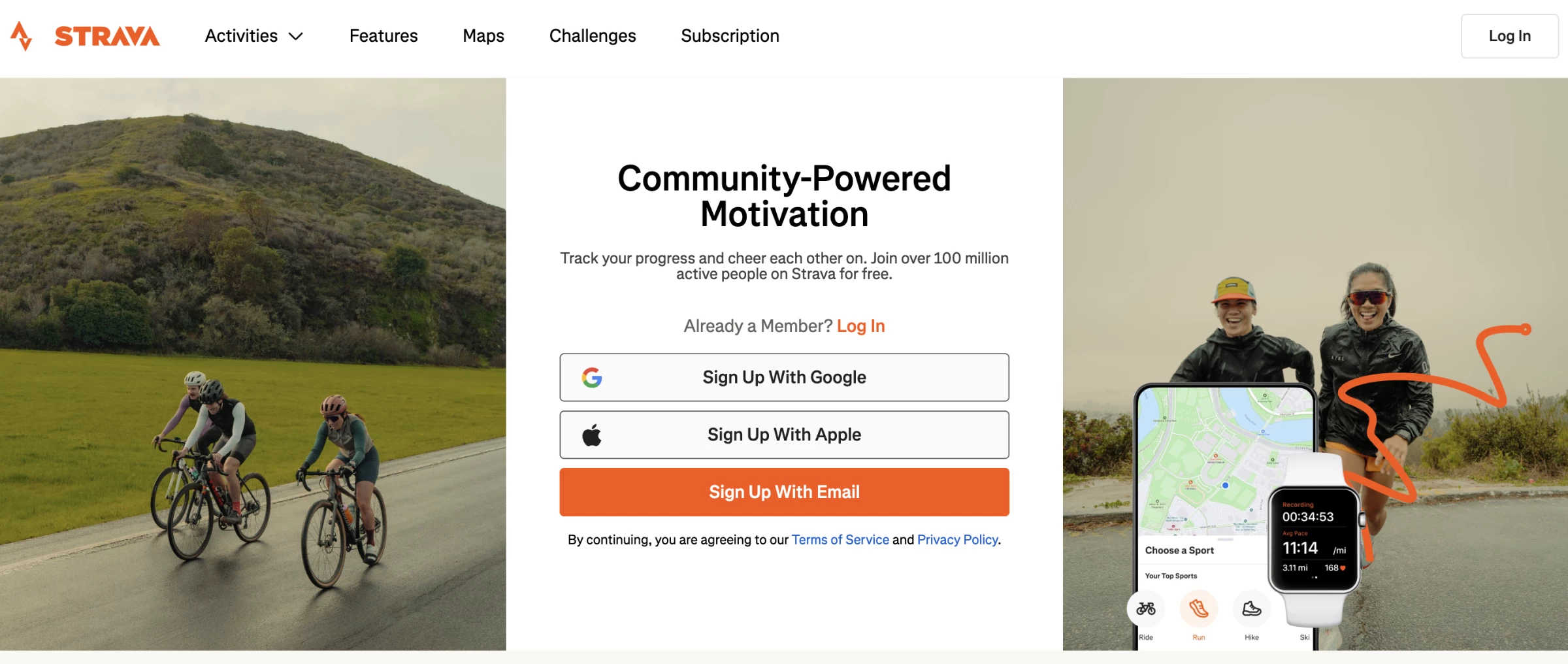
Standout Features:
- Live route data as the product demo
- Athlete photography over illustration
- Segment leaderboards on the marketing page
Strava sells a network, not a fitness tracker, and a network is worth nothing to someone who can't see it running. So the marketing site shows real activity from real users.
Route maps, segment leaderboards, and performance data all appear before you make an account. You see what other people did this morning, which is the product working.
The photos are of actual athletes instead of the illustrated figures most fitness apps use. Strava's users would spot stock imagery immediately, and the photography matches the people it's aimed at.
Why it works: Strava now has more than 150 million registered athletes in over 185 countries to put on the page, up from 40 million in 2019, on roughly $500 million in annual recurring revenue.
No competitor can copy those maps and leaderboards without the same number of users, which is why they sit outside the signup wall.
18. Bose by Bose's In-house Design Team
Standout Features:
- Product first, specification second
- Audio demonstrations embedded in the page
- Neutral ground for coloured hardware
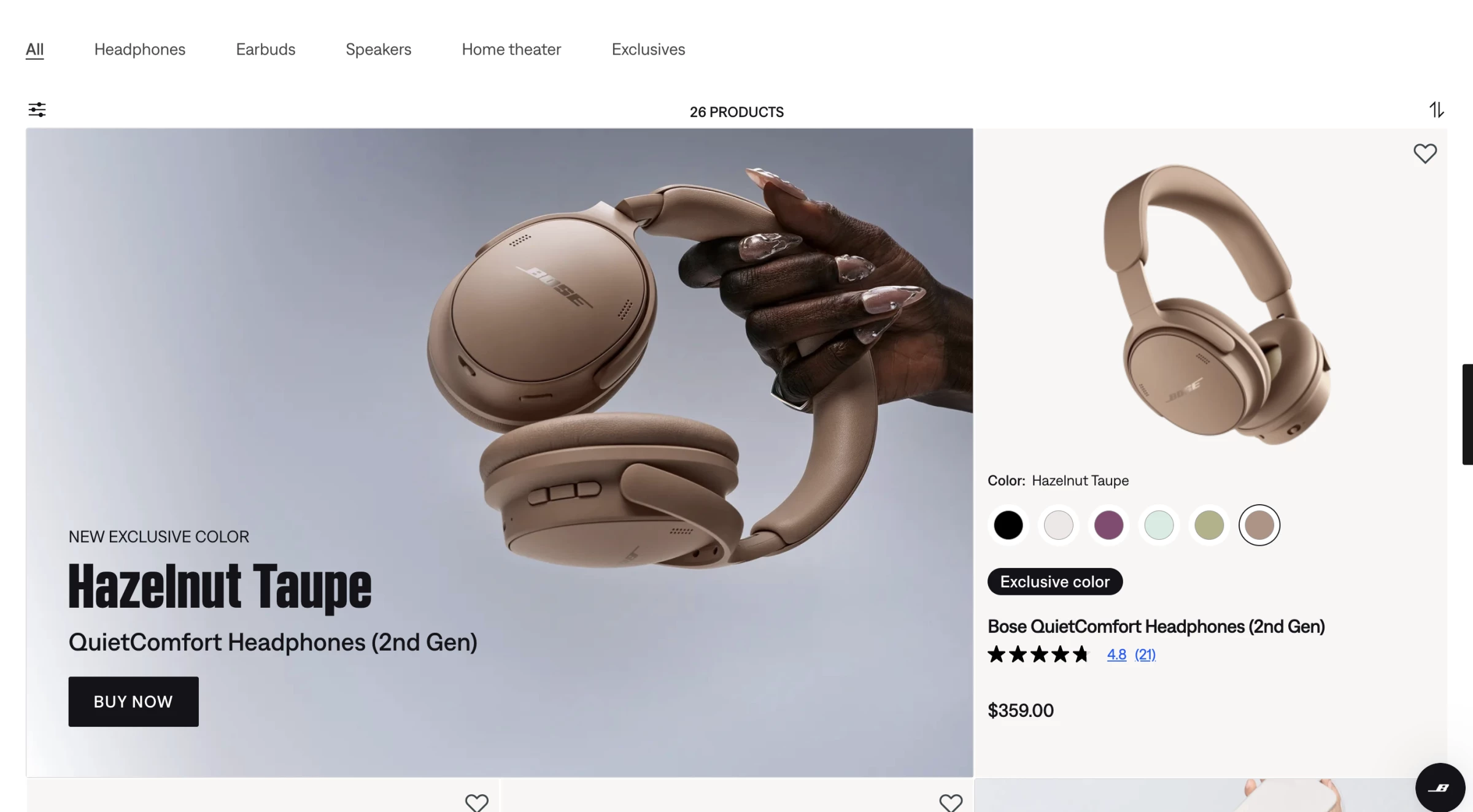
You can't judge headphones by looking at them, which is the hardest problem on this list. Most audio brands answer it with a spec table.
Bose puts the product first and the numbers last. A large photo shows you the object, then the page explains where you'd use it, then the specs turn up at the bottom for anyone who wants them. That's the order people actually decide in.
Backgrounds stay neutral so the colored models look like their real colors. Audio demos play inside the page instead of sitting behind a separate media section, so you hear the product on the page where you're deciding.
Why it works: Audio demos play inside the page, so nobody leaves to find a YouTube review. That's where most headphone shoppers go and a lot of them don't come back.
Putting the photo first and the specs last matches the order people decide in, so the page never asks anyone to read numbers before they want them.
19. Alethia by ++hellohello
Standout Features:
- Photoreal moss rocks on dark forest green
- Monospaced flux readouts as labels
- Numbered method list, 01 to 05
Alethia measures carbon at ecosystem level for companies that need their numbers to survive an audit. Almost every carbon company uses soft green branding, which is exactly what makes a procurement lead suspicious. ++hellohello threw that out.
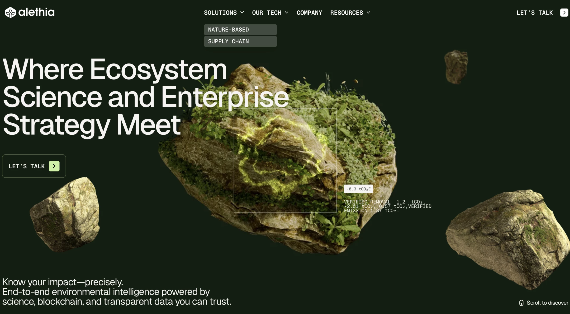
The first screen sits on a near-black forest green background with yellow-to-green gradient bands top and bottom. Photoreal moss-covered rocks float in the space, lit and rendered like photographs.
"Where Ecosystem Science and Enterprise Strategy Meet" sits in white sans above a line promising you can know your impact precisely.
The type does the convincing. Data labels use a monospace font and sit pinned to the rocks they measure: −8.3 tCO₂e, verified removal −1.2 tCO₂, verified emission 1.87 tCO₂. Monospaced numbers look like output from an instrument rather than something a marketer typed.
The method runs as a numbered list, 01 through 05, from observation systems to blockchain traceability to scale, each step saying what it does.
Later sections drop to three or four words over looping video backgrounds that move like wind through grass.
Why it works commercially: Alethia's buyers need carbon claims that survive an audit. Monospaced numbers pinned to the objects they measure look like output from an instrument, which is what a procurement lead needs before putting the site's figure in a filing.
Read the full Alethia climate technology website design analysis.
20. Shaga Odyssey by Phenomenon Studio
Standout Features:
- Price fixed in the navigation
- Live unit counter in the corner
- Macro texture views of the enclosure
$499, direct, with no retailer in between. That's the entire commercial problem the Odyssey site has to solve, for an audience that reads spec sheets and distrusts marketing.
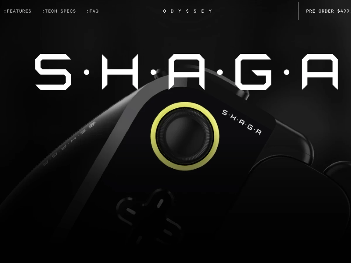
The navigation carries the price. ":FEATURES:TECH SPECS:FAQ" sits left, "O D Y S S E Y" runs letterspaced across the centre, and "PRE ORDER $499" holds the right side behind a thin vertical rule.
Nobody has to hunt for the number, and the colon prefixes give the menu the register of a terminal command.
One lime ring sits around the thumbstick. Nothing else on the page is saturated: the ground is black, the S·H·A·G·A wordmark sets in a wide chamfered display face in white with interpuncts between the letters, and the controller renders in gloss black. The eye lands on the ring, which happens to be the part of the device you touch.
A floating panel in the corner turns raw data into a live interface, so global sales climb and rare units disappear in real time as you watch. Keep scrolling, and the camera sweeps from wide product shots straight into extreme hardware closeups.
The effect stands in for the hands-on inspection an online buyer usually goes without.
Why it works commercially: Nobody hunts for the price, since $499 sits in the navigation on every screen. The counter in the corner shows stock dropping while you read.
For a product with no shop to walk into, those two things do what a sales floor does: quote the price and let you know it might sell out.
Read the full Shaga Odyssey website design breakdown.
11 Tech Web Design Trends and Patterns Shaping 2026
1. Routing as a Priority
The homepage picks one reader and puts every other audience one click away.
PayPal splits consumer and merchant in the top-level navigation, ADDVERB pins a Dev Portal beside a Scroll to Discover, and Emerald24 gives corporate clients, partners, and end users separate product pages.
The number: 67% of B2B buyers prefer a rep-free experience, in Gartner's 2026 survey of 646 buyers. The routing decision your sales team used to make on a call now happens in your navigation.
2. Motion Tied to a Product Claim
Every effect names the promise it reinforces, or it comes out.
Deed Delivery's van tracing a route demonstrates the delivery network, and Existence's paced scroll demonstrates conscious choice. A parallax background demonstrates nothing.
The number: The median home page ships 697 KB of JavaScript and only 48% of mobile origins pass all three Core Web Vitals, per HTTP Archive's 2025 Web Almanac.
Every unjustified effect draws from the same budget.
3. Scrollytelling
Content unfolds as the visitor scrolls, with motion carrying the sequence.
Voltpile breaks the problem and the solution into paced reveals, and Humbleteam's CTRL SHIFT! podcast site uses the technique to represent each episode's subject visually.
The number: Sites raising session depth 10% or more saw a 5.4% conversion lift in Contentsquare's 2025 benchmark. A page that reveals earns those extra screens.
4. Dark Mode as a Default
Dark backgrounds with light type read as built-for-developers, which is why so much of the category defaults to them.
Conreality and Shaga Odyssey both run near-black grounds with a single accent, and Visions Design holds the treatment across a full site.
The number: WebAIM's 2026 Million report found low-contrast text on 83.9% of the top million homepages, up from 79.1%. Dark mode is where contrast quietly fails, so the palette has to survive a checker before it ships
5. Experimental Navigation
Menus give way to non-linear layouts, hover states, and cursor treatments that make browsing part of the product.
Workshop Built does this on the Wildcatter LA site, and Konfiture's work on Friesday uses cursor effects to the same end.
The number: The WebAIM Million put the average homepage at 1,437 elements per home page, a 22.5% increase in one year.
Wayfinding is what keeps that density navigable, which is also why unconventional navigation fails when it replaces orientation.
6. Custom Illustration Over Stock
Bespoke illustration carries explanation a screenshot cannot, and it removes the stock-photo tell that makes early-stage companies look interchangeable.
Deed Delivery builds an entire city, and Maña Industries runs its whole homepage on hand-drawn work.
The number: 66.6 images on the average homepage, up 13.6% in a year. Image weight is only worth paying when the images are the evidence.
7. Image and Video Headers
Large visual headers replace text-heavy introductions and set the tone before a word is read.
Alethia opens on photoreal renders in motion, and Kovdra Design Bureau's work on Sistema for GUK AIs uses one to establish a register a product screenshot could not.
The number: Images account for 1,059 KB of a 2,362 KB median mobile home page in the 2025 Web Almanac, and that page is 202.8% heavier than its 2015 equivalent.
A hero video is a budget decision before it is an aesthetic one.
8. Proof Inside the Reading Flow
Certifications, benchmarks, and customer logos sit on the pages where judgment forms. Surge AI puts seven customer marks under the fold, and Emerald24 puts Swift and Entrust in the first scroll.
The number: 69% of B2B buyers hit inconsistencies between a supplier's website and its sellers. A certification sitting on page fourteen of your site is a certification your buyer never counted.
9. Bento Grids
A bento grid arranges modules of unequal size on one screen, each tile holding an illustration or product shot that links to a feature detail page.
The unequal sizing is the mechanism, since it encodes a hierarchy the visitor absorbs without reading a comparison table.
Apple established the pattern with tiles running roughly 1:1, 2:1, and 2:2 against a twelve-column grid, and the category adopted it wholesale.
The number: The average home page carries 56.1 detectable accessibility errors, up 10.1% in a year in the 2026 WebAIM Million. A bento grid multiplies interactive tiles, and every tile is a place to add to that count or avoid it.
10. Merging Branding and UI
The marketing site and the logged-in product carry one palette, one type system, and one component library, so a trial user never feels handed off.
Konpo built Surge AI's identity, site, product, and design system as a single commission for exactly this reason.
The number: 69% of B2B buyers report inconsistencies between a supplier's website and its sellers, in Gartner's research. Visual discontinuity between site and product is the same failure arriving one step later.
11. Less Is More
Decorative layers and oversized storytelling give way to precise hierarchy and fast load times.
Emerald24 runs a white ground with one accent, and Alethia drops to three-word sections. Minimalist web design in this category is a performance strategy wearing an aesthetic.
The number: The median mobile home page reached 2,362 KB in 2025, 202.8% heavier than its 2015 equivalent. Restraint is the only intervention that reverses that line.
What a Tech Website Design Costs and How Long It Takes
DesignRush's web design pricing data puts SaaS and tech website projects at $10,000 to $100,000+, the widest band of any industry tracked apart from healthcare and financial services.
Custom applications, user dashboards, and security requirements are what push the ceiling.
Project type | Cost | Timeline |
Simple, 1–5 pages, no CMS | $7,000–$10,000 | 2–3 weeks |
Small business, 5–15 pages, CMS | $10,000–$15,000 | 5–7 weeks |
Mid-complexity, 15–40 pages, custom CMS | $15,000–$30,000 | 10–14 weeks |
Complex, custom features and integrations | $30,000–$80,000 | 4–6 months |
Enterprise or custom platform | $60,000–$100,000+ | 4–6+ months |
Source: DesignRush prices for web design.
A simple build runs about 138 hours, mid-complexity about 261, and complex work 500 or more. The blended US agency rate sits at $145 an hour, with junior time at $60–85 and creative direction and strategy at $190–255.
Ali Sayyed, co-founder of Aleph Website, draws the line at the point where custom stops paying. Speaking to DesignRush in 2024, Sayyed said a fully custom build "is a product reserved for tech-savvy business owners."
Below that threshold, his team builds on a light theme and keeps the budget under $5,000.
Overrun cause | Typical increase |
New features added mid-project | 15% to 30% |
Integration complexity | 10% to 25% |
Client-side content delays | 10% to 15% |
Excess revision rounds | 5% to 15% |
Extra pages | 5% to 25% |
Rush premium | 25% to 50% |
Source: DesignRush web design pricing data.
Integration complexity is the line tech companies underestimate. A marketing site that has to read from the product, a billing system, and a documentation repository is three integrations before anyone has designed a page.
Weighing an in-house hire against an agency? Our freelance versus agency cost comparison breaks down where each stops making sense.
Tech Website Design Mistakes These 20 Sites Avoid
Each one comes with a check you can run today and a fix with a time estimate. They run cheapest first, so work down this list.
Mistake: Letting the site fall behind the product
- Check: Open your homepage next to your current pricing page and your latest release notes. Name anything the homepage still claims that the product no longer does.
- Fix: An afternoon, no budget. Alex Schupp, founder of Crowd Digital Marketing, told DesignRush that "an outdated or unattractive website can cause customers to leave", and in tech the decay is factual before it is visual. Watch pricing-page exits for a month afterward.
Mistake: Treating contrast as a style choice
- Check: Run your homepage through a contrast checker, then tab through it without a mouse. Low-contrast text appears on 83.9% of the top million homepages, so assume you have it until a tool says otherwise.
- Fix: A day for contrast and alt text. Dark interfaces fail this most often because the palette was chosen for mood, and DesignRush has covered why WCAG failures keep climbing in more detail.
Mistake: Writing the homepage for the whole buying committee
- Check: Read your hero and name the single reader it addresses. If you cannot, it addresses nobody.
- Fix: A week, mostly argument. Split at the navigation level the way PayPal does, and give the homepage one primary action matched to intent.
Mistake: Shipping animation with nothing behind it
- Check: For each motion effect, name in one sentence what a visitor learns from it. The median home page already carries 697 KB of JavaScript, so the budget is spent before you start.
- Fix: A week. Cut what fails the test, add a reduced-motion path to what survives, and measure load time before and after.
Mistake: Quarantining proof on a trust page
- Check: Pull analytics for your customers, certifications, or security page and compare the traffic to your pricing page. A credentials page nobody opens is not proof, it is storage.
- Fix: A week. Move the three strongest marks onto pricing, product, and your highest-traffic solution page, where Surge AI and Emerald24 both put theirs.
Mistake: Treating documentation as engineering's problem
- Check: Search your own docs for a question a prospect asks during evaluation and time how long the answer takes to find. If it takes you longer than ninety seconds, a prospect gave up before you started counting.
- Fix: Two to four weeks. Brief the docs as a marketing surface, because in technical categories that is where the evaluation happens.
Mistake: Briefing a CMS nobody in marketing can operate
- Check: Ask a marketer how long a new landing page takes without a developer. If the answer is measured in days, the architecture is the problem.
- Fix: Two to four months, inside the $25,000 tier where content modeling is standard. Doing it later bills at $145 an hour on top.
Mistake: Commissioning a redesign before the cheap fixes are exhausted
- Check: Name the condition that makes your reference site work, then name whether you have it. Then say what the seven fixes above did not solve.
- Fix: Four to six-plus months and $30,000 to $80,000. A redesign without a named problem reproduces the old one with better typography.
Tech Website Designs: Final Thoughts
These 20 look nothing alike, and that is the finding. Tesla hides its menu, PayPal splits at the top, Emerald24 stacks five products into one stepper. Each one holds up since each one answers a different question about who is buying.
Which is why copying a look you admire usually goes wrong. The site you are borrowing from solved a constraint you probably do not have, and the layout was the last decision, not the first.
What travels is the order: work out who is reading before anyone draws a screen, then make every effect prove it teaches something before anyone builds it.

Our design experts recognize the most innovative and creative designs from across the globe. Visit Design Awards to see the:
- Best Logo Designs
- Best Website Designs
- Best Video Designs
- Best Print Designs
- Best Packaging Designs
- Best App Designs
Our team also ranks agencies worldwide to help you find a qualified agency partner. Visit our Agency Directory for the top Logo Design Companies, as well as:
- Top Web Design Agencies
- Top Video Production Companies
- Top Print Design Companies
- Top Packaging Design Companies
- Top Mobile App Development Companies