Uber, the global ride-sharing giant, has consistently prioritized seamless and intuitive user experience. Their website, a central hub for both riders and drivers, exemplifies this commitment with a clean design, clear information architecture, and a laser focus on functionality. By prioritizing user needs in its web design, Uber provides a model for brands looking to optimize their online presence for conversions and engagement.
Key Insights for Brands:
- Minimalist design can drive conversions and enhance usability
- Clear calls to action (CTAs) improve user engagement and goal completion
- Ensuring your website design is responsive boosts accessibility and user experience
The Uber Website’s Visually-Driven Functionality Enhances User Experience
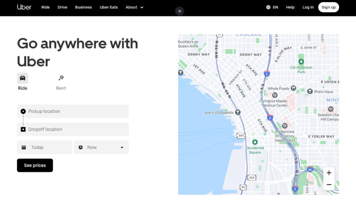
Uber’s hero section is a prime example of an effective blend of visuals and functionality. Unlike traditional hero sections with static images or videos, Uber features a dynamic, interactive map and a booking widget that allows users to explore the service and see pricing in real time. This approach reinforces the brand's focus on convenience and transparency while providing immediate value to the user.
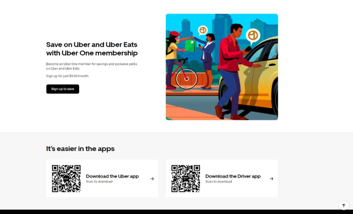
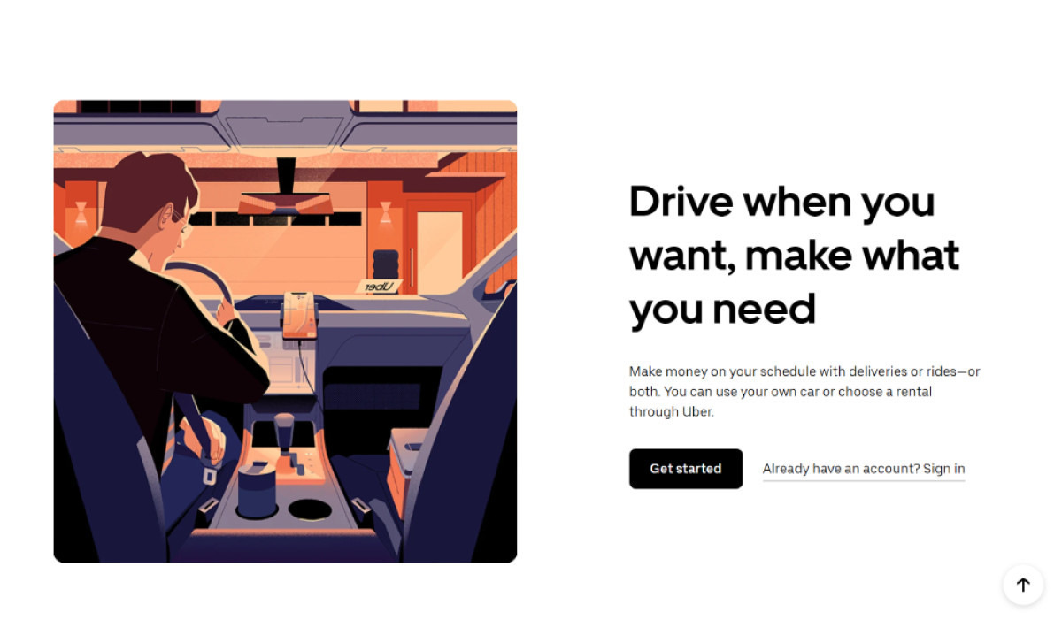
Beyond the hero section, Uber uses digital illustrations and photos strategically throughout the website to visually communicate its diverse offerings and user benefits. Instead of lengthy descriptions, these illustrations clearly depict Uber’s offerings, such as rides and deliveries. This visual shorthand saves users time and reduces cognitive load, creating a cohesive and engaging brand experience.
These user-centric design choices contribute to the website’s UI/UX performance, increasing user satisfaction and engagement.
Uber’s Intuitive Navigation System Offers Seamless Browsing Journey
The website greets visitors with a clear and concise navigation system. Simple page menu options like "Ride" and "Drive" cater to the core user needs. Unlike many websites that bury their help resources, Uber flaunts its "Help" page in the main navigation bar, making assistance easily accessible.
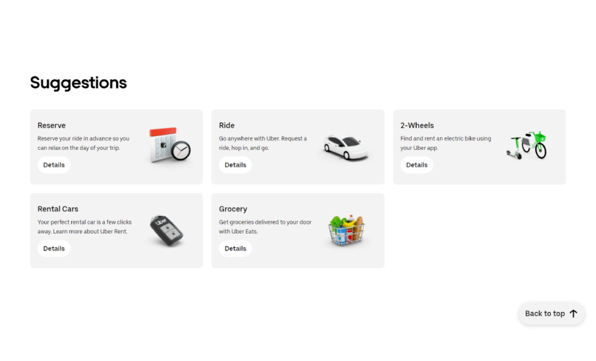
Additionally, the concise labels and the logical placement of elements in the home page’s “Suggestions” section — right after the hero section — make it easy to find your desired information. Whether you're there to reserve a ride, get a rental, or order groceries, the navigation seamlessly directs you to the relevant section.
Uber’s commitment to offering a user-friendly design extends beyond the main menu. In the footer, the "Visit the Help Center" link takes precedence, appearing even before company and product pages. This prioritization of user support underscores Uber's dedication to addressing questions and concerns promptly.
Furthermore, a "Back to Top" button appears in the bottom right corner as you scroll down, allowing for quick and easy navigation back to the top of the page. These subtle yet thoughtful design choices — often best achieved with the help of expert website design and development agencies — create a truly intuitive browsing experience.
The Website Design’s Strategic Use of White Space Creates a Clean, Modern Aesthetic
Uber masterfully employs white space to create a clean and uncluttered aesthetic. Ample white space around the map, form fields, and CTA button prevents visual clutter and allows each element to breathe. This minimalist approach adds sophistication and efficiency, reflecting the brand's core values.
By decluttering the visual space, Uber improves readability and draws focus to essential elements. Even the logo, with its minimalist design and thin sans-serif typeface, contributes to the overall clean aesthetic, reinforcing the brand's commitment to simplicity and clarity.
Learn more about how minimalist web UI design principles can enhance user experience.
Uber’s Mobile-First Website Design Prioritizes User Accessibility
Recognizing that many users access their services on the go, Uber has adopted a mobile-first design approach. The website's responsive design adapts seamlessly to various screen sizes, ensuring a consistent experience across all devices. This is crucial for a service like Uber, which is often accessed via smartphones.
By prioritizing mobile users, Uber maximizes accessibility and caters to the modern user's lifestyle. Furthermore, clear CTAs with QR codes, such as "Download the Uber app" and "Download the Driver app," encourage mobile app adoption for an even more streamlined experience.
The Uber website exemplifies how effective design can be when it prioritizes the user experience. By combining intuitive navigation, strategic use of white space, and a mobile-first approach, Uber has created an aesthetically pleasing yet highly functional website. This winning combination makes Uber a prime example of how the best web designs leverage aesthetic elements effectively for user satisfaction in the digital age.

-preview.jpg)