Webflow Showcases Innovative Website Design
Webflow is a responsive website design tool, content management system and hosting platform. Their website features a bevy of products that can help entrepreneurs, designers and developers create beautiful websites of their own that will support their businesses, and their digital destination showcases this well.
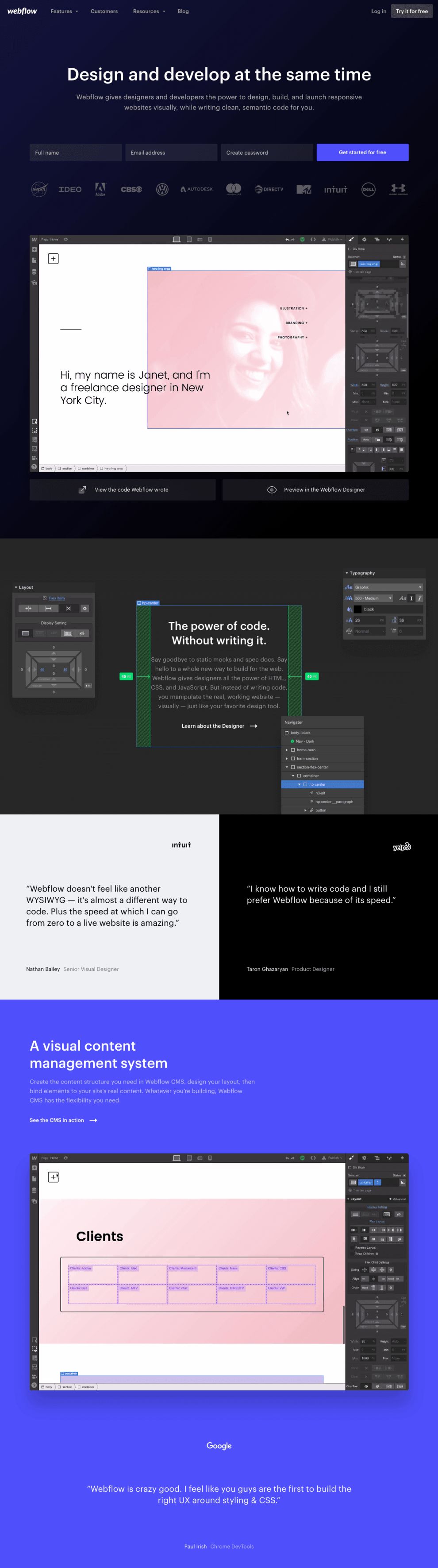
Upon landing on the homepage, users are greeted with a bold dark background, a subtle gradient from midnight blue to stark black. A small white Webflow logo is seen in the upper left-hand corner, next two a minimal navigation menu. Log in and trial calls to action balance the menu in the upper right corner. Meanwhile, larger white sans-serif font is prominently showcased in the middle of the page atop blue primary calls to action. A subtle, slightly transparent line of major logos who have used their programs rounds out the initial landing page.
Webflow Website Design Uses Embedded Videos
Scroll down the homepage to see an embedded video of the program. This video is so smooth and quickly loaded that at first, it just looks like a gentle animation. However, it is instead a video of a screen designing a website, showing how user-friendly the program and features are. In addition, the video is a direct element within the website design, not embedded from a third party such as YouTueb or Vimeo. This makes the smooth incorporation even more impressive.
The long scroll continues as users are met with a section describing the "designer" program -- the video the proceeded it. Two real-life testimonials are then presented, and with further scrolling, users move onto another Webflow program video.

Each section is defined by slightly different colors, from charcoal to jet black to bright cobalt blue. This helps the user keep track of where they are in the journey, which is particularly helpful with such a deep scroll. Plus, the dark background and bold pops of color reinforce the unique brand identity.
After a few short videos and corresponding sections of short program descriptions, users can learn about the animation possibilities in the Interaction 2.0 section. A minimal yet geometric animation fluidly moves across the screen as you scroll down, while bold calls to action implore users to either learn more about the many ways in which Webflow can improve their website design or view success stories from other companies. This gives them plenty of options without being pushy or overwhelming. The copy is straightforward and simple, which balances the in-your-face website design well.
Webflow Uses Its Own Tools To Build Website
There's no better way to promote your product or services that showing them in action -- and that's exactly what Webflow does. Much like design agencies showcase their portfolios and consulting firms display their success stories, Webflow doesn't just tell users what their programs can do -- they show them in the actual website design, as Webflow was created completely through Webflow products.

Website Design Utilizes Motion Graphics
Perhaps the most impressive design element Webflow utilizes throughout their website design is the use of motion graphics. Each page features multiple points of smooth and subtle animation.
However, this movement isn't thrown into the site with no purpose or cause. Each shape that fades in and out of view or geometric box that rotates with the scroll draws the users' attention to important information that Webflow wants to highlight. It also simultaneously showcases the precise and high-level designs that their programs can execute, making their implementation beneficial for multiple reasons.
Webflow Incorporates Trendy Design Elements To Create Engaging Website
In addition to motion graphics, Webflow uses other trendy design elements to captivate users. While the majority of the website is darker, they still balance information and graphics with plenty of negative space. Periodically, bright blocks of color break up the monotony of the edgy background.
The sub-navigation of every page is color coded. Each page has its own minimal icon next to the title in the top menu. Whatever page users are currently on remains highlighted, helping them to travel throughout the website with ease. That color coding also informs the design of every page, completely changing the color scheme all the way down. However, each design is still rooted in a dark background and futuristic minimal aesthetic, which creates brand cohesion despite the varying hues throughout the site.
Webflow also incorporates tasteful gradients to add depth to the website design. Instead of straying too far from the color palette on each page, the gradients are a slow shift from the accent color to black. Meanwhile, graphics are layered atop one another, creating unique imagery that displays program specs.


