There’s nothing like smell of motor oil and burnt rubber tires to remind everyone that a trip to the mechanic is no fun. How everyone longs for the days where at the click of a button they can make an appointment to have their car serviced, avoiding having to wait in long lines or spend the entire day in a smelly garage.
The days of longing for a simple solution is over thanks to Your Mechanic's user friendly website. The deep scroll site includes a nifty UI that draws users to take advantage of the site. The website is smart, sophisticated, and minimal which brings the user interface to a whole new level.
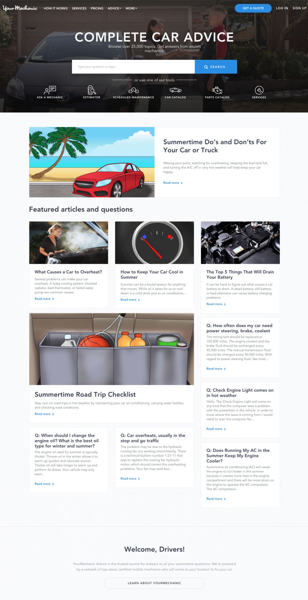
The homepage is a basic transparent bar with a faint image in the back. At the top, the fantastic white typography blends with the dark gray menu bar backdrop. The top menu bar has subtle call to actions, then boom, a blue “get a quote” button. In the middle is a horizontal search box where user’s can get interactive with the site and type in a question. They can also opt to click on one of the buttons at the bottom and be hyperlinked to a different page.

Your Mechanic’s blog is simple and to the point, which viewers like. Each blog is filled with authentic content that is specific, informational, and playful. It juxtaposes everyday life and the need for vehicle maintenance. It’s not flashy or overbearing, but relatable and purposeful.
The white menu bar at the top of the page is noticeable, but not distracting which allows users to focus on the page’s main feature. The illustration has a high pixel count with basic imagery that works in conjunction with the title. For example, the Summertime Do’s and Don'ts For Your Car or Truck blog is a seasonal piece and the illustration reflects summertime without adding overbearing imagery.
What makes this website a heavy hitter is its use of minimalism. From the typography to the white backdrop, each element epitomizes the phrase “less is more.” The overall theme of Your Mechanic’s website is the Goldilocks rule, not too much, not too little, everything is just right.
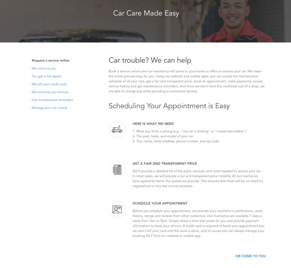
Between Your Mechanic’s basic sitemap and simple user interface, this auto industry powerhouse has driven right into the core of innovative web design. They proved that they don’t need overbearing content or flash imagery to get their point across. Like the banner of their about page says, its “Car Care Made Easy.”
Your Mechanic is a best website design in the Automotive industry.


-preview.jpg)

-preview.jpg)