In 2026, web design still revolves around a few key screen sizes that dominate user behavior. Designers stick to these dimensions to ensure smooth experiences across devices. However, the real challenge is figuring out which sizes matter most without wasting time on rarely used formats.
Knowing the standards gives every project a solid starting point. When you know what to focus on, your team can design with confidence. Let’s break it down.
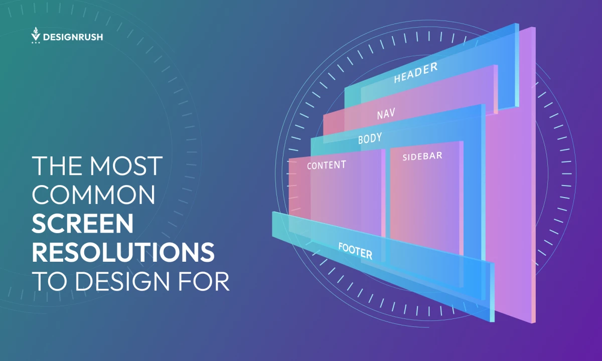
Website Sizes Standard
The ideal website size depends on the device, but a good range is 1280×720 to 1440×900 for desktops, 360×800 for mobile, and 768×1024 for tablets.
Another effective approach is to design with the most common screen resolutions in mind, which we’ll explore below.
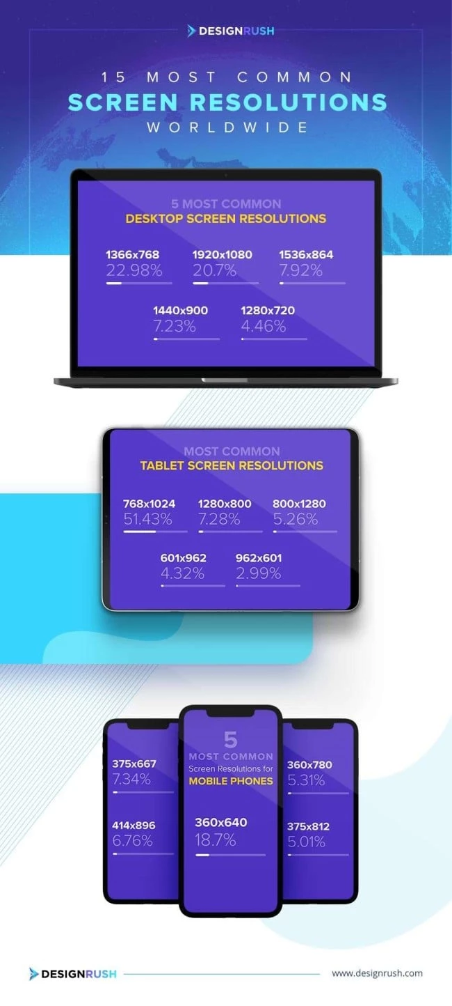
Most Common Desktop Screen Resolutions Worldwide
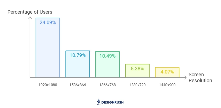
According to StatCounter's March 2025 data, the most used desktop screen resolutions worldwide are:
- 1920x1080 (24.09%)
- 1536x864 (10.79%)
- 1366x768 (10.49%)
- 1280x720 (5.38%)
- 1440x900 (4.07%)
Most Common Mobile Screen Resolutions Worldwide
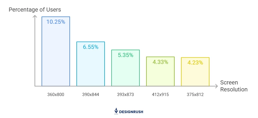
Here’s a snapshot of the most common mobile screen sizes:
- 360x800 (10.25%)
- 390x844 (6.55%)
- 393x873 (5.35%)
- 412x915 (4.33%)
- 375x812 (4.23%)
Most Common Tablet Screen Resolutions Worldwide
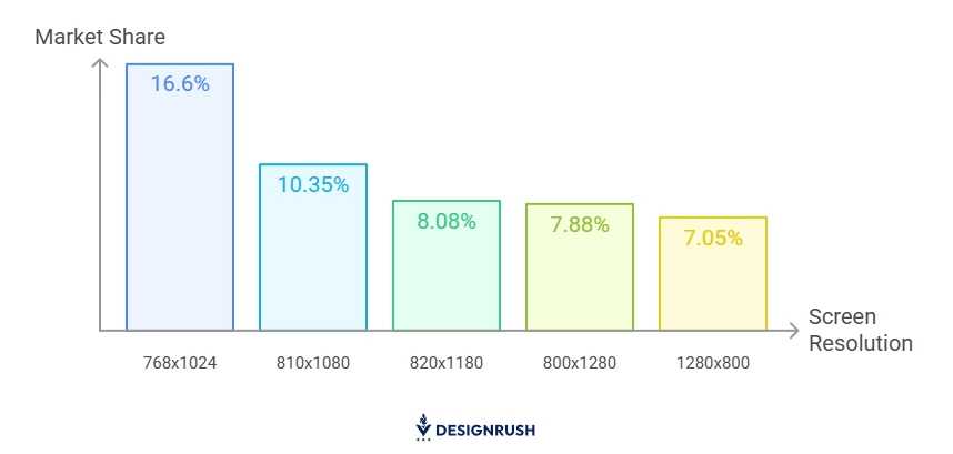
StatCounter reports that the most common tablet screen resolutions worldwide are:
- 768x1024 (16.6%)
- 810x1080 (10.35%)
- 820x1180 (8.08%)
- 800x1280 (7.88%)
- 1280x800 (7.05%)
Share This Infographic on Your Website
COPY AND PASTE THE CODE BELOW
| <img src="https://media.designrush.com/tinymce_images/89438/conversions/most-common-screen-resolutions-worldwide-content-webp.webp" alt="Most common screen resolutions worldwide"> |
Top 15 Most Common Screen Resolutions in the US
If you’re building a website for a US-based audience, here are the most common screen sizes that you should opt for in 2026:
Desktop Screen Resolutions in the US
The most common desktop screen resolutions in the United States are:
- 1920x1080 (21.52%)
- 1280x960 (9.99%)
- 1366x768 (7.28%)
- 1536x864 (7.02%)
- 1280x720 (4.78%)
Mobile Screen Resolutions in the US
During the same period of time, the most common screen resolutions for mobile phones in the US were:
- 390x844 (14.47%)
- 393x852 (9.67%)
- 430x932 (7.76%)
- 375x812 (5.82%)
- 428x926 (4.93%)
Tablet Screen Resolutions in the US
The most common tablet screen resolution is as follows:
- 768×1024 (14.47%)
- 810×1080 (11.77%)
- 800×1280 (10.29%)
- 1280×800 (9.08%)
- 820×1180 (8.55%)
Why Website Dimensions Matter in Web Design and Development
According to StatCounter, the traffic share was generated through:
- Mobile (62.22%)
- Desktop (36.06%)
- Tablet (1.72%)
With mobile leading by a wide margin, screen dimensions have become one of the most important factors in web design. A layout that works perfectly on one device might break on another, making responsive design an absolute necessity — not just a nice-to-have.
Understanding common screen sizes helps developers make smart decisions early on. Most teams start wireframing with a standard desktop and mobile resolution, building flexible layouts that scale gracefully across devices.
Brands that want to stand out should optimize for every user scenario. That means planning for:
- Desktop, tablet, and mobile screen dimensions
- Portrait and landscape orientations
- Browser-specific layout behaviors
When these factors are considered from the start, the result is a site that looks sharp and works seamlessly — no matter how or where it’s viewed.
How To Decide Which Website Dimensions To Use
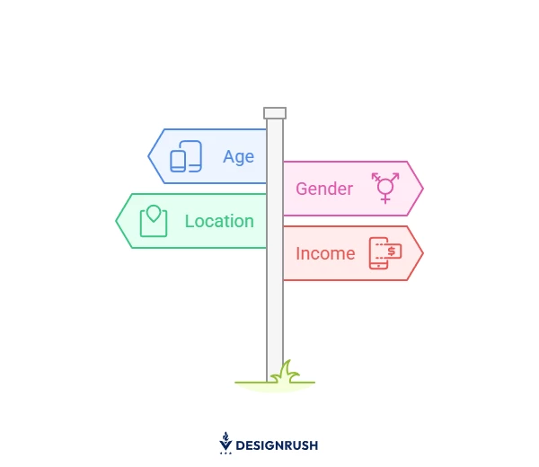
The first step to choosing the right web dimensions is to find out what mobile screen sizes your target market actually uses. Start by looking at your audience’s demographics, which can give you insights into the devices they use to access your website.
Here’s what to look at:
- Age: Research the most popular device brand/model among the age group you are targeting. YouGov is a great, up-to-date resource that tracks these trends and filters.
- Gender: Filter the most popular devices among genders, allowing you to crossmatch the devices by age group and target gender.
- Location: Going into a more granular, in-depth insight, adding local trends helps you sharpen your focus.
- Income: If you’re targeting high-income audiences, your website will have to be on-point and perform smoothly on the latest, most cutting-edge devices.
Responsive vs. Mobile-First Web Design: Which One To Opt For?
Not sure whether to go with a responsive or mobile-first design? You’re not alone. Both are popular approaches, but they work in different ways and serve different needs.
Responsive web design starts with a full desktop layout and scales down to fit smaller screens. It’s been around for a while and is still widely used. If most of a brand’s traffic comes from laptops or desktops, this might be the easier path.
Here’s why some teams stick with responsive design:
- It keeps the same look and feel across all devices
- It can be quicker if the desktop version is already in place
- It fits well into more traditional design processes
On the other hand, mobile-first design begins from the smallest screen and works its way up. It’s all about putting mobile users first, which makes sense, given how much traffic now comes from phones. This method focuses on clean layouts, fast load times, and easy navigation.
Mobile-first is a solid choice for companies that:
- See most of their users on mobile
- Want a fast, focused experience on smaller screens
- Care about performance and simplicity from the ground up
So, which one’s better? It depends. If mobile traffic leads the way, mobile-first often makes more sense. However, if desktop users still dominate, responsive might be the smoother fit. What matters most is giving every user a good experience — no matter where they are.
That’s exactly the balance Laura Magnuson, Art Director at Bop Design, aims for:
“Even as mobile traffic grows, desktop still plays a big role in how people engage. We design responsively, but we don’t assume everyone’s journey starts on a phone. The goal is to make every version clear, fast, and easy to navigate.”
Website Dimensions Takeaways
Website dimensions and webpage sizes matter because a single poor on-site experience can repel your users once and for all.
Considering the fact that users access the web from mobile devices, including smartphones and tablet,s as well, there are two types of web design you can choose from to optimize your website for different devices:
- Mobile responsive
- Mobile-first
No matter which dimensions you choose, make sure you design for your audience and consider their age, gender, location, and income. This will help you improve user experience, increase retention, and boost search engine rankings.
Our team ranks agencies worldwide to help you find a qualified partner. Visit our Agency Directory for the Top Web Development Companies, as well as:
- AI Web Design Agencies
- Top Front End Web Development Companies
- UI/UX Design Agencies
- Web Development Companies for Small Businesses
- Top Web Development Companies in Chicago
Our design experts also recognize the most innovative design projects across the globe. Visit our Awards section to see the best in web design.
Website Dimensions FAQs
1. What are the best website dimensions to use?
There’s no one-size-fits-all answer, but focusing on the most common screen resolutions for desktop (1920x1080), mobile (360x800), and tablet (768x1024) is a great starting point.
Pair this with responsive design principles to ensure your site adapts seamlessly across devices. Ultimately, the best dimensions are those that deliver a smooth, user-friendly experience for your specific audience.
2. How to check whether your website is mobile-friendly?
There are tools like the Mobile Friendly Test where you can discover whether your web pages are easy to use on mobile devices.


-preview-webp.webp)