I ran five code visualization tools through test projects to see which ones held up under pressure. These are the ones I’d recommend to any CTO trying to keep engineering fast, clear, and aligned.
Key Findings
- CodeSee and Swimm are standouts for onboarding and knowledge sharing, which is why they’re great picks for fast-moving teams and contractor-heavy projects.
- CodeScene and Embold lead in technical debt tracking and code quality enforcement, especially for teams dealing with legacy systems or tight release cycles.
- Understand offers the most robust reporting for safety-critical and compliance-heavy environments, though its interface may feel dense for more casual use.
Top Code Visualization Tools Reviewed
Code visualization tools are becoming the go-to for cutting through legacy complexity, scaling onboarding, and making smarter refactor calls.
Here are my top picks; each brings something different, depending on your team’s needs
| Tool | Best For | Interactive Maps | Static Code Analysis | Knowledge Sharing Support | Pricing |
| Swimm | Legacy code documentation | ❌ | ❌ | ✅ | Inquire |
| CodeScene | Tech debt insights | ✅ | ✅ | ✅ | Starts at €20 per month |
| Understand | Detailed analysis of codebases | ✅ | ✅ | ✅ | Starts at $100 per month |
| CodeSee | Codebase onboarding and mapping | ✅ | ❌ | ✅ | Starts at $10 per month |
| Embold | CI-based code quality checks | ✅ | ✅ | ❌ | Starts at €8 per month |
1. Swimm – Best for Legacy Code Documentation
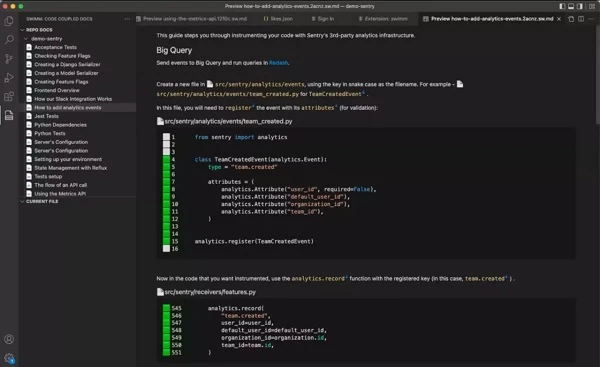
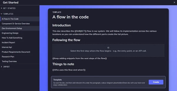
Swimm stood out to me the moment I saw how it handles older, undocumented systems. It pulls business logic straight from the code — COBOL, Assembly, you name it — and lays it out in a way that actually makes sense for engineers and non-engineers alike.
| Pros | Cons | Pricing |
|
|
|
The main selling point for me was how Swimm keeps documentation fresh without turning it into a chore. It hooks into your existing tools and syncs automatically, so your docs stay aligned, without anyone needing to babysit them.
What Users Say
One thing that came up quickly was how limited the template options are. Swimm gives you a few to start with, but if you’re working across different teams or use cases, you might hit the ceiling pretty fast.
Some users also pointed out that the pricing model can be tough to justify for smaller teams or non-commercial projects. Since it’s closed source and built mainly for enterprise, it shuts out the kind of organic, everyday use that could really help it spread.
Who’s It For?
If you’re dealing with legacy code that’s missing documentation or was never documented in the first place, Swimm can save a ton of time. It works well for teams trying to reverse engineer decades-old systems without digging through scattered notes or tracking down long-gone subject matter experts.
It’s just as useful for onboarding. Instead of having new hires guess their way through the codebase, Swimm gives them visual context and structure right away so they can get up to speed without slowing others down.
From what I’ve seen, it fits best in companies with aging systems and steady team growth.
Book a product demo to try out Swimm – no payment required.
Other Notable Features
- Docs enforced through CI/CD
- In-IDE just-in-time documentation
- AI-powered contextual chat
- Deep static code analysis
- Auto-updating system flow diagrams
- Team-wide documentation governance
- Supports 40+ programming languages
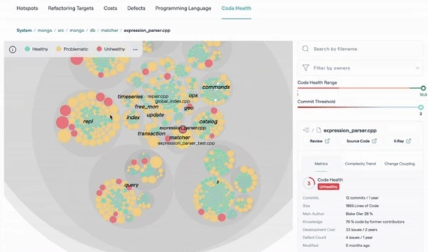
2. CodeScene – Best for Tech Debt Insights
I’ve used CodeScene when I needed a clearer way to deal with tech debt that wasn’t just gut instinct or guesswork. It pulls in behavior data, team dynamics, and actual business risk to give you an actionable view of what’s dragging your codebase down.
| Pros | Cons | Pricing |
|
|
|
Access to the CodeHealth metric gave me the leverage I needed in roadmap discussions. It draws a straight line from messy code to missed goals, so I could start making decisions backed by impact.
That said, once you start relying on CodeScene, you’ll probably notice a gap in one key area.
What Users Say
Some users mention feeling like they were drinking from a firehose the first time they opened CodeScene. There’s a lot coming at you — charts, heatmaps, and metric dashboards stacked on top of each other.
If you don’t already know what you’re looking for, it’s easy to get stuck in analysis mode and lose time instead of saving it. The tool works best when someone takes the lead on framing what matters most upfront.
Some users appreciate the transparency of a public benchmark, but there’s always the worry that it can be tuned too tightly to look good on paper.
Who’s It For?
When I need to cut through the noise and figure out what’s really slowing a team down, I reach for CodeScene. It helps clarify where time and energy are being wasted, especially across large or fast-moving engineering organizations.
You get a way to prioritize debt and cleanup efforts without relying on hunches or endless debates. For teams where delivery speed and code stability actually affect business goals, this tool pulls its weight.
I believe execs can use it to align tech decisions with outcomes, not just output.
Get started with CodeScene's 14-day trial period.
Other Notable Features
- Real-time IDE feedback provided
- AI-powered refactoring suggestions offered
- Analyzes team dynamics visually
- Predicts delivery risks early
- Supports API and plugins
3. Understand – Best for Detailed Analysis of Codebases
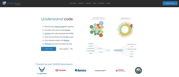
Understand isn’t as flashy as other code visualization tools, but it gets straight to the point, which is exactly what’s needed when dealing with high-stakes codebases. I’ve used it to make sense of dense legacy systems and bring out important aspects for audits and compliance reviews.
| Pros | Cons | Pricing |
|
|
|
I instantly saw the value in this tool once I ran some of our older systems through it. Even with tangled, legacy code, it gave me a clean breakdown — functions, dependencies, structure — without slowing down or missing the bigger picture.
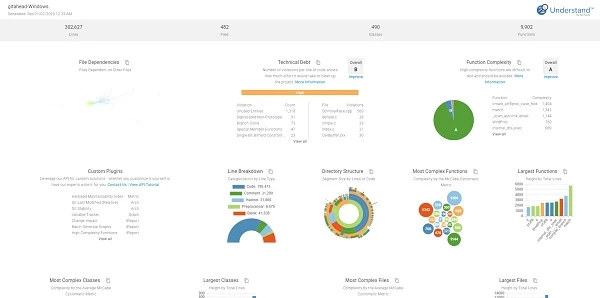
That said, the interface and visuals feel like a product built for engineers more than execs, which can slow you down when sharing reports with stakeholders who aren’t in the code day-to-day.
What Users Say
I’ve heard from a few teams that the interface can feel crowded, especially if you’re just jumping in for a quick look at the code. There’s a lot packed into the UI, and it’s easy to get lost if you’re not using it regularly.
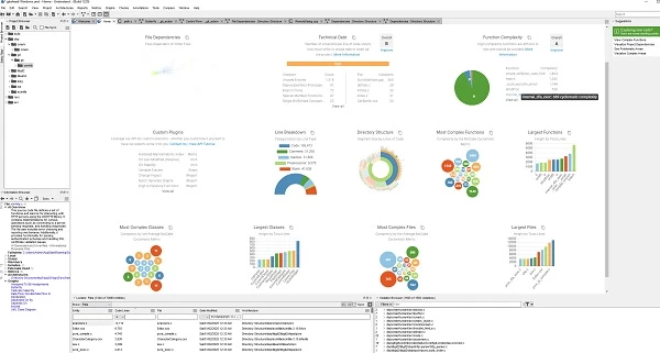
For those new to this code visualization tool or just trying to visualize one specific part of a system, the number of toggles, graphs, and filters can slow things down.
While many appreciate the depth and language support variety once they get used to it, there’s still a recurring call for a simpler view or starter mode to make onboarding less of a hurdle.
Who’s It For?
Understand is a strong fit when you’re dealing with code that has regulatory strings attached. I’ve used it to build out compliance reports that weren’t just technically accurate but actually passed audits without rounds of back-and-forth.
It also works well if you’re stepping into legacy systems where documentation is either outdated or missing. The ability to map out dependencies, call trees, and control flow ahead of time has saved me from breaking things I didn’t even know were connected.
Understand is especially helpful when you’re onboarding people into large systems where a few diagrams can be more useful than a hundred lines of comments.
Start your free trial and web demo with Understand.
Other Notable Features
- Offers customizable graph visuals
- Includes advanced bug detection
- Features a rich plugin framework
- Provides quick entity tracking
- Enables advanced code comparison
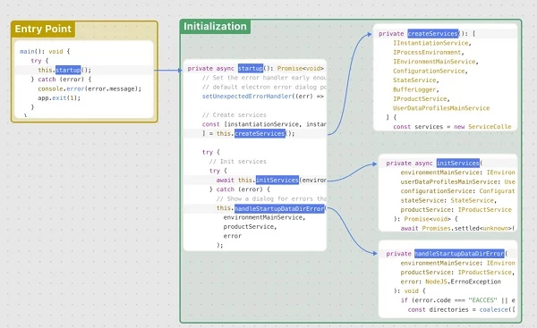
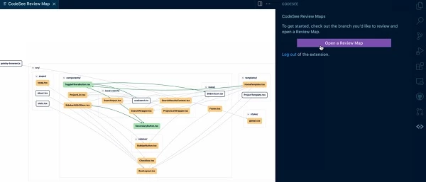
4. CodeSee – Best for Codebase Onboarding & Mapping
CodeSee has given me a living, breathing map of my codebase the second I connect to it. It’s the only tool I’ve used where you can go from “What is this?” to “I get it” in minutes without having to ask around or dig through outdated docs.
| Pros | Cons | Pricing |
|
|
|
From my experience, it’s a perfect tool when onboarding new engineers or handing off services to other teams. The interactive code tours and ownership maps don’t just explain how the system works — they show who’s touched what, why it was built that way, and what to avoid breaking.
That said, CodeSee’s strength in mapping everything so thoroughly can have a downside if you’re not careful with how you manage visibility and access.
What Users Say
Some users run into friction when they leave CodeSee’s default settings untouched. The visualizations can get noisy fast, and if you don’t dial back the notifications, it feels like getting pinged for every line of code that moves.
A few users mentioned that it takes a bit of time to figure out how to tailor the experience to the size and style of your team.
On the other hand, some users really love the live mapping – especially those independent developers who parachute into codebases with absolutely no diagrams or comments to help them out. It’d be a lifesaver for them to have something like this.
Who’s It For?
CodeSee makes a lot of sense if you’re bringing in new engineers and don’t want them guessing their way through tribal knowledge and outdated documentation. The interactive tours, code ownership overlays, and map-driven walkthroughs speed up onboarding in a way I haven’t seen from other tools.
If you’re tackling a large refactor or migrating services, the live maps help in visualizing code and spot unintended ripple effects before they turn into real problems.
CodeSee is a great tool to have during modernization efforts where one small change could impact five services you forgot were still talking to each other.
It’s a solid pick if your team is scaling or you’re juggling multiple contributors across time zones and need a way to keep everyone aligned without extra meetings.
Try CodeSee for free – no payment required.
Other Notable Features
- Auto-generated and auto-updating code maps
- Service maps and flow visualization
- Custom knowledge views
- Visual code reviews
- AI code insights
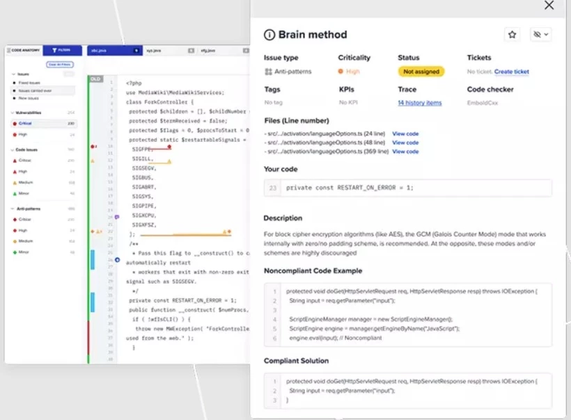
5. Embold – Best for CI-Based Code Quality Checks
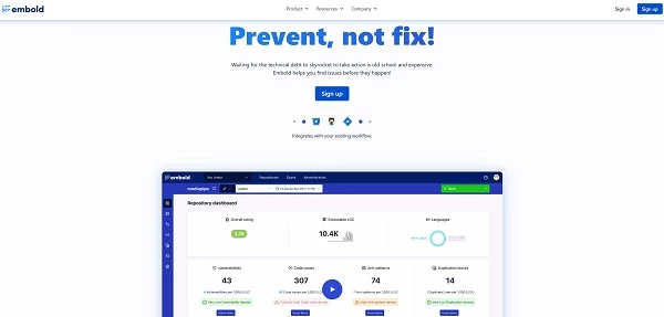
Embold takes a very enterprise-first approach to static code analysis, with a focus on catching structural flaws, vulnerabilities, and maintainability issues before they become delivery blockers. I've tested it on larger codebases where things tend to spiral fast, and it gave me a tight feedback loop without waiting for a full audit or security review.
| Pros | Cons | Pricing |
|
|
|
One thing that immediately stood out to me was the anti-pattern detection. Out of all the code visualization tools I’ve tried, this is the only one that’s been able to consistently flag structural design problems early — across 30 different types.
But just like anything good, there’s always a tradeoff to consider. Let’s get into that.
What Users Say
Some users feel that the project overview dashboard falls short when it comes to surfacing the bigger picture. It gives you a snapshot but not quite enough context to confidently track high-level progress or make fast calls during sprint planning or reviews.
This can be a hurdle for CTOs who rely on quick, high-signal views to stay in sync with multiple teams or initiatives.
Still, Embold continues to come up in conversations around code visualization tools worth considering for static analysis and ongoing code quality checks.
Who’s It For?
For enterprise DevOps teams looking to keep code quality tight across fast-moving projects, Embold fits right into the flow. It plugs into your CI/CD setup and keeps watch in the background, catching structural flaws and risky patterns before they start creeping into production.
When you’re managing large teams or rotating contributors, Embold’s pull request scanning and automated quality gates help keep your standards consistent.
It’s a solid pick for any engineering leader who wants proactive insight into code health without constantly digging through dashboards or diff files.
Get a free product tour with Embold today.
Other Notable Features
- Anti-pattern detection (30 types)
- Smart heatmap and component explorer
- Pull request quality gates
- Custom KPIs and dashboards
- Jira integration with ticket-level analytics
![]()
Our team ranks agencies worldwide to help you find a qualified partner. Visit our Agency Directory for the Top Software Development Companies, as well as:
- Software Consulting Agencies
- Top Software Testing Companies
- AI Development Companies
- Top Mobile App Development Companies
- Top Software Companies in Nashville
Our design experts also recognize the most innovative design projects across the globe. Visit our Awards section for the best & latest in app designs.
Code Visualization Tools FAQs
1. What is code visualization used for?
Code visualization is for helping developers understand complex software by representing its structure, dependencies, and execution flow graphically. This makes it easier to identify issues, onboard new team members, and improve code quality.
2. What are the benefits of code visualization?
The benefits of code visualization include faster comprehension of codebases, improved collaboration through shared visual understanding, quicker identification of bugs and performance bottlenecks, and better architectural oversight for refactoring and maintenance.
3. Which code visualization tool is best?
The “best” tool for visualizing code depends on what you need, but popular options include CodeScene for behavioral analysis, Understand for deep static analysis, and CodeSee for automated code maps.