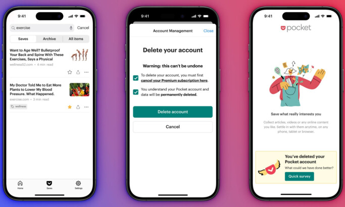
Standout Features:
- Bold red accenting on a white UI
- Visual simplicity for ease of navigation
- Cross-platform, personalized streaming
Despite a $1 billion net loss in 2024, iHeartMedia (parent company) grew revenue to $3.9 billion, up 3% year-over-year. This resilience aligns with iHeartRadio’s investment in user-first design: seamless, personalized, and accessible across devices. In prioritizing accessibility and global connectivity, iHeartRadio positions design as a strategic lever for long-term growth.
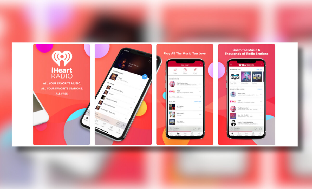
The iHeartRadio app is designed around a clean white canvas, punctuated by the brand’s signature red across navigation bars, buttons, and playback indicators. This deliberate color minimalism enhances content legibility while preserving visual identity.
Visual simplicity defines the user interface. The app minimizes clutter by favoring text-based navigation with compact thumbnails. This UI makes content browsing easier for radio-centric users and improves screen accessibility. A persistent bottom navigation bar offers quick access to Library, Search, and Live Radio, emphasizing ease for users across generations.
In 2025, iHeartRadio introduced AI-powered playlist personalization, enhanced smart speaker sync, and voice search for podcasts, responding to growing demand for hands-free, intuitive listening. Music remains the top use for voice navigation, making these upgrades timely and user-centric. iHeartRadio’s design evolves with real-world habits, not just trends.
The iHeartRadio app proves that thoughtful design, rooted in simplicity, personalization, and cross-platform ease, can deliver real user value without overwhelming the experience. In a crowded field of streaming apps, it stands out not by reinventing the wheel, but by making everyday listening more intuitive, accessible, and connected.
-preview.jpg)


-preview.jpg)