Standout Features:
- Dark and light mode
- Internal zooming options
- Reducing content per screen
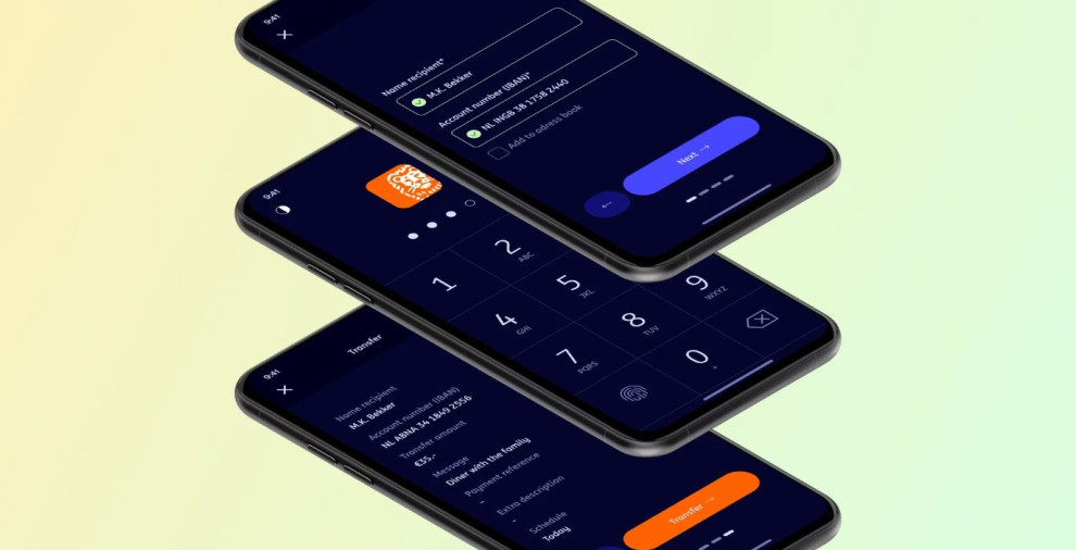
ING is an app designed to make banking more accessible. It focuses on solving all the common issues with online banking for people with impaired vision.
While most apps come in a default light mode, Bryan Yip set up a dark theme based around a deep blue background for versatility. This dark mode uses a bright blue and orange shade that secures maximum visibility for all vital elements.
The content per screen has been split into parts to avoid visual and informational overload and simplify the completion process.
Each screen also has an internal zooming option that further boosts the user experience, so they won’t have to rely on external tools for reading.
Get a chance to become the next Design Award winner.
SUBMIT YOUR DESIGN

-preview.jpg)
-preview.jpg)