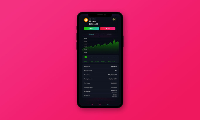
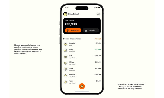
The FinDXB App Design Delivers an Enjoyable Visual Experience Through Its Dark Theme
FinDXB is a banking app crafted to establish a smooth, user-friendly, smart banking atmosphere. This app design by Tequila enables customers to effortlessly utilize services and oversee their finances with minimal reliance on human involvement, making it one of the best app designs.
The prime element that helps the design look approachable and pleasant is its sleek, dark theme. Composed of various shades of gray, the background color and section labels deliver a beautiful monochromatic base.
To ensure readability despite the dark background, the designers incorporated legible font styles that are easy on the eyes. They also used lighter colors for contrast, such as white and gray.
Discover more cool app designs with dark UIs.

The FinDXB App Design Breaks Monotony Through a Blend of Colors That Help Differentiate Functionalities
The visuals bring the app design to life with a prominent display of vivid colors, matching the monochromatic background and effectively merging style with function.
The outlines for profile pictures and CTA buttons are all dressed in a cool color gradient that reflects the shades in the logo, complementing the app's branding. It is one of the agency's design strategies to create a consistent look for the brand — this only shows why Tequila sits as one of the best mobile app development companies today.
Additionally, the color coding contributes to the intuitive feel of the app. For example, Credit Cards have blue icons, Payments Made and Autopay options are green, and Payments Due are red.
Get inspired by these apps that have exceptional user experience.

Tequila's FinDXB App Design Enhances Functionality Through the Organized User Dashboard
The dashboard provides an overview of all the functions the app offers, starting with the current overall financial balance as the top element, followed by the autopay options that include some information on payments made and those to be settled.
These snippets also contain data on the date and the cost of payments, enabling users to track their spending easily.
The next item on the dashboard features all the credit cards linked to the account with ease of access to their data and/or assets, followed by a horizontal conveyor belt of investment recommendations the app makes tailored to each user.
Check out more of the easy-to-use app designs!

FinDXB's App Design Employs Familiar Icons To Simplify the Navigation Process
FinDXB's app design is neat and straightforward. Thanks to its structured Information Architecture, the design sets the bar for ease of use.
The agency also leverages the users' familiarity with several brands, such as Visa and Bitcoin, to immediately lead them to these options on the app.
Overall, Tequila's work on the FinDXB app is recognized as the Best Design Award winner for its user-efficient design. Its components, from the typography and colors to the layout and icons, all work together to deliver a visually appealing and banking experience.


-preview.jpg)


-preview.jpg)


