Standout Features:
- Professional color palette
- User-friendly
- Emphasized security checks
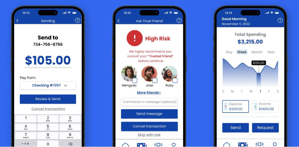
Zonglin Yang’s app design for Safe Lane visually highlights the brand name. It pays great attention to safe transactions while keeping the layout straightforward.
The design features a professional color palette that combines efficiency and appeal. In color theory, blue gives off a reliable and trustworthy impression, which is why Facebook, Dell, Ford, and other big brands use it.
Moreover, the app design has an extensive positive space without intrusive visuals, making it easy to use. The focus remains on the possible actions and forms.
While intuitive, the design ensures that everything is clear by double-checking tutorial pathways. Another standout feature is its emphasis on security checks. If the algorithm assumes suspicious activity, the app warns users before confirming payments with alarming red visuals.


