If you haven't tried Venmo, you're seriously missing out.
Paying people back used to be a pain. Cash wasn't always on hand, bank transfers only worked between the right accounts, and half the time you'd forget to send the money at all.
Venmo changed that. Tens of millions of Americans use it to send and receive money from friends and family, usually in seconds, without touching a bank branch or paying a fee.
The staying power isn't accidental. Much of it traces back to how the Venmo app interface was designed from the ground up, borrowing from social media app design without losing sight of what a payments tool actually needs to do.
What Venmo Actually Is
What launched as a way to split dinner tabs now touches debit cards, credit, crypto trading, and business profiles. Owned by PayPal, it has grown to over 100 million active accounts as of 2025, with the company targeting $2 billion in revenue by 2027.
The reason it stuck isn't the feature list. It's that Venmo made paying people back feel like a social interaction rather than a chore. The Venmo app interface is where that tension plays out in practice.
How Venmo Turned Payments Into a Social Experience
Splitting a bill used to mean a vague promise to pay someone back, usually forgotten by morning. Venmo solved that. But it did something more interesting too. It turned payments into content.
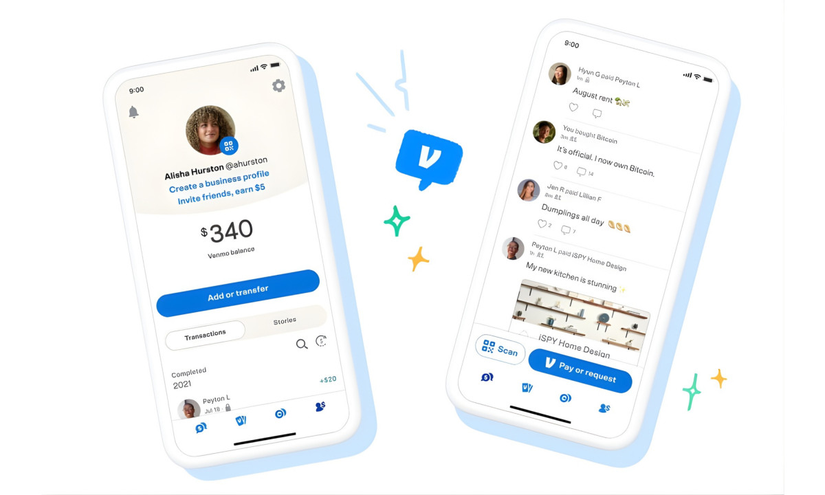
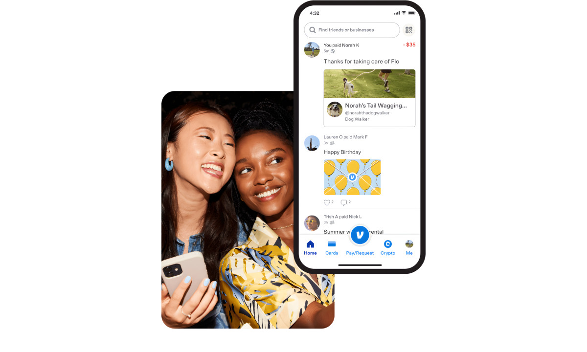
Payments show up in a feed with emojis, captions, and inside jokes. It's goofy on purpose. It's also why "just Venmo me" became everyday vocabulary.
By 2023, mobile payment transaction value globally had already crossed $1.97 trillion, surging past $4 trillion by 2025. Venmo's early bet on social media mechanics put it ahead of that curve long before the money followed.
The Team Behind the App
The product design team at Venmo made a call most fintech teams wouldn't: lead with social, not security.
They introduced a public transaction feed that put payments into a social context, differentiating Venmo from traditional banking interfaces from day one.
The team sits within PayPal's broader product organization but operates with a distinct design identity, prioritizing personality and emoji over utility and trust signals. That's a deliberate product stance, not an aesthetic accident.
Former PayPal Chief Design Officer Daniela Jorge put the design philosophy plainly:
“Iconic design is about all of the customer insights that go into the design process such that the resulting product does its job better than the customer might expect.”
The Venmo app interface is a pretty good example of that in practice.
A Closer Look at the Venmo App Interface
The Venmo app interface has one job: to get out of the way.
Early versions buried Pay and Request in a corner while the global feed dominated the home screen, leaving casual users confused. The 2021 redesign fixed that.
Payments come first, navigation collapsed into four clean tabs, and the social feed stepped back. Subsequent updates through 2025 refined debit and wallet features without touching the core navigation structure.
User research backed the shift. Venmo's own audience ranked simplicity, transparency, and speed as their top priorities, and the redesigned Venmo interface maps onto all three directly. Simplicity meant accomplishing goals without thinking too hard. Transparency meant knowing exactly what would happen before tapping confirm.
Those priorities are more than just philosophical guidelines. They also translate into a set of deliberate interface decisions that quietly guide users through each action. Several design details in particular demonstrate how the app turns those principles into everyday behavior.
Notable Design Features of Venmo:
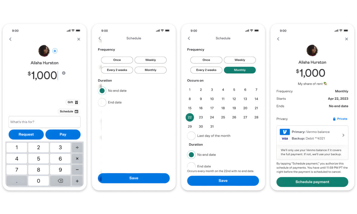
- Microinteractions reinforce clarity at every step. When you choose Pay over Request, the other button disappears and the color shifts. Immediate visual feedback, no ambiguity, one less thing to second-guess.
- Typography plays a role here too. Clean, legible type at every touchpoint keeps the focus on the action, not the interface. Dollar amounts are large and immediately readable. Supporting text stays small and secondary. Nothing competes for attention it doesn't deserve.
- Social proof does quiet work here too. Seeing friends actively paying each other normalizes the behavior and nudges newer users along. Research shows that adding social elements to utility-driven tasks creates habit-forming patterns.
When sending money triggers positive social feedback, users associate payment with connection rather than obligation. That's the behavioral logic behind the entire Venmo UI, and it's the same principle that makes social media feeds so hard to put down.
Tracking Venmo's Design Evolution
The 2009 version of Venmo did two things: send money and add a note. That was it.
As Venmo app features piled up, the navigation didn't keep pace. New features were dropped into an already cluttered sidebar, everything treated as equally important, nothing easy to find.
The fix came in stages. Cleaner tab structure. Better information hierarchy. Then progressive onboarding, which now routes users differently based on whether they're here for personal payments, business, or crypto. A study puts the completion rate lift from personalized onboarding at up to 53.5%.
Crypto on Venmo was designed to lower the barrier, not just add a feature. Plain language, familiar visuals, and step-by-step flows replaced the wall of jargon most trading platforms lead with.
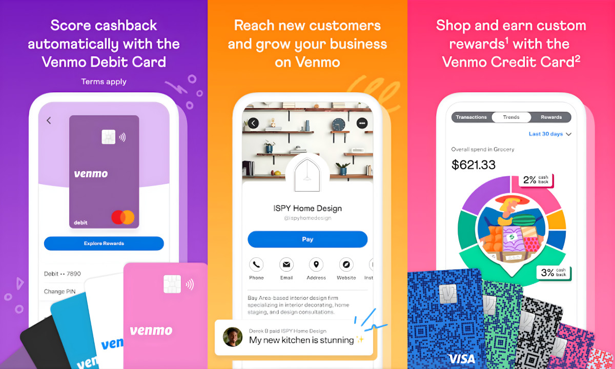
Business profiles launched in 2021 after a 2020 pilot, subscriber tools followed, and 2025 brought expanded debit functionality. Each addition reflects the same app design principle: grow the product without overwhelming the interface.
Meanwhile, the Venmo app logo has stayed relatively consistent: a clean wordmark in Venmo blue, simple enough to work at any size. That simplicity is by design. In a feed full of emoji and transaction notes, the logo functions as a neutral anchor.
The Venmo logo is present but deliberately unobtrusive. The broader visual identity leans into that same restraint, flat UI, generous whitespace, and a color system that uses green and red functionally for incoming and outgoing payments rather than decoratively.
Where Venmo Stands Against the Competition
The P2P payment space is crowded. Each app has carved out its own lane.
- Cash App leans into investing and Bitcoin, with a younger demographic and a starker visual style.
- PayPal covers more ground, merchants, international transfers, business accounts, but trades Venmo's personality for utility.
- Zelle moves money faster and lives inside most banking apps, but has no social layer to speak of.
- Apple Cash is frictionless if you're in the Apple ecosystem, irrelevant if you're not.
What the Venmo app interface does that none of these replicates do is blend financial utility with genuine social media engagement.
No other mobile payment service has a social feed as active, useful, and personal as Venmo's. This feed is what every competitor has declined to copy, and it's what keeps Venmo's retention numbers healthy despite the pressure.
How Venmo Handles Security and Trust
Early Venmo drew criticism for making transactions public by default. That has since been addressed. Users are now prompted to set their privacy mode during initial setup, choosing between Private, Friends, or Public before their first transaction goes through.
The security layer is comprehensive: identity verification, end-to-end encryption, multi-factor authentication, and background fraud monitoring are all standard.
Rigorous testing is built into every product update, and that standard carries through to the Venmo app interface. Security functions as a built-in feature rather than a footnote buried in fine print.
Venmo UX Case Study: What Designers Can Learn
The core takeaway from any Venmo case study is simple. Social design and financial utility don't have to fight each other.
Venmo's UX team pulled from both fintech and social media, and built something that actually does what it promises: payments that feel effortless.
The real takeaway comes from a product team committing to a clear design philosophy early and consistently building around it rather than shifting direction with every new trend.
Progressive disclosure handles complexity. The social layer handles retention. Typography and microinteractions fill in the gaps. The Venmo UI holds all of it together without breaking a sweat.
Most apps pick a lane. Venmo figured out how to use both.


