-account-photo_listing.jpg)
-account-photo_listing.jpg)


Our Jury has worked with Prada, Nike, Chanel, Google, and Apple.
Best App Designs
Tapping through these app designs feels like a masterclass in what good UI actually means in 2026.
Best App Designs
4,200+ Submitted Designs
- Agriculture
- Android and iOS
- Arts & Recreation
- Automotive
- Banking & Finance
- Chat
- Content & News
- Cooking
- Dating App
- Distribution
- E-Commerce & Retail
- Education
- Engineering
- Entertainment
- Fashion & Beauty
- Food & Beverage
- Government
- Health & Wellness
- Hospitality
- Luxury
- Medical & Pharmacy
- Nutrition
- Professional Services
- Real Estate
- Sports & Leisure
- Streaming
- Technology
- Travel
- Video Game
View Design
Generis
-preview.jpg)
View Design
Untold
byOguz Boz
-preview.jpg)
View Design
HealthPartners

View Design
Aura
byFYC Labs

View Design
Poker Heart

View Design
Vouch
byTenscope

View Design
Halal Bites

View Design
On Demand Food Delivery
byCodiant

View Design
Food Delivery Mobile App
byRonas IT
Get Connected
With The Right Agency Partner
& Receive Proposals For FREE

View Design
KFC Russia Mobile App
bySurf

View Design
Food Delivery App

View Design
Medicai App

View Design
EASY PEASY
byBrights
View Design
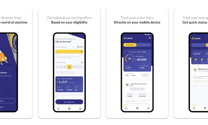
LetsGo

View Design
Novus World
byPagepro

View Design
Inner Peace

View Design
MasterStudy

View Design
Mental Health
Ready to elevate your designs?