Static infographics had their moment. Then, motion graphics took over, turning data into stories. Today, animated infographics aren’t just eye-catching — they’re essential in the attention economy.
Data shows engagement for content that includes images and graphics can be up to 650% greater, according to Positionly. This is because attention-grabbing, interactive visuals simplify complex data and make dry stats come alive.
As for animated content, 88% of marketers say it's more effective in differentiating their brand from competitors, according to 2025 data from Market.us Scoop.

In addition to engagement, interactive visuals and infographics help digital businesses to reach their KPIs. Specifically, as much as 178% more external links are generated by blog posts and articles that include infographics.
Brands are catching on, using animated infographics for social campaigns, product explainers, and more. Not just flashy charts, but narratives that educate, persuade, and stick. Make sure you don't fall behind.
Here are 10 examples of animated infographics that turn passive viewers into engaged audiences.
1. The Product Explainer
[Source: Outmost Studio]
A product explainer is your digital elevator pitch — if an audience doesn’t get what your product does in the first 30 seconds, they’re gone. These videos are the infomercials for the digital age, but instead of a guy yelling about OxiClean, you get slick animation, tight scripting, and visuals that turn complexity into clarity. The best ones don’t just explain — they sell without feeling like they’re selling.
Take SEND’s explainer by Outmost Studio, for example. This animated infographic doesn’t overwhelm with software jargon but focuses on a simple but effective narrative: SEND eliminates the parts of underwriting that make people want to switch careers.
The animation is fluid, the transitions are purposeful, and the entire video feels effortless — just like the software it promotes. It’s the perfect example of show, don’t tell. rather than listing features, it visualizes pain points disappearing in real-time.
The design choices are just as sharp as the messaging. The video leans on clean geometry, bold glyphs, and a structured layout that mirrors the logic-driven nature of underwriting itself. Solid colors and negative space keep distractions out of the picture, letting motion and meaning take center stage. There’s no wasted visual noise — just direct, confident storytelling.
Pro Tip: Your product isn’t the hero — your customer is. The best explainer videos celebrate what the user can do once the software removes their headaches. Focus on transformation, not just functionality.
2. The Microcontent
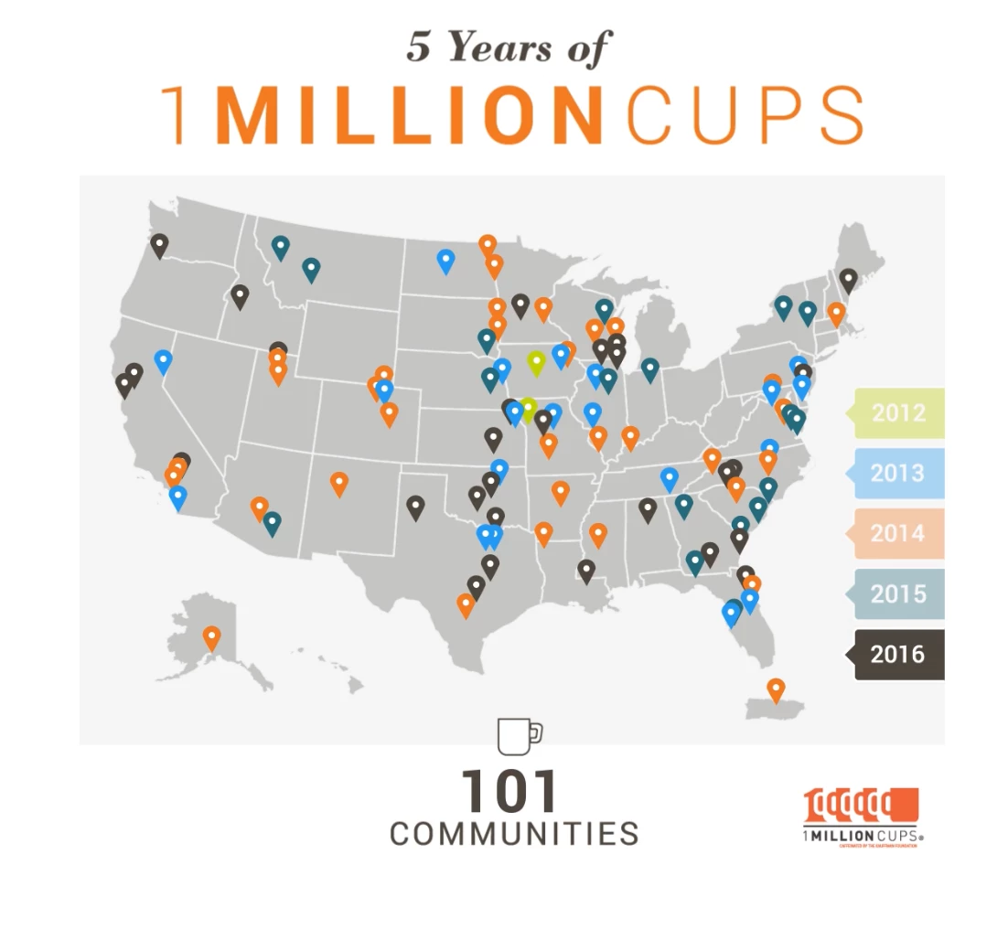
[Source Lemonly]
Attention spans on social media make goldfish look like deep thinkers. Social media animations (or microcontent) are built for this reality — quick, engaging, and digestible. They strip storytelling down to its essentials, delivering impact before the scroll kills you.
Lemonly understood the physics of the Instagram feed. Their animated piece for Toast — celebrating five years and one million customers — is a study in visual economy. The snappy transitions, fluid motion, and crisp typography make the numbers feel alive, not static. A warm, modern color palette paired with subtle kinetic text keeps things engaging without turning into a visual assault.
Even better? It gets to the point. There’s no bloated setup, no waiting — just instant, dynamic storytelling that delivers a milestone in motion. The branding stays front and center without feeling intrusive, which is where most corporate microcontent stumbles.
Pro Tip: Trim the fat. Microcontent isn’t the place for elaborate setups or slow burns. Start with action, lead with motion, and leave no wasted frames.
3. The How-To Guide
[Source: Bettina Gericke]
Most how-to content is about as engaging as an instruction manual for a microwave. Animated guide-tos fix that, turning dry step-by-step instructions into something you actually want to watch. Whether it's safety procedures, onboarding, or, in this case, surviving the undead, animation makes information stick.
Bettina Gericke took what could have been a standard survival checklist and gave it the pulse of a living instructional animated infographics with wit that bites. The clean, graphic style keeps it visually striking without distracting the viewer with too many elements.
Also worth noting is the choice of a pastel color palette. Instead of predictable horror-inspired blacks, reds, and greens, Gericke leans into soft, almost playful hues. This visual contrast makes the absurdity of the topic pop even more. The pastel treatment downplays the gore, making survival tips feel approachable rather than grim. It’s proof that content doesn’t have to lean into clichés to get its point across.
But where does it really win? The way it balances humor and clarity. The stiff, almost PSA-like narration contrasts with the absurdity of the content, making it impossible to ignore, let alone forget.
Pro Tip: Teach through movement. Use transitions, pacing, and motion cues to reinforce the instructions — let the visuals do the explaining before the text does.
4. The Educational Video
[Source: The School of Life/YouTube]
Most people don't want to feel like they’re sitting through a lecture. If the content is too dry, they check out. If it’s too simple, they dismiss it.
Educational animated infographics thread the needle — they make complex ideas feel intuitive, engaging, and personal. When done well, they don’t just convey information; they change how people think.
The School of Life excels at making profound psychological insights feel both intellectual and deeply human — and this video is no exception. Art Rake’s animation doesn’t just decorate the script; it amplifies it.
Visually, it leans on a hand-drawn, minimalistic style that mirrors the intimacy of the topic. The soft, muted color palette and fluid transitions create a sense of gentleness and reflection — a crucial choice given the emotional weight of the subject. There’s nothing cold or clinical about this explainer; it feels like a conversation, not a diagnosis.
Emotional pacing — this is where the animation excels. It doesn’t rush and instead lingers on key moments, allowing the weight of the words to land.
It visualizes emotional complexity without oversimplifying. The concepts of rupture and repair aren’t just defined; they’re demonstrated through movement, timing, and subtle shifts in form and space. Instead of making psychology feel academic, it makes it feel human.
Pro Tip: Make your animated infographic feel lived-in. When tackling educational subjects, animation shouldn’t feel sterile. Opt for organic motion, fluid transitions, and a color palette that complements the tone of the discussion. If the topic is raw and personal, the visuals should feel human, not mechanical.
5. The Interactive Data Visualizations
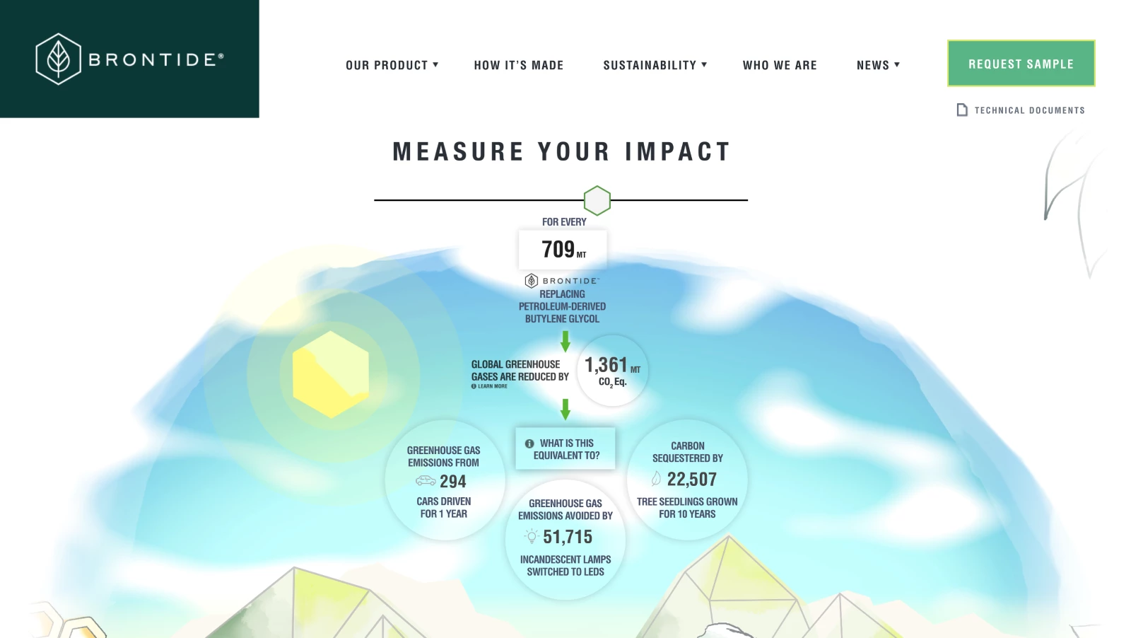
[Source: Brontide]
Data is boring — until you make it personal. Static graphs and spreadsheets tell you something; interactive data visualizations show you something about yourself. They don’t just display information — they let users explore, compare, and internalize the impact of their choices in real time. Giving people a way to manipulate and experience information is the difference between engagement and indifference.
What sets it apart is how effortlessly users can engage with the data. The interface invites exploration without friction, making complex sustainability metrics feel accessible and actionable.
Storm Brain’s design for Brontide’s impact calculator is clean, the motion is subtle, and every interaction feels purposeful. You’re not just consuming information — you’re experiencing it. And because it’s interactive, every user gets a tailored insight, making the data feel personally relevant.
Pro Tip: Make it reactive. The best interactive visualizations don’t just let users click — they respond. Use real-time updates, dynamic animations with the best data visualization tools, and immediate feedback to create an experience that feels alive.
6. The Campaign for a Cause
-content-large-webp.webp)
[Source: Very True Story]
Facts don’t change minds — stories do. And in advocacy, attention is the scarcest resource. Animated infographics allow causes to compress urgency into minutes and translate complex issues into compelling narratives. When done right, they don’t just inform; they spark action.
Very True Story understands that awareness isn’t enough — people need to feel something. Instead of drowning viewers in statistics, their Dow Wolf Awareness Week animation draws them into the story of the wolf — its role in the ecosystem, the threats it faces, and why its survival matters.
What makes it effective? The design choices reflect the subject matter:
- Soft, natural color palettes evoke the wilderness without feeling heavy-handed
- Smooth, almost hypnotic transitions mimic the fluid movement of a wolf in the wild
- A balance of realism and abstraction makes the message engaging without feeling like a documentary
The result? A campaign that feels urgent without resorting to shock tactics — an emotional appeal wrapped in thoughtful design.
Pro Tip: Lead with empathy, not statistics. Numbers are important, but people act when they connect with a cause. Use animation to create an emotional entry point — then bring in the data.
7. The Brand Story
[Source: Outmost Studio]
A brand’s message can’t just be stated — it has to be felt. Facts about climate change are everywhere, but unless they’re framed in a way that resonates emotionally, they’re just gonna end up as white noise. Brand storytelling works when it turns abstract issues into human narratives, making the audience see themselves in the story. That’s exactly what Zurich’s ‘Youth Against Carbon’ does.
Outmost Studio focuses on voice and visuals that feel personal, urgent, and collective. The narration is direct and conversational, positioning climate action as a responsibility rather than an abstract concern. It frames the fight against environmental damage as something within reach, something personal — something requiring individual voices, not just corporate policies.
Visually, the animation reinforces this message. The hand-drawn, fluid aesthetic makes the message feel organic and movement-driven, rather than corporate and static. The color palette is simple but effective: a deep blue backdrop with contrasting white and yellow figures gives the piece a sense of clarity and purpose.
One of the most striking visuals is the sequence of footsteps forming a cascade of environmental symbols — bottles, cars, icebergs, animals. It’s a clean, simple metaphor for impact: every step leaves a mark, and individual choices accumulate into global consequences. This is where the animation excels — it turns abstract concepts into tangible, visual storytelling without relying on overused imagery.
Pro Tip: Use metaphor to make complex ideas immediate. Abstract issues — especially global ones — can feel too big to grasp. Visual metaphors create a direct, intuitive connection between individual action and collective impact.
8. The Commercial Ad
[Source: Kapital/YouTube]
Brand commercials exist in a brutal reality: people don’t typically want to watch ads. They’ll skip, scroll, or mentally check out unless you give them a reason to stay. Animated brand commercials work because they sidestep the usual marketing fatigue. Instead of feeling like a sales pitch, they can tell a story, explain an idea, or entertain — all while subtly reinforcing the brand’s identity.
Industrial and B2B marketing isn’t exactly known for flair. Most companies stick to dry brochures, dense PDFs, and uninspired corporate explainer videos. But Avalaunch Media takes a different approach with Kapital Steel’s brand story — one that gets attention. Instead of droning on about efficiency and logistics, this ad does something rare in the steel industry: it makes a point with attitude.
The commercial is a full-on takedown of outdated steel procurement. The visual style is bold and disruptive — harsh color blocking, grungy textures, and aggressive typography that feel more like a music video than a factory-floor promo.
The narration plays off a classic frustration loop: why are we still waiting on slow, manual processes when technology has already solved these problems elsewhere? The ad leans into that contrast, using caveman-era imagery and an irreverent tone to drive the message home.
There’s no slow buildup — the spot jumps straight into how inefficient the industry is and why Kapital Steel is different. The Kapital App is positioned as the obvious solution, and by the time the ad closes, sticking with the old way feels as absurd as chiseling orders into stone tablets.
And it’s effective because it ditches corporate politeness in favor of straight talk and visual punch. The aesthetic is raw and industrial but modern — exactly the balance you want when selling innovation to an old-school industry.
Pro Tip: Challenge the status quo. If your industry is known for being slow to evolve, lean into that contrast. Use humor, unexpected visuals, and a bit of provocation to wake up an audience that’s been conditioned to accept inefficiency.
9. The Seasonal Microcontent
View this post on Instagram
Seasonal content is marketing’s version of a pop-up shop — limited-time relevance, high engagement, and a built-in reason to refresh your brand’s messaging. The best seasonal animations don’t just slap a holiday theme onto an existing campaign; they lean into the moment, using the visual language and energy of the season to make an impact.
Lemonly takes a playful, self-aware approach with its “Scary Good Infographics” campaign. Instead of forcing a Halloween theme onto a random message, they weave their brand into the holiday with a wink.
The animation embraces classic spooky elements — a mad scientist’s lab, eerie typography, and a dark-but-fun color palette — while keeping everything on-brand and instantly recognizable. The motion work is fluid, engaging, and well-timed.
The animation is perfect as microcontent. It’s light, timely, and shareable. There’s no hard sell, just a fun and visually clever way to reinforce Lemonly’s creative chops. It works because it feels natural — like a brand having fun with its identity rather than forcing a holiday gimmick.
Pro Tip: Own the theme, don’t just borrow it. The best seasonal animations integrate holiday elements seamlessly into the brand’s existing style. Use seasonality to enhance your message, not just as decoration.
10. The Year in Review
-content-large-webp.webp)
[Source: Giant Ant]
Year-end recaps are more than just a nostalgia trip — they’re a data-driven dopamine hit. Done well, they turn raw stats into a personalized highlight reel, making users feel like the main character of their own journey. Brands like Spotify and Strava have perfected this formula: take a user’s data, wrap it in animation, and deliver a shareable, feel-good moment that reinforces engagement.
Strava didn’t just summarize a year in sport; they built 2 million unique stories. Giant Ant, working with Stink Studios, designed 20 customizable, code-driven animation scenes that reacted dynamically to individual user data. Every graph, route map, and stat wasn't just a number — it was a bespoke, animated snapshot of an athlete’s year.
What makes this execution impressive is the balance between automation and craft. Instead of templated visuals that feel robotic, each scene was designed with a sense of fluidity and motion that made the data feel alive.
Visually, the animation takes a clean, modernist approach, using a stark white background contrasted by bold, high-contrast black typography and bright orange data points. This minimalist style allows the movement of data to take center stage without distractions.
The circular and modular shapes give the design a sense of rhythm, visually reinforcing the idea of movement, repetition, and progress. The transitions are crisp and kinetic, ensuring that each data point doesn’t just appear but unfold in a way that mimics real athletic momentum. It’s a perfect example of form following function — every design choice enhances the feeling of progress and accomplishment.
This is personalization at scale brilliantly executed. Strava turned cold data into something visually compelling, emotionally rewarding, and infinitely shareable. It’s one thing to see a mileage total — it’s another to watch it unfold as a dynamic, beautifully designed story built just for you.
And even though this video was created over seven years ago, it still holds up. The design remains sleek, effortlessly engaging, and timeless. Strava’s ‘Year in Sport’ sets a standard that many brands are still chasing today.
Pro Tip: Make data feel personal. If you’re using animation for data visualization, don’t just display numbers — find ways to bring them to life, making the user feel like they’re seeing their own story unfold.
Why Animated Infographics Matter More Than Ever in 2026
People are bombarded with more content than ever, and static visuals alone no longer cut it. In fact, video drives 82.5% of all internet traffic, and people process visuals 60,000x faster than text. To truly capture attention, information needs to be dynamic. Animated infographics offer precisely that, making complex data not just digestible, but unignorable.
Here are five reasons why animated infographics should be on your content marketing collateral radar this year:
1. They break through the clutter
The human brain processes visuals faster than text, but here’s what matters — motion keeps people engaged longer. And where algorithms reward video and audiences skim past anything that doesn’t move, motion graphics give brands a competitive edge. A static bar chart gets overlooked. An animated data story gets watched, shared, saved, and remembered.
2. They make complex information clear
The problem with most brands? They confuse detail with clarity. They bombard audiences with numbers, assuming volume equals credibility.
But data only works when it’s understood.
Animated infographics turn raw stats into compelling visual narratives, making insights intuitive. Whether it's a financial report, a sustainability metric, or a UX heatmap, motion guides the eye and makes meaning clear.
3. They move people to act
Views don’t matter if nothing happens afterward. Animated infographics aren’t just for engagement — they’re for action. Think product explainers that increase conversions, campaign visuals that spark donations, and interactive animations that drive deeper interaction.
Motion adds urgency, emotion, and clarity, making information not just easy to understand but hard to ignore.
4. They give content a longer shelf life
AI-generated content is flooding the internet, making originality harder to find. Blog posts? AI can churn them out in seconds. Static infographics? Easily copied.
But animated visuals? They require craft. They combine design, storytelling, and technical execution in a way that still resists automation. For brands looking to stay ahead, motion isn’t just a creative choice — it’s a safeguard against blending into the noise.
5. They make brand stories unforgettable
A brand without a story is just another product. And in 2026, a story without motion is a lost opportunity. Whether it’s Apple explaining privacy, Spotify visualizing listening habits, or Patagonia illustrating sustainability, animated infographics turn brand messages into experiences. They let brands show — not just tell — why they matter.
How to Create an Animated Infographic
Creating an animated infographic is more than flashy visuals — it’s about making information clear, engaging, and unmissable. In general, the rule of thumb should be structure first, and animation second.
Here’s how to do it right:
1. Define your goal and audience
Every successful animated infographic starts with a purpose. Are you simplifying complex data? Breaking down a product feature? Driving engagement on social media? Your objective determines everything — from the storytelling approach to the motion style.
Likewise, knowing your audience helps fine-tune the tone, pacing, and level of detail. A B2B audience might need a sleek, polished explainer, while a social media audience thrives on snappy, high-impact visuals.
2. Storyboard the visual flow
Animation needs structure. Before touching any motion tools, map out how the information will unfold. This isn’t just about aesthetics — it’s about hierarchy. What’s the key takeaway? What needs emphasis? How will the viewer’s eye move from one point to another? A solid storyboard helps prevent unnecessary motion and keeps the animation purposeful rather than distracting.
And if you want to make your animated infographics work even harder, build them into a solid content marketing strategy.
3. Choose the right tools or team
The software you use depends on complexity and skill level. Beginners can use Canva or Animaker for simple, template-driven animations. For professional-grade production, tools like Adobe After Effects or Blender offer full motion control, advanced layering, and precision animation. But software is just one part of the equation.
For complex, high-quality animations — especially for brand campaigns, explainer videos, or interactive content — hiring a professional animation studio or infographics professional ensures your infographic stands out and aligns perfectly with your brand’s storytelling.
4. Animate With Intent
The best animated infographics should enhance clarity, not create chaos. The goal isn’t to move everything — it’s to guide the viewer’s focus. Use motion to reveal key points, transition smoothly between ideas, and create natural emphasis.
Keep these principles in mind:
- Pacing matters. Too fast, and it overwhelms; too slow, and it loses attention
- Easing adds realism — smooth acceleration and deceleration prevent a robotic feel
- Microinteractions make a difference. Subtle motion (like a pulsing number or a sliding text reveal) keeps things engaging without distraction
5. Refine, test, and optimize
Animation isn’t finished when the last keyframe is set. It needs testing. Preview the infographic across different devices and platforms.
If it’s for social media, ensure it grabs attention within the first three seconds. If it’s for a landing page, check that it loads fast without killing site performance.
Small tweaks — adjusting timing, color contrast, or call-to-action placement — can make the difference between a scroll-past and a conversion.
Animated Infographics: The Bottom Line
We’ve seen this play out before. Radio gave way to TV. Static banners lost to video ads. The attention economy doesn’t reward those who keep still — it favors motion. In 2026, animated infographics are, as the cliche goes, "here to stay." They’re how brands communicate when they want to be heard.
Information alone doesn’t persuade. It needs movement, rhythm, pulse. A well-executed animated infographic doesn’t just sit there hoping for engagement — it actively pulls the audience in, guides their attention, and leaves an imprint. It turns stats into narratives, complexity into clarity, and fleeting impressions into something that sticks.
The question isn’t whether motion matters. It’s whether you’re using it intelligently. Brands that integrate animation into their storytelling do more than inform; they can actually steer the conversation. Those who don’t? They’re background noise.
So don’t just stand still. Move.
Animated Infographics FAQs
1. What are animated infographics?
Animated infographics use motion to make numbers, ideas, and complex concepts digestible, engaging, and unskippable. Whether for marketing, education, or social media, they transform static information into something that moves visually and in impact.
2. What tools are best for creating animated infographics?
It depends on how much control you want. If you're looking for quick, template-driven solutions, Canva or Animaker can do the job.
If you want precision, customization, and pro-level motion graphics, tools like Adobe After Effects or Blender offer full creative freedom.
And if animation isn’t your strong suit? Hire a design agency — because nothing tanks engagement faster than bad motion.
3. How are animated infographics used in marketing?
Animated infographics don’t just tell your audience something — they show it, prove it, and make them feel it. Whether it’s a slick explainer video, a high-retention social media post, or a data-driven story that holds attention, animated infographics turn passive viewers into engaged ones.
4. Can I create an animated infographic for free?
Technically, yes. But “free” comes with trade-offs. Platforms like Canva and Animaker offer free plans with basic motion tools, but if you want something that looks polished, aligns with your brand, and doesn’t scream “budget animation,” investing in premium tools — or a professional studio — pays off.