Interactive infographics combine data visualization with user engagement, incorporating elements that require interaction, such as scrolling, clicking, or hovering.
These infographics are useful for telling compelling stories while presenting a ton of data. They are more engaging than static infographics because they encourage users to actively participate and explore your content at their own pace. It's this interactivity that transforms dry facts into captivating experiences.
Let’s dive into 10 versatile examples of interactive infographics that will inspire you with their visually appealing, engaging, and insightful designs.
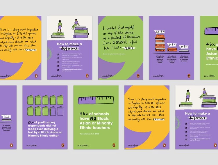
1. Lit in Colour by Taaryn
Standout features:
- Strategic use of parallax scrolling
- Heartwarming hand-drafted illustrations
- Warmth-exuding colors
The Lit in Colour interactive infographic, created by Taaryn in collaboration with Penguin Books and The Runnymede Trust, is a powerful example of how top infographic design agencies can use design and storytelling to advocate for change.
The project was developed to highlight the lack of diversity in English literature curricula and spark conversations about inclusivity in education. Through engaging illustrations, bold typography, and approachable and charming data visualization, the infographic effectively presents stark statistics that underscore the campaign’s and brand’s essence.
The infographic uses parallax scrolling to add depth and interaction to the storytelling experience. As viewers scroll, key illustrations, quotes, and data are highlighted and remain on-screen while users read the written content. This dynamic feature ensures that viewers can absorb the critical findings without feeling overwhelmed.
Moreover, brightly colored text boxes divide its sections, improving readability and creating visual hierarchy, while heartwarming hand-drawn illustrations and script typography add tranquility and authenticity to the campaign.
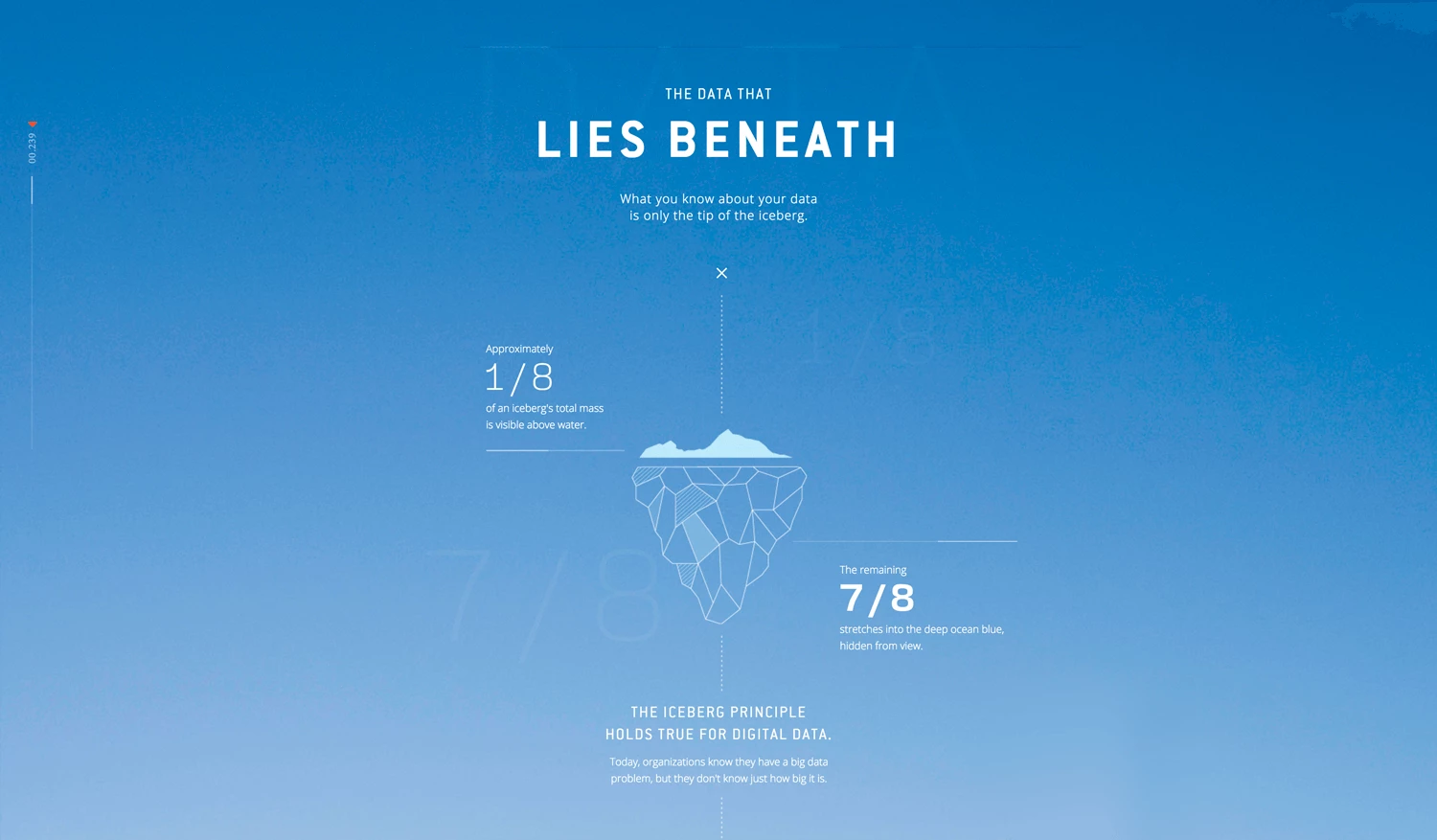
2. The Data That Lies Beneath by Column Five
Standout features:
- Creative metaphorical storytelling
- Scroll-controlled depth ruler
- Subtle hover and on-click effects
The Data That Lies Beneath, created by Column Five in collaboration with Lucidworks, offers a compelling visual narrative that demystifies the concept of dark data while showcasing its untapped potential.
The interactive infographic effectively uses the metaphor of an iceberg and the ocean depths to represent the hidden layers of data. A depth ruler along the left side of the screen guides users as they "dive deeper" into understanding dark data’s cost and power, making the experience intuitive and immersive.
To emphasize key insights, the design employs clean, simple graphs that appear as users scroll, as well as buttons that transform once clicked or hovered. These are paired with thematic illustrations such as anglerfish and radar, reinforcing the underwater concept while symbolizing the tools and power required to navigate and harness dark data.
This thoughtful visual communication example combines data and storytelling, transforming a complex subject into an engaging exploration. By connecting abstract concepts to familiar metaphors, The Data That Lies Beneath successfully encourages users to reflect on the importance of collecting, analyzing, and utilizing dark data.
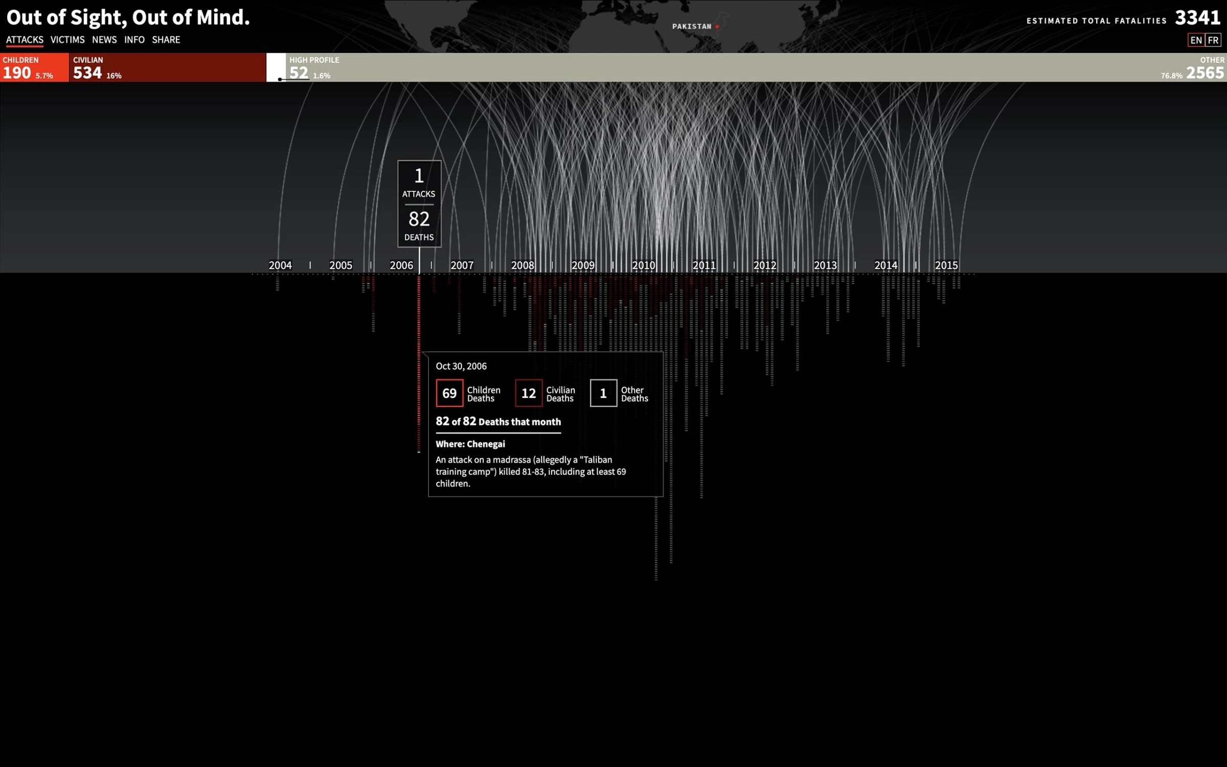
3. Out of Sight, Out of Mind by PitchInteractive
Standout features:
- Gradually unfolding data visualization
- Persistent bar showcasing stats
- Intuitive color-coded navigation
Pitch Interactive’s Out of Sight, Out of Mind is a poignant interactive visualization that brings to light the hidden realities of modern drone warfare. Drawing on data from the Bureau of Investigative Journalism, it chronicles every known U.S. and Coalition military drone attack since 2004, presenting the data through a compelling horizontal timeline.
The visualization builds dynamically, with each attack creating a visual rhythm that emphasizes the scale and frequency of these events. This approach transforms raw data into an emotionally resonant experience, urging viewers to grapple with the human cost of such conflicts.
The interactive timeline encourages exploration by allowing users to hover or click on specific attacks to reveal detailed information, including dates, locations, and fatality counts. A persistent bar at the top of the visualization categorizes victims — children, civilians, high-profile targets, and others.
Moreover, the color-coded data makes the research process intuitive and easy. Lastly, by introducing a vertical "Victims" view, the infographic further highlights the individuals affected, expanding monthly data to underscore the human impact of drone warfare.
These constant statistics ensure that viewers remain aware of the human toll behind the numbers, fostering a sense of accountability and reflection.
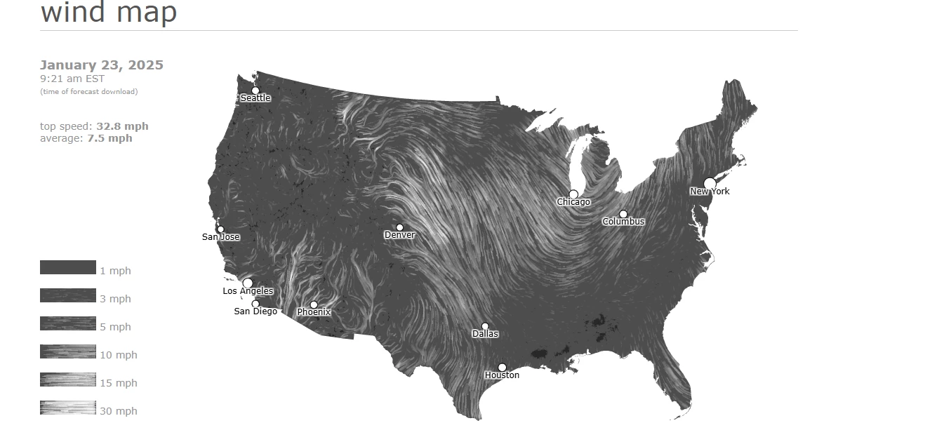
4. Wind Map by Hint.fm
Standout features:
- Comet-like motion trails
- Minimalist black-and-white palette
- Insightful hover effect
The Wind Map, created by Hint.fm, transforms surface wind data into a mesmerizing visual experience, presenting the flow of air currents across the United States in real time.
To capture the patterns of wind movement, the design uses delicate, comet-like trails, offering a dynamic yet minimalist portrayal. To ensure viewers focus solely on the wind's behavior without distractions, designers rendered the map entirely in black and white.
The Wind Map visualizes near-term wind forecasts from the National Digital Forecast Database, updating hourly to maintain accuracy. Hovering over any point on the map reveals precise wind speeds for that coordinate, while a legend in the lower-left corner provides an approximate speed range based on motion density.
By pairing historical techniques — like how wind is represented in Edmund Halley’s 1686 map of the trade winds — with modern technology, the Wind Map balances scientific utility and artistic expression. It creates a living portrait of the air in motion, engaging users with its fluid, ever-changing visuals while subtly reminding us of nature's invisible forces.
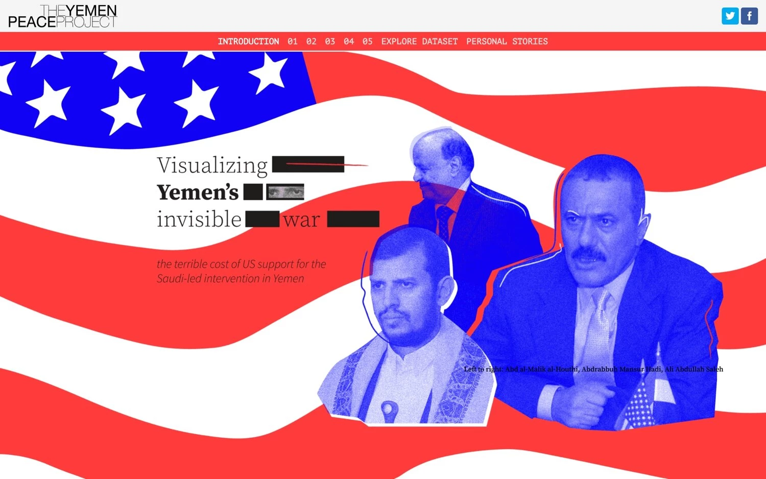
5. Visualizing Yemen's Invisible War by Data4Change
Standout features:
- Interactive graphs with filter options
- Images showcased during scrolling
- Navigation-enhancing sticky menu
Visualizing Yemen’s Invisible War by Data4Change sheds light on the ongoing conflict in Yemen by utilizing data from the Yemen Data Project and interviews conducted within Yemen. Its purpose is to promote transparency, accountability, and a deeper understanding of the war’s impact, making it a critical tool for advocacy and education.
The design incorporates interactive graphs that allow users to explore the data in depth. Filters and selectable graph bars empower viewers to customize their exploration, uncovering precise insights relevant to their interests.
To further enrich the experience, the agency implemented scrolling visuals that present impactful images alongside key information. This feature breaks up text-heavy sections, lightening the cognitive load while emphasizing critical points.
Streamlining the navigation, the sticky menu enables users to seamlessly move between sections. By combining dynamic interactivity, impactful visuals, and user-friendly navigation, Visualizing Yemen’s Invisible War stands as a striking example of the best infographic designs that make even the most complex issues accessible and engaging.
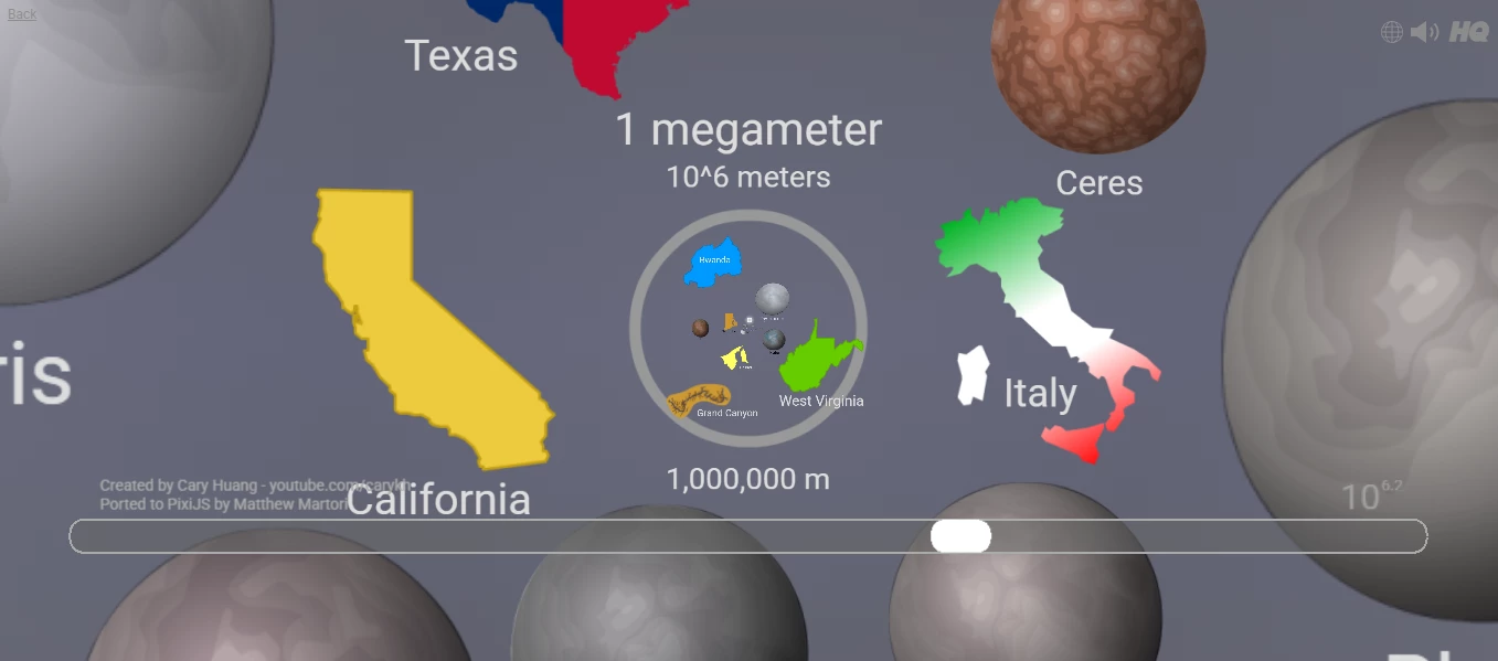
6. The Scale of the Universe 2 by HTwins.Net
Standout features:
- Atmospheric orchestral music
- Streamlined interaction
- Approachable illustrations
The Scale of the Universe 2, developed by HTwins.Net, offers an extraordinary exploration of scale, guiding users through the vast range of known objects in the universe.
Instead of adhering to traditional maps of Earth or the cosmos, this interactive infographic juxtaposes the size, placing vastly different objects — like Italy and a comet — on the same plane. The clean, approachable illustrations ensure accessibility for audiences of all ages, making ideas about scale and magnitude easier to grasp.
The interaction is streamlined, relying solely on scrolling and clicking to navigate through the cosmic expanse. This simplicity eliminates potential confusion and keeps users immersed in the journey without distraction. Atmospheric orchestral music further enhances the experience, striking a perfect balance between tranquil and eerie.
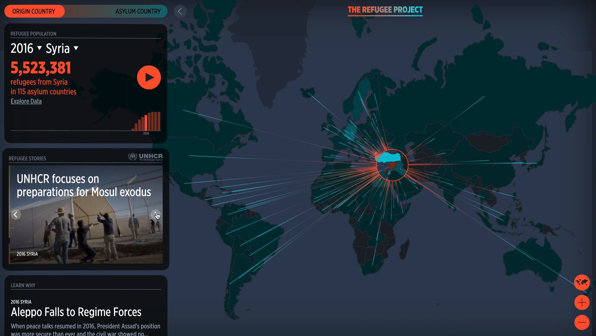
7. The Refugee Project by Hyperakt
Standout features:
- Simple yet immersive UI
- Origin/Destination toggle feature
- Real-life stories humanizing the content
Hyperakt’s The Refugee Project is a powerful visual narrative that brings to life over 40 years of refugee data collected by the United Nations High Commissioner for Refugees (UNHCR). Designed to illuminate the stories behind the numbers, this interactive experience contextualizes refugee movements with historical, political, and social insights.
The design integrates a world map, bar chart timelines, and a dynamic information dashboard, offering a streamlined yet immersive interface. Red circles represent the number of refugees from that country while their size adjusts to reflect shifting populations over time.
To further enhance the visualization, radiating lines color-coded by movement direction (red for origin, and blue for destination) draw attention to the interwoven narratives of displacement and refuge. An “Origin/Destination” toggle feature allows users to switch perspectives, promoting engagement and a more nuanced exploration of the data.
To humanize the data further, the project includes 83 meticulously researched stories, spotlighting the underlying turmoil driving refugee migrations. These narratives, paired with year-specific headlines, connect users to the broader context, ensuring the numbers resonate emotionally.
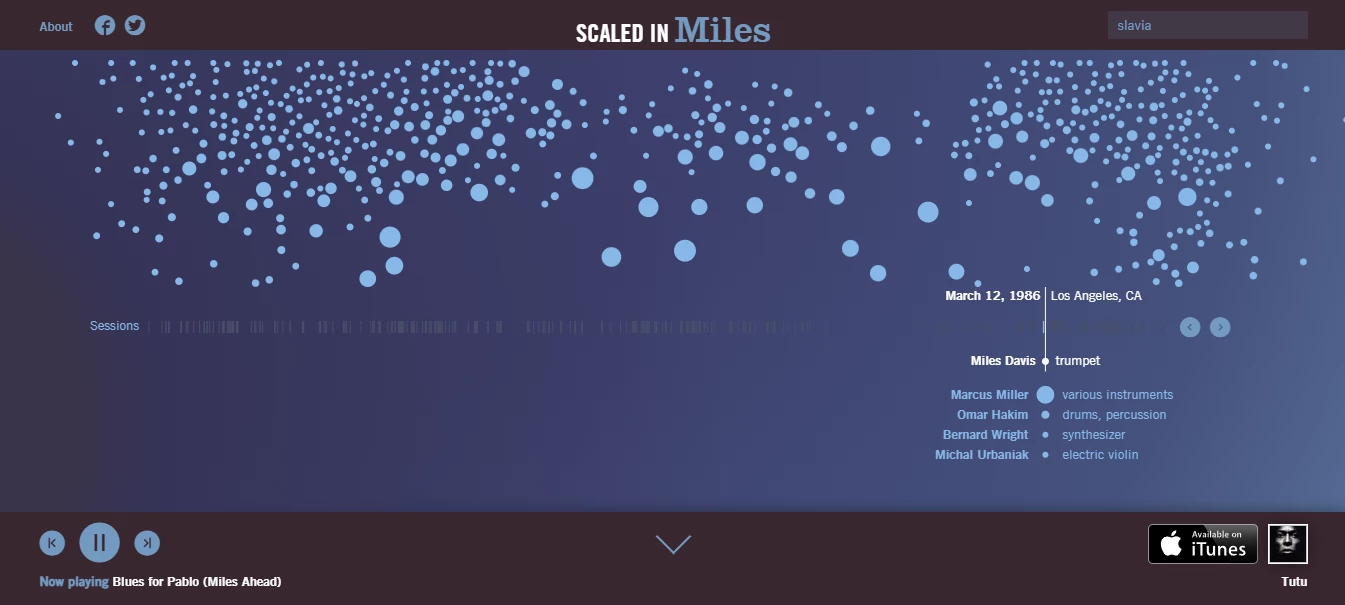
8. Scaled in Miles by Fathom
Standout features:
- Integrated music
- Interactive and comprehensive timeline
- Navigation-enhancing search option
Scaled in Miles, created by Fathom, is an engaging interactive web app that celebrates the life and music of jazz icon Miles Davis. Designed as a single-page application, it features a minimal yet intuitive interface that allows users to explore Davis's musical legacy through an integrated timeline.
An audio player in the bottom left corner enables listeners to experience Miles’s work, with options to skip or revisit songs, fostering an immersive exploration of his groundbreaking contributions to jazz.
Each bubble above the timeline represents a musician Davis collaborated with, positioned based on their peak activity with him while its size reflects the duration of their collaboration.
Users can click on these bubbles or select options on the timeline to reveal the albums which these artists contributed and the instruments they played. This meticulous organization ensures that every layer of Davis's artistry is explored in a way that is as captivating as his music itself.
Adding to the dynamic experience, the album artwork corresponding to each period appears in the bottom right corner, providing additional context and serving as a gateway to further exploration on iTunes.
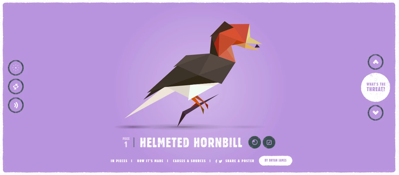
9. In Pieces by BryBry
Standout features:
- Engaging fluid motion effects
- Highlighted CTA button
- Polygonal animal illustrations
In Pieces is one of the most mesmerizing examples of interactive infographics designed by BryBry, created to raise awareness about endangered species. Each animal is represented through intricate polygonal art, symbolizing the fragility of these species and their fragmented existence.
The interactive nature of the site captivates users with fluid motion, as each animal flows seamlessly from one location to another using innovative SAS loops.
A standout feature is the “What’s the Threat” button, which dramatically shatters the species’ polygons across the screen, visually representing their potential disappearance. This impactful animation reveals critical information about the threats these animals face, supplemented by videos, statistical data, and links to conservation efforts.
Moreover, embracing the power of color psychology, the design draws attention to the urgency of conservation while fostering hope by employing vibrant colors and soft tones. Overall, In Pieces demonstrates the power of infographics to inspire action, proving that information presented through innovative design can resonate deeply with audiences.
10. World Inequality Database on Education by Interactive Things

Standout features:
- Various compare factors and filters
- Color-coded graph navigation
- Overlapping disparities features
Interactive Things’ World Inequality Database on Education platform offers an insightful and interactive infographic that examines educational disparities across over 100 countries.
Its design empowers users to delve beyond generalized statistics, uncovering inequities that affect specific demographic groups. Through comprehensive filters, users can compare disparities based on factors such as gender, ethnicity, religion, wealth, disability, and more, creating a multifaceted view of global educational challenges.
The platform’s intuitive use of color-coded graphs ensures a seamless browsing experience, with clear navigation aiding users in exploring the extensive data. Each visual element is thoughtfully designed to make complex information accessible, providing clarity without oversimplifying the gravity of the disparities.
Moreover, the overlapping disparity feature allows users to drill down into nuanced data, enabling them to focus on particular demographics and education levels within a specific country.
Benefits of Interactive Infographics
Interactive infographics go beyond aesthetics, enhancing engagement, improving retention, and simplifying complex information. Here’s why they’re a game-changer:
- Stronger Data Retention: The brain processes visuals rapidly, making interactive infographics an effective way to present and retain complex information.
- Higher Engagement: Features like scrolling, clicking, and hovering keep users actively involved, increasing time spent on content.
- Better SEO Performance: They attract backlinks, boost dwell time, and improve search rankings, driving more organic traffic and boosting content marketing efforts.
- Wider Social Reach: Their eye-catching design makes them highly shareable, increasing visibility across social media.
- Enhanced Brand Authority: Well-designed infographics elevate professionalism, reinforcing credibility and premium positioning.
- Multi-Sensory Appeal: By integrating visuals, text, and interactive elements, they engage different learning styles and improve information absorption.
- Simplified Learning: Breaking content into interactive, digestible segments makes even complex topics easier to grasp.
In a nutshell, interactive infographics transform how audiences consume and remember information by combining data, design, and interactivity.
Interactive Infographics: The Bottom Line
Interactive infographics are powerful tools for visual storytelling, offering a creative and effective way to present data. Whether used on websites, apps, or marketing campaigns, their ability to engage audiences makes them indispensable for modern businesses.
Designers should embrace these tools, as they enable brands to communicate ideas compellingly and creatively, leaving lasting impressions on their audiences.
Interactive Infographic FAQs
1. What are interactive infographics?
Interactive infographics go beyond static images. They combine data visualization with interactive elements like scrolling, clicking, hovering, and animations to engage users and enhance understanding.
2. What tools are used to create interactive infographics?
Popular tools include Adobe Illustrator, Tableau, Canva, and web-based platforms like Infogram and Visme. These tools provide intuitive interfaces and extensive customization options, making it easier to create visually stunning and interactive designs. By leveraging these tools, designers can craft professional-quality infographics that captivate audiences.
3. What industries use interactive infographics?
Industries like education, journalism, marketing, and technology widely use interactive infographics for data storytelling and audience engagement. Marketing professionals use them to boost brand visibility and connect with customers, while technology firms rely on them to explain intricate processes or innovations effectively.
4. Why are interactive infographics effective?
By combining text, visuals, and interactivity, interactive infographics cater to different learning styles and ensure wider accessibility. Their dynamic nature captures attention, keeping audiences engaged longer than static content. Additionally, they foster emotional connections by presenting data in relatable, visually appealing formats.
5. How can businesses benefit from interactive infographics?
Interactive infographics can present data creatively, boost brand perception, and increase customer engagement. They enhance the audience’s understanding of products or services, which can drive conversions. Moreover, their shareable nature amplifies brand reach, creating opportunities for greater visibility and customer retention.