- Agency: Maryan Ivasyk
- Client: Flame Paint
- Category: Logo Design — Emblem
- Location: Vienna, Austria
- Project Brief: Create a logo conveying a bold, evolving identity through a refined emblem for stronger brand recognition.
An emblem for a street art staple must evolve without losing its edge. Maryan Ivasyk’s rebranding of Flame Paint modernizes a graffiti cornerstone while preserving the grit that made it iconic.
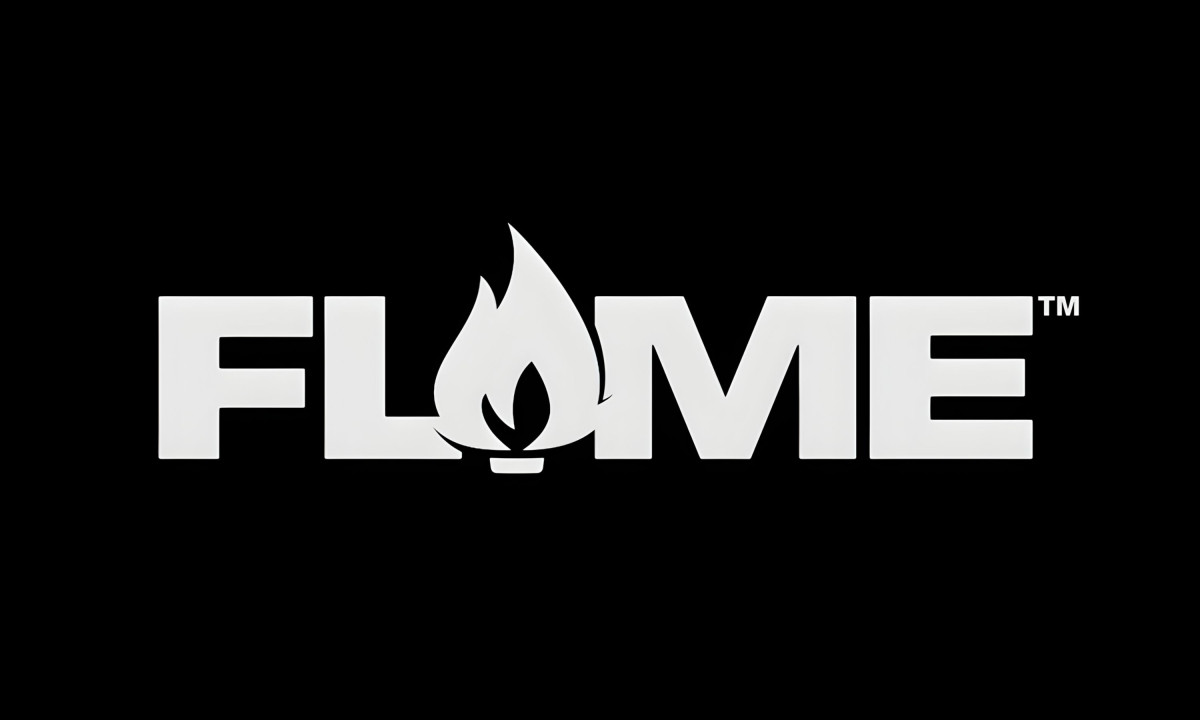
The smartest move is structural. The A in "FLAME" isn't a letter. It's the flame icon itself, replacing the character entirely and locking the symbol into the wordmark as a single unit.
The mark can't exist without the type and the type can't exist without the mark. That integration means the logo never needs a separate icon placement, which matters on a cylindrical spray can where real estate is tight.
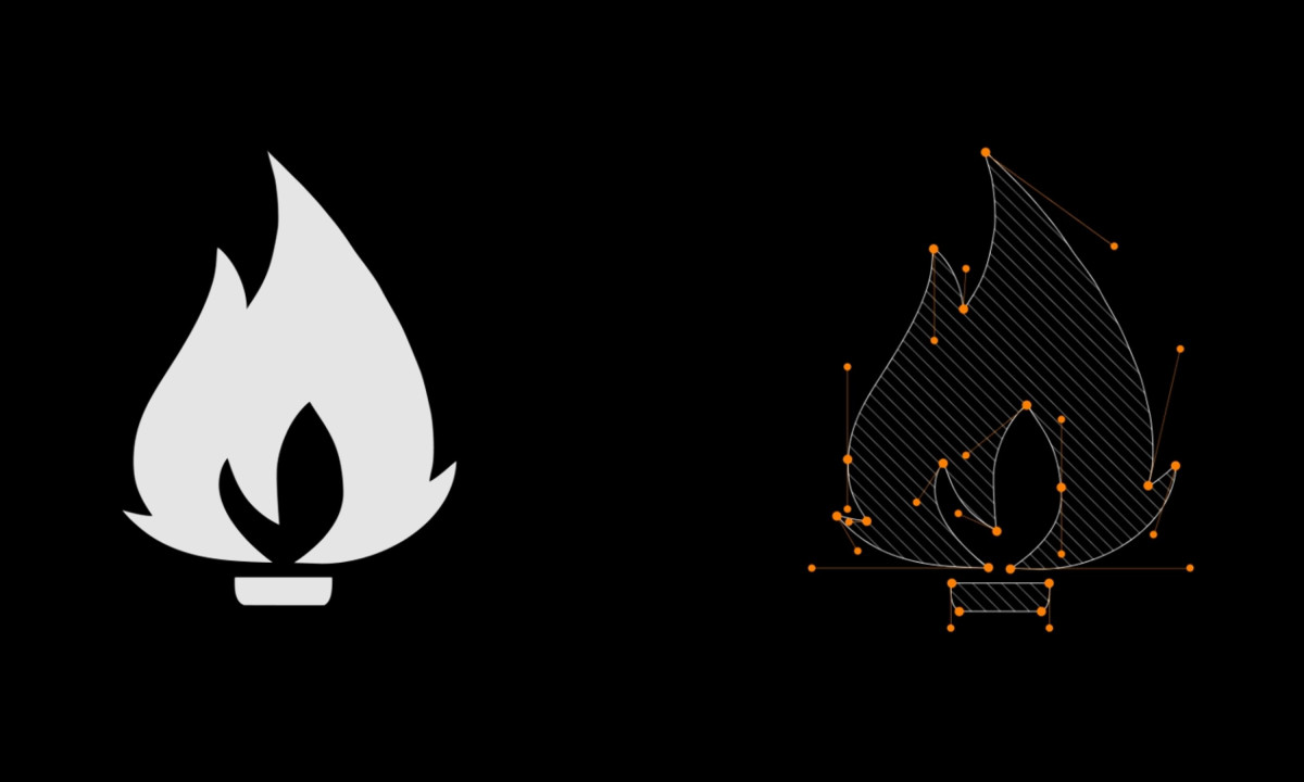
The flame icon gets cleaner without getting softer. The vector construction (visible in the process image) shows how Ivasyk tightened the curves and reduced the anchor points while preserving the original shape's proportions.
Three nested flame layers sit above a small base, giving the symbol enough internal detail to read at large scale and enough simplicity to hold at small sizes on a cap or nozzle.
Contrast drives the new color system. The brand pairs its signature high-heat orange with a deep, matte charcoal to ensure the logo remains legible and striking across a broader range of art supplies.
The type runs in a heavy condensed sans-serif with flat terminals and squared-off counters. It reads as industrial without trying to look handmade or "street." That's the right call for a brand expanding into fine art supplies. The graffiti audience doesn't need the logo to look like graffiti. They need it to look like the brand they already trust.
Ivasyk solved the hardest version of a logo redesign: the one where the existing audience would notice if you changed too much. The new mark is sharper, more versatile and built for surfaces beyond spray cans. But it still looks like Flame. That's the whole job.