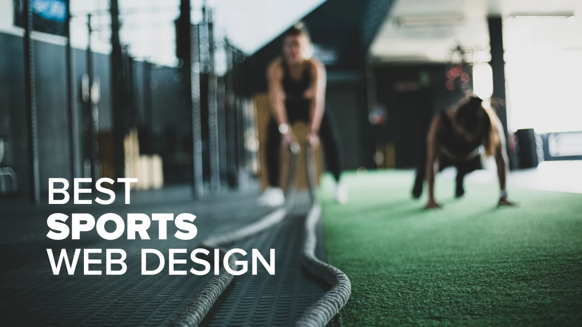
By 2025, the global sports market will be worth $600 billion, while 3.5 billion people will actively participate in sports, making it the second most common leisure activity after travel.
Furthermore, sports eCommerce is expected to contribute 30% of online sales in the next five years.
It is no wonder why sports brands pay a lot of attention to their online image to help them get ahead in a very competitive environment. Enter some of the best web design agencies on the market!
This article lists the best sports website designs that go the extra mile in impressing, engaging, and educating the audience with their web design, content, and features.
1. The XRS by 36 creative

Standout features:
- A one-page layout
- A minimalistic website design
- Stream functionality
The XRS website is extremely straightforward. It has one function: to present the Cascade XRC helmet. And 36 creative did an incredible job at portraying it.
No distracting features impede you from focusing on the helmet and all its perks. As you scroll down, the website lets you in on the various aspects of the product, taking you on an imaginative sales pitch. And suppose you don’t feel like scrolling; you can stream a short video taking you on an adrenaline-rush journey while telling you everything you need to know about the XRS helmet.
The website is intuitive and looks modern. The minimalistic design is presented on black-and-white gradient notes forming a futuristic vibe. It helps the viewer focus on the product at all times. The helmet model is presented in 3D, enhancing its presence on the screen.
2. Thibaut Courtois By Three Sixty

Standout features:
- The added depth dimension to the scrolling experience
- Monochrome aesthetics
- Minimal menu navigation
Thibaut Courtois is a Belgian national team and Real Madrid goalkeeper widely regarded as one of the best players in his position.
His website, conceived and executed by Three Sixty digital agency, employs a unique navigation concept. As opposed to scrolling the website from top to bottom, the visitor moves “in-depth.” The scrolling action zooms into the screen and conveys a feeling of moving forward as it goes past the images and bits of different content.
The mostly dark-mode website uses plenty of black negative space, with the monochrome imagery centered and the delicate floating effect thrown in. The gold and white accents are scattered throughout, including the main navigation menu. Logos like “Nike,” “Real Madrid” and Courtois’ very own are placed on the left.
Its custom-made serif font is both stylish and contemporary-looking. The subtle motion effects in the background lend more liveliness to the website, while the space-saving tabs help organize content for certain pages.
3. The Pitch by Rareview

Standout features:
- Interactive
- Visual animations
- Expressive typeface
The Pitch’s website is a one-page layout filled with exciting data for baseball lovers. Once you enter the website, you’re faced with a ball in the center of three concentric circles of dynamic text. You can move the 3D model of the ball around by dragging your mouse to any side. Rareview sets up the stage for an upcoming interactive website story through this feature, making it feel more engaging.
As you start scrolling, the text is omitted, and you zoom out of the ball until it disappears from the screen. The next thing you see is a couple of photos depicting the sport, followed by a description of what awaits you below. The texts move via creative animations, maintaining high viewer engagement.
It’s written in an expressive typeface that accompanies the overall old-school background. By combining this background with dynamic elements and fashionable design trends, the website manages to stay relevant while letting you relieve all the iconic moments in baseball history.
4. yfitnesslab By General Condition

Standout features:
- Gritty aesthetics and animated static noise
- Effortless user journey
- Great menu navigation
yfitnesslab is a personal training program developed by a Belgrade, Serbia-based speed fitness EMS instructor and senior physiotherapist. The website for his services is a brainchild of General Condition branding and web design specialists.
The website’s concept and visual identity take the instructor’s unique blend of medicine and fitness into account. It uses Supertype angular typography, black and grey tones, and minimal photography to emphasize this duality.
"Materials” in the background, such as concrete, black fabrics, shattered glass, and gritty surfaces convey the sweltering, hard-working nature of yfitnesslab’s training routine. A particularly eye-catching visual is the animated static noise in the background.
The homepage covers the entire user journey of an interested prospect or a casual visitor who can find compelling info delivered directly and fluff-free. The sliding navigation menu on the left takes up half the screen and points to several other pages/points of interest that elaborate on the homepage’s content. This layout is an excellent example of website design for health and wellness, guiding users effortlessly to the information they need.
5. PSV Eindhoven Legends Lounge By De Jongens van Boven
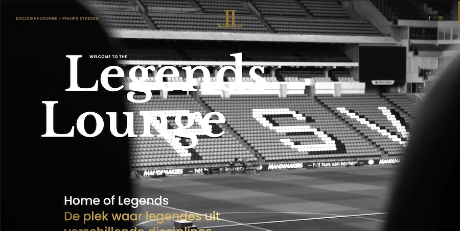
Standout features:
- One-page layout
- Full-screen videos
- Classy typeface
PSV Eindhoven is one of the Netherlands’ most successful soccer clubs. Its “Philips” stadium has a special lounge section in the stands that hosts celebrities, club legends, and VIP members. And this lounge section has its own website, courtesy of De Jongens van Boven.
Above the fold, the full-screen videos provide spectacular backdrops showcasing the view from the lounge as well as the luxurious amenities enjoyed by the visitors. As this is another monochrome website on this list, the white and gold accents counterbalance the restrained palette.
A high-end serif typeface is used on the larger, accentuated bits of copy while a more conventional sans-serif font lends legibility to a greater chunk of content. Scrolling down the site, the visitor sees which Dutch sports legends they get to meet up close and personal and which awarded Chefs prepare the delicacies they get to sample.
The one-page website doesn’t require any navigation menu. The only two outbound links are to the Legends Lounge’s Facebook and Instagram pages.
6. Prioritet Serneke Arena by 2Creative

Standout features:
- Effective all-caps italic fonts
- A dynamic and inviting layout
- A contrasting color palette
The Prioritet Serneke Arena is a catch-all sports hall that offers recreational and professional athletes various options for pursuing their hobbies or professions.
This brand vision is communicated through a big, encouraging copy, "KOM NÄRMARE MÅLEN," which translates to "Get closer to your goals" on the header.
2Creative created a website that looks and feels active to support the overall message and brand identity. It’s evident in the persuasive call-to-action buttons and the inviting dynamic layout.
Furthermore, the website has superb UI/UX design. It immediately presents visitors with the different halls (Football, Ski Dome, Sports Halls) they can book upon entry. Scrolling down will also reveal the activities they can try: dining, hotel stays, and event conferences.
Shades of blue and green across the website are aggressively contrasted with a bright red in the top right corner to let the visitor know where the most critical information is.
7. Squadeasy By Guillaume Azadian

Standout features:
- Vibrant, on-brand colors
- Great-looking social proof section
- Sticky navigation
In stark contrast to the previous entries on this list, the Squadeasy website – developed and designed by Guillaume Azadian – uses the boldest shade of electric green to wow the audience and make vital elements pop.
Besides the choice of color, two things jump out as the most striking impression: the symmetry of elements (the slogan in the center, the menu, brand logo, mission statement, and CTA in the corners) and the quirky animated dog head that rotates as the user moves the mouse cursor.
The page animation loads as the user commences the journey. An elongated sans-serif font contrasts the background and provides good readability. The sticky main menu appears on the screen again as soon as the visitor scrolls back up a little.
The most notable part of the website’s homepage is the showcase of how the app works. A screenshot of the app in action is accompanied by simple-to-follow, step-by-step instructions. The next section with case studies and social proof is even better looking, with stat images overlaying the content beneath them.
Several call-to-actions appear on the page, sporting different looks and different copies. This inconsistency doesn’t harm the overall user journey and instead contributes to a fuller and richer experience.
8. Salzburgring by Stefan Prosch

Standout features:
- Informative homepage
- A futuristic font style
- Hi-res dynamic photos
The site greets you with the racetrack photo with a color overlay that immediately builds a dynamic atmosphere. It's accompanied by a short but effective copy written in a futuristic white font. The font resembles a racing track's curves around each edge of a letter.
Stefan Prosch struck the perfect balance between engaging media and valuable information for the interested parties, including the calendar, the current weather conditions, and track-related data. The content is accompanied by a black background mixed with racetrack photos. There's a filter spread across the pictures, providing a dimmed shade of red across them.
Near the bottom of the page, you'll encounter a gallery of high-resolution dynamic race track photos that effectively help you picture yourself on the stands or behind the wheel. By now, you might be thinking, "Where do I sign up?" - but the website design predicts that thought perfectly with a "contact us" CTA to save you time.
9. Route One By Eastside Co

Standout features:
- Auto-suggest search bar
- Hi-res photos
- Well-organized category menu
Route One is an eCommerce website selling sports clothing, shoes, accessories, and equipment. It is designed and created by Eastside Co, a Birmingham, UK-headquartered agency specializing in Shopify projects.
The scope and breadth of the website’s offering are apparent through a well-organized main menu that contains all the essential categories. The vital bits of information, such as phone contact, next-day delivery, and login form are all located near the top of the page, quite visibly and well-integrated into the overall design.
Furthermore, large-format photography above and below the fold links to the most common points of customers’ interest - be it specific items or general shopping sections. The product pages focus on the visual representation of each item through a neatly arranged description, specifications, and other info.
Related items that up-sell and cross-sell to the visitor appear just above the visible Add to Cart button. Personal recommendations and a very seamless checkout process complete the overall pleasant user experience on Route One’s eStore.
10. Wolves F.C. Academy by Platform81

Standout features:
- Straightforward design
- Sidebar navigation
- UI-oriented homepage
This is the official website of the English soccer Premier League club Wolves F.C. From the get-go, Platform 81 ensures that you can’t mistake it for something else. The whole website uses the black-and-orange color combination that beautifully conveys the club’s colors.
The website is devoted to their upcoming talents, the youth team. Once you hit the homepage, the website offers you a chance to move forward as a parent/player, coach/scout, or partner. This genius move helps the browser navigate through the site easier while demonstrating the designers’ care for a high-quality user interface.
If you decide to scroll down and happen to get lost along the way, you can quickly find what you’re looking for, thanks to the fixed sidebar on the left side of the screen. You can also find an unintrusive navbar leading to ticket and merchandise stores and contact details at the top.
Feeling motivated yet? Check out our list of top-rated web design players on the global pitch and choose your next partner.
11. W Series By Organic
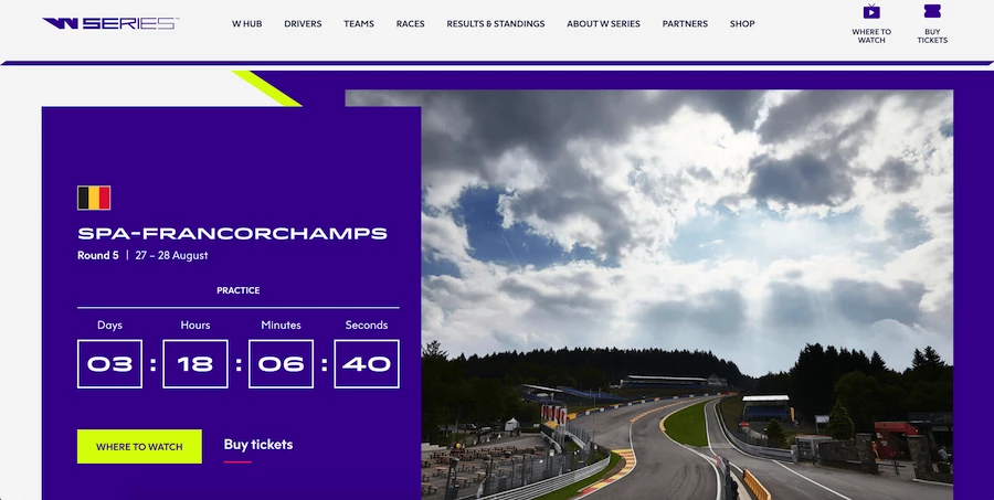
Standout features:
- Mega main menu
- Stream functionality
- Great use of accent colors
The website for W Series, an all-women motor racing championship cup, was created by Organic website design agency. Since the 2019 digital launch of the W Series, it required a digital presence that would enhance functionality and provide more consistent and refined aesthetics.
The minimalist visual flair and overhauled mega main menu provide rich content, updated weekly with every new race. The digital expansion of the W Series is also reflected in the site’s functionality to stream the races on any device.
The website’s navigation, site structure, and page design make the information easy to access. The quick page overviews are made possible with the clever use of modules and tab elements that come especially in handy for complex facets such as race stats.
Lastly, the majority of the website uses white negative space, while the accents in purple and electric yellow help numerous elements stand out.
12. Ryan Giggs by Steven Tan
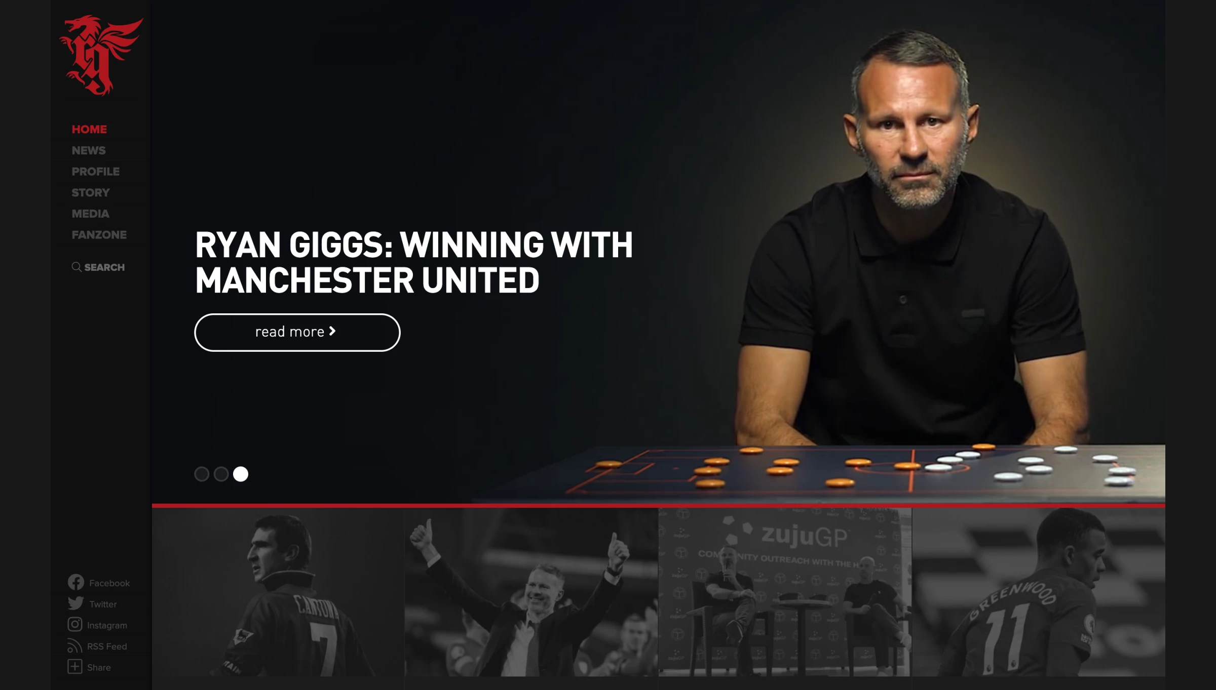
Standout features:
- National and club symbolism in the logo
- Color-labeled categories
- Sidebar navigation
Ryan Giggs is a British soccer legend. And what better way to enjoy the site loading time than to look at a silhouette of a soccer player running with the ball, reminiscing of all the times such scenes led to Giggs’ iconic moments.
Steven Tan effectively painted a life-like portrait of the player’s brand. The Welshman takes pride in his origins, so the website’s logo features his initials painted in red, embraced by a dragon. This mythical creature is the national animal of Wales, so Tan creates a magnificent portrayal of Giggs’ patriotism through this symbolism.
The homepage offers a preview of square-shaped highlights. As you hover over one of them, you’ll notice a color indicating which category the highlight belongs to (news, downloads, featured, etc.). On the left, you’ll find a handy sidebar with social media shortcuts and a search option.
13. Xperience Park By Mars Rouge
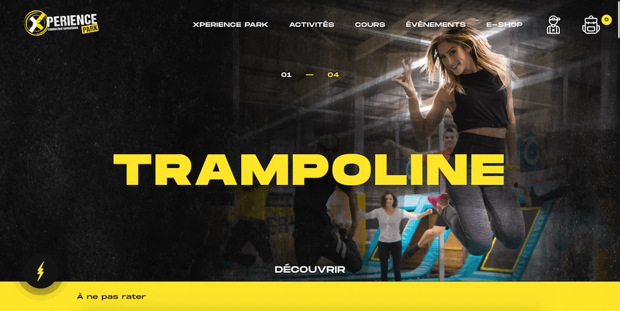
Standout features:
- Vibrant & contrasting color palette
- Excellent use of tabs module
- Online shop containing exclusive deals
Xperience Park leisure park located in the French region of Alsace offers multiple activities such as shuffleboard, Ninja Warriors, arcades, and even augmented reality-enhanced sports.
Their website, a product of Mars Rouge design agency, conjures the excitement of the place through a vibrant yellow-black color palette. The website aggregates info on activities, events, and even an online store on a single platform.
The main menu navigation is not only sticky but in line with the user’s journey. It also comes with an unusual appearance: uneven borders, an animated yellow circle to highlight the selected menu item, and the so-called mega dropdown menu showing the contained items with images, not just words.
The highly saturated photographs interrupted by the boxy “grid” layout of content arrangement balance out the information-rich middle section containing tabs module with multiple content pieces occupying the same space.
14. Orlando Pirates F.C. by Agent Orange Design

Standout features:
- A visually-appealing carousel
- A fixed navbar
- A variety of up-to-date media
Orlando Pirates F.C. is a South African soccer club, and Agent Orange Design made sure its website design reflects everything a player, coach, or fan could be interested in. The dominant imagery is in the club's official colors, black and red.
At the top of the homepage, you see a creative news-like carousel to help you keep up with the latest information. The navbar on top is fixed, so you can scroll around the website while retaining the option to access different pages, such as the club’s shop, fan zone, and social media accounts.
The homepage also highlights their current roster with another carousel of the players' photos. You can access various media covering Orlando Pirates' memorable moments near the bottom of the page.
15. Kitelement By Able.cz
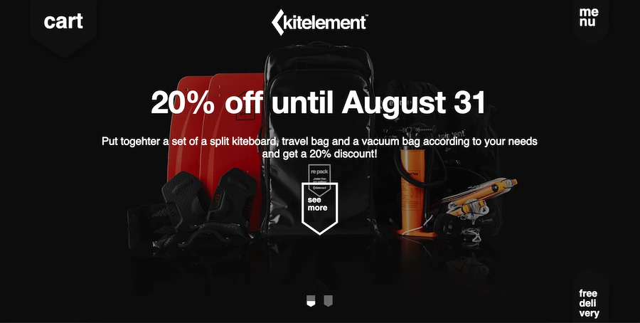
Standout features:
- Custom recurring design and navigation elements
- A main menu sliding in from the top
- Product pages open with a full-screen video of a product
Kitelement is an eCommerce website selling outdoor equipment, backpacks, kiteboards, travel bags, and other items used by avid freestyle aficionados.
The recurring design element, implemented by Czech design agency Able, is the downward arrow that appears in various forms throughout the website. It is apparent in the two top-side elements, the cart and the main menu button, the shape of a CTA button, and the screen/photo design frame that separates different sections as the visitor progresses on their user journey.
Within the arrow-shaped frame are hi-res images of the products or full-screen videos showing them in action. Various CTAs, from “Read now,” “Follow us” to “Shop now” utilize the same cutting-edge, sans-serif typography found elsewhere on the website.
The most interesting aspect of this website is the main menu navigation. Clicking on the menu button in the top right corner will open a quick-sliding menu across the entire screen.
Last but not least are the product pages, which showcase the items in full-screen videos before detailing specifications, price, and close-up images.
16. Team Elite Kickboxing By Framework Design
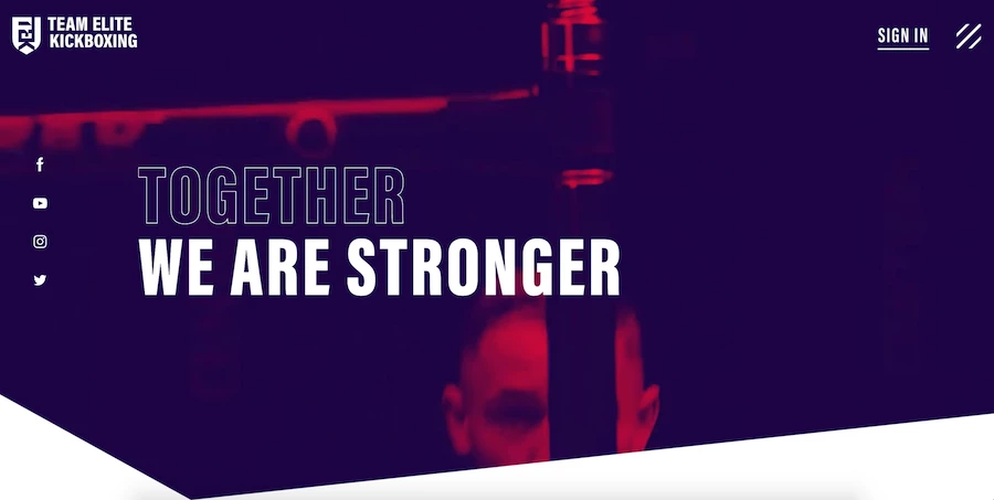
Standout features:
- Action-shot photography and videos
- White space against contrasting lively colors
- Unobtrusive sliding main menu
Team Elite Kickboxing is a kickboxing academy from Nottingham, UK. Their website is conceived, designed, and developed by Framework Design and relies heavily on videos – the most critical consideration of their work with this client.
A brand-led website captures the essence of the school, its values, and the skills they profess. The visual representation of the school branding demonstrates speed, precision, and agility – three core qualities of kickboxing.
Action-shot video in the site’s background, tinted in brand colors of purple and red, is incorporated within the graphic’s thin and sharp lines to convey the feeling of fast movements and precision. The bold colors and lines also represent the energetic personality of the Team Elite Kickboxing team.
The videos feature people of all ages and genders to encapsulate the school’s inclusivity and cross-generational appeal.
17. Juventus By Deltatre

Standout features:
- Well-incorporated team colors into the website design
- Brilliant use of various media
- User-oriented content
London-based agency Deltatre’s extensive experience in sports branding and web design has landed them a job of creating a website for Italy’s most successful soccer club – Juventus.
The stunning website opens with a full-screen video showcasing the current happenings in the club – at the time of this writing, it was the launch of the team’s third kit. Scrolling down displays the main portion of the website, including a distinctive main menu design that moves from the left side to the top.
The tailored Juventus font adorns the pages, as does the extensive use of multimedia such as videos, motion effects, and user-generated content like the fan’s Instagram feed containing Juventus memorabilia. The navigation is fairly simple and focuses mostly on the interaction with fans and exclusive content devoted to the club’s followers.
The minimal search bar takes up the top of the screen only when called upon. The black and white palette of the main menu, headers, module titles, and other details perfectly align with the current best practices in layout organization and is also an on-brand representation of the team’s colors.
18. Short Par 4 By The Movetic
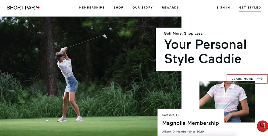
Standout features:
- A very distinctive menu navigation
- Accent color on CTAs
- Distraction-free shop pages
Short Par 4 is a brand that specializes in golf apparel. Their website is developed and designed by The Movetic creative agency.
Above the fold on the homepage, the main menu navigation is quite clearly indicated with a lot of white space. The thick white line leaves enough breathing room for menu items to be very noticeable among all other content on the page.
As is the custom with clothing eCommerce websites, large images take up the majority of the screen. Boxy modules and content sections utilize a very legible sans serif font in black color against the white background.
The explanatory messaging that describes the process of ordering the apparel is quite understandable and follows the natural progression of the user journey on the homepage. The CTAs use the red border to differentiate this vital element of the conversion funnel from the rest of the content.
19. GO180 by junction

Standout Features:
- Full-screen videos on a loop
- Strategic CTA placements
- Sticky navigation menu
GO180 is a company committed to helping people achieve their physical goals through guided diet, exercise, and lifestyle. They collaborated with junction, a creative and digital agency focused on branding.
Upon entering the website, visitors are greeted with a full-screen video display that plays on repeat. It showcases the whole gym facility and equipment used by coaches and trainees. Positioned in the center of the video is a distinct CTA button in white that redirects users to a Join Now page. The agency designed the website with a seamless transition in mind. Each section has a dedicated image background, a tagline, and a CTA that links them to different pages of the site.
It’s also commendable that the agency capitalized on the brand’s evocative images. Displaying these in full high-quality view gives the potential customers a peek at what kind of services they can expect from the brand.
Lastly, the sticky navigation menu is a smart decision. With this, visitors can easily access the page they need anywhere on the site.


-preview-webp.webp)