Standout features:
- Elegant & simple design
- Circular text
- Condensed sans serif typography
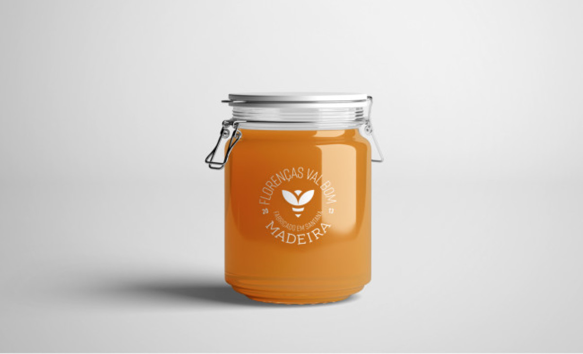
Florencas Val Bom’s packaging design places the product in the spotlight. JBW ensured to leave enough space for the honey to shine with this design while also alluding to the brand!
The designers went with a transparent honey jar, inviting customers to focus on the sugary star of the show. Sitting at the front center, you’ll see the brand logo with the brand name written around it.
The logo and the text are white, which, when mixed with the natural gold of honey in the background, provides a soothing visual experience. This elegant and simple design features a straightforward, condensed sans serif typography that further explores the unaggressive brand positioning, letting the product speak for the brand.
Get a chance to become the next Design Award winner.
SUBMIT YOUR DESIGN

-preview.jpg)

-preview.jpg)


