- Advertising
- Aerospace
- Agriculture
- Architecture
- Arts & Recreation
- Automotive
- Banking & Finance
- Content & News
- E-Commerce & Retail
- Engineering
- Entertainment
- Fashion & Beauty
- Food & Beverage
- Government
- Health & Wellness
- Hospitality
- Legal & Insurance
- Luxury
- Manufacturing
- Medical & Pharmacy
- Non-Profit
- Professional Services
- Real Estate
- Sports & Leisure
- Technology
- Travel

Pho-Kit's Packaging Design Is Based On Sustainability & Ease Of Use
Pho-Kit is a fast-food restaurant that serves ready-to-go Pho soups, one of the staples of Vietnamese cuisine. While its culinary leanings are traditional, the brand has quite a progressive stance on takeout packaging.
Lucca AM, a digital creative agency from Rockford, IL, has come up with user-friendly packaging that significantly reduces single-use plastic and the amount of waste.
The entire Pho-Kit takeout it consists of an easy to fold bag (packed with humorous imagery such as puns and cheeky takes on existing brands – more on that later in the article) and two cups for broth and noodles, or any other ingredient, hanging from the bag’s two openings. A pair of chopsticks in a sleek red container completes the takeout dining package.
Most packaging design agencies understand the increasing consumer demand for environmentally responsible products. That's why they try to lessen the design's environmental footprint while positioning the brand as more conscientious and forward-thinking.
While Pho-Kit's packaging still uses plastics, it reduces its amount significantly compared to most other takeouts. This makes it comparatively more eco-friendly, albeit not entirely ecological.
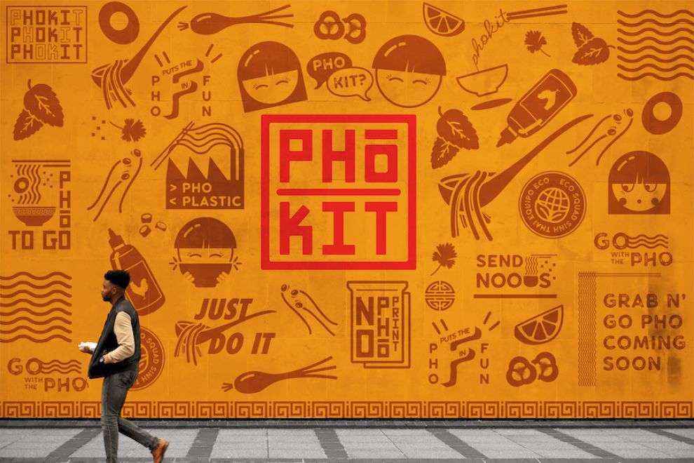
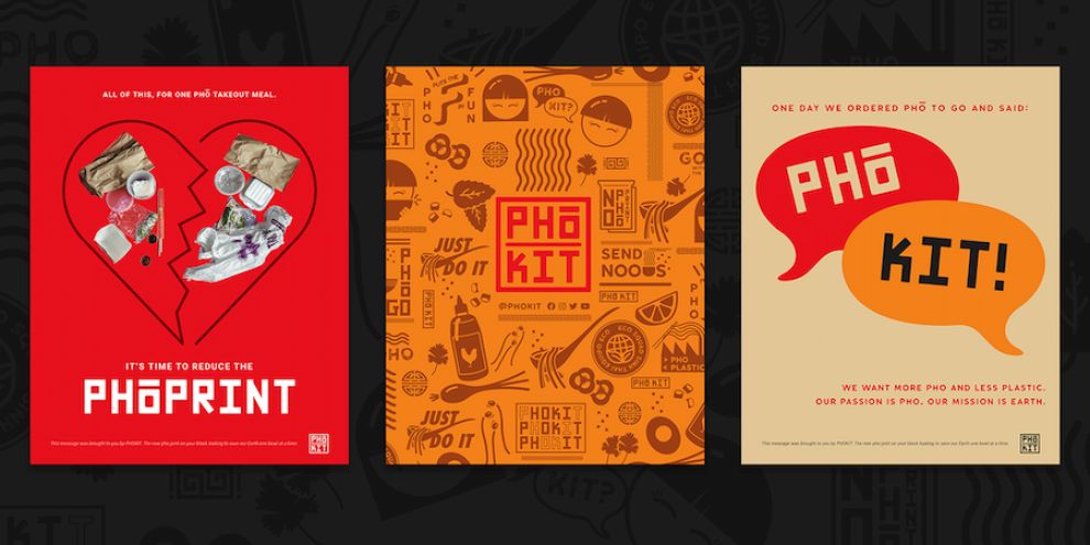
The defining visual trait of Pho-Kit packaging design is the use of edgy, contemporary iconographic details and striking brand colors. The agency also created a distinctive primary and secondary logo for the brand, as well as a unique typeface.
The excellent art direction makes all of these diverse elements work together in harmony.

Pho-Kit's Logotype Is An Important Part Of The Packaging Design
The design of Pho-Kit logo reflects the brand’s economical and efficient nature. According to Lucca AM, the logo’s lettering was constructed by “just one shape, by using a rounded rectangle,” allowing them to come up with a minimal and balanced geometric logotype.
Pho-Kit logo is an integral and a very important part of this packaging design. It takes up a big amount of space on the packaging, lends branding and unique identity to it.
The agency has created two types of logos and four differently colored iterations in each type. Branding experts adopt this strategy to offer versatility and adaptability. Multiple iterations of the logo allow the brand to maintain its visual consistency across various digital or print platforms.
Here, the primary logo consists of the word “Pho” on top of the word “Kit” with a separator line between them. They are framed with a solid line square.
The secondary logo is also squared but has the words “Pho” and “Kit” next to each other with a vertical separator between them.
The four logo versions in both primary and secondary category come in four unique brand colors: bright red, orange, black and beige. The color of the logo depends on the color of the takeout bag background: for example, the beige logo appears on black background, white logo sits on the red background and so on.

How Pho-Kit's Packaging Integrates Playful Typography Into The Design
Bits of fun and seemingly random text appear all over the Pho-Kit packaging. The lighthearted brand tone is apparent in such witty double entendre as “Send noods,” “Go with the Pho” and notable others.
To go along with such unconventional copy, the agency designed custom typography for the client. The sans-serif font type, Klasik, resembles the infamous Comic Sans font in that it also looks like it belongs in comic books’ speech bubbles.
The typography plays into the overall packaging design by adding a valuable element that connects with the target audience on an emotional and intellectual level. It makes the text on the packaging stand out and provide personality to the design.
Similarly to the logo, the font also comes in several different styles. Each style is very on-brand and suited for Pho-Kit's laid-back persona and casual messaging style.

Brand-Consistent, Fun Icons & Graphic Elements Give Pho-Kit Packaging Design Its Zing
Accompanying this zany copy are the equally offbeat icons, illustrations and graphic elements scattered all throughout the Pho-Kit packaging design
Simple vector illustrations of Pho bowls, children consuming Pho soup and, especially, a very cheeky take on the Nike’s “Just do it” tagline, make up the utterly delightful conundrum of visuals.
These are chiefly reserved for the actual bag design, which is the eccentric half of the Pho-Kit packaging design.
Unlike The Takeout Box, Pho-Kit's Food Container Design Is Understated
It should be noted that the cups/food containers are low-key compared to the Pho-Kit bag.
Sporting different shades of beige, the cups are remarkably spartan in their design, with one very eye-catching element: the broth container has a wavy graphics that signifies a liquid content, while the noodle container has multiple wavy lines – again, signifying the appropriate food content of its own.
This contrast in design actually benefits the overall packaging’s look – plus, when paired and carried together with the bag, the cups are clearly noticeable.

Pho-Kit Packaging Design Reduces The Brand’s Carbon Footprint & Engages The Consumer
Lucca AM’s Pho-Kit packaging design is proof that you can have your Pho soup and eat it, too – or in clearer terms, that sustainable, eco-oriented products can be quite fun and eye-pleasing.
The agency’s deliverables envelop much more than mere packaging: logo design, brand colors, brand typography, icons...All of these contribute to a much broader, well-defined visual identity condensed into a single takeout package.
Add to this the fact that they have successfully eliminated substantial quantities of plastic waste and it’s quite evident that we have a winner on our hands. And we don’t just mean the winner in our Packaging Design Awards category for July 2021.
- Industries:Food & Beverage


