In a saturated FMCG market where design is often overlooked, Reitan Retail, Norway’s leading grocery chain, partnered with Magiska Design Sverige AB to transform the humble Skippack Tunfisk into a category standout. The final design is a retail asset that blends visual tradition, functional clarity, and brand equity in one scalable system.
Key Insights for Brands:
- Use color coding to improve product recognition
- Incorporate illustrations to boost perceived quality without losing mass-market appeal
- Design labels with a visual hierarchy to guide faster purchasing choices at retail
Magiska Uses Illustration to Signal Provenance and Transparency
People trust what feels real. That’s why “transparent sourcing” and “visual authenticity” are now top drivers of food trust, according to a 2023 report by FMI and NielsenIQ. Magiska Design Sverige AB leans into that insight, using vintage hand-drawn illustrations to give Skippack Tunfisk a look that feels honest, crafted, and rooted in tradition.
The 360° wraparound illustration ensures visibility regardless of how the can is displayed — stacked, upright, or side-by-side. It transforms every viewing angle into brand reinforcement. This matters in busy aisles, where only 30–40% of the packaging is often visible.
For health-conscious and sustainability-minded shoppers, the vintage fish illustration signals trust. Its handcrafted detail and nod to traditional fishmonger signage imply quality and transparency, suggesting the product is as honest as it looks. No slogans needed.
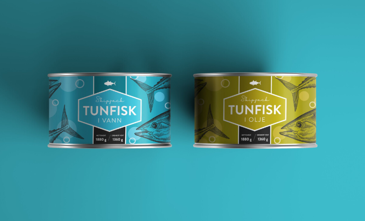
Skippack Tunfisk’s Color Differentiation Packaging Improves SKU Clarity

The effectiveness of color-coded product lines in enhancing brand recognition within busy retail environments is a well-documented principle in marketing and visual psychology. For the Skippack Tunfisk brand, each SKU is immediately distinguishable: turquoise for “in water,” olive for “in oil.” It’s a classic signal-vs-noise exercise.
In color psychology, color acts as a fast, potent visual cue, helping shoppers quickly distinguish between variants while reinforcing brand recognition. In this design, the near-monochromatic palette creates strong visual separation between SKUs without overwhelming the core elements.
This restraint allows the bold brand name to remain dominant, while the intricate fish illustration supports it with texture and authenticity, enhancing shelf presence without competing for attention.
Additionally, the bubble patterns add motion and freshness, enhancing the design without disrupting visual clarity. Most importantly, visual consistency carries through across formats, whether print, 3D, or digital, ensuring the brand feels cohesive in both physical and online spaces.
Explore the best colorful packaging designs that turn heads and drive sales.
The Label’s Visual Hierarchy Is Built for Split-Second Clarity
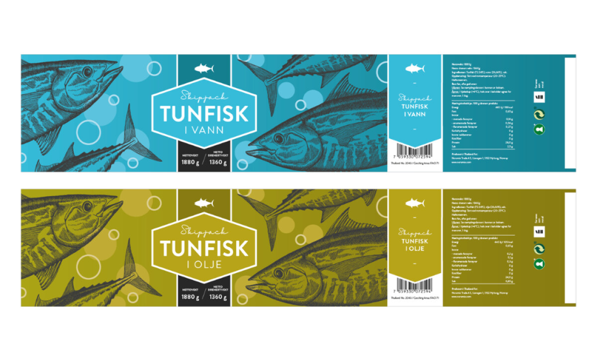
At the core of the label is a hexagonal frame that systematizes product information: brand name, variant, and format. This layout significantly improves first-glance comprehension, which is crucial because human vision processes information in rapid "snapshots" (fixations) lasting 100-500 milliseconds, rather than a continuous scan.
Typography also does heavy lifting. A friendly script adds personality, while a neutral sans-serif ensures readability. This blend softens the design without compromising clarity. Technical specs like net and drained weight are housed in high-contrast black boxes, an effective tactic for drawing attention to decision-critical data. All supporting information, such as nutrition, sourcing, and barcode, is isolated to one vertical edge, minimizing visual noise and keeping the product structured, clean, and easy to evaluate.
Consistent Label Architecture Prepares the Brand for Retail Realities
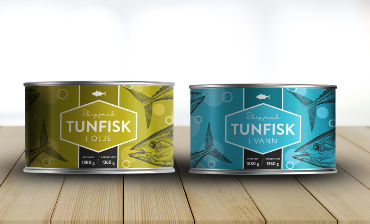
Magiska designed the packaging for the realities of convenience and discount retail. Its wraparound symmetry allows for optimal orientation across shelves, bins, and stacks, maintaining brand visibility in fast-paced, space-limited environments. Its compact size strikes the right balance: small enough for efficiency, bold enough for visibility.
Sustainability and nutritional icons are subtly included, such as the Green Dot (Grønt Punkt), which signifies compliance with extended producer responsibility, and the Keyhole Nutrition Icon (Nøkkelhullet), indicating the product meets Nordic health standards for nutrition. That level of clarity matters, as 64% of global consumers now factor health and environmental impact into food purchases.
Finally, the design’s consistency across variants ensures that returning customers don't have to “re-learn” the package, reducing friction and increasing loyalty. In short, the design builds habits.
The Skippack Tunfisk redesign demonstrates how even low-margin grocery staples can become branding assets. It shows how a professional packaging design agency can turn functional packaging into a marketing advantage built on heritage, usability, and strategic restraint. For brands operating in crowded categories, this is a playbook worth studying.
In a time where private-label competition is surging and shelf space is shrinking, intentional packaging design is a growth strategy.
Magiska Design's level of thoughtful execution is what earned the project this month's Design Awards win. Skippack Tunfisk’s packaging stands as a benchmark for how intentional, brand-led design can elevate perception and consumer experience, earning its place among the best packaging designs in today’s grocery retail space.


