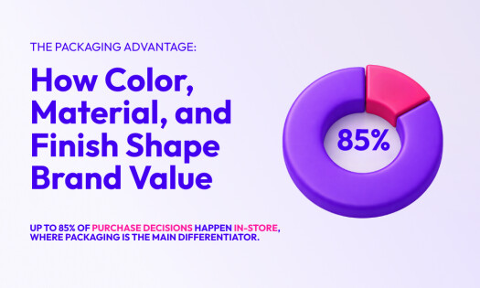
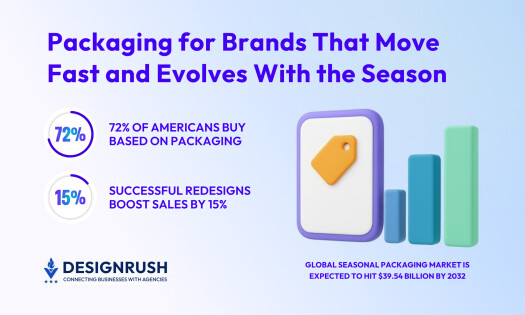
They say looks aren’t everything. But when it comes to product packaging design, it mostly is. As much as 72% of US consumers say that it influences their buying decisions.
Simply put, product packaging should never be an afterthought for any business, which is why packaging design companies take much into consideration to influence business outcomes for years to come.
In this article, we list the best packaging designs that entice consumers, obliterate the competition, and conquer retail shelves.
1. The Harmonist By The Graphic Brands

Standout features:
- A contemporary bottle shape
- Distinctive label colors
- Classic typography
The Harmonist is a brand of multiflavored gin alcoholic beverages whose remarkable package design is the work of Graphic Brands. The client approached the agency to get their premium brand in touch with the current market and their target audience’s expectations.
To achieve this, the agency worked live with the client through a series of “live amends” during which they incorporated suggestions to give the bottle its final shape. According to the Graphic Brands team, “This ensured feedback was acted on immediately, which helped the client visualize various design options during the online meeting.”
The agency used its vast knowledge of the retail food and beverages market to formulate a concept for a premium label that works within an affordable price range.
The final design is a sleek yet sturdy bottle with a wide base and a short neck, featuring a label with plenty of hand-drawn illustrations of flowers, herbs, and plants. These illustrations – as well as a distinctive label color – depict the gin’s specific flavors and ingredients.
The highly stylized and flamboyant typography doesn’t break away from the tradition of gin drinks’ fonts, keeping the welcome familiarity and historical continuity with this particular product throughout the decades.
The letter “A” in “harmonist” with its two elongated wings portrayed harmony and equilibrium to bring together a brand name that complements the flavor’s exquisite balance.
2. Pure Nosh By Slice Design

Standout features:
- Unpredictable, surreal designs
- Absurd character collages
- On-brand messaging
Pure Nosh is a British brand of multi-flavored, handmade tofu chips. Slice Design branding company is behind this product’s package design whose aim was to convey its “tantalizing range of snacks.”
The agency used the brand’s slogan “Don’t take life too seriously.” to create packaging that reflects the brand’s cheeky nature. Each packaging design corresponds to four individual flavors with its own personality and use of zany collages that “mirrors the surprising combination of tofu and snacking.”
The four different designs feature four distinct central characters reminiscent of Terry Gilliam’s work in Monty Python – an iconic and quintessentially British TV series famous for its absurd and unexpected humor.
These characters have faces of different people and/or creatures pasted crudely onto a body of something or someone radically different.
The background is a collage of sorts — various elements irreverently presented in different styles. The flavors also have distinct colors while the brand name stands atop in unique, script-like typography.
Pure Nosh package design is deliberately “noisy” to go against the wave of current minimalist trends.
3. Azeka’s Sauce By SCI Creations

Standout features:
- Visual cues from Hawaii’s cultural heritage
- A distinguishing bottle neckline
- Mutually contrasting colors for each flavor
Azeka’s Sauce is a Hawaiian food brand with a longstanding tradition and reputation. Interestingly enough, it was a Kickstarter campaign that resuscitated this locally famous name. Their rebranding and package design efforts were aided by SCI Creations design agency that would emphasize the sauces' diverse applications in a variety of cuisines.
As per the agency’s admission, the “goal was to create a cohesive brand that was united in its look and appearance.” This effectively translates into the same layout for each bottle with certain distinctive elements that stand out in order to show off the unique character of each flavor. On top of that, the agency also wanted to imprint a recognizable Hawaiian identity upon the packaging.
From the very shape of the bottle featuring a distinguishing neckline to the color of each sauce giving the bottle its character, Azeka’s Sauce package design is much more than just a label – it is a synergy of the product, the shape of the container and the intricate design elements.
As is custom, each flavor comes with a distinctive color that is prevalent on the label. Geometrical patterns akin to the natives of these isles reveal the identity that is deeply rooted within greater areas of the Pacific since such patterns can be found in Micronesian and Polynesian cultures.
The brand name in electric yellow stands quite vividly against the label’s negative space. The rest of the lettering uses a very legible sans serif typography, also in white, to contrast the vibrant label color.
4. Proper Oats By Brash Creative

Standout features:
- Easy-to-use container
- Simple messaging
- Eye-catching design
Proper Oats is a popular brand of ready-to-eat oatmeal from the UK whose market rise was facilitated by the endorsement of entrepreneur Deborah Meaden and its appearance on the BBC’s The One Show. Its package design is a creation of Brash Creative agency.
They set out to create an “eye-catching packaging that provides ample amounts of shelf standout” to compete in the brand’s saturated space and yet reflects the product accurately. They also aimed to educate the consumers on the concept of overnight oats and communicate the fun and healthy flavors through the choice of colors.
The result is a very contemporary-looking design with instantly recognizable flavor profiles and a “ready to eat” message highlighted on the packaging. The messaging rejects the scientific jargon, making the entire concept universally comprehensible to a wider audience.
Each flavor features its own signature color all over the packaging, with little to no white surfaces that would break the wholeness of the solid color palette. Different, darker shades of each color – pink for raspberry and green for apples – are featured on the wording and other visual elements for legibility.
5. Cá Bay Chocolate By Brand Intheblack

Standout features:
- Emphatic brand identity
- Striking on-brand colors
- A symbolic logo
Cá Bay is a bar of gourmet chocolate manufactured in Binh Thuan, Vietnam. Its brand identity and package design were formulated, developed, and delivered by Brand Intheblack.
The visual design approach explores all facets of the brand’s presence, the diversity of chocolate flavors, the meaning behind its concept, and the desired messaging. The logo, the colors, and the typography all play their role in presenting this chocolate experience as unmatched on the local market and ready to take on the world.
The brand name that means “carp jumping over the dragon gate” is placed prominently in custom rounded fonts. This symbolic depiction communicates the significance of “powerful transformation and moving forward” in sacred Asian traditions.
Cá Bay package design took this guiding principle in the packaging’s visual cornerstone. Simplified and enlarged on the packaging, these elements make the chocolate flavor stand out and provide a connection to the brand story and origins.
These elements result in striking packaging that lends a popping effect to a product that usually stands beside dozens of others on retail shelves. The thematic storyline connects with the producer’s cultural heritage, making it instantly understandable to the chocolate’s primary market.
6. Kombucha Cocktails By Campbell Creative

Standout features:
- Neon color accents
- Cut-through etchings
- Hand-drawn illustrations for each flavor
Kombucha Cocktails is an all-natural and organic beverage aimed at health-conscious consumers. Campbell Creative has designed product packaging that is impactful on the shelf and true to the brand’s original mission and vision.
The idea for Kombucha Cocktails’ package design originates from the agency’s desire to “stop a consumer’s scan, make them pick up a can, and ultimately toss it into their shopping cart.”
This mission of creating a beverage can that consumers will not resist picking up and putting in their shopping cart resulted in a striking matte black can with neon accent colors. This is combined with custom drawings paired according to individual flavors that were cut through the label to reveal the metallic can beneath.
The illustrations depict a different natural setting for each flavor - each scene contains a symbolic link to the drink’s effect it has on the drinker’s health and well-being.
The agency tried out several different illustration styles and decided on the hand-drawn aesthetics that come to life through the etchings on the matte label.
The “U” in the logo mark represents the tab on the can, colored to match the logo. It is designed to be bold with subtle organic edges within the typeface.
7. World Chef By PKG

Standout features:
- A design that embraces international varieties
- A unique font throughout
- Palette focusing on two colors only
World Chef is a food and beverage brand whose branding and packaging design is the work of PKG agency. The end goal was to "capture a growing consumer desire for new international and ethnic flavors." The resulting packaging conveys World Chef's devotion to respecting the authenticity of international cuisine.
To depict this encounter with different cultures and encourage consumers to indulge in them, the agency created a design that relies on famous landmarks of different nations. A different package was designed for each new food pairing, as the "brand’s engraved iconography and shopworn feel allows the bright, colorful ingredients to pop" in order to highlight the quality of the ingredients.
A delightfully delicious image of a dish is featured prominently on the front of the bag, with a single serif font of varying sizes communicating the dish's name, ingredients, and other consumer info of note.
More succulent imagery and in-depth content that elaborates the messaging on the front are found on the back of the packaging. A shade of beige is the primary color for the bag, with accents — depending on the type of food inside — coming in various colors.
The Thanksgiving edition of the packaging uses a unique and interesting take on an illustration of a Turkey with colorful lines in the background, limiting the palette to brown, blue, yellow, and green.