Best Wine Packaging Designs of 2026
All time Best Wine Packaging Designs of 2026
Wine
- Advertising
- Arts & Recreation
- Automotive
- Bread
- Chocolate
- Condiment
- Condom
- Dairy Product
- E-Commerce & Retail
- Eco and Sustainable
- Entertainment
- Fashion & Beauty
- Food & Beverage
- Frozen Food
- Health & Wellness
- Honey
- Hospitality
- Jewelry
- Luxury
- Manufacturing
- Medical & Pharmacy
- Medicine
- Olive Oil
- Pet Food
- Skincare
- Soap
- Spirit
- Sports & Leisure
- Technology
- Toys and Games
- Travel
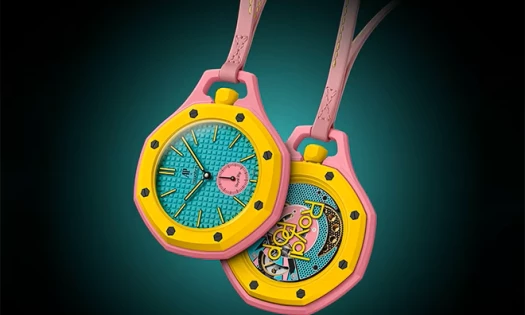
- Watch Branding
- Wine
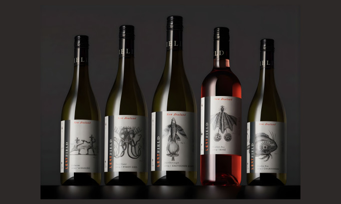
Left Field Wines
Folk Tale®
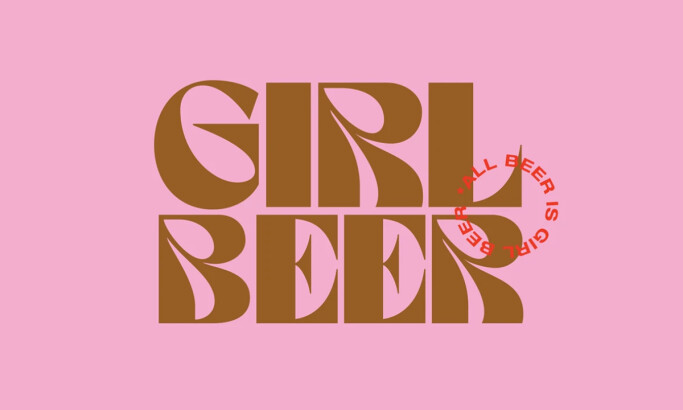
Girl Beer
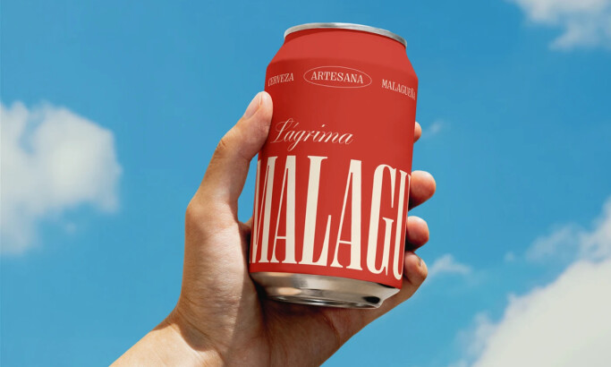
La Malagueña
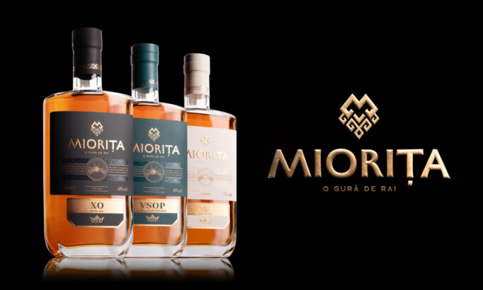
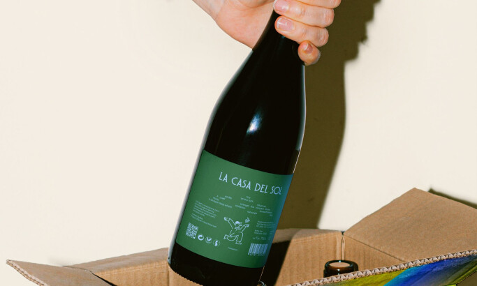
Miorita Vinars
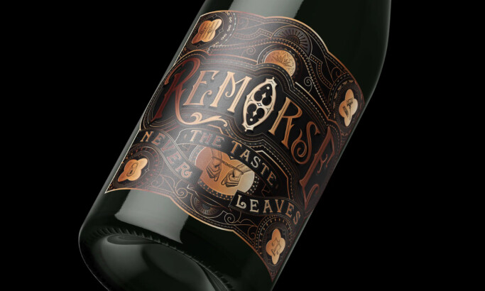
Remorse
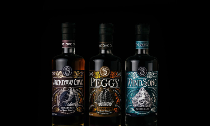
Far Shore Merchants

Fazio
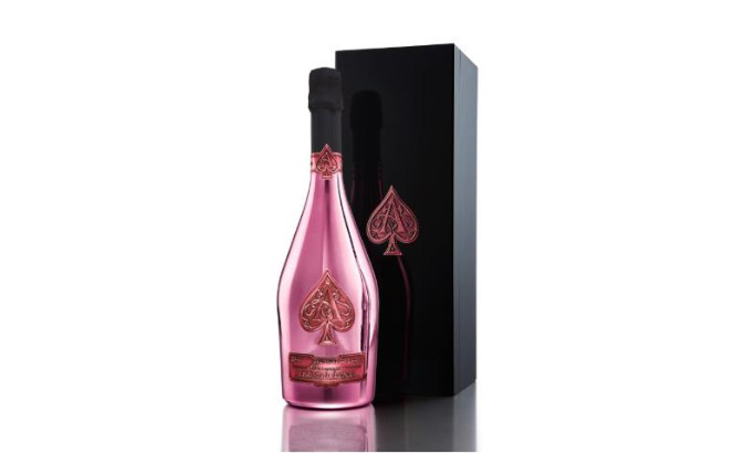
Armand de Brignac
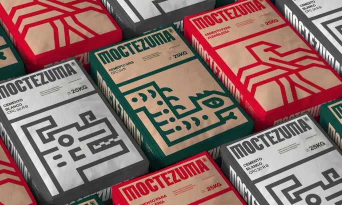
Moctezuma
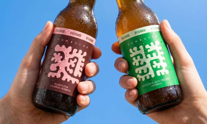
Fooshi
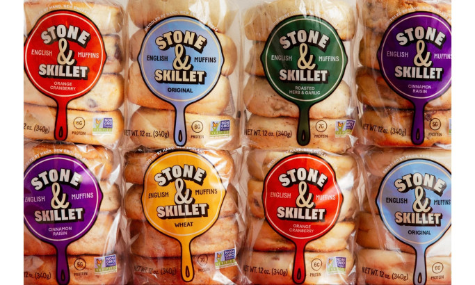
Stone & Skillet
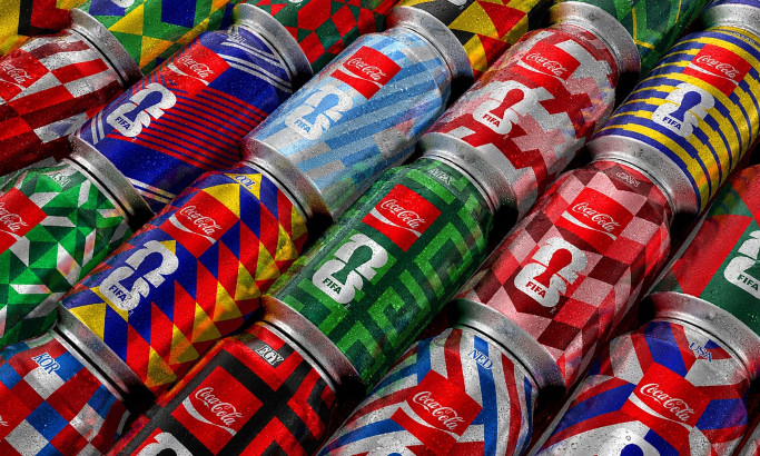
Coca-Cola FIFA World Cup 26 Collectible Country Cans
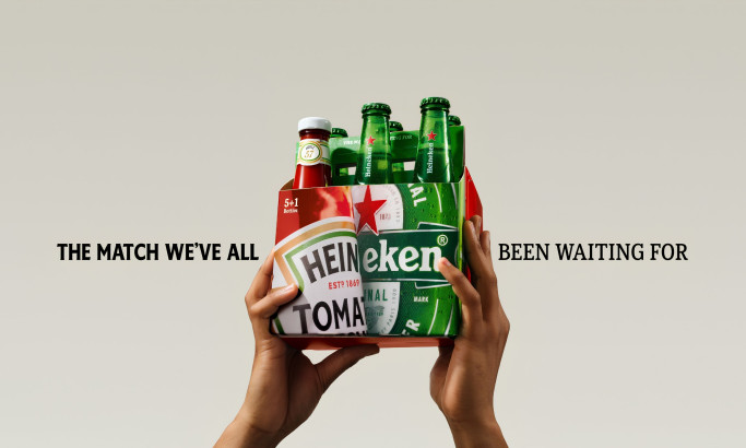
HEINZ x Heineken® Limited Edition Six-Pack
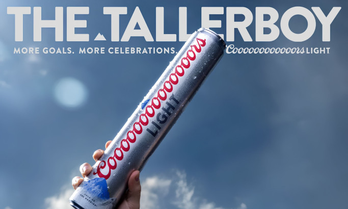
Coors Light Tallerboy
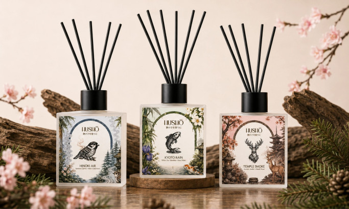
Hushō

Mật Mã Gift Set

I AM ITALIANO
The Design Research Process
Our design research process is a dynamic journey in the ever-evolving landscape of packaging design. We search the web, contact brands and agencies, and evaluate the designs worthy of being part of our collection. To be acknowledged among the best packaging designs, one must master innovation, trends, impact, functionality, user experience, and even branding.
Designs that manage to transcend expectations and take packaging aesthetics to the next level gain recognition, and the finest among them may advance further and compete for the title of Design Award winner.
If you believe your design embodies these principles, you too can submit it for consideration, contributing to the vibrant tapestry of packaging design excellence.


-account-photo_listing.jpg)
-account-photo_listing.jpg)