
Packaging Design Awards
Packaging
Award Winners
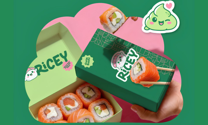
Ricey
Designed by
AnaZeli Design
award winnerJUNE 2026
9.4/10
 AO10.00
 AO9.50
 BS9.00
 KS9.00
 LB9.50
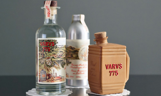
Varus 775
Designed by
OlssønBarbieri
award winnerJUNE 2026
8.7/10
- AO10.00
- AO9.50
- BS10.00
- KS5.50
- LB8.50
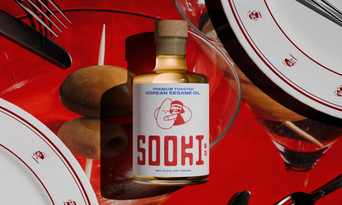
Sooki
Designed by
The Collected Works
award winnerJUNE 2026
8.4/10
- AO9.50
- AO8.50
- BS9.00
- KS7.00
- LB8.00
Visit website
View Design
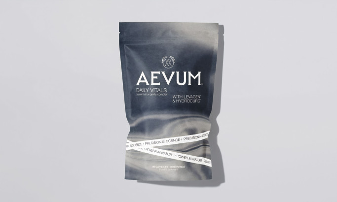
AEVUM
Visit website
View Design
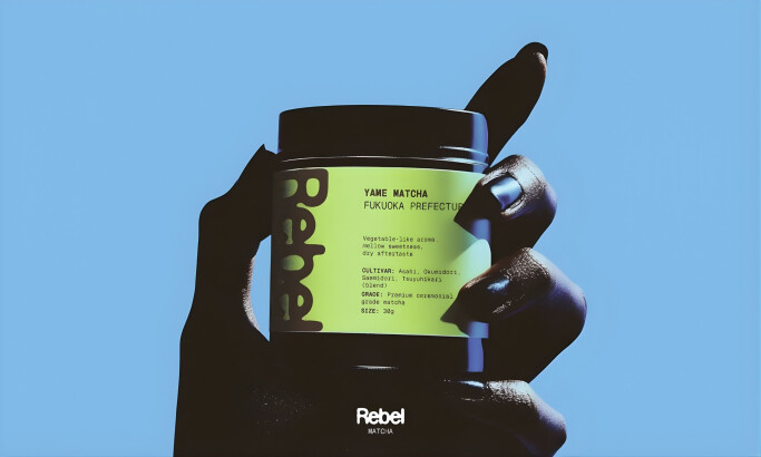
REBEL Matcha
Visit website
View Design
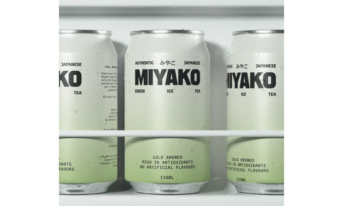
Miyako
Monthly Competition Countdown
Submission are still open
10 Designs Submitted
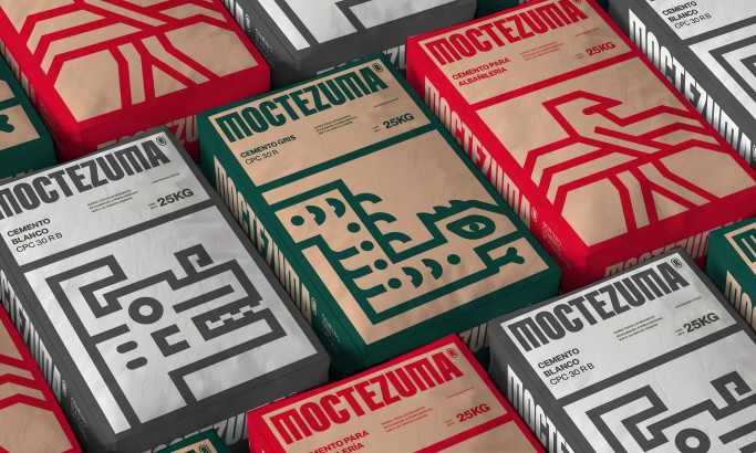
Moctezuma
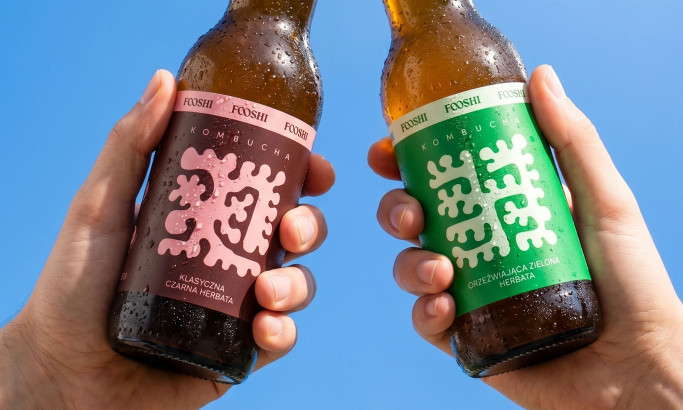
Fooshi
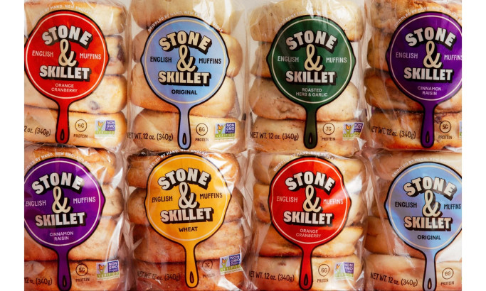
Stone & Skillet
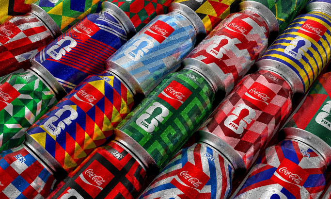
Coca-Cola FIFA World Cup 26 Collectible Country Cans
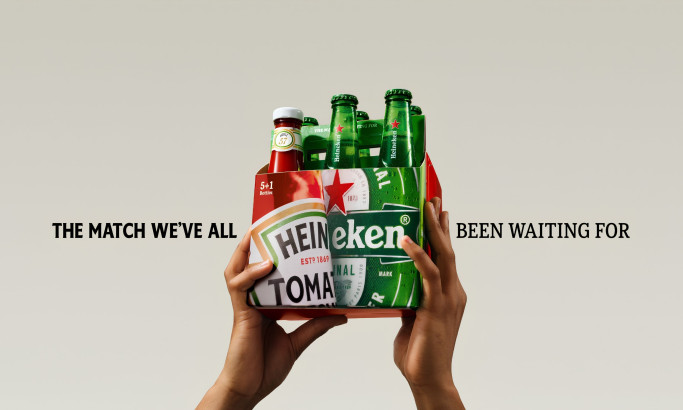
HEINZ x Heineken® Limited Edition Six-Pack
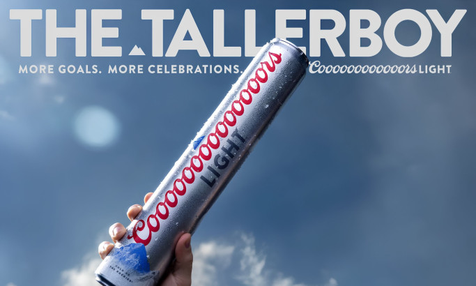
Coors Light Tallerboy
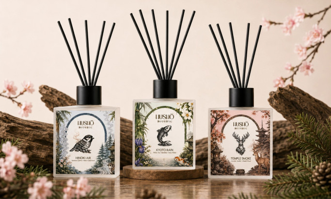
Hushō

Mật Mã Gift Set

I AM ITALIANO
Industries
- Advertising
- Arts & Recreation
- Automotive
- Bread
- Chocolate
- Condiment
- Condom
- Dairy Product
- E-Commerce & Retail
- Eco and Sustainable
- Entertainment
- Fashion & Beauty
- Food & Beverage
- Frozen Food
- Health & Wellness
- Honey
- Hospitality
- Jewelry
- Luxury
- Manufacturing
- Medical & Pharmacy
- Medicine
- Olive Oil
- Pet Food
- Skincare
- Soap
- Spirit
- Sports & Leisure
- Technology
- Toys and Games
- Travel
- Watch Branding
- Wine
Ricey
Varus 775
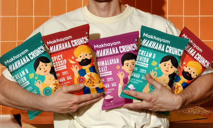
Makhyam Crunch
Sooki
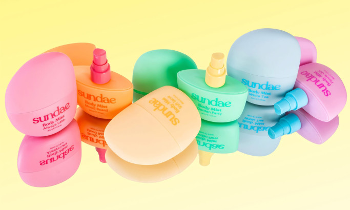
Sundae Body Mist
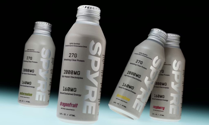
SPYRE
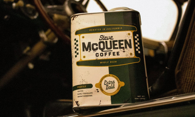
Steve McQueen Coffee
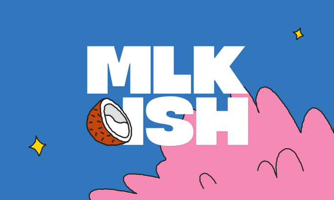
MILK’ISH
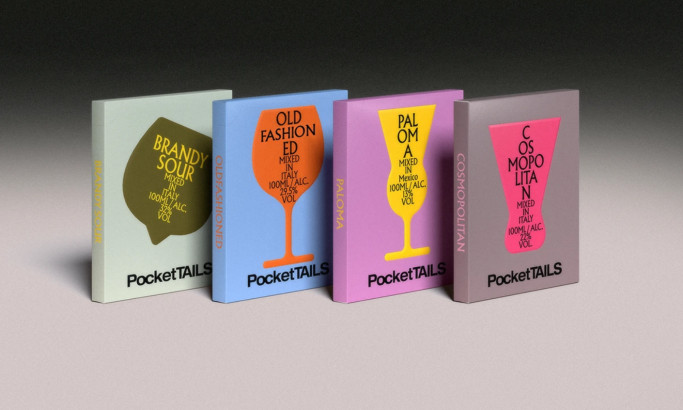
PocketTAILS


-account-photo_listing.jpg)
-account-photo_listing.jpg)


Each juror is selected for their expertise in areas such as branding, digital design, illustration, and user experience, ensuring every entry is reviewed with fairness and insight.
Our Jury has worked with Prada, Nike, Chanel, Google, and Apple. Can you join them?
Design Awards Evaluation Criteria
Impact
- How well does the design command attention and elicit a response from the user?
Creativity
- Was the design unique and resourceful in its techniques, tools, concepts, and materials?
Functionality
- Was the design able to achieve its purpose and improve the user's experience?
Execution
- Was the design detail-oriented in its execution process and final presentation?
Branding
- Was the design effective in reflecting the brand it represents?
Frequently Asked Questions
Click on a question to expand and see the answer
What is the ROI of winning a DesignRush Award?
Winning is a trust and conversion asset you can reuse everywhere. With DesignRush Awards, the ROI typically shows up in:
- Sales enablement: winner status + laurels/badges strengthen proposals, pitch decks, and “why us” sections, helping reduce friction in late-stage deals.
- Visibility inside DesignRush: winners get stronger positioning on category and awards-related pages, which can support inbound interest from businesses browsing agencies.
- Marketing content: winner announcement + shareable assets give you ready-to-publish social, newsletter, and PR angles to keep your work circulating beyond the campaign window.
How does the voting process work?
DesignRush Awards can include public voting windows for eligible competitions. When voting is enabled, visitors vote directly on the competition page and those votes contribute to the final result for voting-based outcomes.
Some formats (for example finalist showcases) may be displayed without voting. The page will clearly indicate whether voting is active and the exact voting dates for that cycle.
Some formats (for example finalist showcases) may be displayed without voting. The page will clearly indicate whether voting is active and the exact voting dates for that cycle.
What do winners receive?
DesignRush Awards winners receive:
- Winner recognition on the platform (winner status displayed on the awards experience)
- Digital laurels/badges for website, proposals, and social
- Winner announcement visibility during the awards cycle (shareable winner feature you can circulate)
- Stronger placement opportunities tied to awards and community exposure as the program pushes winners and top projects
How are entries judged?
DesignRush Awards entries are reviewed with a focus on both design excellence and effectiveness. In practice, evaluation is based on criteria like:
- Concept and originality
- Visual craft and consistency
- Clarity, usability, and execution quality (especially for web and digital)
- How well the work solves the stated problem for the intended audience Judging is category-aware, so what matters most depends on whether it’s branding, web, product, digital, etc.
Is there a fee to submit?
Yes. To enter the DesignRush Awards, you submit through an active subscription. The subscription is what unlocks your entry, your competition placement, and the related winner assets/visibility if you place.