Community Teamwork is a professional organization which drives change for the communities it serves. Typically, they help to improve housing, education and economic opportunities that reduce poverty in specific areas, and thus, strengthen these communities.
Figmints, the Rhode Island-based creative studio, were tasked with the challenge of updating the Community Teamwork brand with added personality and legibility whilst still maintaining the context of their history.
They were able to compile a series of marketing materials around their proposed print designs, which included:
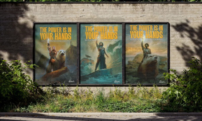
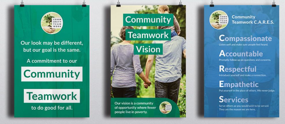
- Table tents and posters to showcasing the new face of the company,
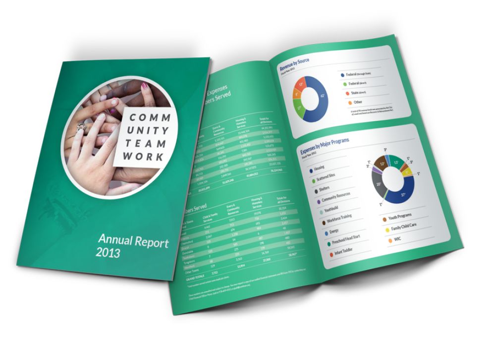
- An annual report to explain the new brand story,
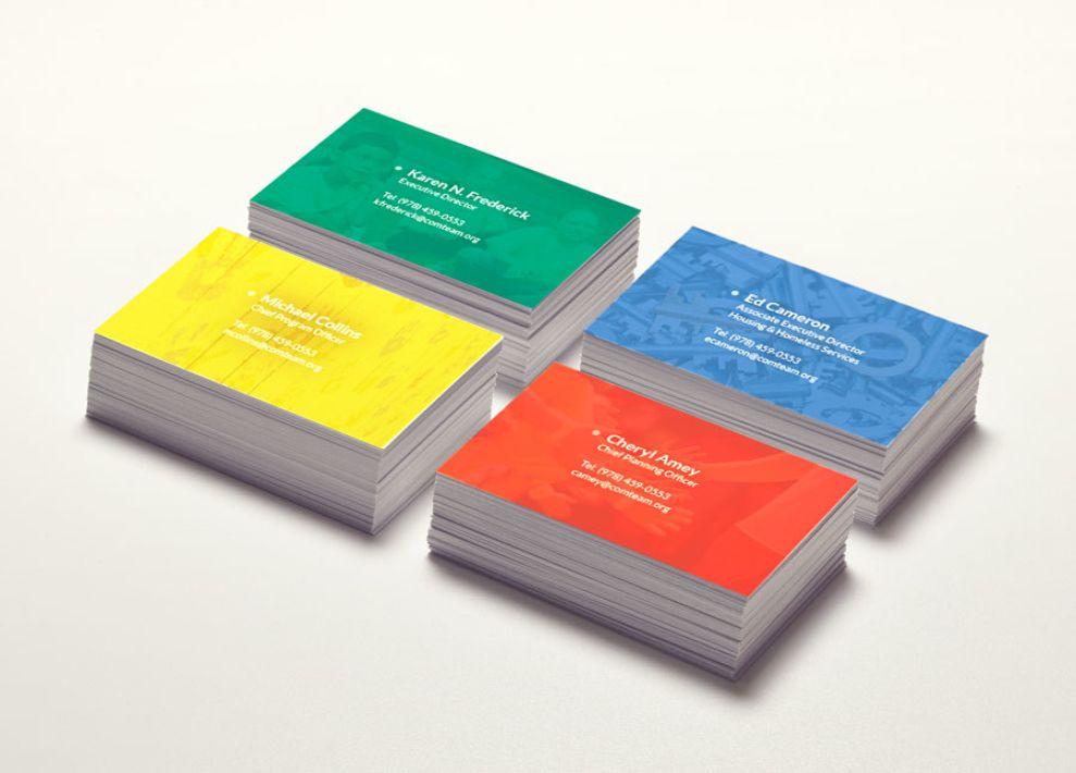
- Business cards for the promotion of the brand, and
- Some fun apparel concepts, like t-shirts where the center of the logo is open to being filled in by the wearer.
In terms of design, the annual report underwent most in-depth development. The brand needed to be presented in a fashion that struck a balance between the global impact of the work they were doing, whilst also considering the personal stories of Community Teamwork’s clients. This was achieved by using a series of visually impactful graphics that represented the facts and figures involved.
Throughout the designs, there is a color code in place to highlight the different subsidiaries. Across most of the printed materials, color is used as either a powerful accessory for showcasing statistics or as an eye-catching tool to grab your attention i.e. the business cards. These colors are also shaded in a way that appears to make the overall appearance of the printed designs more welcoming and cheerful.
The fonts used throughout the designs are from the San Serif family, with the weighting used ultimately being the differential factor between the headings, sub-headings, and paragraphs. Having most of the text in white also adds an element of purity and integrity to the designs, which aligns perfectly with the aforementioned objectives of the designs.
One Brand One Community is a colorful print design in the Non-Profit industry.