Check out this list of the best health and wellness print designs and see how the best print designers combine information and aesthetics. These designs are visually pleasing standouts.
Need more inspiration? Head to our best print designs catalog for the finest prints and posters!
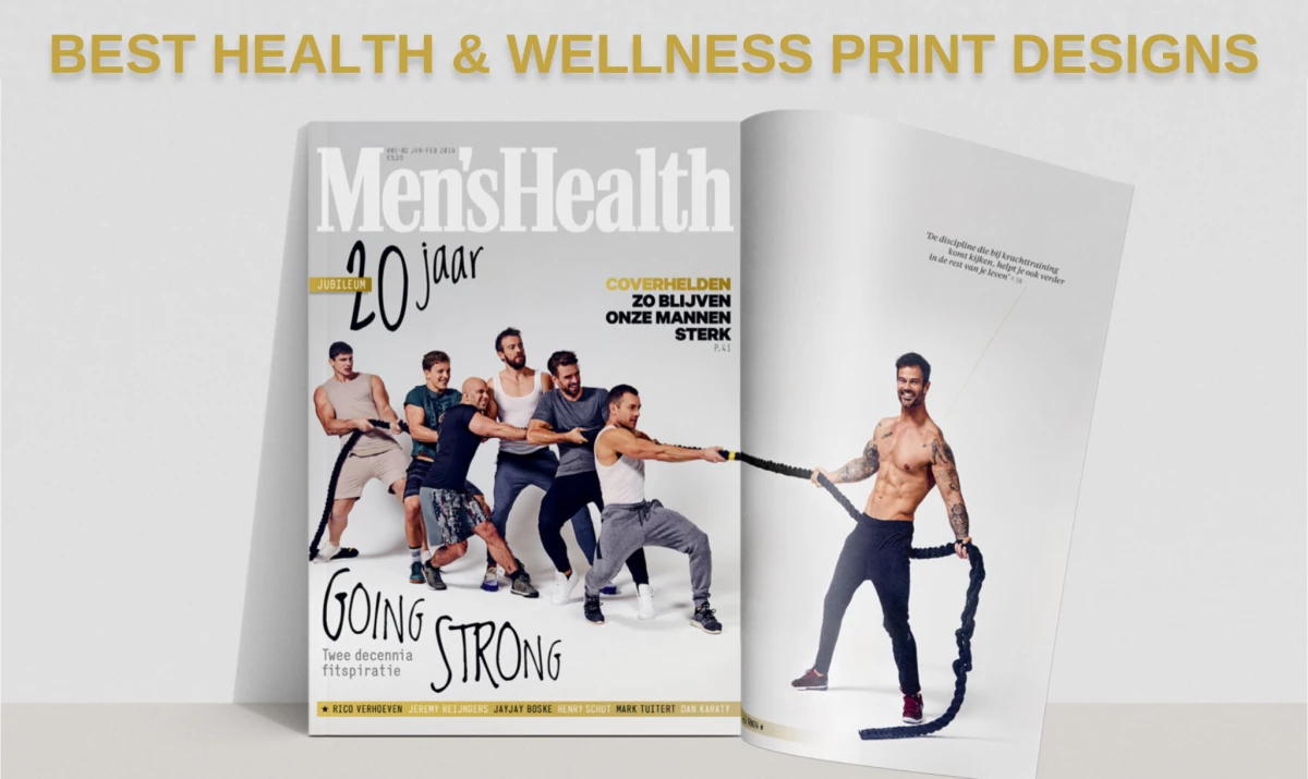
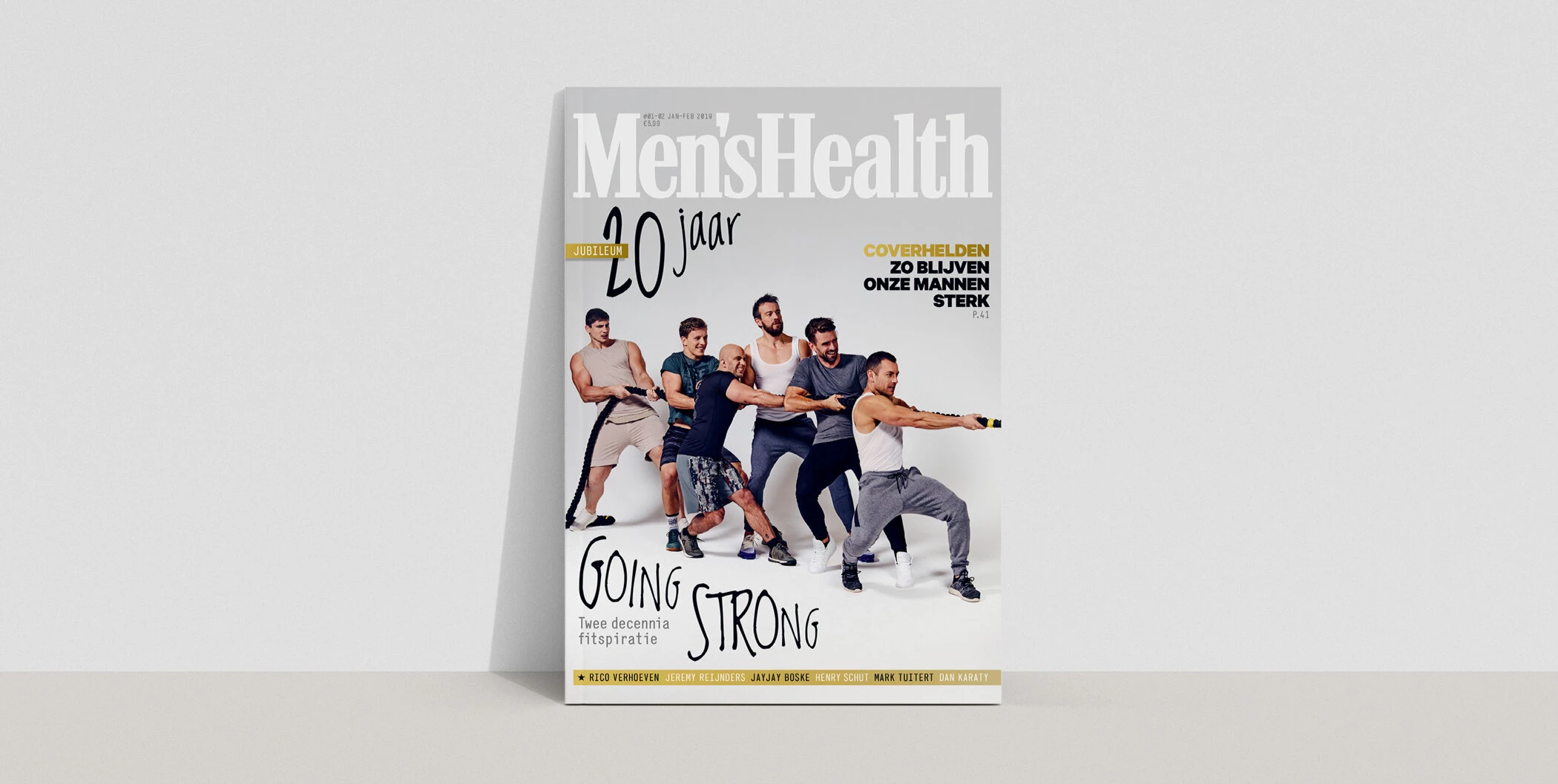
1. Men's Health by RAZA Creative Direction
Standout Features:
- Creative photos
- Men playing tug of war
- Clean, sharp visuals
What better way to celebrate years of fitness inspirations than having several fitspirations in one cover?
For the 20th anniversary of Dutch Men's Health, RAZA Creative Direction produced a magazine cover featuring sports icons in a tug of war. This powerful visual, captured by renowned photographer Stef Nagel, celebrates strength and camaraderie, aligning with the publication's mission to inspire its readers.
The sharp and clean visuals capture the essence of the Men's Health brand, resulting in a memorable magazine cover. The text, "20 jaar Going Strong," is also an instant eye-catcher with its seemingly handwritten font style, swaying away from the usual serif fonts on the cover.
Get inspired by these best magazine print designs.
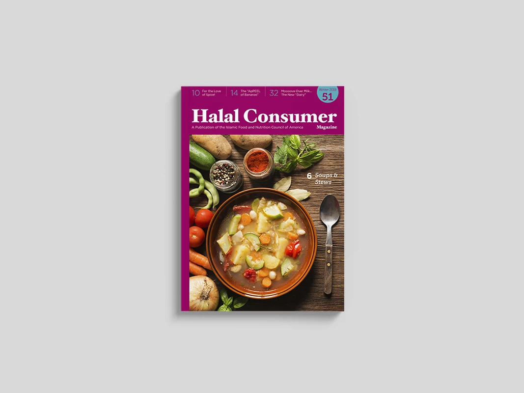
2. Halal Consumer Magazine by Annan Shehadi
Standout Features:
- Vibrant images
- Prominent magazine title
- Colorful layout
Designed by Annan Shehadi, the cover of Halal Consumer Magazine features a vibrant and appealing image highlighting halal dishes. It reflects the magazine's focus on food and wellness for North American Muslims.
The magazine's title is prominently displayed, and the print design is colorful and engaging, inviting readers to explore the content. Flipping through the pages is a treat to the eyes and mind, as the content spans various topics complemented by diverse imagery.
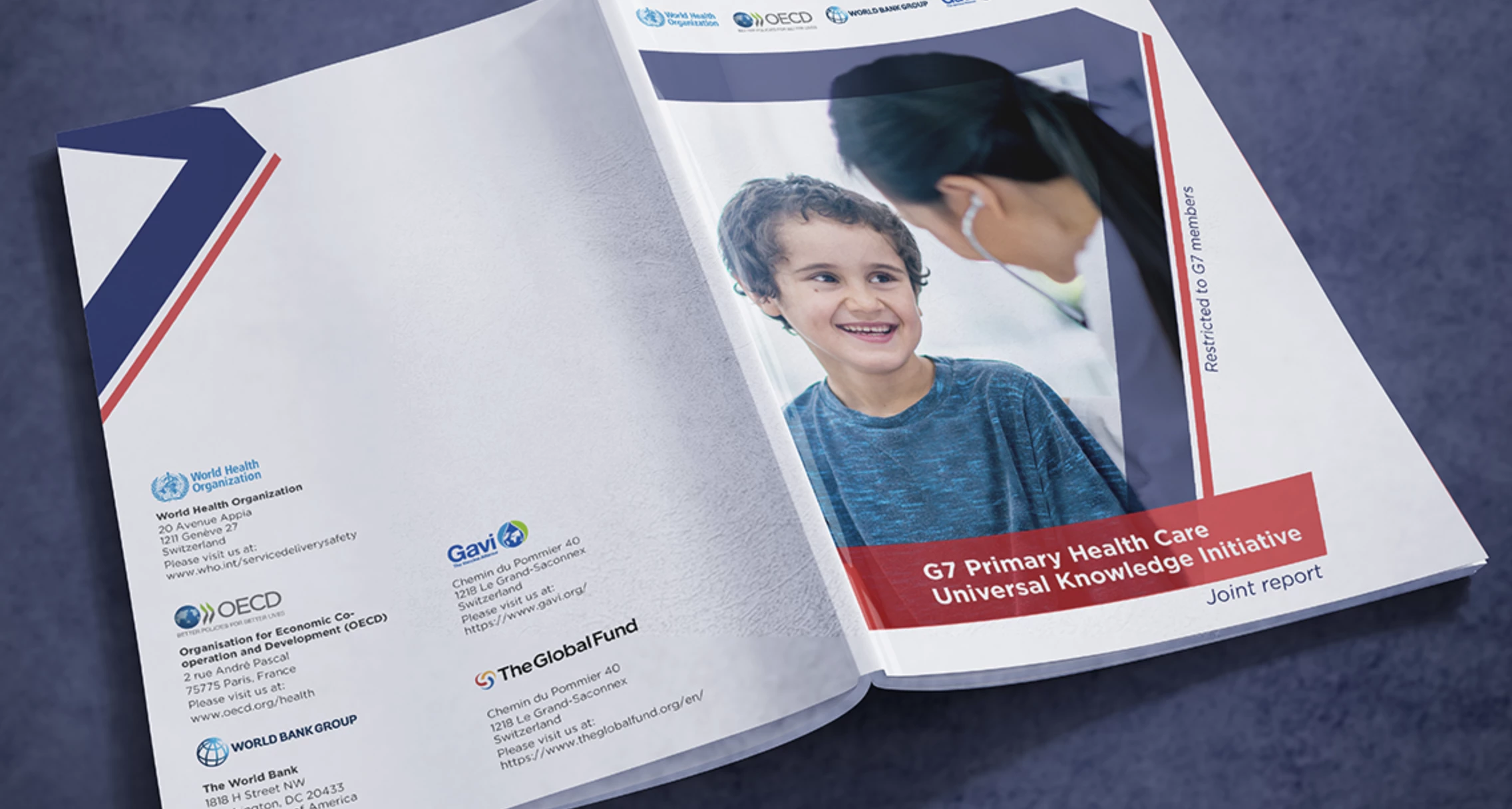
3. G7 Book by YAT Communication
Standout Features:
- Logo in front
- Healthcare-related images
- Clean, minimalist look
The G7 Book design by YAT Communication features the G7 France Biarritz 2019 logo prominently on the cover, symbolizing the summit's emphasis on unity and cooperation. The design uses healthcare-related photos to give it a more realistic and personal touch.
The report's clean and minimalistic look is the perfect match, given the serious nature of the topic. It keeps it approachable without being overwhelming.
Explore these non-profit print design examples.
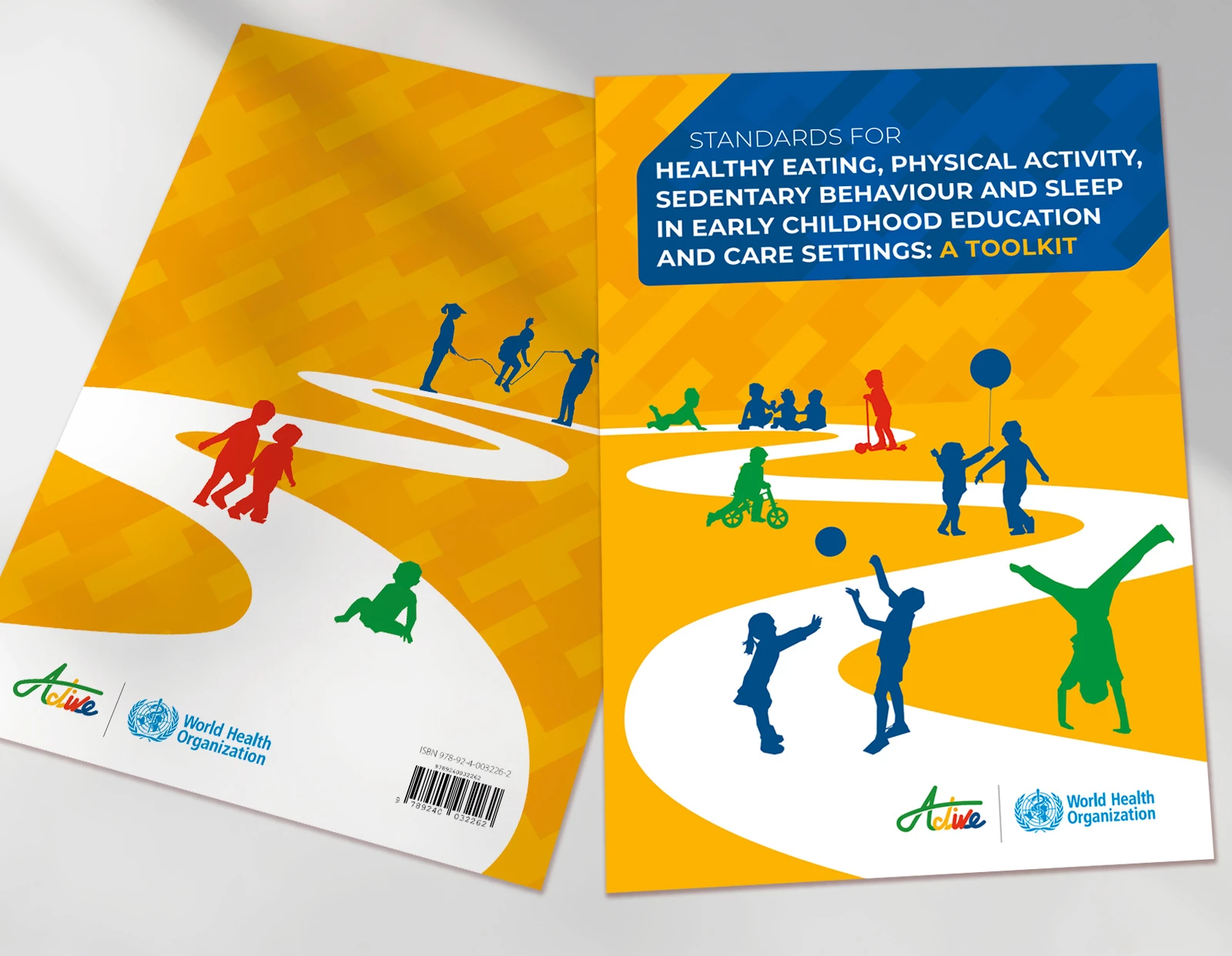
4. Standards for Early Childhood Education and Care Settings by Eddy Hill Design
Standout Features:
- Bright colors
- Prominent title placement
- Graphics depict physical activities
The print design for the Standards for Early Childhood Education and Care Settings by Eddy Hill Design features bright yellow and blue colors that immediately stand out. The emphasized title placement grabs attention with its all-uppercase font style, immediately conveying the topic and nature of the toolkit.
The design successfully communicates the brand goals through the graphic elements scattered in the toolkit. We see graphics of children doing several physical activities, from the cover to the inner pages.
This toolkit is a practical resource from the World Health Organization, aimed at guiding the integration of healthy habits into early childhood education.
5. AVIVA WO/MAN by Kelsey Van Horn Design Studio
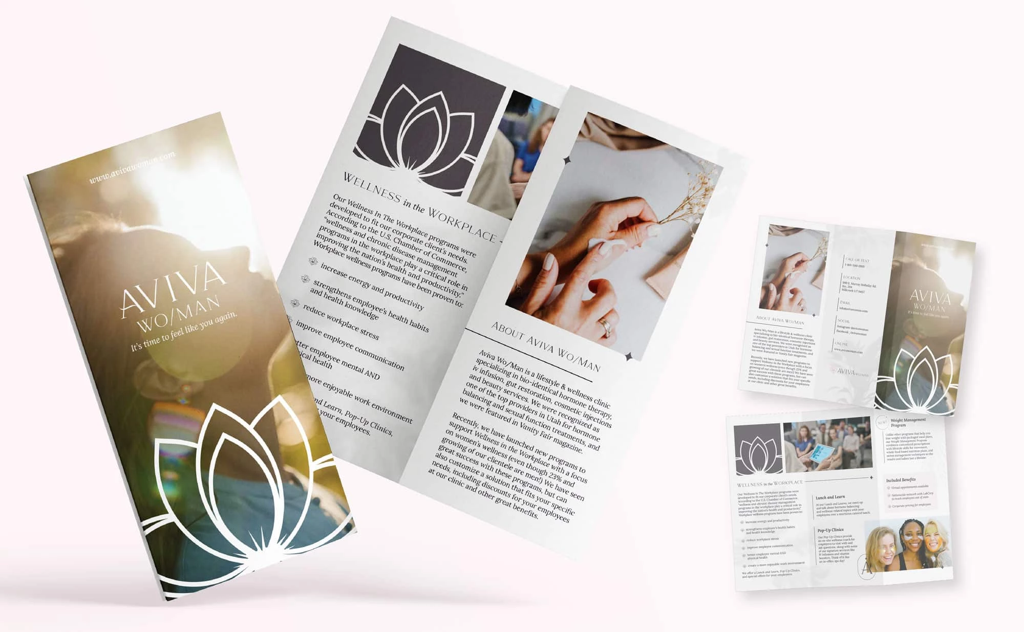
Standout Features:
- Lotus flowers
- Sleek yet soft aesthetic
- Calming aura
The print design for AVIVA WO/MAN by Kelsey Van Horn Design Studio showcases a serene and soft aesthetic, emphasizing wellness and tranquility. The lotus illustrations are a key visual element, symbolizing purity and rebirth. Make sure to check out our article on best wellness branding designs.
The layout provides a calming visual experience that mirrors the services offered by the clinic. This design approach effectively communicates the brand's essence and focuses on holistic health and wellness.