Sports websites face a unique challenge: they need to channel raw energy without creating chaos. I've seen too many athletic brands mistake visual noise for motivation.
Digital Silk's redesign for AllRecruit gets it right. The site pulses with ambition but never sacrifices clarity for flash.
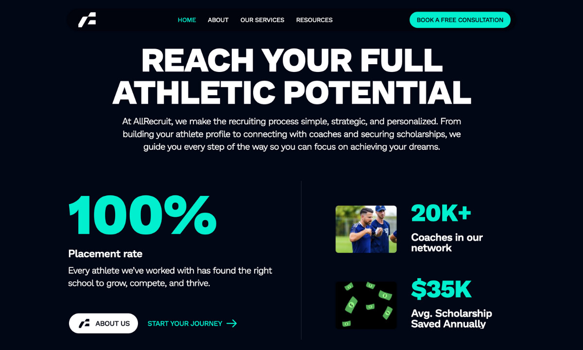
Industry Insight: Placing one clear call-to-action (CTA) above the fold or in a persistent position can boost conversions by 20-30%or more. Research shows that pages with a single dominant CTA perform better than those with multiple competing links.
For AllRecruit, that means keeping one clear action (“Book a Free Consultation” or “Begin Your Recruiting Journey”) in constant view. Fewer distractions and consistent direction make it easier for users to act, turning browsing into real inquiries.
Key Insights for Brands:
- High-contrast color evokes confidence and youthful ambition
- Structured, mobile-first UX streamlines conversion pathways
- Motion and typography combine to tell a story of drive and opportunity
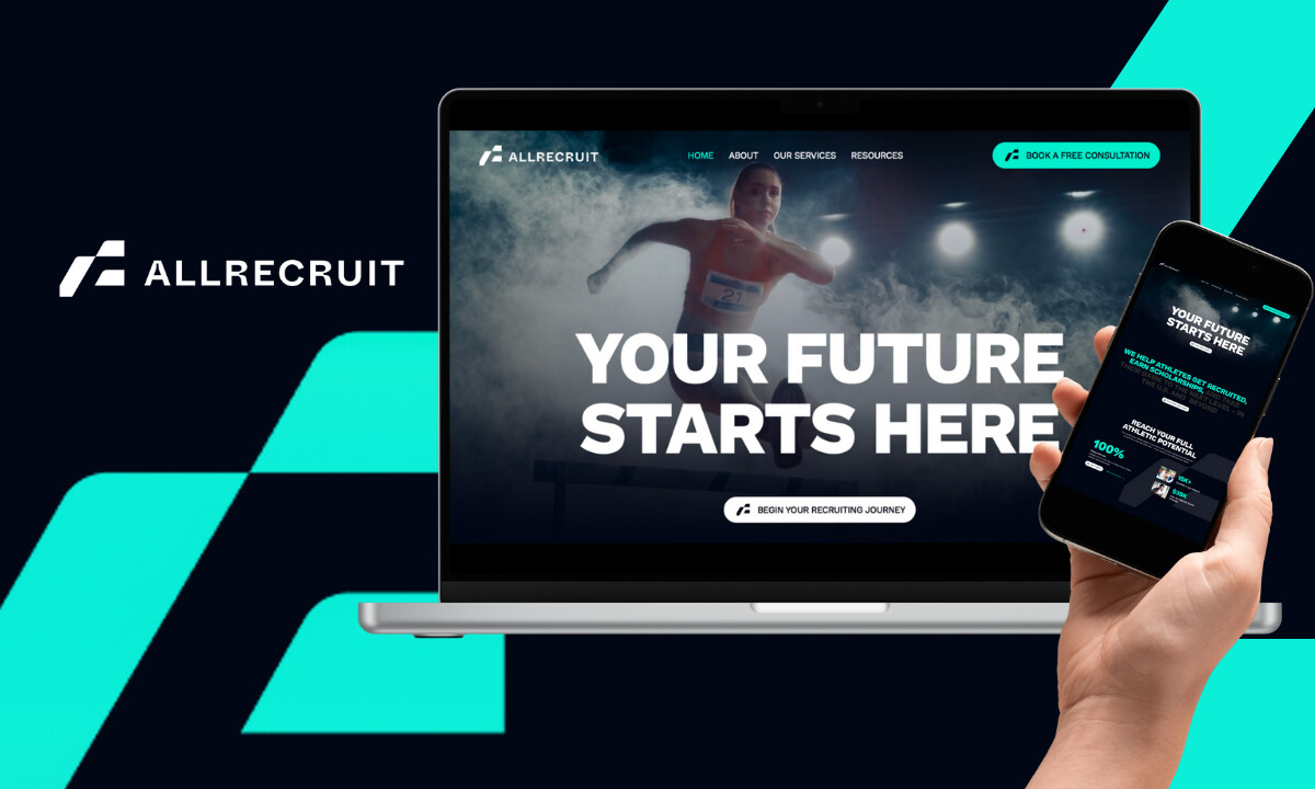
Neon Visual System Channels Athletic Energy
AllRecruit's primary color scheme fuses deep navy with neon teal accents to project a futuristic, high-energy identity.
When I first saw the "Surge Neon" (teal) popping against that dark backdrop, I understood the strategy immediately. This palette echoes the visual language of major athletic brands like Nike and Gatorade. It builds credibility through familiarity while giving AllRecruit a look that’s distinctly its own.
I also noticed how neon-infused section dividers, glow effects on buttons, and highlighted headlines energize viewers without overwhelming the content. For a generation of digital-native athletes, this visual tempo feels familiar: fast, responsive, and always on.
Explore top-tier sports website designs and power your brand with championship-caliber UX.
Prodigy Sans Typography Reinforces Motion and Clarity
Choosing a statement typeface in a recruitment niche that often defaults to neutral sans-serifs is a bold move, and it works.
The website design taps into emotion from the first scroll.
The custom use of Prodigy Sans in extra bold weights emphasizes confidence and clarity. Section headers are powerful but never overpowering, thanks to generous space and restrained alignment.
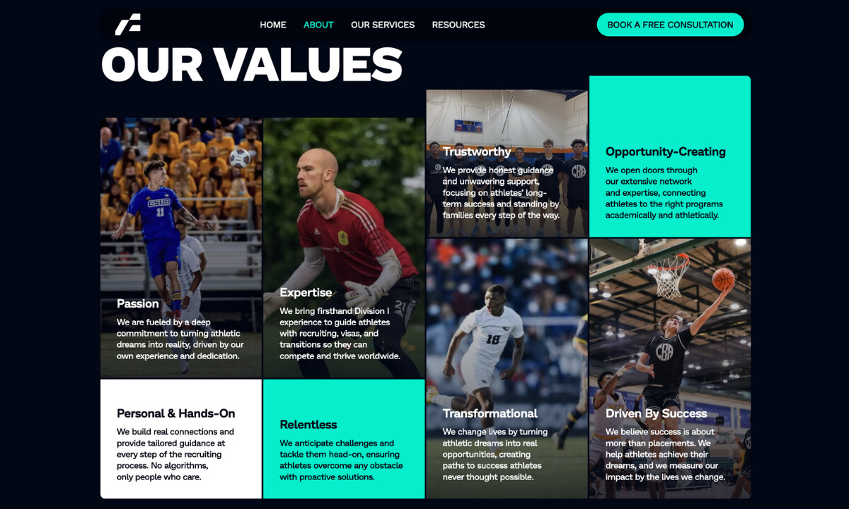
UX Architecture Built for Conversion
Digital Silk built the website’s structure around five user landing pages, each purposefully designed to inform and convert.
Navigation flows logically through services, values, and outcomes, mirroring the steps in a student-athlete's scholarship journey.
CTAs are strategically placed at scroll-ready points and this turns curiosity into commitment.
Read the full guide on mastering CTA design that converts.
Key landing pages rely on clear visual cues and minimal friction. Navigation is simple enough for fast action but structured enough to build trust…exactly what conversion-driven UX should achieve.
Cohesive Branding Despite Creative Revisions
Despite early challenges with branding clarity, the final product reflects a cohesive and confident identity.
The design successfully integrates multiple rounds of revisions (particularly around palette shifts) without sacrificing consistency.
This resilience underscores Digital Silk’s flexibility and strategic process. They anchored the experience around typographic strength and navigational clarity, ensuring the evolving color system never disrupted the design’s core objectives.
What Agencies Can Learn from Digital Silk
_f9f2c81ab971-desktop.jpg)
1. Stay Flexible During Brand Evolution
When visual identity is still forming, strong design hierarchy becomes your anchor.
Digital Silk maintained consistency through changes by establishing clear structural rules early. The system could flex without breaking because the foundation was solid from the start.
2. Use Color to Evoke Energy
The neon teal accents don't just look good. They communicate optimism and drive, traits that resonate immediately with student-athletes thinking about their futures.
Color choices in sports branding need to do emotional work, not just aesthetic work. Digital Silk understood this completely.
3. UX simplicity wins in high-pressure journeys
Student-athletes aren’t browsing casually. They want quick answers, clear action steps, and reassurance. The structure of this site gives them exactly that.
4. Guide Every Click Toward Conversion
Digital Silk anchored CTAs at multiple scroll depths, so users can act the moment inspiration hits. This isn't aggressive. It's strategic.
The CTAs feel like natural next steps, not interruptions. That subtle difference dramatically affects conversion rates.
Why It Works
The design thrives because everything aligns with the brand’s mission: turning potential into progress.
The color creates intensity, the typography reinforces discipline, and the UX keeps ambition on track. Each component supports the same story: one of growth, focus, and opportunity.
For me, the AllRecruit site succeeds because it understands its audience. It doesn’t just speak to athletes; it speaks like them — fast, confident, and driven by results.
About DesignRush Featured Designs
At DesignRush, we spotlight digital experiences that combine creativity with performance. Projects like AllRecruit are recognized for turning design craft into business results.
Many go on to earn Monthly Design Awards, gaining visibility among leading agencies, brands, and creative professionals.
- Best Website Designs
- Best App Designs
- Best Logo Designs
- Best Print Designs
- Best Packaging Designs
- Best Video Designs
For a full list of design agencies and related services, see our Agency Directory.


-preview.jpg)