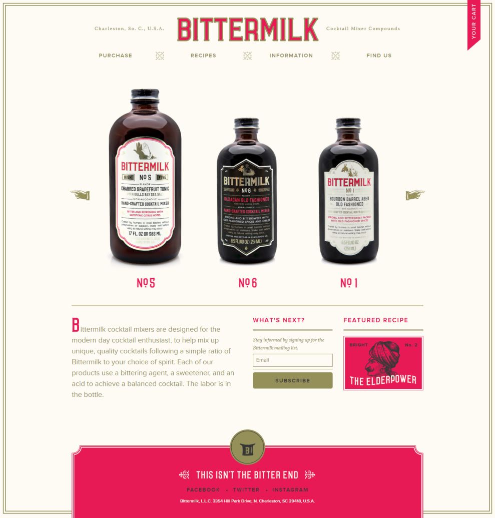
The designers of this website understand that an e-commerce website is about showing and selling products. So instead of fancy banner images and teasing text, the user gets to see what's being advertised as soon as they land on the website.
In fact, the homepage breaks the tendencies and, instead of trying to fit everything in one deep scroll page, keeps it simple and straightforward. Besides the cocktail bottles, the user gets just enough information about the product to know if that's what he is looking for -- only on click do they get more information.
The design is very simple and minimalist, with a very retro feel to it. Tradition is normally associated with product quality -- especially in beverages -- so these details add to the idea that this is unique and above the others. Little elements like the slider arrows/hands, the target icons on the navigation menu, and the borders framing the content fit perfectly with the chosen design style.

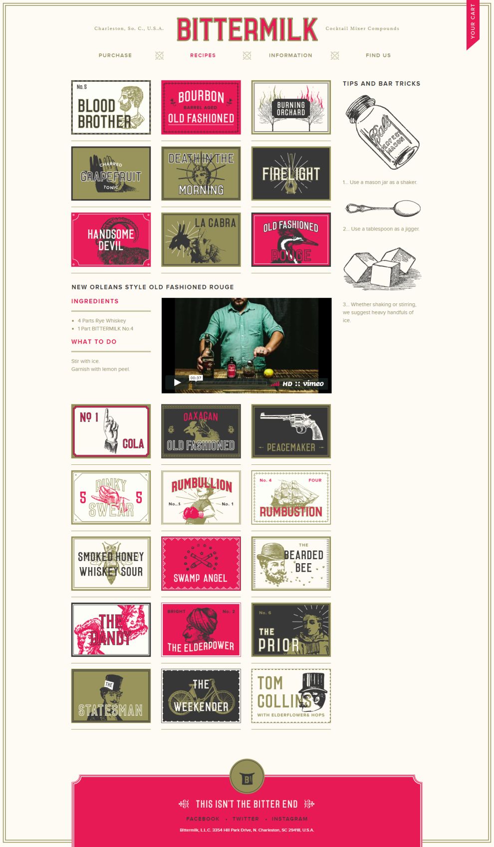
The recipes area is filled with beautiful illustrations representing different cocktails, and looks like a collection of old stamps.
The names are pretty self-explanatory, whereas the drawings are sometimes associated with the name (a goat for La Cabra, a pistol for The Peacemaker) and other times they are not. Either way, it is a great opportunity to display artistry add to the retro look of the website.
The site stays on-brand with the colors, illustration style, and borders, and draws users in with tricks and "how to's" on the right sidebar -- an excellent way to gain new customers! These pair nicely with the videos that accompany the recipes, and are ultimately quite helpful.
Bittermilk is a beautiful website design in the E-commerce & Retail and Food & Beverage industries.


