DrinkCann’s Website Uses Bold, Contrasting Colors And Large Typography To Communicate Unique Values
DrinkCann is a cannabis-infused tonic: a canned beverage that comes in multiple unique flavors and visually appealing packaging.
It belongs to a category known as a “social drink” — a liquid refreshment that is best enjoyed in a company of likeminded peers.
This brand positioning determines the product’s market appeal and the demographic it targets: mostly young people in their 20s and 30s. This target audience also informs the brand’s very effective web design.
DrinkCann’s website is a colorful affair with microinteractions and motion effects. It is a single-page website, although the Shop and Merchandise sections have their own standalone locations.
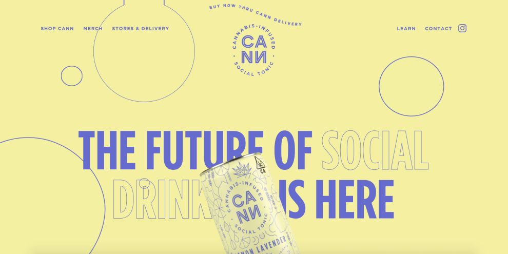
The user journey begins with the value proposition statement, “The future of social drink is here” and a subtly animated image of a DrinkCann can. The screen above the fold is pale yellow and indigo, which transitions to a more vibrant orange/magenta combo as the user scrolls.
As each separate segment passes, the colors change too, mixing understated, pastel colors and bright, garish ones for top-notch visibility and readability.
The non-serif font in the headers narrows and widens in a neat effect as the visitor scrolls. The same or very similar copy typeface (“Gotham”) uses bold and nonbold words interchangeably to point out important pieces of information.

Subtle Movements And Animations Provide User Engagement “Juice” To DrinkCann’s Website Design
From the wavy call-to-action at the very top of the page. to the upward movement of the bubbles in the background, the DrinkCann website is an animated place.
Microanimations keep visitors engaged through the single-page site and push them toward the bottom of the page for conversion.
DrinkCann uses these microanimations splendidly. The constant feeling as you scroll through the site is “what’s going to happen next?” The website does a great job of boosting on-page session times by keeping visitors on the edge of their seats.
The gradual change of hues, along with the floating cans and headers that float in and out, enlarge and diminish, overlap and disperse... all of these elements breathe life into the website.
If you are looking to create an engaging design like this, check these top-ranked Washington DC web design companies.
DrinkCann’s Mix Of A Single-Column, Grid Layout And White Space Ensures A Seamless Transition Toward Conversion
DrinkCann’s website – or rather, a single home page – is a comprehensive one. Plenty of content organized into thematic sections makes up a substantial number of elements.
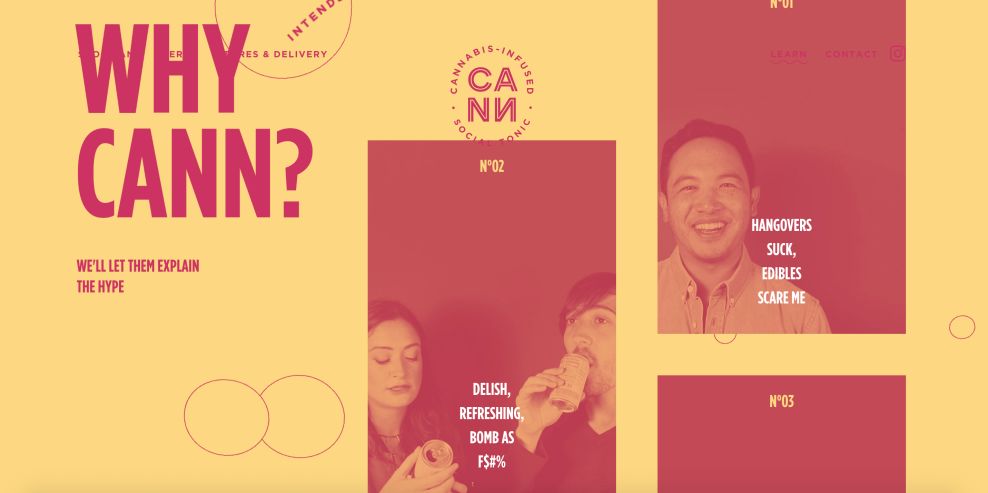
To help users navigate through a very long page, the website opts for large images and fonts, with every screen packing one message only. This single-column layout doesn’t overwhelm the visitors and comes across as very direct and to-the-point.
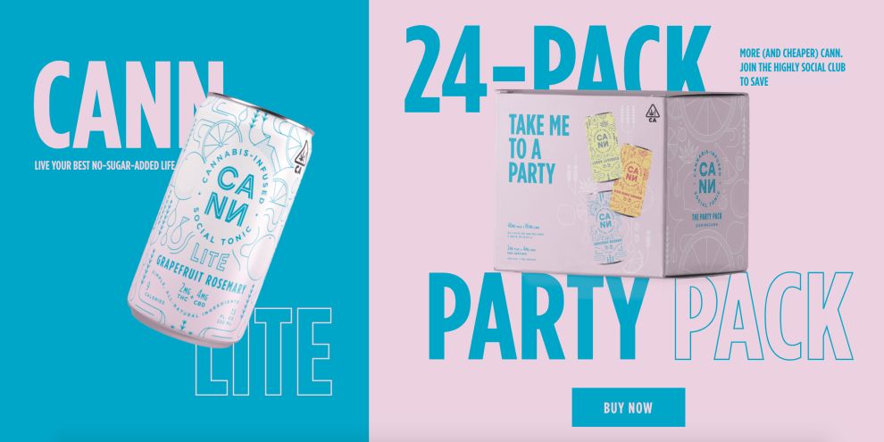
One quarter in, the layout separates into a multi-grid design to communicate and compare several beverage options, before merging into a single-column look again.
What is common in all of these website areas is that there is a lot of “breathing” space. White space ensures there is no copy clutter, keeping visitors’ gaze centered on the most essential sections of the site at all times.
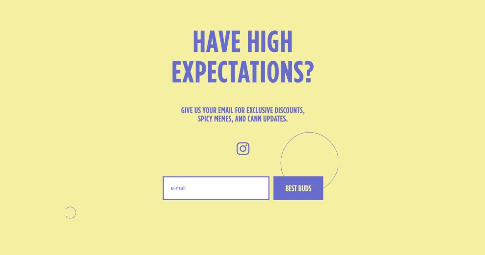
This unique user journey ends with the conversion point at the bottom. The visitors are given two options: to call or text the expert that will keep them informed on promos, products and retail locations or to subscribe for updates.

Multiple CTAs Facilitate Navigation On DrinkCann’s Website
The site’s call-to-action buttons come in various shapes and sizes. The most prevalent one is “Buy Now,” which blends into the color scheme of the page section it’s in. When a user hovers over it, it inverts the colors. For the items that are out of stock, the button copy reads “Sold Out.”
Other CTAs that appear include “Shop Merch,” “Order From Us” and “Visit a Dispensary.”
If you are looking to create a visually compelling website for your small business, check our list of the best small business website design companies.
DrinkCann’s Copy Aligns With The Product’s Demographic And Integrates Into The Design
Brand messaging is an integral part of website design. DrinkCann’s tone of voice is casual, mildly playful and hip, perfectly aligning with its target audience.
It is still highly-informative and packed with valuable bits of info. Apart from educating prospective buyers about this unorthodox product, the messaging also blends in with the design, blurring the line between visual and verbal.
Website copy is kept to-the-point, as best practices of marketing messaging dictate. It describes the drink in just enough detail to clear off any doubts that visitors may have.
The major part of the buying decision rests in the visual, contextual and lifestyle appeal the product induces in buyers.
DrinkCann Website’s Vivid Minimalism Incites A Thirst For More In Its Visitors
Drink Cann’s “Learn” section describes social tonic as a “tonic taken to give a feeling of vigor and wellbeing” and “intended for the highly social.”
The page also educates visitors on the use of cannabis as the drink’s ingredient and how its dosage benefits the consumer’s mood and overall health.
This food and beverage brand’s website is, first and foremost, a visual spectacle and a demonstration of cutting-edge aesthetics in web design.
When you look past its obvious visual appeal, it becomes apparent there’s a lot more than meets the eye. It is also a highly functional, fast website, with a great layout and (a lack of traditional) navigation that makes it easy for visitors to get around.
There’s style and substance to it that both add up.
Instead of keeping the messaging as a separate entity, it feels instead incorporated into the core design, leading to a less disjointed experience.
The youthful looks correlate with the brand’s ideal customer and ride the wave of the current trend of a stripped-down user interface aided by bright colors.

-preview.jpg)

