Bose, a renowned audio industry leader, showcases its high-quality products on an immersive website design with interactive elements, a clear layout, and vibrant visuals. These features not only boost user engagement but also stand as a testament to the brand’s commitment to delivering top-notch service. Ultimately, this website design offers an enjoyable and informative shopping experience for patrons and prospects.
Key Insights for Brands:
- Implement user-friendly search features to allow easy website navigation
- Interactive product displays with detailed information aid customers’ buying journeys and decisions
- Adopting a minimalist layout can enhance your brand image and appeal to contemporary consumers
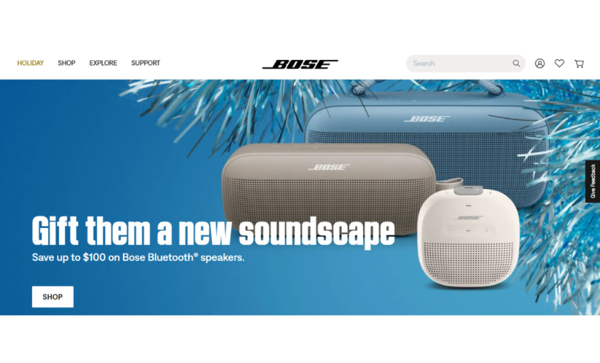
Bose's Minimalist Homepage Design Embodies Industry Leadership
The Bose website masterfully combines minimalism with interactivity, offering an intuitive and engaging user experience. Hover effects, ample white space, and a clean, organized layout enhance the site’s usability while maintaining a sleek aesthetic.
The homepage adopts a streamlined yet visually interesting design that integrates large carousels and visuals, a sleek on-page product menu, and prominent CTA (call-to-action) buttons. This approach results in a distinctive layout that differentiates it from eCommerce website designs, effectively showcasing Bose's innovative wearable technology.
Every design element serves a purpose. For instance, the homepage images double as navigation tools, seamlessly integrated with the “Recommended” shop section and a newsletter subscription form. Together, these elements engage users and simplify the customer journey from product discovery to purchase.
The Bose Website Design Enhance User Browsing With Simple Yet Engaging Navigation Features
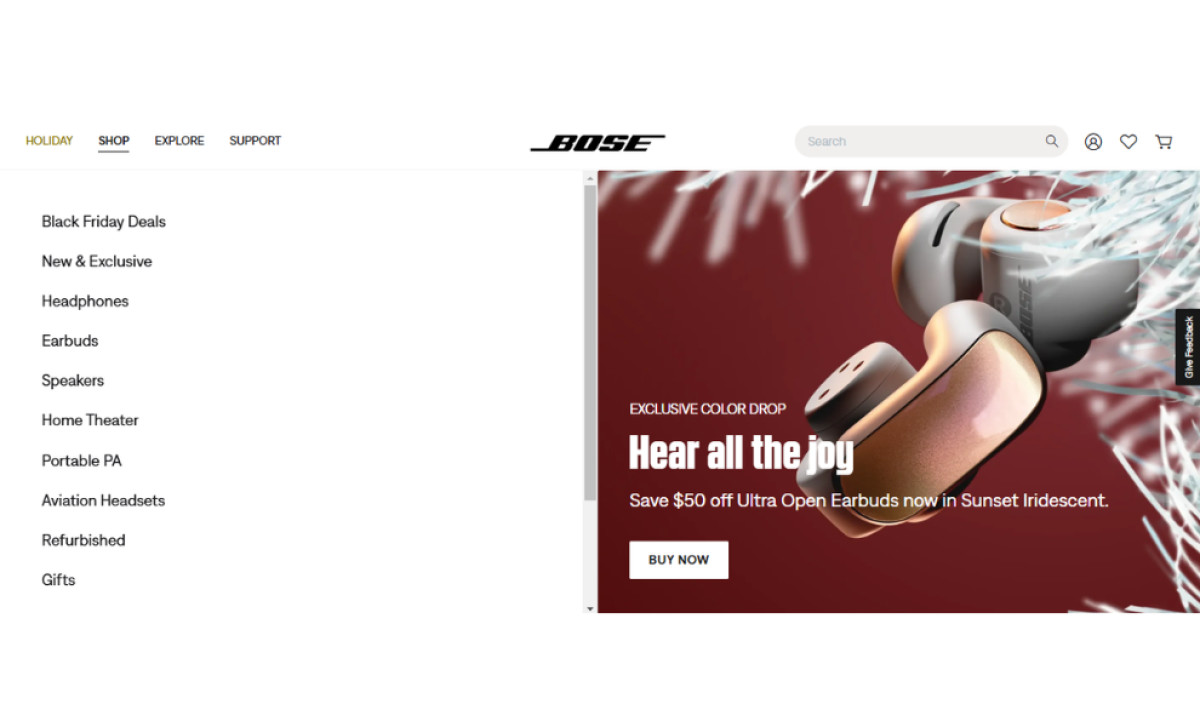
The main navigation on the Bose website is straightforward but impactful. It features only four main menu options, streamlining the browsing experience and ensuring users find what they need efficiently.
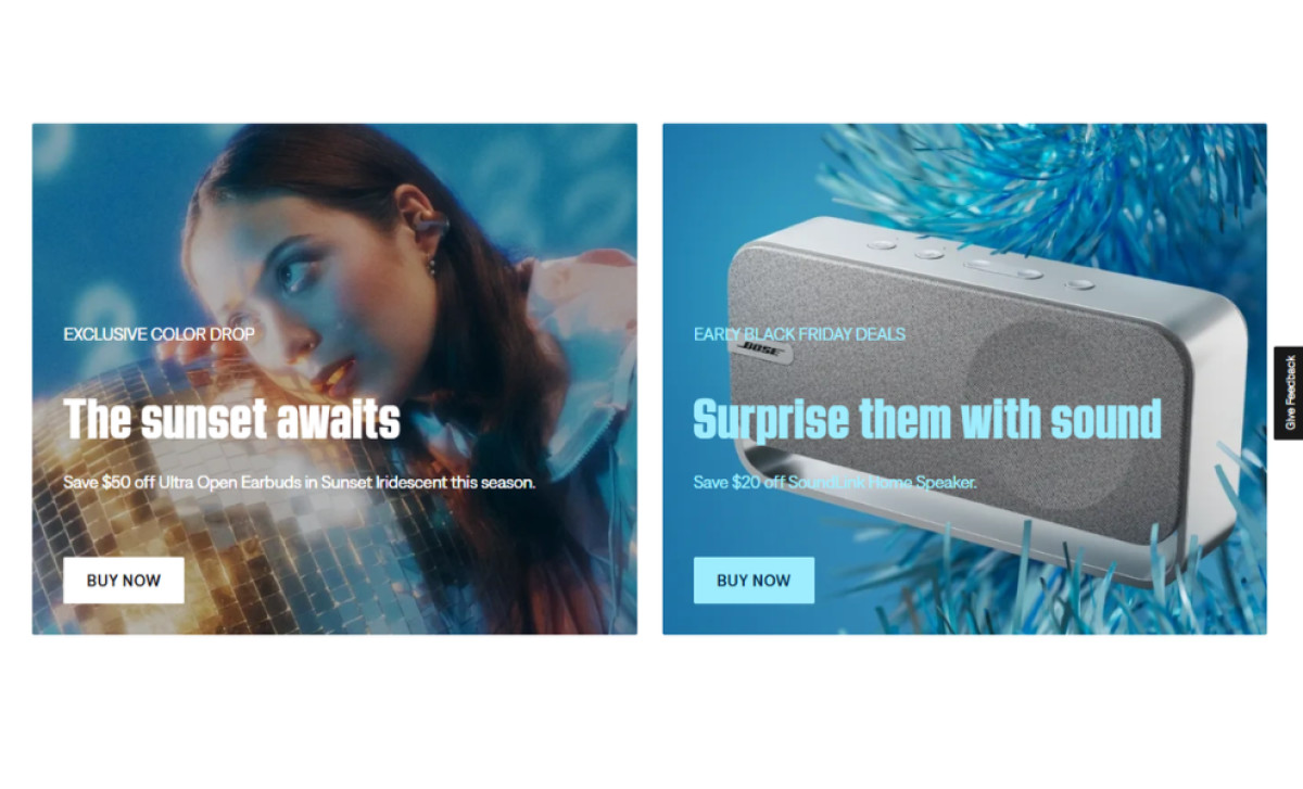
Upon hovering over any of the four options, it opens into a dynamic display of web content navigation buttons on the left and bold imagery with a "Buy Now" CTA button on the right. These visuals highlight products that motivate purchases and spotlight current collaborations or partnerships that reinforce the brand's impact.
A user-friendly search bar further enhances navigation by offering a quicker way to locate what you’re looking for and suggesting related topics and categories. This thoughtful feature ensures users can easily explore the website, whether searching for a specific product or browsing for inspiration. It's a prime example of how top-notch website designers craft intuitive solutions to enhance user engagement and cut bounce rates.
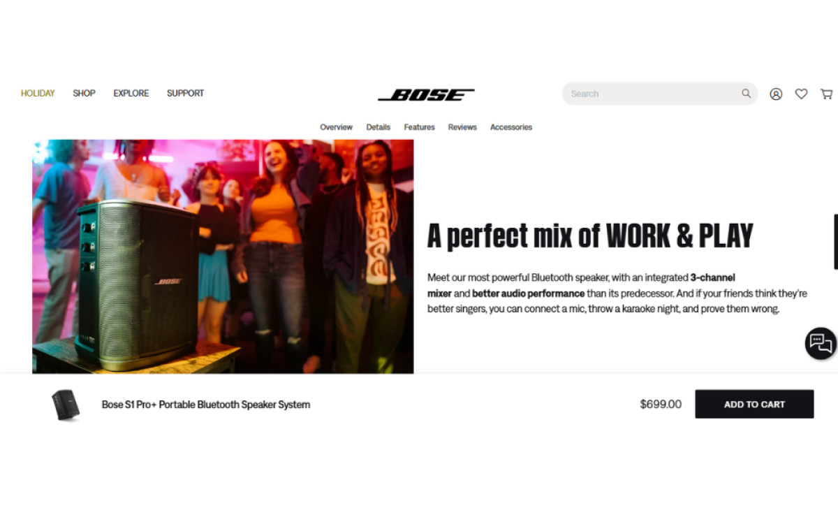
Deep-Scroll Pages, Lifestyle Images, and Interactive Product Viewers Elevate Bose’s Product Presentation
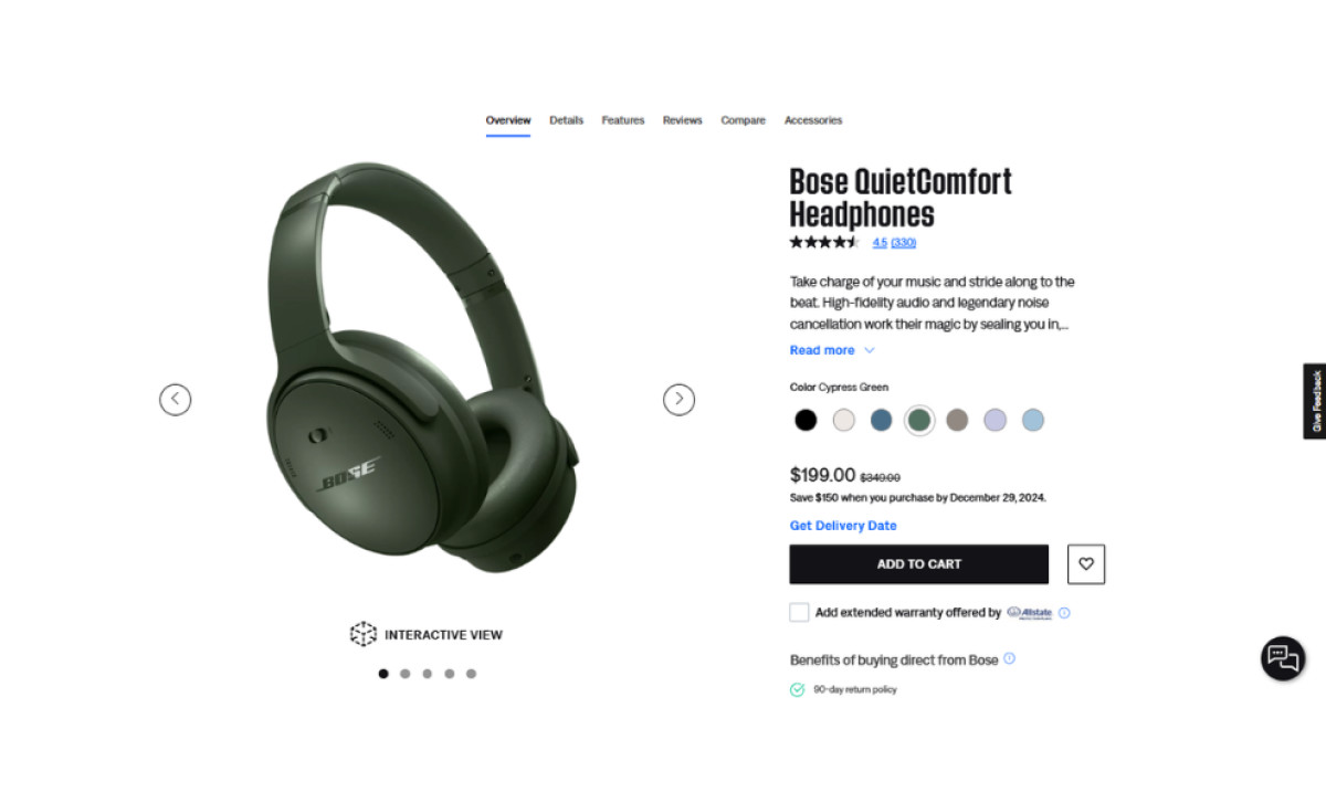
Bose’s product pages are immersive and informative, utilizing deep-scroll layouts to provide comprehensive product information. These pages include detailed product showcases, customer reviews, and complementary product recommendations, ensuring users have all the information they need without leaving the page.
Lifestyle images and videos enhance the presentation by illustrating product appeal, usability, and versatility in various real-life scenarios. Tech online store websites use this engaging multimedia approach to foster a deeper emotional connection with the products, helping users visualize how the products fit into their own lives.
An interactive viewer tool takes this immersive experience further, offering an in-depth, interactive view that allows users to explore products in detail. Users can examine the products closely and even visualize how they will look in their own space through an augmented reality demo. This detailed presentation, inherent to the best luxury web designs, ensures a well-rounded product showcase and helps users make informed purchasing decisions.
The Website Design’s Blend of Slim and Bold Sans-Serif Typography Highlights Product Sophistication and Modernity
The Bose website blends slim and bold sans-serif typography to achieve a modern and elegant aesthetic. Slim fonts are used for secondary details, ensuring legibility and complementing the site’s minimalistic design. In contrast, bold typefaces highlight key information and draw attention to the most important elements, such as product names, headlines, and CTAs.
This thoughtful typographic balance creates a clear visual hierarchy, mirroring Bose’s commitment to producing high-quality products with cutting-edge design and performance. It also highlights the brand’s modern, polished, and consumer-focused identity, excellently complementing the site’s clean and intuitive layout.
In conclusion, Bose’s website stands out as one of the best website designs today, thanks to its extensive visuals, user-friendly and minimalist design, and immersive product pages. It’s a perfect blend of simplicity and engagement that reflects Bose’s innovative spirit.