More than they intend to sell, luxury brands aim to ignite a lifestyle adoption in their demographics. This goal should be visible in all of their marketing efforts; from in-person collaterals to online branding.
And with their hefty price tags comes a greater responsibility of presenting them as extravagant as their products look. We’ve compiled the 14 best high-end luxury website designs that do justice to the brands they represent.
In a saturated eCommerce and service landscape, let’s see how the specialized web design agencies made these brands stand out.
14. Tailored Art & Design by AST & Partners

Standout Features:
- Gallery museum-inspired layout
- Minimalist design
- Prominent black and gold palette
Tailored Art & Design’s website is simple yet elegant and artistic. The brand, headed by Thomas Joseph Smith, is a supplier of artwork and unique design solutions for top hotels in London.
With the brand’s intention to solidify its name in the contemporary art market, they partnered with AST & Partners to design their website. The London-based design agency supports brands not just with design, but with recommendations and insightful business advice, too.
The website is designed like a gallery museum – decorated with art pieces from furniture to paintings. When you scroll down, different artwork and abstract designs line up. All of those are accompanied by a CTA button going to the specific page each image represents.
Right after the said section is a content block containing a brief introduction about the brand and a CTA that links to the About page.
The agency blended black and gold in this design and meshed the palette with a white and gray background. These colors, especially the golden accents, add a dash of richness to the overlook look of the design.
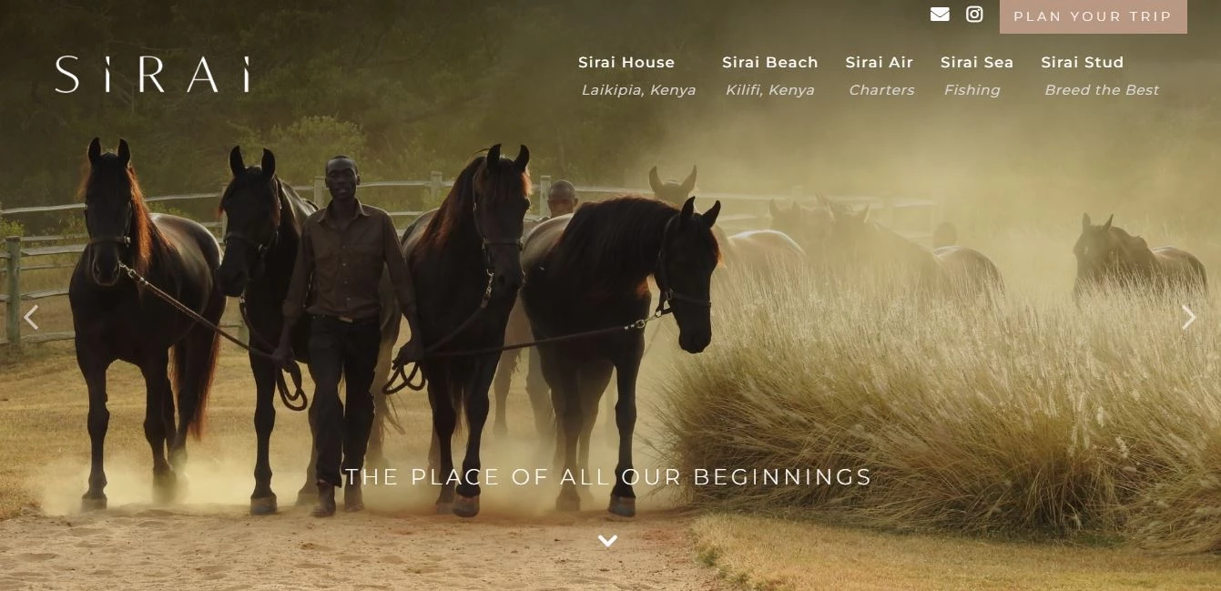
13. Sirai House by Focus Online
Standout Features:
- Muted color palette
- A well-spaced and legible typeface
- Content sliders
Sirai House is every traveler’s companion in Kenya. They are dedicated to offering luxury homes and must-try experiences in the country.
The brand envisions propagating the Sirai way of life to the world. And this is brought to life by Focus Online, a marketing agency for luxury travel companies, through their website design.
The agency combined action images, landscapes, and blocks of muted colors in creating this luxury design. These muted shades complement the images and add an introspective mood while browsing. In other words, the palette alone urges the site visitors to reminisce or imagine themselves in the heart of Kenya.
Unlike other website designs on this list, Sirai House doesn’t have sticky menu navigation. The design doesn’t need it. Considering the blocks of content and information displayed on the pages, a sticky menu will only add distraction to the viewers. That’s why it’s perfectly understandable to display the menu categories in the header, footer section, and on the page as image CTAs.
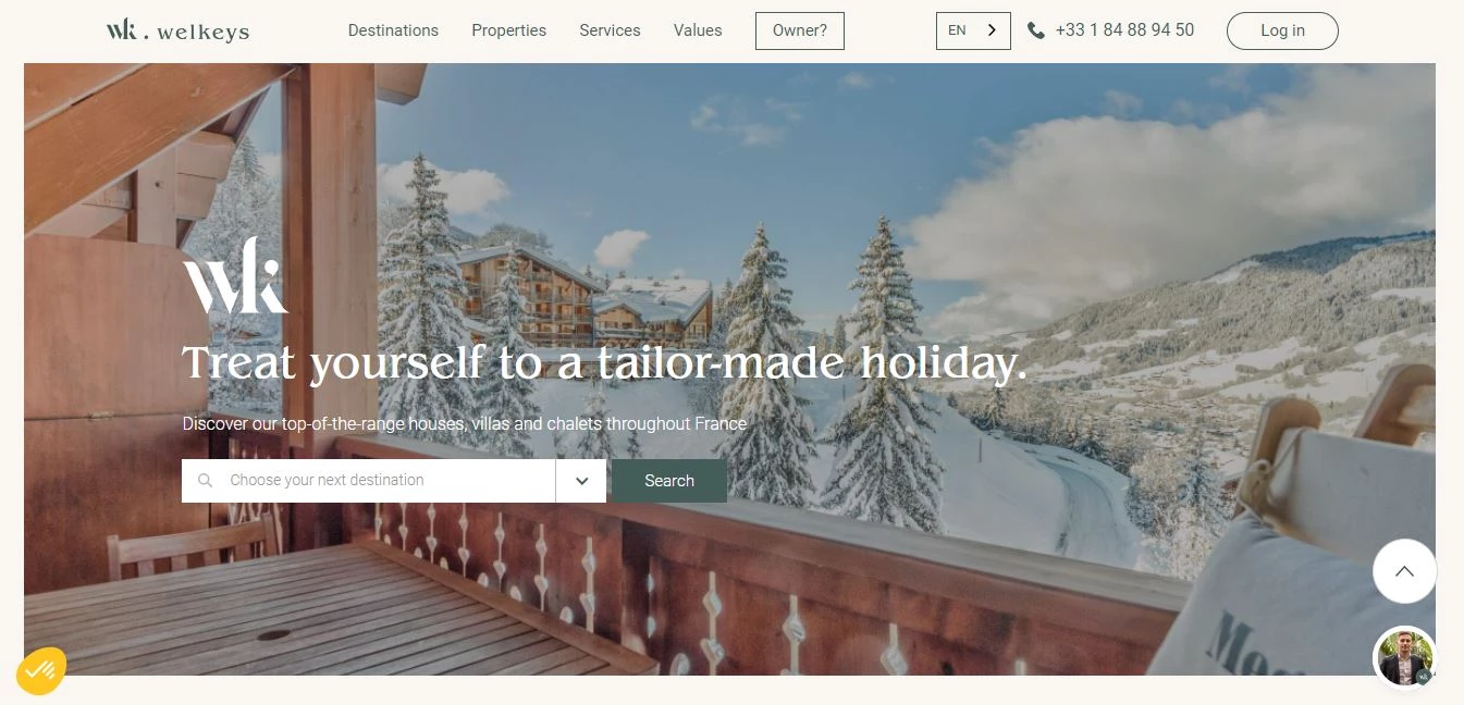
12. Welkeys by Alegria Group
Standout Features:
- User-friendly search bar
- Featured destinations section
- Attractive banner images
They say the key to a successful sale is not to sell the services per se, but the experience and stories that come with it. That’s the principle the Alegria Group lived by in creating this website design for Welkeys.
The website welcomes with a three-column layout image that shows the activities, accommodations, and restaurants. Below are more interesting recreational sports and activities to choose from.
Menu navigation sits comfortably at the top section of the page. Its sticky feature makes it visible on all pages for visitors’ easy access. The website displays in French by default, but there’s also a very convenient language modifier beside the menu buttons.
The agency enclosed content in blocks but provided enough space around it like margins. No sections touch each other because there’s enough whitespace in between. This design move might be unusual in the hospitality industry since we’re used to seeing design elements take up the whole space, but it totally works for this brand. It exudes an organized and classy feel – much like how client handles their customers’ trips.
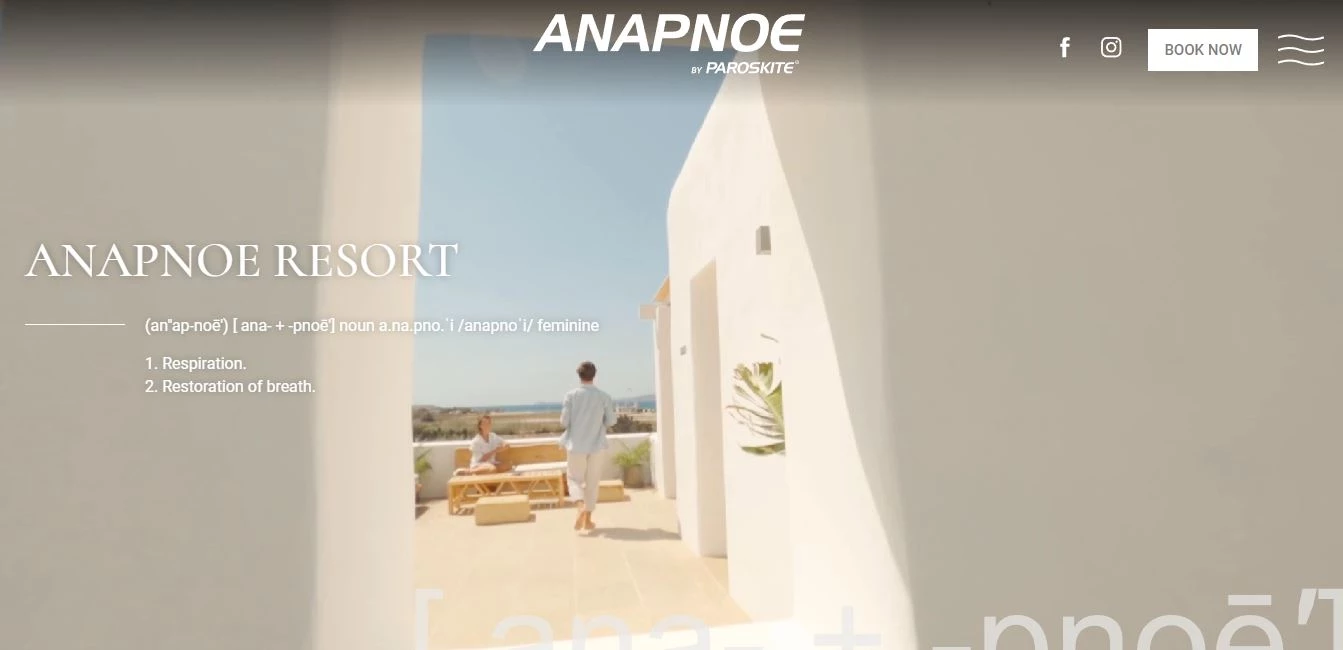
11. ParosKite Anapnoe Resort by Kollective
Standout Features:
- Dictionary-inspired copy on the header
- Seamless design elements transition
- Full-screen embedded video
Let yourself be captivated by scenic views and luxurious rest and recreation activities offered by Anapnoe Resort, the haven for all windsurfers in Pounda Beach, Paros.
Kollective is a full-service design and marketing agency specializing in the hotel and hospitality industry. They are the geniuses behind this inviting website design. Upon entry, visitors are further dragged into the page by the full-screen video on loop in the header section. The video gives the viewers a sneak peek at everything they can do in Paros.
Overlaying this video is a dictionary-inspired copy design. It displays the phonetics of the word “Anapnoe” and its meanings, which are “respiration” and “restoration of breath.”
Scrolling down, you’ll get to see why the resort prides itself on being the place that provides much-needed rest for its clients. Landscape and interior photos are displayed on the page with short content in between. These elements seamlessly transition in as you scroll through them.
In the middle of the page, the designers embedded a full-screen video with an optional play button. This is a good way to break the content and allow visitors to get a taste of what it would feel like when they visit the resort.
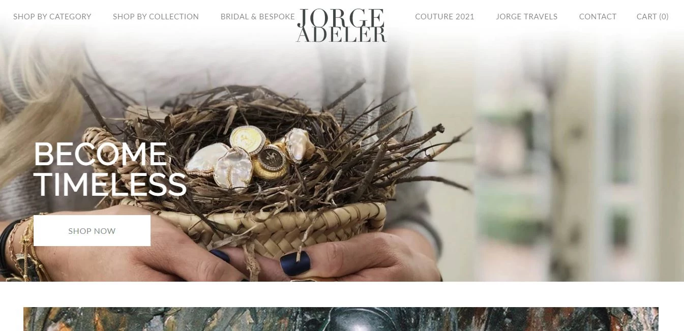
10. Jorge Adeler by PixelChefs
Standout Features:
- Celebrity feature
- Full-screen image layout
- Shopify integrated IG grid
PixelChefs is a digital marketing and website design agency passionate about helping eCommerce and the service industry succeed in the digital landscape. And that’s exactly what they did when they took on the project of designing master jeweler Jorge Adeler’s luxury website.
Browsing through the website is like getting lost in the pages of a fashion magazine. Product categories are laid out on the page as image blocks with CTA buttons directing to their specific pages. These images take up the space of the whole screen – enough to lure visitors into viewing more.
Unlike other brands that display client testimonials, this website displays photographs of well-known celebrities wearing Jorge Adeler jewelry. This section displays four images at a time, then it automatically slides to the left to reveal more.
Magazine-style layouts like this bank on images heavily. Just above the footer section, the designers integrated the client’s Instagram account displaying images in a three-by-three grid.
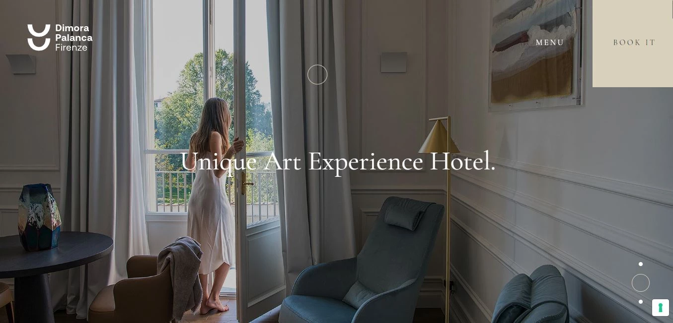
9. Dimora Palanca Firenze by Altea
Standout Features:
- Wide photo gallery
- Line and geometric designs
- Interactive images
Want to know how to sell an experience? Take pointers from Altea, the design agency behind Dimora Palanca Firenze’s website design.
The client is a hotel and restaurant perfect for cosmopolitan travelers and art enthusiasts nestled in Florence.
Three alternating banner images welcome the site visitors. They can also easily access the menu and booking page in the upper right corner of the page. These two sticky buttons are visible on all pages.
The layout is arranged by alternating content sections and image blocks. This balance ensures that site visitors get enough breathing space. Also, breaking the content with images aims to improve user focus and decrease bounce rate since they will not be overwhelmed with too much text.
Considering this design is heavily reliant on the client’s images, the agency made some of them interactive. Some image banners contain menu options that direct users to the hotel’s accommodations page, while some function as a gallery where users can click to view more.
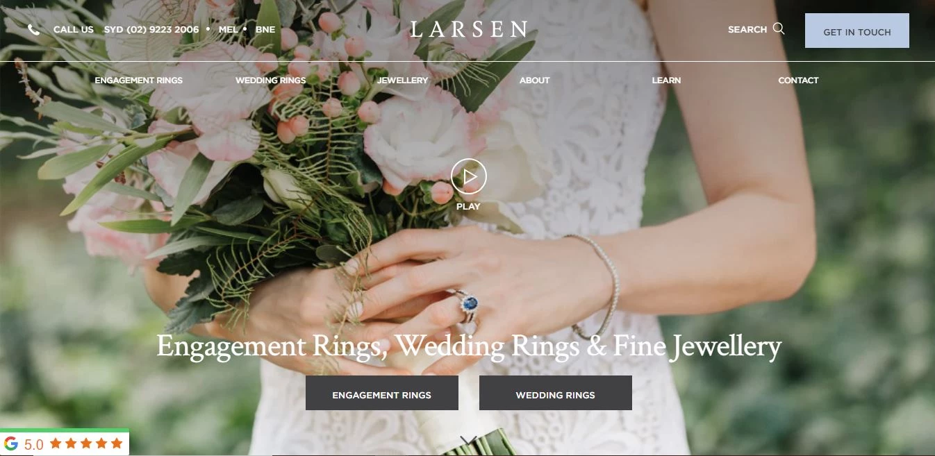
8. Larsen Jewellery by Bapple
Standout Features:
- Google rating bookmarked sitewide
- Excellent balance of elements
- Two-layer sticky navigation
Feast your eyes on the immense talent in jewelry crafting that is Larsen Jewellery – a family business founded by husband and wife Lars and Susie Larsen with the mission to offer high-quality and ethically produced jewelry.
The brand is passionate about producing sustainable accessories in the market. Their vision is backed by Bapple, a design agency based in Australia that’s focused on branding, UX, and website design.
The luxury website design strategy for this brand is to open with a lifestyle shot of a product in use. In particular, a bride holding her bouquet while wearing a Larsen Jewellery ring. But alas! This is not your usual image header. Look closely and you’ll see a subtle play button in the middle. When clicked, a video opens and shows the behind-the-scenes of jewelry making.
Instead of overloading their pages with product placements, the agency arranged them with content blocks and huge image headers to break sections.
Balancing the overall luxurious feel are minimalist icons and CTAs scattered throughout the page. Look at some of these best jewelry website designs here.
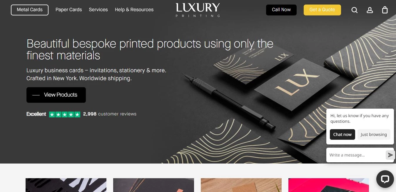
7. Luxury Printing by Brisbane Digital Agency
Standout Features:
- Accessible FAQs section
- Sticky menu navigation
- Grid-style product display
Brisbane Digital Agency, a marketing company that caters to the global market, definitely understands the digital landscape of luxury brands. They turned the ordinarily cluttered eCommerce site layout into something classy and posh for Luxury Printing’s website design.
Its header features a sleek flat display of the brand’s products against a black matte background. Right under it is a grid view of some of their products – complete with the product image, item name, and price. When hovered over, these grids display a pop-up image with an “Order Now” button.
When the visitors are deep in the inner pages, they can easily get back to the main product category page they wish to visit through the sticky menu navigation. This design has a slim menu block on the topmost part of the page that houses product categories, services, resources, quick access to a quote request, a Call Now button, and the user’s account details and cart.
6. The Grove by UP Hotel Agency

Standout Features:
- Full-screen video header
- Embedded Instagram images
- Artistic accents
Right off the bat, you know that The Grove is a brand that provides luxurious experiences to its clients. Design company UP Hotel Agency wanted to make sure this is understood by adding the full-screen brand video on a loop embedded in the website’s header section.
This video shows cinematic shots of the 18-hole golf resort, luxe interiors, spa, and high-end restaurants accessible at this hotel haven based in London. Below this section are menu text links that allow visitors to explore the hotel’s rooms, services, and events calendar.
Additionally, the agency designed a sticky slim navigation bar that displays the logo, hamburger menu, CTAs going to the gift vouchers page, and booking panel.
Before reaching the footer section, the agency embedded the brand’s Instagram (IG) profile. This section displays a grid of images straight from the social media channel. Although this feature is not unique to the website, one thing to note is how the IG posts are displayed. When you hover over each image, you’ll get to read the caption that comes with it. Also, there are arrows on both sides that allow visitors to browse more images.
5. Cacao Catering & Events by Artrivo

Standout Features:
- Classy typeface
- Subtle CTA statements
- Stylish all-white design
Brewing an event? Let Cacao Catering & Events handle it. The team consists of talented staff with over 15 years in the industry. They vow to provide quality, luxury, and dedication to any event they work on.
To help them realize this experience in the digital arena, Artrivo entered the equation. They are a creative agency focused on building and designing websites for a range of different clients.
In this project, the agency managed to create a classy yet palatable design. They worked on an all-white background, then laid out images taken during their events; from luxurious table settings to food flat lays.
Their CTAs have two versions that work aesthetically: one, a button in white or black, and two, discreet text statements characterized by a long horizontal line beside them.
Lastly, they mixed printed and cursive font styles into the website design. The cursive fonts add a certain elegance to the page and are often used as headings and titles. The block scripts are used for CTAs, subtexts, and menu titles.
4. The Watersmeet Hotel by Priority Pixels

Standout Features:
- Seamless transitions
- Relaxing atmosphere
- High-quality scenic images
This 4-star luxury hotel rests in Woolacombe, North Devon. Watersmeet Hotel boasts an award-winning two-AA rosette restaurant, swimming pools with spa facilities, and a stunning view of Combesgate Beach.
Their website is designed by Priority Pixels, a digital marketing agency offering a full range of creative services.
Welcoming visitors is a full-screen image of the hotel’s facade accompanied by a logo, a menu button, and a Book Now CTA. Its menu navigation opens into a widescreen panel when clicked, while the Book Now CTA displays options in a dropdown layout.
When you scroll down, content blocks and images seamlessly transition into their respective positions in a slideshow. The agency also added distinct icons to present the brand’s claims such as Best Rate, Best Dinner Date, Exclusive Offers, and more.
With its scenic images and light colors, this website design lulls its audience into a full-on relaxation mode.
3. theWit Hotel by 97 Switch

Standout Features:
- Sticky CTA button in the header
- Accessibility adjustments for better usability
- Large lifestyle and cinematic images
theWit Hotel is a creative oasis in the heart of the bustling city of Chicago, visually represented by the website’s video header of Chicago’s roads at night, its theater and arts center and its shopping district.
97 Switch, the agency behind this luxury website design, is an agency providing the overall digital strategy for this creative brand, also based in Chicago.
In this website design, they capitalized on the client’s high-resolution images. They laid out lifestyle and cinematic shots on the site, almost occupying the whole page. Copy is very minimal in this design because the selling point of this brand is in the visuals.
Large image headers have discreet CTAs on them directing users to specific pages such as Dine (Food & Drink) and Weddings.
2. Meukow Cognac by Passionate

Standout Features:
- Product slider
- Minimalist and timeless design
- Reactive images per scrolling
Browsing the Meukow Cognac website designed by Passionate feels like exploring a lair of potions – timeless wine blended with care and passion for the winery. The agency’s use of black and gold boost this design’s elegance to a whole new level.
The welcoming header follows a minimalist approach. It highlights one of its products on the left, with the brand tagline on the right. The background is a black-and-white view of the cellar and a man enjoying his drink.
A subtle yet classy touch on this design is the reactive function of the graphics embedded across the site. Images float and seemingly follow the user’s scroll movement, slowly transitioning in once scrolled upon.
Apart from insider photographs featuring the company’s cellar and wine creation, the agency managed to present the products in an engaging manner, too. They incorporated a product slider feature displaying some of their bottles. Once the CTA beside it is clicked, visitors are redirected to the Collections – an all-black page that contains more information about the liquor.
1. St. Johns Fragrance Co by Aspire Digital Solutions

Standout Features:
- Featured scents section
- Bookmarked discount offer
- Rustic and masculine
St Johns Fragrance Co is an iconic men’s fragrance company with 175 years of history. Aspire was approached to refresh their Shopify website and branding.
Acting as an extension of the fragrance brand, Aspire began by gaining a thorough understanding of the industry, company history, goals, and desired features and functionalities for their customers.
Their designers captured the essence of St. Johns with a design that reflected the rich island history the brand is known for. From there, the development team created a feature-rich, fully interactive site for the customers of St Johns Fragrance Co. with social login, a robust rewards program, wishlists, photo reviews, a lightning-fast store location, and a featured retailers' blog. The web design was extended with animated email marketing campaigns and promotions.