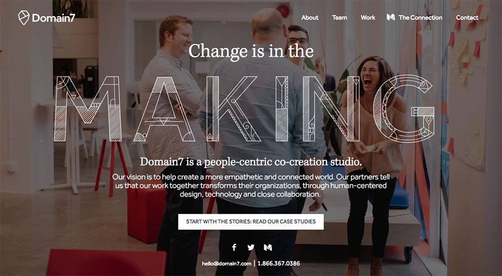
Domain7 is a co-creation studio where people are the focus for creating a more empathetic world. The company’s landing page puts a fun spin on introductions by using animations to make things interesting. The company lives by the logo “change is in the making” and uses their design skills to animate the word “making.” Centered in the middle of the page, potential clients cannot miss the bold statement.
The non-scroll page utilizes a header menu to help potential clients navigate through Domain7’s website. Each page is presented in a simplified sans-serif font, just large enough to read, but not big enough to be a distraction.

Domain7 relies on heavy communication through words for potential clients to learn an in-depth analysis of the company.
Forgoing backgrounds, the company uses a white negative space in order to put the focus entirely on what they have to say.
With the words as the focus, the company makes strong use of alternating between sans serif and serif fonts to divide up the page.
Serif font is used to create headers for segments, while sans-serif creates the meat of each section as it is an easier-to-read font. Bold wording draws attention to specific areas that may interest potential clients.
Additionally, company photographs are used to show off various inside details of Domain7. Potential clients are able to view employees working, processes of the company, and more through the photographs used. These photographs are also used to break up the information, creating a welcome reprieve for users.
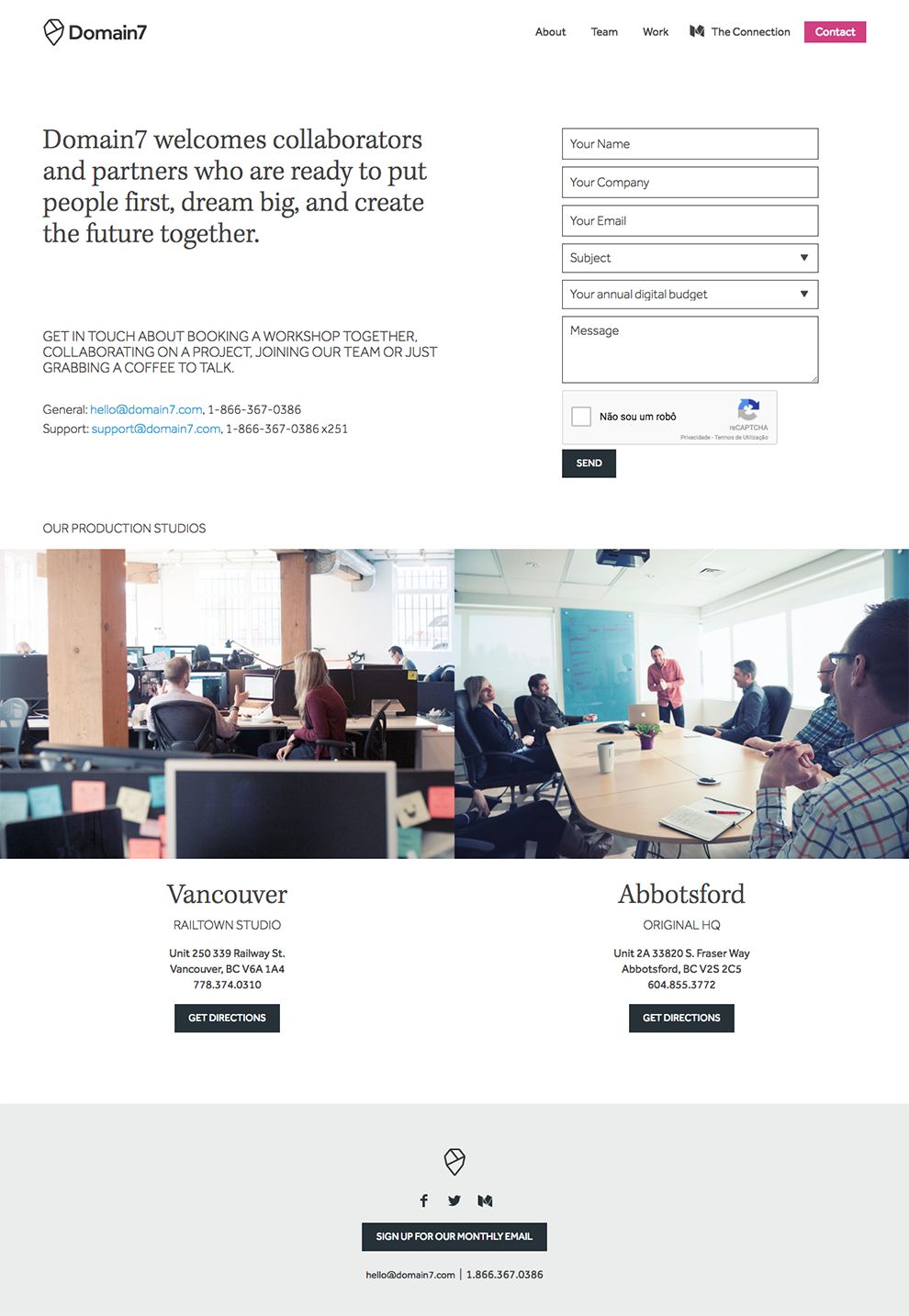
Domain7 wants to make it easy for potential clients to contact them and do so by embedding a contact form into their website. The form allows potential clients to plug in a simple amount of information.
In order to reach out to the company, however, Domain7 requires the passing of a reCAPTCHA test, which prevents spam while adding a bit more work for the user.
Regardless, Domain7's website design is an excellent example of subtle animation and a clear message reaching an audience with an impeccable design.
Domain7 is a professional website design in the Arts & Recreation and Professional Services industries.