Solo is a creative studio that completes complex projects in recording, VFX, drones, 2D or 3D animation, and more for their clients. From digital and web formats to Facebook and YouTube, no content format or media platform is untouchable with Solo. The only limit is your imagination.
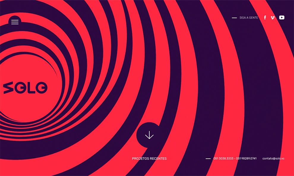
For a site that claims to be able to deliver incredible services and a variety of capabilities, users should expect a unique first impression—and the home page does not disappoint. It is jam-packed with spiraling swirls, funky colors, moving animation, and mesmerizing patterns that leave no room for even a corner of unoccupied negative space. These sneak peek elements of what Solo can offer are neatly divided with even lines to keep the busy layout from looking like a crazy mess.
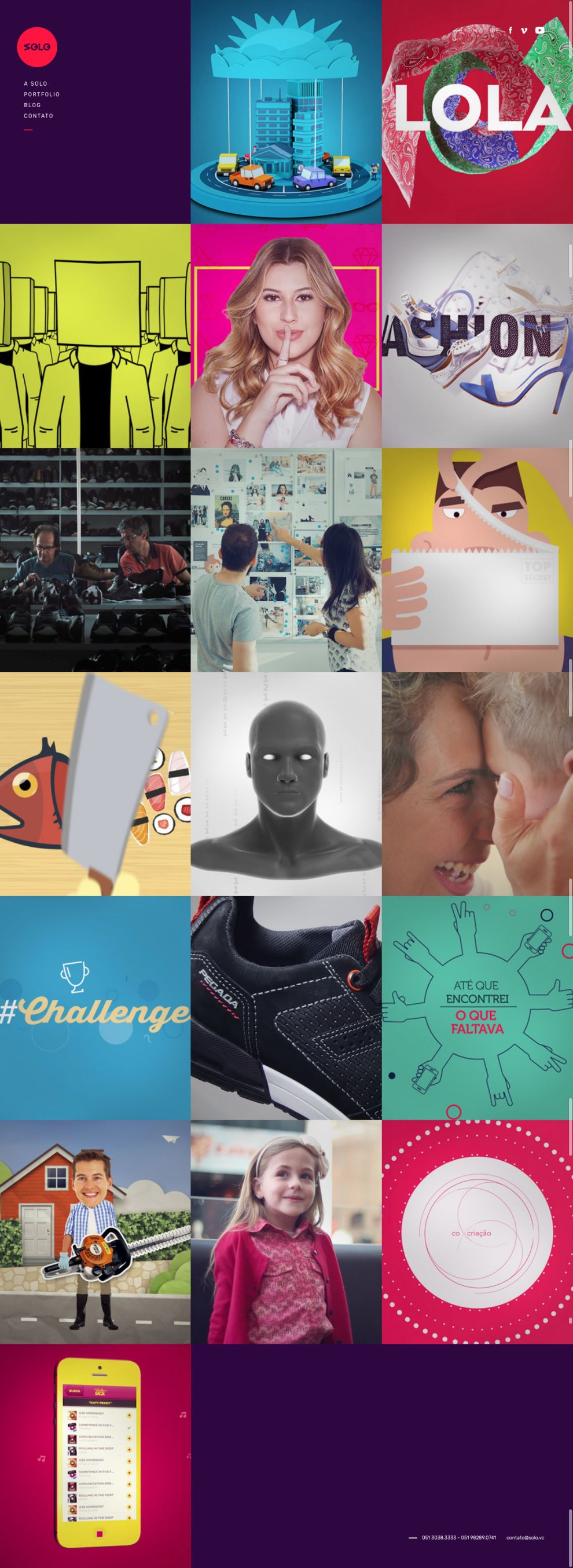
The portfolio subjects are neatly lined up and separated, so users can look at a page full of Solo’s work samples without getting bombarded by mixed content. Cleverly, the portfolio cover examples resemble cards, and they flip over when the user’s cursor touches them, revealing specific project information. This is certainly an original way for viewers to identify information. Every portfolio cover is unique and diverse from one another, specifically fashioned to represent the individual project characteristics. Overall, the portfolio design terrifically showcases Solo's artistic ingenuity.

Every portfolio piece gets a video, and the animation within them is flawless. The movements are precise and smooth—no choppy or freezing flukes. The colors are vibrant to draw the user’s attention, and the pixels are sharp for clear imagery. Best of all, the design goes beyond static pictures that usually flood typical portfolios and seizes users’ interests with the mobile elements.

Solo’s blog section is well done with big, highlighted titles that immediately direct users to each article. Again, balanced lines do an outstanding job of dividing the pieces from one another without having to use a large amount of negative space. The colors contrast one another with a darker background and bright lettering to make the words stand out from all the other aspects of the page. When viewing an article’s content, the negative space changes from the original eventful theme to a plain white color. This makes it very easy to read the article so users do not have to strain their eyes, and it allows the photographs to be evident with vivid detail.
Solo is a force determined to provide its professional services in a creative and efficient manner. Their website design is a prime example of how inventive drive can be presented in an easy-to-use and eye-catching platform.
Solo is a colorful website design in the Advertising, Arts & Recreation, Professional Services and Technology industries.


