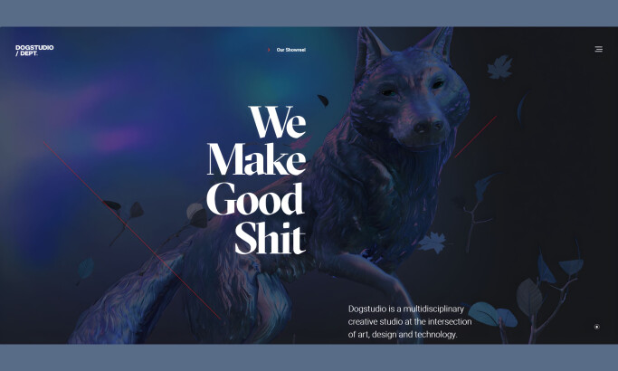
Ideo’s website is like the sassy aunt that tells you to get to the point. This site seems to have reinvented the phrase “less is more.” The approach works as the design is simplistic and clean. The menu bar’s typography is big and gets in the viewer’s face. Ideo’s idea for design works well.
The site user interface makes navigation a cinch and propels the viewer to explore the site without sounding needy. It gets to the point and isn’t overloaded with fluffy content and boring concepts.
Ideo’s minimalist approach is stunning and forces the viewer to get to the meat of their page. It’s an idyllic masterpiece that sways the viewer to look at web design for what it is, a digital sense of style.

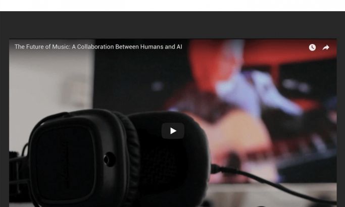
An important tool for any website attempting to use minimization is organization. Pages can’t afford to be messy and will quickly lose a visitor’s attention. The deep scroll design with categorized subpages is brilliant. For example, this subpage focuses on design and fashion. Each article, blog, or case study holds different content but falls under the same category.
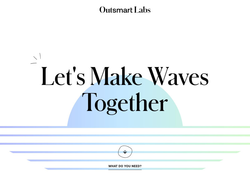
The white backdrop brings forward the overall two-dimensional design. The highlighted letters when scrolling over words coupled with the embeddedhigh-resolution photographs offers clear, visual symmetry. It gives the site a bold, yet simplistic look, allowing the typography to be the focal point for page visitors.

On the top, right corner of each page, there’s a menu button that leads to the oversimplified page. Basic black is elegant, sexy, and screams attention. The large, white typeface and the small navigation bar underneath cuts to the chase. It’s a basic javascript function, with no imagery or distracting graphics. It stands out and forces the viewer to pick an option.

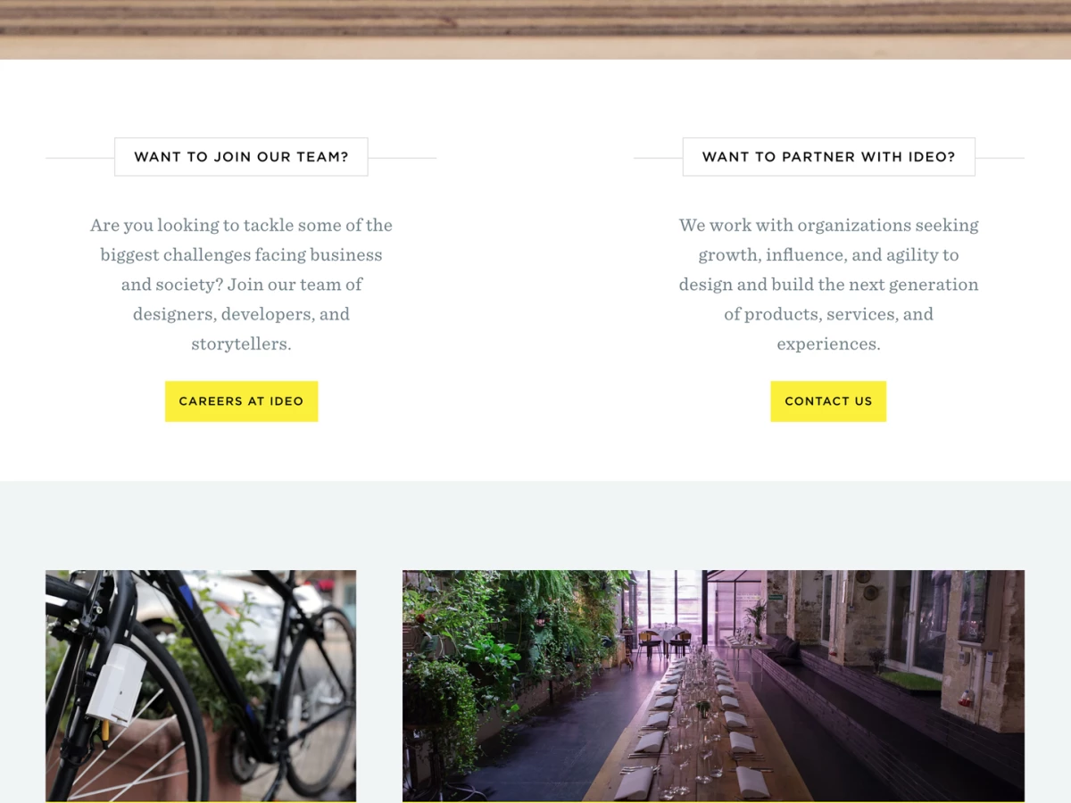
Slide scroll that is done right and have a purpose can make any website pop. Ideo’s about page is a functional slide that splits the screen with an embedded photo on the right and content with translucent words with a basic font on the left. The dark-gray backdrop in the content box allows viewers to read first and shift their eyes to the right, where they see the photo and a small vertical icon bar invite them to follow Ideo’s social media pages.
Ideo’s web design is funky and innovative without loud colors, overbearing illustrations or subpage disorganization. It’s useful, captivating, and basic. They’re a global design company because they choose to be innovative by using a basic user interface.
Ideo is a corporate website design in the Advertising, Arts & Recreation and Technology industries.