Mule Design is a design firm dedicated to creating and maintaining lasting brands by helping companies teach and train their own.
The homepage utilizes a combination of photographs and text boxes to bring information to their potential clients.
Photographs are used as page dividers between text boxes to separate information. Each text box offers up a large and bold sans serif header to catch attention in the center of the page.
Sub-text is written in sans serif font as well, but at a fraction of the size and left-aligned within the center of the page.
Call-to-action prompts are created in bright red to draw the attention of potential clients.

Mule Design has a wide portfolio of written work as well as speaking works to showcase to potential clients.
Speaking and written works are divided into two separate pages accessible through the vibrant red header menu.
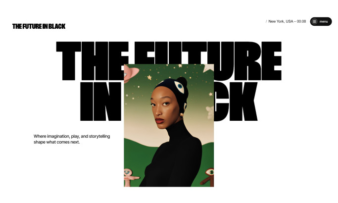
Portfolio pages are presented in a singular timeline from the center of the page. Images for each piece are left-aligned and large enough to generate interest in the project created.
The company uses a larger red sans-serif font to make the title of each piece stand out against the white negative space.

Mule Design allows their work to speak for itself, while also utilizing the words of their “awesome” clients to speak volumes about working with the company for site visitors to review.
Nestled in a white negative space, all testimonials are centered down the page in condensed paragraphs that are aligned to the left.
The names of the past clients are bolded, along with the name of the person who gave the testimonial.
Testimonials are brief, concise, and straight to the point for easy reading and presentation. Additionally, Mule Design understands the importance of putting a face to the name and offers up a button-sized colored photograph of each person who wrote the review.
Mule Design is a beautiful website design in the Professional Services industry.