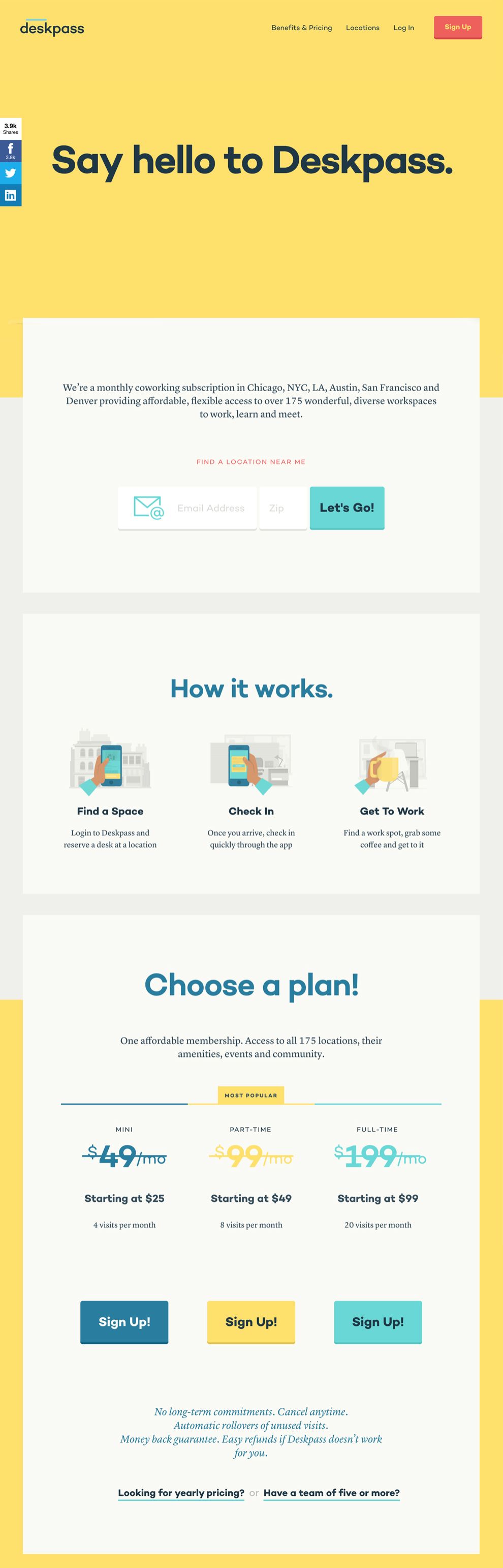
Deskpass is a monthly coworking subscription in Chicago, NYC, LA, and Denver providing affordable, flexible access to over 100 wonderful, diverse workspaces to work, learn, and meet.
This industry is riding along with the rise of the sharing economy. Today, to shop a workplace is like any other online shopping. Differentiating yourself from the rival, featuring the strengths of the products, and providing easy and approachable access is essential. Deskpass has set a successful example for the well-planned content arrangement and design appearance.
In general, the interface design is trendy and suitable; the color treatment is clever and smoothing. The messaging is placed nicely, including useful inline linkings and clear call-to-actions. On “Homepage”, under deep-scrolling fashion, a lot of good features worth mentioning. Visitors are first greeted with the auto-rotating messages, the dynamic programming is eye-catching. The big signup form placed right below the description is a nice and direct approach. “How it works” section uses auto-rotating sliders and also tabbed function to explain the process. “Get it done” uses grid structure and crisscrossing treatment to name the features and benefits. Then, the plans are beautifully displayed and introduced.
Deskpass markets their products smartly by the featured bloggers, testimonials, and the advocates. At the end, signup form is shown in a large footer design. In short, the information architect has done a thoughtful job on organizing, structuring, and labeling the content in an effective and sustainable way; and the designer has come up with the best solutions to make each section shine.

The same great effort also could be seen on subpage “Benefits & Pricing." It definitely makes the heavy content more approachable. A sticky navigation system is provided on this specific page and serves as tab-like filters, which brings the user environment to a higher ground. The sections like “Statistics,” “Audiences,” and “Compare” are more advanced advertising tools.
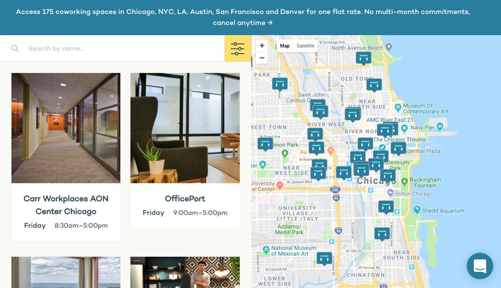
Once users are persuaded and decide to rent, the process regarding signup forms and the location finding and booking has to be easy. Again, none of these areas are overlooked. The landing page and detail page of “Locations” both have plenty of information, including a beautiful map and functional search and filters features.
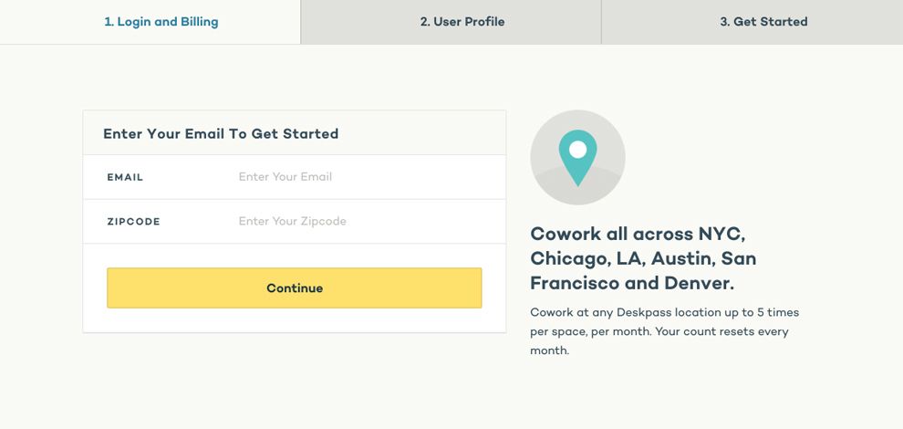
The simplicity of the forms makes the process less daunting and more engaging. The web experience is fully responsive and user-centric.
Deskpass is a colorful website design in the Professional Services industry.