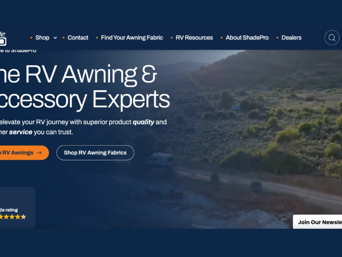
ShadePro’s website turns a complex RV shopping experience into a frictionless journey.
The challenge was clear: simplify the buying process, support a less tech-savvy audience, and drive real business growth.
Digital Silk stepped in with a complete overhaul that led to a custom-built product configurator, intuitive UX, and a clean layout prioritizing clarity over clutter.
Industry Insight: 83% of users leave sites that fail to offer straightforward information. ShadePro avoids that risk by making key details accessible, especially during product selection.
Let’s take a closer look at how it all comes together.
Key Findings for Brands:
- Guide users with tools that simplify technical product choices
- Use modular layouts to organize content and reduce decision fatigue
- Design for convenience and usability without compromising modern aesthetics
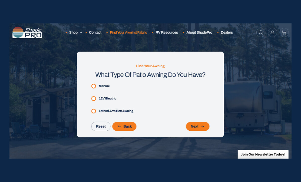
Custom Sales Configurator Streamlines the Buyer Journey
ShadePro’s biggest breakthrough is a custom-built sales configurator that redefines how RV owners shop for awnings online.
A clean interface prompts users to enter key details: RV size, brand, and awning type. Based on the user’s inputs, the site instantly surfaces the most relevant product match.
The experience is frictionless; it removes guesswork and reduces decision fatigue. No more clicking through endless filters or struggling to compare technical specs!
According to Forrester, 77% of consumers have recommended or paid more for a brand that provides a personalized service or experience.
The site’s configurator hits that mark. It’s not flashy, but it’s purposeful and exactly what ShadePro’s customers need.
Intuitive Visual Hierarchy Supports Fast Scanning
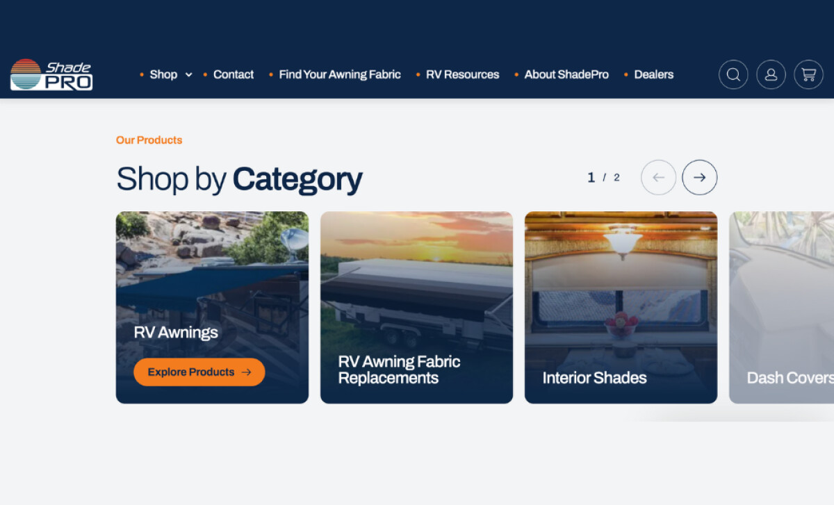
A ResearchGate study on web design states that a well-executed visual hierarchy is crucial in directing users' focus and improving usability. Here, every site element follows a clear logic that guides the user along.
ShadePro’s design achieves that through:
- Modular content blocks(like "Shop by Category" and "Best Sellers") that break up the page and reduce confusion
- Bright orange CTAs that stand out confidently against the blue and white palette to help drive conversions
- Brand imagery that highlights real RV environments, adding a lifestyle-driven layer to the product story
- Ample white space to let products breathe and encourage relaxed browsing
The site feels familiar and structured, like a well-organized campground. The way sections are organized lets users know exactly where to go next.
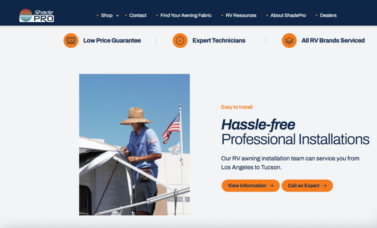
Accessible UX Elements Cater to an Older, More Loyal Demographic
Digital Silk didn’t just design for “users.” They designed for real people, specifically RV owners who are often older, less digitally fluent, but deeply engaged with the lifestyle.
Here’s how they made accessibility a core part of the experience:
- Optimized font styles, sizes, and strong contrast improve readability
- Clear, non-technical language builds trust and reduces confusion
- Visuals are more instructional, not simply decorative
- Non-excessive animation creates a calm, confident interface
Considering that 96.3% of the top 1 million websites have detectable accessibility errors, this kind of thoughtful execution sets ShadePro apart.
It supports the principle that accessibility should go beyond meeting standards. It should create an experience that feels welcoming, supportive, and easy to use.
Responsive UX Drives Engagement and Long-Term ROI
From browsing to buying, every moment of ShadePro’s experience works well across devices. For RVers on the move, that’s non-negotiable.
This is how the site delivers on responsiveness:
- Sales configurator is device-friendly, with no loss in composition or speed
- Sticky menus and promos keep key conversion elements in sight
- Load times stay fast, even with high-resolution imagery and interactive tools
The best part? The revenue agrees. Just weeks after launch, ShadePro saw a 155.8% jump in daily revenue, and monthly performance has remained strong ever since.
This blend of mobility and performance is precisely why ShadePro stands out. By meeting users where they are, the site raises the bar for how niche retailers can serve, support, and convert their customers online.
It’s a benchmark-worthy example of what the best web designs in the eCommerce sector should strive for.
What Agencies Can Learn from ShadePro
Digital Silk’s work on ShadePro reminds us that exceptional design solves the right problem with precision and empathy.
Here’s what designers can take away:
- Design for the decision: focus on where users get stuck, not just what looks impressive
- Build tools that reduce effort: an interface and its features should guide, not overwhelm
- Let structure lead:good layout, hierarchy, and flow can convert better than clever visuals
When strategy and user-centered thinking come first, the design naturally follows, and results speak for themselves.
Urbanna Landscaping’s website redefines what a service-based digital presence can be: refined, functional, and grounded in real impact.
If you're aiming to create a website that connects, converts, and inspires just like this, explore our vetted list of top web design partners in our Agency Directory. You’ll also find specialized experts in:
Want more examples of digital design done right? Visit our Design Awards, your source for the most compelling design inspirations across industries.