The Un Known Website Design Excites Visitors With Visually Stimulating User Experience
The Un Known, a Montreal-based creative marketing and content agency, specializes in branded entertainment and creates alternative solutions for clients who are tired of the conventional.
Its website, courtesy of CEO Fayçall Hajji, embodies the company’s philosophy and is an extraordinary display of stunning, yet simplistic architecture, unconventional navigation and jaw-dropping visuals.
But The Un Known website design is much more than that. It's also an effective video commercial that excites and educates visitors while making them question their preconceptions and perception about engaging the audience and the creative process itself.
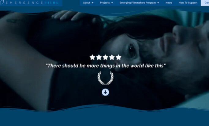
The Un Known features an animated space brimming with opportunities. Right from the get-go, visitors are welcomed with a video that “dares” them to step into The Un Known. The slick video presentation and accompanying animated elements entice visitors to sit through it multiple times, unpacking more and more each time.
Skilled web designers typically use video banners to captivate visitors and create an immersive and engaging experience – a technique that’s beautifully applied here.

The Un Known Uses Bold Messaging And Large Typography To Make Their Statements Known
Exceeding expectations is a goal every website should aim for. To achieve this, The Un Known website design relies on the bold copy that infuses substance into its commanding visual presence. It plays on the company’s name, deconstructing the everyday concepts and shedding new light into what’s familiar.
The Un Known website design combines a couple of proven UX design trends.
The white, all caps, sans-serif typography is one of the website’s strongest elements. Paired with subtle animation and a variation of dark mode, it commands attention while reducing eye strain and creates a higher contrast ratio, even when backgrounds are not exclusively black.
The large letters and the color contrast enhance visual appeal, complementing the fairly minimal horizontal layout. Meanwhile, punchy and on-point copy oozes self-assurance and adds to the distinctive flow of The Un Known website.
The Un Known doesn’t waste its audience’s time. It cleverly highlights its four distinctive sections: “Who,” “Why,” “So What?” and “Here’s What” that laconically spell out the agency’s mission, goals, benefits and services.
As The Un Known puts it:
"...messaging needs to transcend forgettable, annoying interruptive commercial marketing."

The Un Known Proves That Micro-Animations And Interactions Reflect A Brand’s Attention To Detail
Being part of and providing forward-thinking solutions for the entertainment industry, The Un Known must have an equally progressive website.
Eye-catching micro-animations provide another dimension to visitors and contribute to the overall user experience.
After the initial wow effect, the website demonstrates restraint and minimalistic tendencies. The animated elements are used as windows that offer a unique peek into the agency’s creativity, expertise, case studies and types of services. Hovering over their team members, for example, is an excellent example of this method.
Each section down the funnel comes with attractive imagery and subtle movements as the user hovers their mouse over it, which engages the visitors further and ensures longer on-page sessions.
The Un Known website design managed to achieve a balance between a seamless UI/UX and ambitious authenticity, minimalism and dynamism that elevate it from the competition.

The Un Known’s Main Menu Ensures Seamless Navigation While Ignoring The Conventions
Efficiency and simplicity don’t always equal following the norm. The main menu is the vital facet of user navigation and as such, The Un Known website design keeps it “sticky” and visible, changing its color to white when needed to keep it prominent.
Although it’s unusual, the menu’s placement at the bottom of the screen mitigates potential misdirection, as it effortlessly draws the visitors’ eyes, despite the ample distractions that the website offers. To the right are user-focused functions: The option to instantly translate the website to French and a Messenger-enabled chatbot.
Clicking on the menu icon instantly transitions to a simple list pointing to seven website sections, without any dropdown subcategories.
As users hover their cursor over it, each menu item is highlighted with one of the website’s primary colors which improves the visual consistency in UX.
Despite the number of graphics and visual cues, the website load time is near-instant. The inclusion of a loading animation cements The Un Known brand to the visitors’ collective psyche.

The Un Known Website Design Knows How To Provide An Effective Digital Experience
The Un Known website design sprinkles many facets of the best UX practices to the mix.
While it breaks away from the sea of white space-heavy websites and leans towards the dark mode trend, it still uses the brand’s colors quite lavishly.
Complementary pastel hues of peach and dark green feel comforting, evoking a sense of warmth and youthfulness. The designers caught on to what most branding agencies practice in creating color stories: using contrast to create a memorable and impactful visual identity.
The Un Known website is a festival for the senses, but not overwhelming. It is a textbook example that ingenuity, when mixed with the latest design trends, does wonders when engaging visitors, making it deserving of our Best Design Award.