PrimeIT is a Portugal-based international IT consultant firm inspired by the Pantone 2017 color of the year. This electric green shade quickly grabs the user's attention and draws them into the site.
The hamburger menu minimizes clutter on the layout by saving space. This also allows for bold and interesting content, like full-width background images or videos, which engage users with the website as quickly as possible.
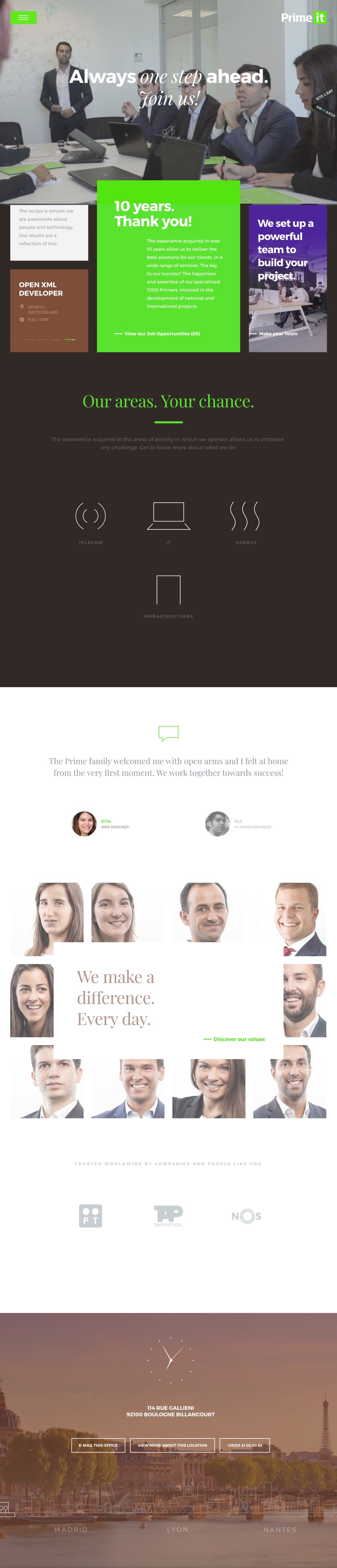
The simplicity of the page and use of negative space allow the content to breathe while the user scrolls down the homepage. Plus, the icons of the different cities on the bottom module are an amazing touch. Each background photo of every city, complete with their respective times, showcase an attention to detail.

An interactive grid displays infrastructure through spectacular images, which the user can navigate through. A small lightbox also appears in a fast zoom, and shows even more details. On the bottom of the page, Primeit has a strong photo that encourages the user to employ their curiosity and discover even more.

The website also brilliantly uses small animations and a subtle 3D effect on the header image as the user scrolls down. Bold colors create an awesome contrast between the sections -- the electric green works particularly well, and gives an almost "positive energy" to the design.

Primeit has amazing transition -- which include sound effects -- when users enter the sector pages. The sound moves from left to right, according to the user's mouse position.
Primeit is a corporate website design in the Advertising, Arts & Recreation, Professional Services and Technology industries.