Alignment in design refers to the intentional arrangement of elements to create a cohesive, balanced composition. Whether it’s text, visuals, or interactive components, alignment ensures every element is positioned with purpose.
In web design, alignment ensures that elements are structured to make it easier for users to interact with the interface. Similarly, in graphic design, aligned text and imagery make brand messages clearer and more impactful.
Let's explore the core principles of alignment, from its role in readability to its applications in web and graphic design. We’ll also tackle common alignment mistakes to avoid, highlight inspiring examples, and provide practical tips to help you master this essential design skill.
Benefits of Alignment in Design
Alignment, in both web design and the graphic design process, improves design by establishing clear visual connections between elements. This guides the viewer’s eye naturally, improves content hierarchy, and reduces visual clutter. When executed effectively, alignment significantly impacts aesthetics and readability.
For instance, a well-aligned webpage ensures users can quickly scan content, locate call-to-action (CTA) buttons, and navigate the page with ease, resulting in a more engaging user experience (UX). Here are more ways alignment aids in design:
1. Establishes Visual Connections
Alignment creates invisible connections between elements, making designs intuitive and visually appealing. These connections guide user focus, reduce cognitive load, and enhance the overall user experience.
2. Builds Hierarchy and Structure
Proper alignment helps prioritize information and direct attention to key elements like headlines, CTA buttons, or visuals. Aligned navigation menus and content blocks create a sense of order, ensuring users don’t feel lost or overwhelmed.
3. Boosts User Engagement and Conversion
A well-designed UI can boost conversions by up to 200%, proving that structured, user-friendly designs drive engagement and build trust. Misaligned layouts can cause confusion, frustration, and higher bounce rates.
4. Enhances Usability and Experience
Alignment is more than just a visual principle — it’s a functional strategy that significantly impacts usability by reducing cognitive load and creating layouts that feel intuitive and seamless. It ensures organization so that users can quickly locate key information. Mastering alignment helps designers craft layouts that resonate with users and achieve their intended purpose.
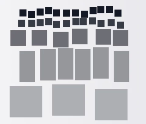
5 Types of Alignment and Their Applications
Understanding the different types of alignment and their strategic applications is crucial for creating polished, user-friendly designs. Let’s explore five alignment types and how they contribute to effective layouts.
1. Horizontal Alignment
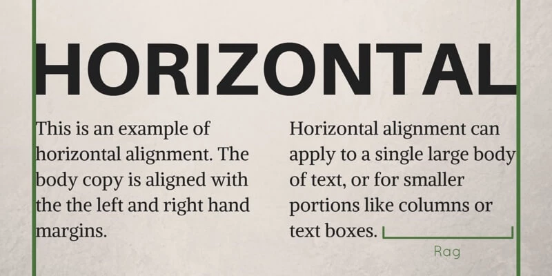
Horizontal alignment arranges elements along a shared horizontal axis, creating a clean and structured layout. This type of alignment is particularly effective in establishing a sense of balance and visual flow, guiding users across a design from left to right — the natural reading direction for most Western languages.
This alignment type is ideal for:
- Navigation menus, as this alignment ensures a logical flow, like the one used on Amazon
- Headlines and subheadings, which become more readable with this alignment, similar to those in The New York Times
- Image galleries, where this alignment creates smooth browsing, such as the layout used by Instagram
- Tables and data rows, as this alignment effectively organizes complex information, like in Google Analytics
- CTAs, where this alignment streamlines interaction, which is common in eCommerce websites
Benefits of Horizontal Alignment
- Ensures elements are aligned along the natural eye movement, making content easier to scan
- Adds a sense of order and professionalism to layouts
- Creates intuitive navigation paths, especially for interactive components like galleries or menus
2. Vertical Alignment
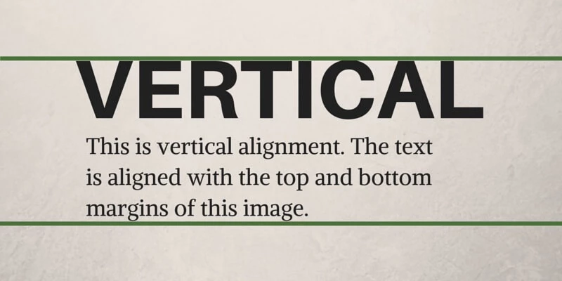
Vertical alignment arranges elements along a shared vertical axis, emphasizing structure and linear flow. It ensures that content is stacked logically and in a visually cohesive manner, making it particularly effective for designs with sequential elements.
This alignment type is ideal for:
- Forms, as stacking input fields improves clarity and usability; often seen on login or registration pages
- Mobile layouts, where this alignment helps content fit narrow screens and allows for easy scrolling
- Text columns, which become more readable in articles or blogs when using this alignment
Benefits of Vertical Alignment
- Directs focus to specific sections of content
- Creates a natural, linear navigation flow
- Enhances readability and usability in long-form content
3. Edge Alignment
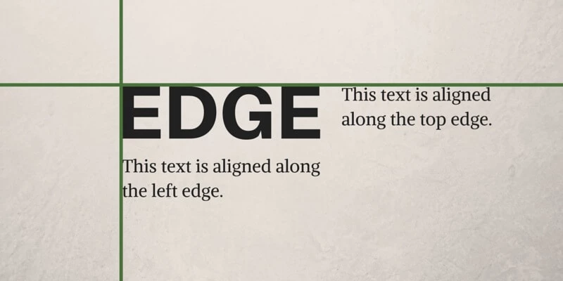
Edge alignment involves positioning elements along a shared left or right margin, creating a clean and structured design. This type of alignment is particularly effective in minimalistic web designs (or used to organize text-heavy layouts), where simplicity and clarity are paramount.
This alignment type is ideal for:
- Text blocks, as it improves readability in articles and documentation
- Website layouts, where it guides users naturally through the content, which is often seen in minimalistic web designs
- Sidebars, where this alignment keeps supplementary content accessible yet distinct from the main content
Benefits of Edge Alignment
- Ensures a structured, professional appearance
- Simplifies navigation by creating clear visual anchors
- Reduces clutter and improves content flow
4. Center Alignment
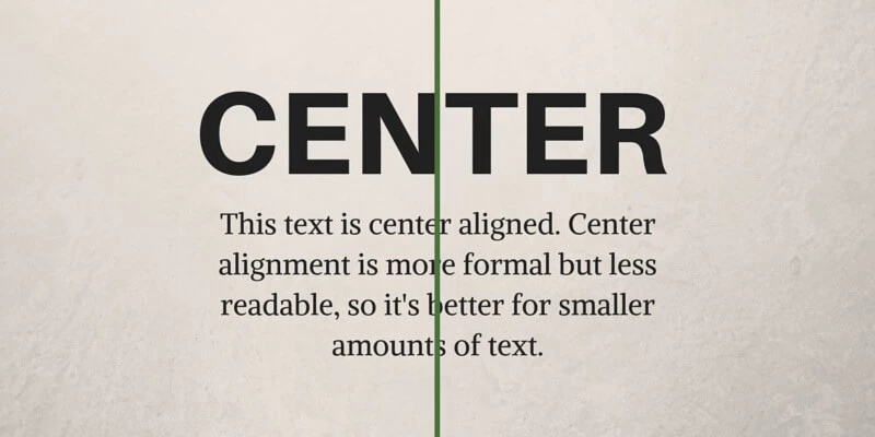
Center alignment places elements along a central axis, creating symmetry and balance. This type of alignment is ideal for drawing attention to key elements or crafting elegant, focused designs.
This alignment type is ideal for:
- Landing pages, where it effectively highlights call-to-action buttons or key messages, like on Google's homepage
- Logos and headlines, as this alignment draws attention to branding or focal points
- Event invites and promotions, where it creates a formal and centered layout for emphasis
Benefits of Center Alignment
- Evokes balance and symmetry
- Highlights important design elements
- Creates a clean, uncluttered appearance when used sparingly
5. Grid-Based Alignment
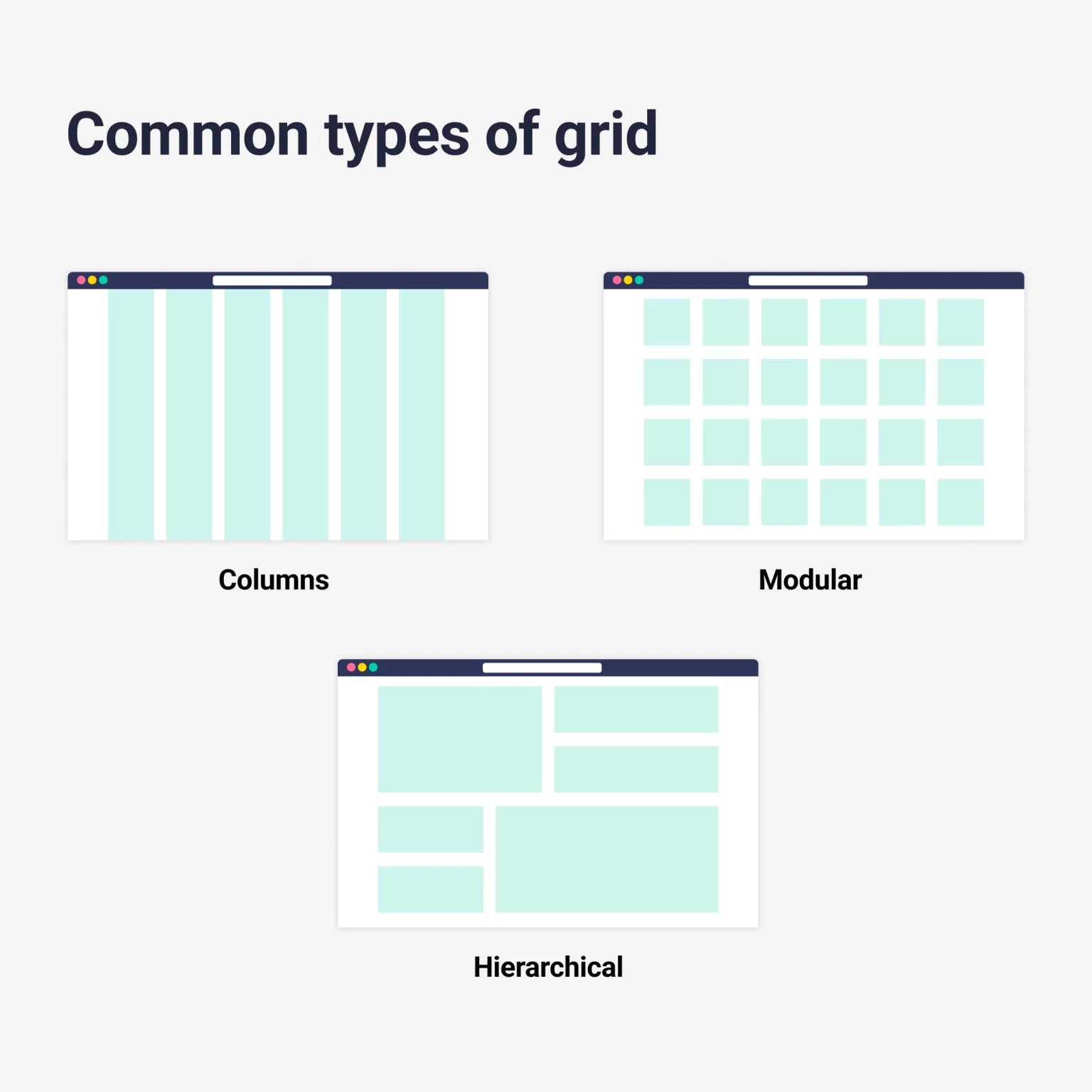
Grid-based alignment uses a structured framework to position elements with consistent spacing and proportions, ensuring layouts are visually cohesive and adaptable. This technique is essential for web and UI designers looking to maintain clarity and balance across different screen sizes.
This alignment type is ideal for:
- Responsive websites, as it maintains consistent alignment across various devices
- Galleries and portfolios, where it displays visuals in an organized manner, similar to Pinterest
- Dashboards, where this alignment structures data for improved clarity and usability
Benefits of Grid-Based Alignment
- Ensures consistency and balance throughout the design
- Simplifies layout adjustments across devices
- Provides scalability and flexibility for complex designs
Tools to Simplify Grid-Based Alignment
Frameworks like CSS Grid and Bootstrap make implementing grid-based alignment straightforward, providing templates that help designers achieve precise spacing and proportional layouts.
When combined with the unity principles of design, grid-based alignment becomes a key strategy for creating layouts that not only look polished but also function seamlessly.
Tips for Maintaining Alignment in Responsive Design
Responsive design poses unique challenges for maintaining alignment, as layouts must adapt seamlessly across devices of varying sizes. Here are some tips to ensure alignment remains consistent:
- Use flexible grids. Frameworks like CSS Grid and Flexbox allow elements to align dynamically, preserving structure across desktop and mobile views.
- Prioritize content hierarchy. Ensure that key elements, such as headlines and call-to-actions, remain aligned and prominent regardless of screen size.
- Test across devices. Regularly test your designs on various devices to identify and fix alignment inconsistencies, as well as ensure an optimal experience for all users.
3 Common Mistakes in Alignment and How to Avoid Them
Alignment is a powerful design tool, but when misused, it can create confusion and frustration for users. To maintain a polished and user-friendly design, it’s important to recognize and avoid common mistakes that undermine the effectiveness of alignment. Let’s explore three key pitfalls and how to prevent them.
1. Inconsistent Alignment
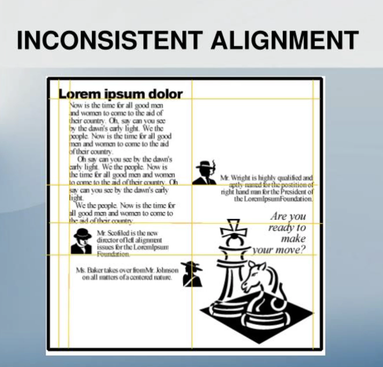
Inconsistently aligned elements disrupt the visual flow and make it harder for users to navigate a design. Misalignment between text, images, and other components creates a chaotic look, eroding trust and diminishing the perceived professionalism of the design.
Why It Happens:
- Designers may neglect to follow alignment rules when adding new elements.
- Lack of attention to spacing and margins leads to uneven layouts.
How to Avoid It:
- Use alignment tools in design software to snap elements into place consistently.
- Establish a clear alignment grid or baseline for all components.
- Regularly audit your layout to catch and correct any inconsistencies.
By ensuring consistent alignment throughout a design, you create a seamless experience that feels intentional and easy to navigate.
2. Overuse of Center Alignment
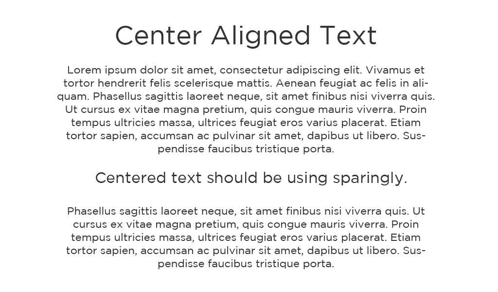
Center alignment can create balance and focus but overusing it can lead to cluttered designs that lack structure. When everything is centered, the user’s eye has no clear path to follow, making it harder to process information or identify key elements.
Why It Happens:
- Center alignment is often seen as a “safe” choice for making designs look clean and balanced.
- Designers may overuse it in an attempt to give equal emphasis to multiple elements.
How to Avoid It:
- Use center alignment sparingly and reserve it for headlines, key visuals, or singular elements that need focus.
- Combine center alignment with edge or grid alignment to create contrast and hierarchy.
- Test your design with users to ensure that key information stands out and the layout feels organized.
Striking the right balance between center alignment and other alignment styles creates designs that are both engaging and structured.
3. Ignoring Grid Systems
A lack of grid systems often results in unstructured layouts that feel disjointed and unprofessional. Ignoring this tool leads to uneven spacing, misaligned components, and poor user experience.
Why It Happens:
- Designers may bypass grids to save time or prioritize creativity over structure.
- In responsive designs, failing to use grids can result in inconsistent layouts across devices.
How to Avoid It:
- Incorporate grid systems like CSS Grid or Flexbox in your design process to maintain consistent alignment.
- Use predefined grid templates to save time and ensure uniformity.
- Adapt grids for responsive design, ensuring that elements realign dynamically on different screen sizes.
Grids are essential for creating cohesive, well-organized designs that guide users effortlessly through your content.
Alignment in Design: Examples
By leveraging edge, center, and grid-based alignment techniques, designers create layouts that enhance usability and leave lasting impressions. Here are three standout examples of alignment that demonstrate its versatility and impact.
1. Edge Alignment: Apple
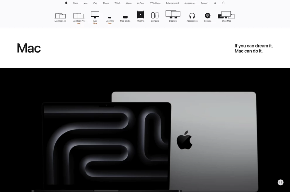
Edge alignment is a clean, minimalistic design hallmark, and Apple’s eCommerce website exemplifies this approach. The site achieves a sense of order and professionalism by aligning content such as product descriptions, images, and navigation menus to the left or right edges.
The consistent alignment creates a natural flow, allowing users to effortlessly scan product categories and focus on call-to-action buttons like “Learn More” or “Buy Now.” This structured design minimizes distractions, helping users quickly find and purchase products.
Edge alignment ensures that even complex content is easy to navigate, making it ideal for eCommerce platforms where clarity and speed are essential.
2. Center Alignment: Dropbox
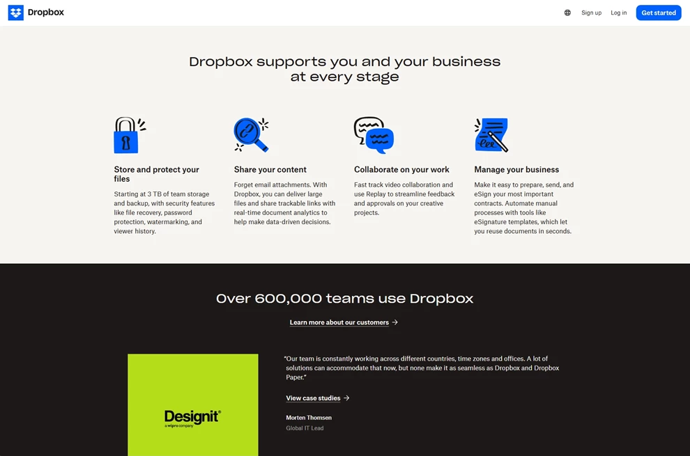
A prominent example of center alignment in web design is the official website of Dropbox. The homepage features centrally aligned elements, such as headlines, images, and call-to-action buttons, creating a balanced and focused user experience.
For a widely used platform like Dropbox, center alignment effectively showcases their services in a clear and user-friendly manner.
3. Grid-Based Alignment: Microsoft
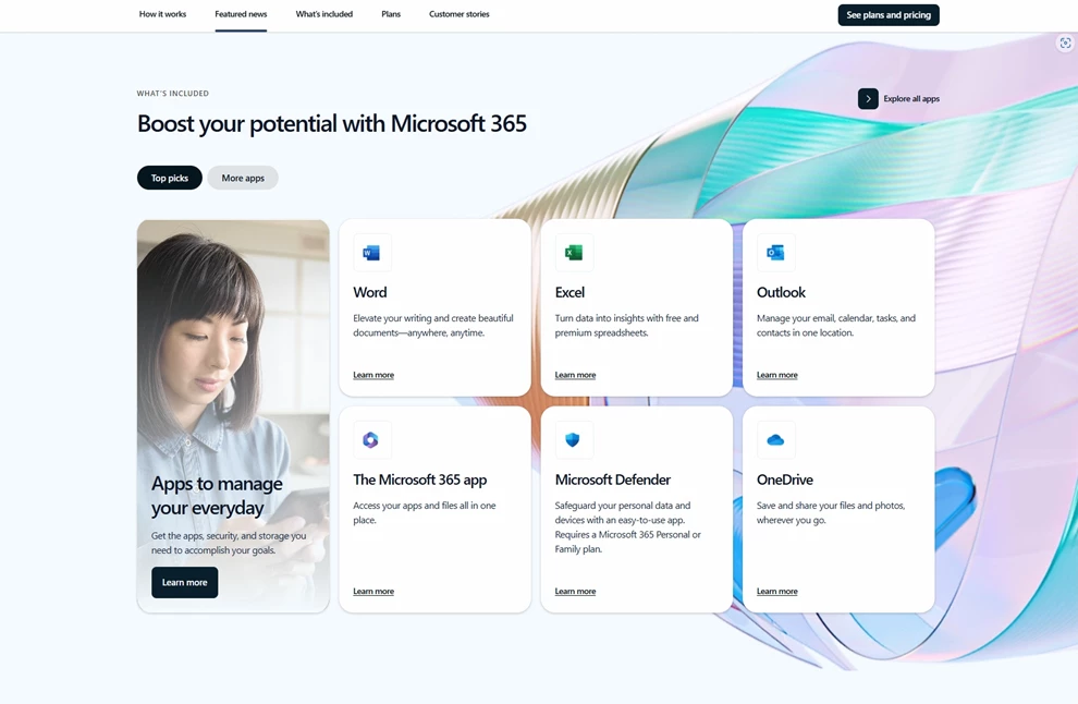
Corporate websites, like Microsoft, rely heavily on grid-based alignment to organize vast amounts of information. By structuring layouts with grids, visitors can quickly locate information — from product offerings to company news — regardless of the complexity of the content.
Alignment in Design: The Bottom Line
Alignment is the silent architect of great design, shaping user experiences that feel seamless and intentional. It’s the foundation that ensures every element serves a purpose, guiding the user’s eye and creating balance across a layout.
Achieving perfect alignment isn’t about rigid rules but creating connections that make designs meaningful and functional. With the right tools and a commitment to detail, designers can unlock the full potential of alignment and deliver work that not only looks polished but also communicates effectively.
Alignment in Design FAQs
1. What is alignment in design, and why is it important?
Alignment in design refers to the arrangement of elements along a common edge, axis, or grid to create balance and harmony. It ensures that designs are visually appealing, easy to navigate, and professional. Proper alignment helps guide user focus, enhances readability, and creates a cohesive user experience.
2. What are the main types of alignment in design?
The main types of alignment include:
- Horizontal Alignment: Aligns elements along a horizontal axis (e.g., navigation menus).
- Vertical Alignment: Arranges elements along a vertical axis (e.g., stacked forms).
- Center Alignment: Positions elements symmetrically around a central axis (e.g., logos or headlines).
- Edge Alignment: Aligns elements to a shared edge, creating clean layouts (e.g., sidebars).
- Grid-Based Alignment: Uses a structured grid for consistent spacing and proportions (e.g., responsive designs).
3. How does alignment impact user experience?
Effective alignment creates a sense of order, reducing cognitive load and making it easier for users to navigate a design. It helps prioritize information by establishing a visual hierarchy, ensuring that key elements like headlines, CTAs, and images stand out.
Misalignment, on the other hand, can confuse users and lead to frustration or disengagement.
4. What tools can designers use to improve alignment in their projects?
These tools help ensure consistency, scalability, and ease of use in any design project.
- Grid Systems: CSS Grid, Bootstrap, or Adobe XD for structured layouts.
- Alignment Features in Software: Built-in tools in platforms like Figma, Sketch, or Canva.
- Guidelines and Rulers: Features in Photoshop or Illustrator for precise alignment.


-preview-webp.webp)