The best government website designs are intuitive, user-centric, and visually compelling. They instill trust and command authority without sacrificing engagement or accessibility.
This list consists of the best examples of website designs for the government. Created by some of the best web design companies on the market, these websites catch attention and go beyond the "dull, stern outlook" stereotype common in the industry.
Each design is appealing and navigable, delivering exemplary user experiences.
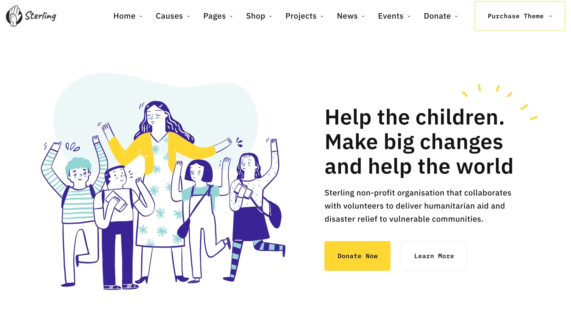
1. Sterling Charity Donation by UPQODE
Standout Features:
- Charming illustrations
- On-brand color palette
- Strategic use of negative space
Sterling is a non-profit organization that collaborates with volunteers to deliver humanitarian aid and disaster relief to vulnerable communities worldwide. UPQODE designed the organization's website, which features a stylish visual presentation, playful illustrations, and an on-brand color palette.
The most critical aspect of Sterling’s website is its messaging. It shuns redundant, lengthy, excessive descriptions in favor of straightforward, on-point paragraphs that clearly convey the organization’s goals and retain their light-hearted tone.
This government website design example uses alternating purple and white blocks to accentuate every piece of content.
The user journey is as simple as the design. While the website doesn’t use sticky menu navigation, it sits at the top of the page, welcoming visitors and showcasing every facet of Sterling’s mission.
Furthermore, each menu section consists of several sub-menu items. When visitors hover the mouse over them, they open in a drop-down manner, revealing a multitude of subcategories.
Clicking on each option takes you to the other side of the website’s metaphorical coin, as the dynamic doodles are replaced with photographs (even the typography transforms to slick, serif Passenger Display font).
Although we wouldn’t usually endorse such a break from the website’s uniformity, this method works in Sterling’s favor. It emphasizes the organization’s mission by showcasing its distinct people-first approach and authenticity.
2. Gineko by Mood Works

Standout Features:
- Innovative Scrolling
- Pastel color palette
- Inspires positivity
As the aptly named Mood Works agency notes: "Medicine is serious business, but can it have a friendly face?" Like seasons, life goes in cycles as we develop and age and have our own kids; then we watch them grow and age and have their own kids. This journey is lovely, but it can be scary, especially in terms of health and medical needs.
That is why Mood Works, when crafting their website design for government client Gineko, aimed to make the user journey reflect the one we trek in life. By using this highly innovative scrolling feature and syncing it with the menu navigation, they presented prospective patients with a familiar face that took their hand and guided them through every stage of the cycle.
That way, Gineko, a pediatrics and ob-gyn clinic in Zagreb, Croatia, and its patients have an incredibly helpful online nurse to streamline and elevate the experience for both parties.
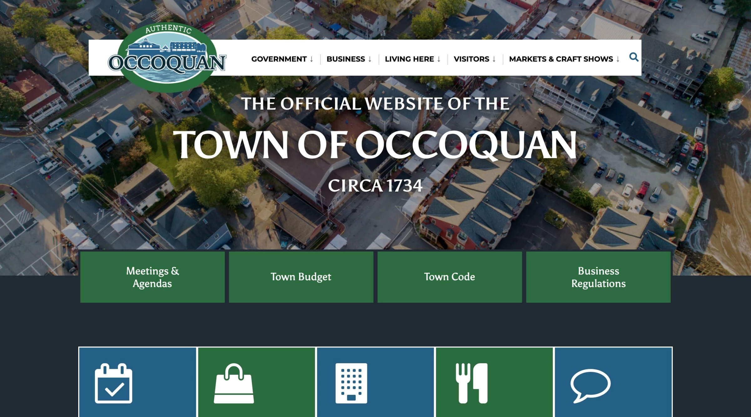
3. The Town of Occoquan by Imagine Design Creative and Marketing
Standout Features
- Sticky menu navigation
- Clever use of colors and typography
- Fast-loading pages
The official website of the Virginia town of Occoquan, crafted by Imagine, is a textbook example of simplicity paired with eye-pleasing visuals in government website designs.
This “less is more” approach captures attention immediately through subtle color grading that complements the homepage’s aerial landscape. The design visually spotlights Occoquan as a small town (with less than 1,200 residents) with plenty to offer.
The tranquil greens and blues throughout the website’s prevalent whiteness perfectly highlight the distinct semi-serif typography. They guide user attention and contribute to a seamless UX. The website's impressive loading time and sticky menu navigation stand out the most in terms of efficiency and usability.
UX best practices dictate that the menu stays at the top of the page when users scroll. Adorned by the town’s official logo, it is clean and practical. It swiftly opens drop-down submenus when visitors hover above different sections, mitigating potential misdirection.
The website page load speed is lightning-fast. Faster sites reap the most benefits, and Imagine Design counts every second. Keeping in mind that pages that load within two seconds have an average bounce rate of a measly 9%, “the official website of the town of Occoquan” officially hits that sweet spot.
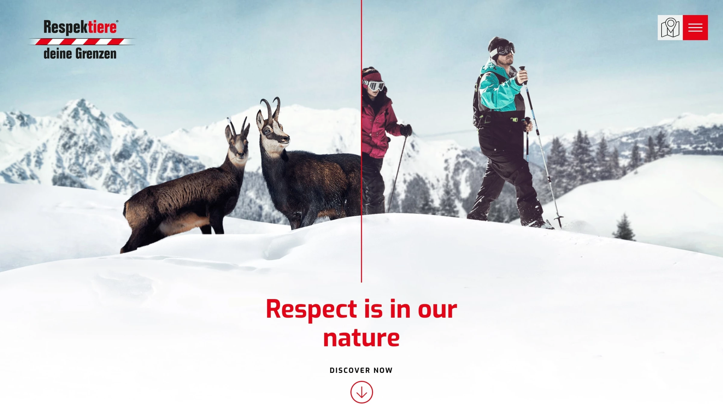
4. Respektiere deine Grenzen by Baschnegger Ammann Partner
Standout Features:
- Interactive map
- Guides the user journey
- Mobile-first design
The Respektiere deine Grenzen, or “Respect your limits,” initiative focuses on treating nature and wildlife with the respect they deserve. Forests, mountains, meadows, and bodies of water are habitats for animals and plants that are becoming scarcer as our “civilized” influence expands.
The website, courtesy of Baschnegger Ammann Partner, acts as a problem-solving notice board, offering a consistent public information campaign to increase awareness via innovative branding tactics.
On the initiative’s website, outdoor life fans will find complete information on nature conservation, helpful tips for planning tours through a riveting interactive map, and booklets with essential rules of conduct.
The website is visually split into two symmetrical sides with a mountain range landscape, illustrating the brand’s mission. The line that splits the homepage guides visitors and represents an ideal on-site user journey, on-page or literally.
Following that line reveals the website’s nature clearly (pun intended), as it uncovers a mobile-first design, ideal for finger scrolling when you relish in the "beautiful outside" with respect. Such an intuitive interface aligns with some of the best government website designs, prioritizing user experience across devices.
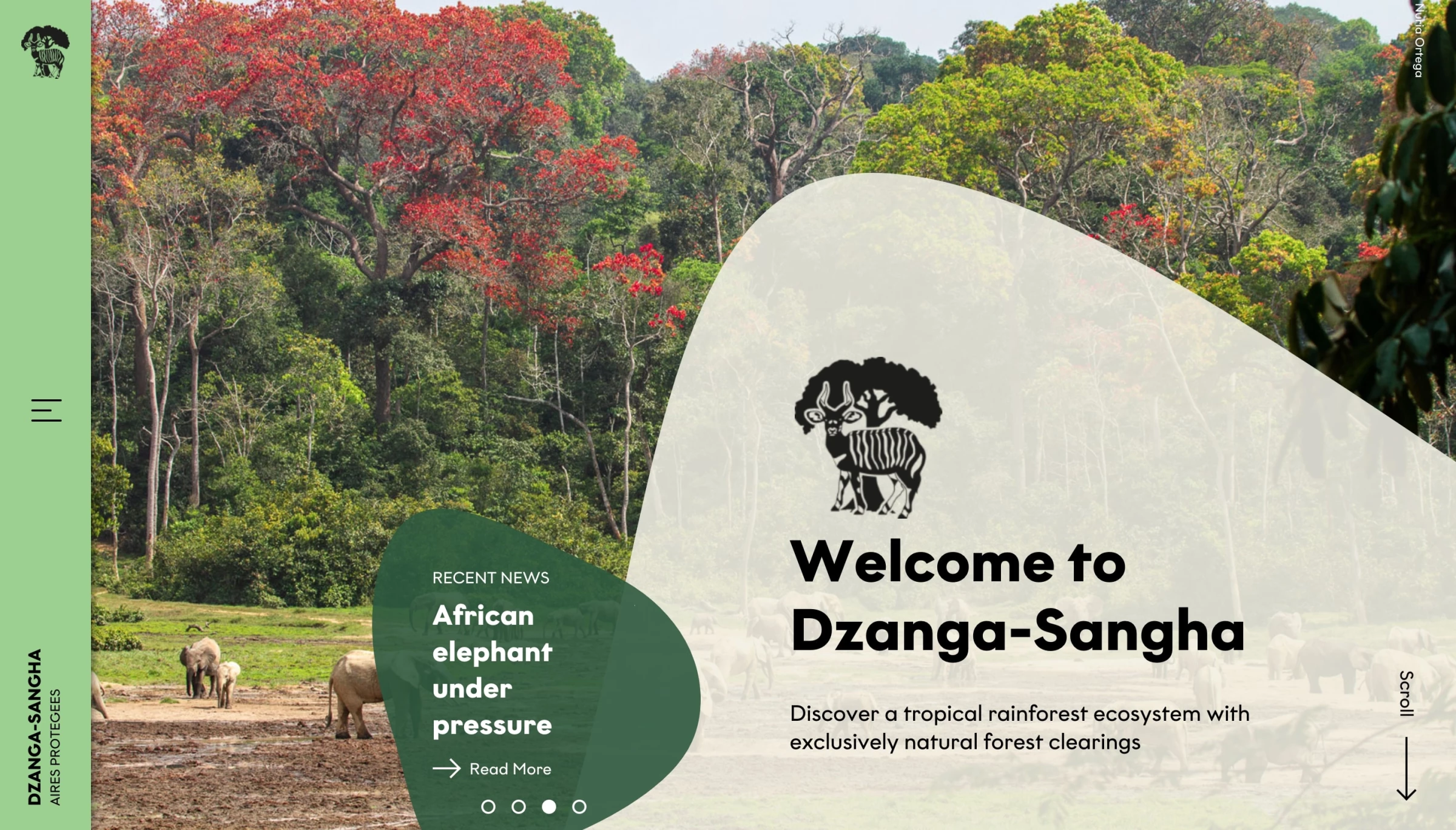
5. Dzanga-Sangha Protected Area by Buro des Prasidenten
Standout Features:
- Innovative Menu
- Stunning visuals
- Compelling and Informative
Established in 1990, the Dzanga-Sangha Protected Area (DSPA) is in the far Southwestern region of the Central African Republic (CAR), at the northern edge of the Congo Basin forest. The area is widely known for its impressive biodiversity and is the most extensive intact forest remaining in the country.
Developed by Burodes Prasidenten for WWF Germany, the Dzanga-Sangha website is an effective communication and engagement model, aligning with some of the best government website design principles.
On the one hand, it provides relevant information about the unique flora and fauna worthy of meticulous preservation. It also addresses conservation-oriented tourism by offering information on accommodation, travel options, and local activities.
The website sports an on-brand color palette associated with Africa's captivating nature. This contributes to the high-end branding usually found in some of the best-crafted tourist agencies’ websites.
The user journey begins with the sticky menu on the page's left side. The hamburger icon opens a sliding menu that commands attention with its palpable green hue and subtle micro-animations.
A particularly eye-catching element is the captivating photo gallery and grayed-out vector illustrations accompanying every page, from information about local wildlife to booking luxurious, eco-friendly accommodations.
The design and storytelling work together to offer a unique taste of the African Outback, attracting visitors and enticing them to continue exploring the website.
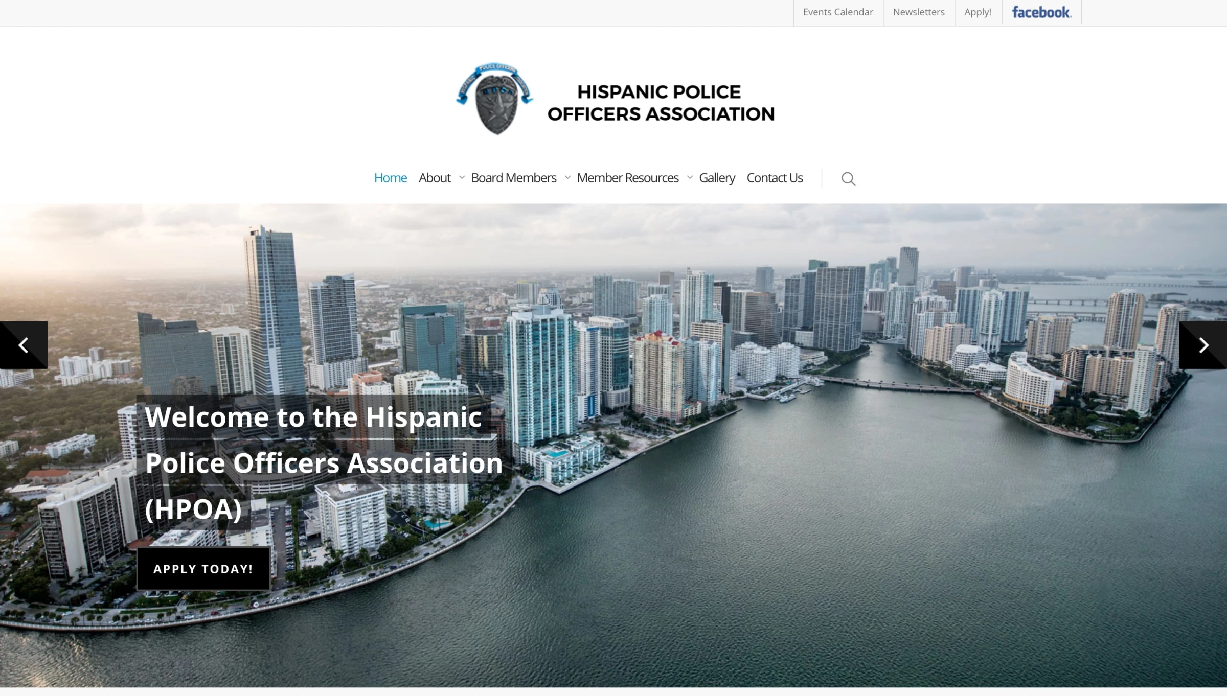
6. Hispanic Police Officers Association by Decographic
Standout Features:
- Animated logo
- Sticky menu navigation
- A good placement of important info
The Hispanic Police Officers Association (HPOA) is a Miami-based, non-profit friendship organization for members of the police force of Latino descent, whether serving or retired.
The purpose of HPOA is to inform, educate, unify, and stimulate its membership through various charities, training programs, legal assistance, and events, and this government website design does precisely that.
To help them create a unified platform for all its members, HPOA hired Decographic, a Miami agency with a proven track record in creating meaningful digital solutions for several local institutions.
While primarily static, the website breathes life with the animated spinning logo (styled like a police badge). It increases user engagement and showcases the organization’s vigilant watch over the city of Miami.
The simple, sticky navigation menu ensures ease of use and increases visitors' retention. It’s clean and practical, without any distractions to draw attention away. Negative space further reinforces user-friendliness, improving readability and allowing visitors to consume the content efficiently.
The uncluttered bright background is only interrupted with occasional photography and striking blue color accents used for icons, highlights, and CTAs.
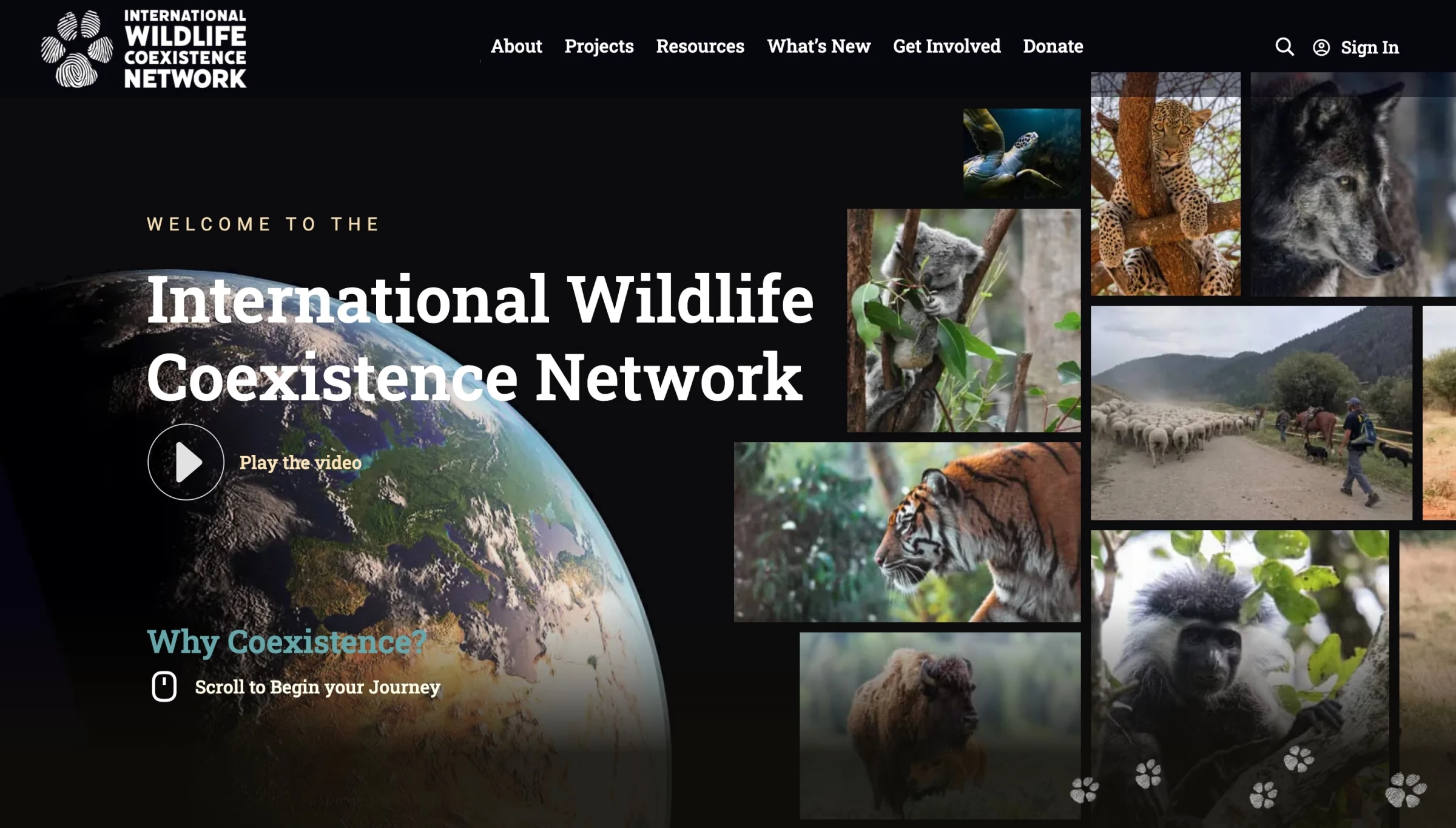
7. Wildlife Coexistence by IndieTech Solutions
Standout Features:
- Flashy intro video
- Dynamic UI
- Micro-animations
The International Wildlife Coexistence Network is a worldwide initiative connecting communities and wildlife experts across the globe.
Their website, crafted by IndieTech Solutions, one of the up-and-coming website design companies, does what words cannot express or properly convey — making a change — design-wise at first and, with any luck, a global shift in perception towards nature preservation.
The website’s atypical journey, starting with an engrossingly beautiful video, tells the brand’s entire story using the so-called “scrollytelling” technique. In other words, it morphs long-form storytelling into a highly interactive experience as users scroll through the website, while video adds a layer of visual appeal.
The initial, unorthodox horizontal scrolling seamlessly switches to vertical, backed with a slew, but unobtrusive, micro-interactions. This approach, often seen in the best website designs for government entities, aims to make absorbing and retaining information memorable, leaving a lasting impression – a virtuous conversion if you ask us.
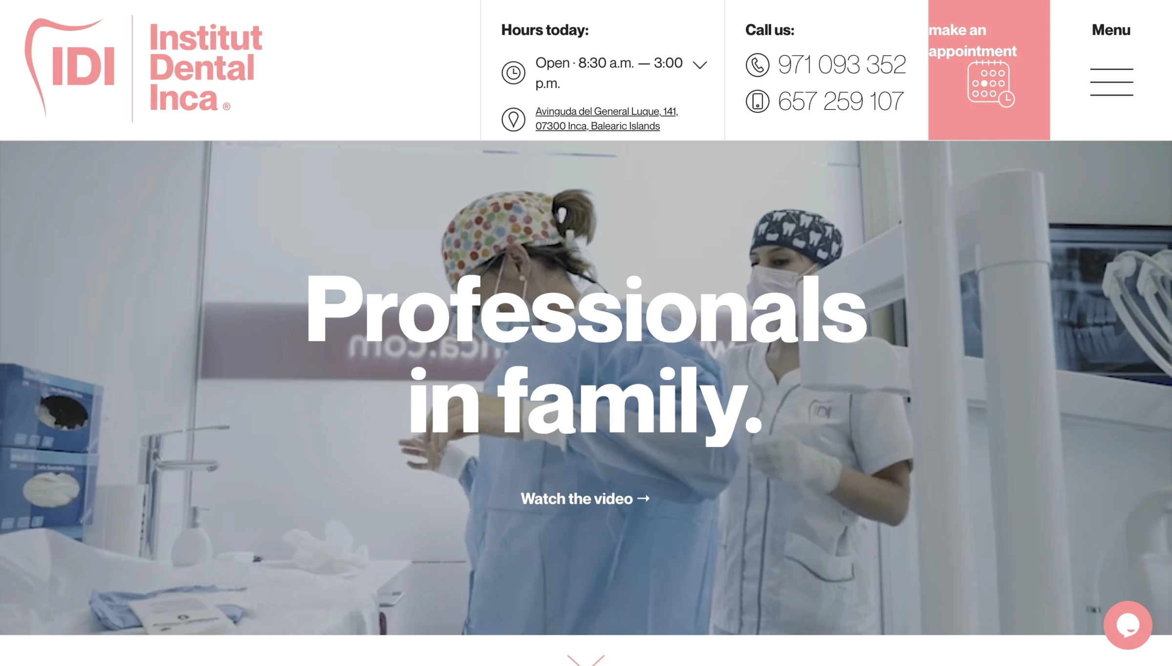
8. IDI - Institut Dental Inca by Miguel Trias
Standout Features:
- Intro video carousel
- Both art and copy highlight the brand’s USP
- Micro-animations
IDI is a Mallorca-based advanced dental institute that perfectly balances high-tech clinics and family-run businesses. The website, developed by Miguel Trias, an independent design studio based on the same Spanish island, is a model union of usability, pleasing aesthetics, and future-proof design.
Technically, it is top-notch, featuring many details and micro-animations that create a genuinely pleasant navigation experience. The smooth journey not only allows users to easily discover IDI’s services and book an appointment but also subconsciously associates the resulting gratification with them.
The government website's design approach to video is exciting. While the looping video on the homepage contributes to the first impression, clicking on it takes you on a journey starting far from a dental clinic.
Visitors who land on dental service websites generally seek four things: location, price, specialist bios, and appointment page. Watching the video alleviates potential anxiety or the typical patient discomfort we all feel in the waiting room.
As we scroll down the page, the economical use of messaging becomes more apparent. With no more promotional copy than necessary, IDI’s website lets patients speak in their stead through prominent testimonials.
A modern, legible sans-serif font and custom iconography are used throughout, from the prominent tagline and CTA at the top to the footer and contact page.
Browse our collection of the best website designs for more inspiration.
9. ASCE by Ironistic
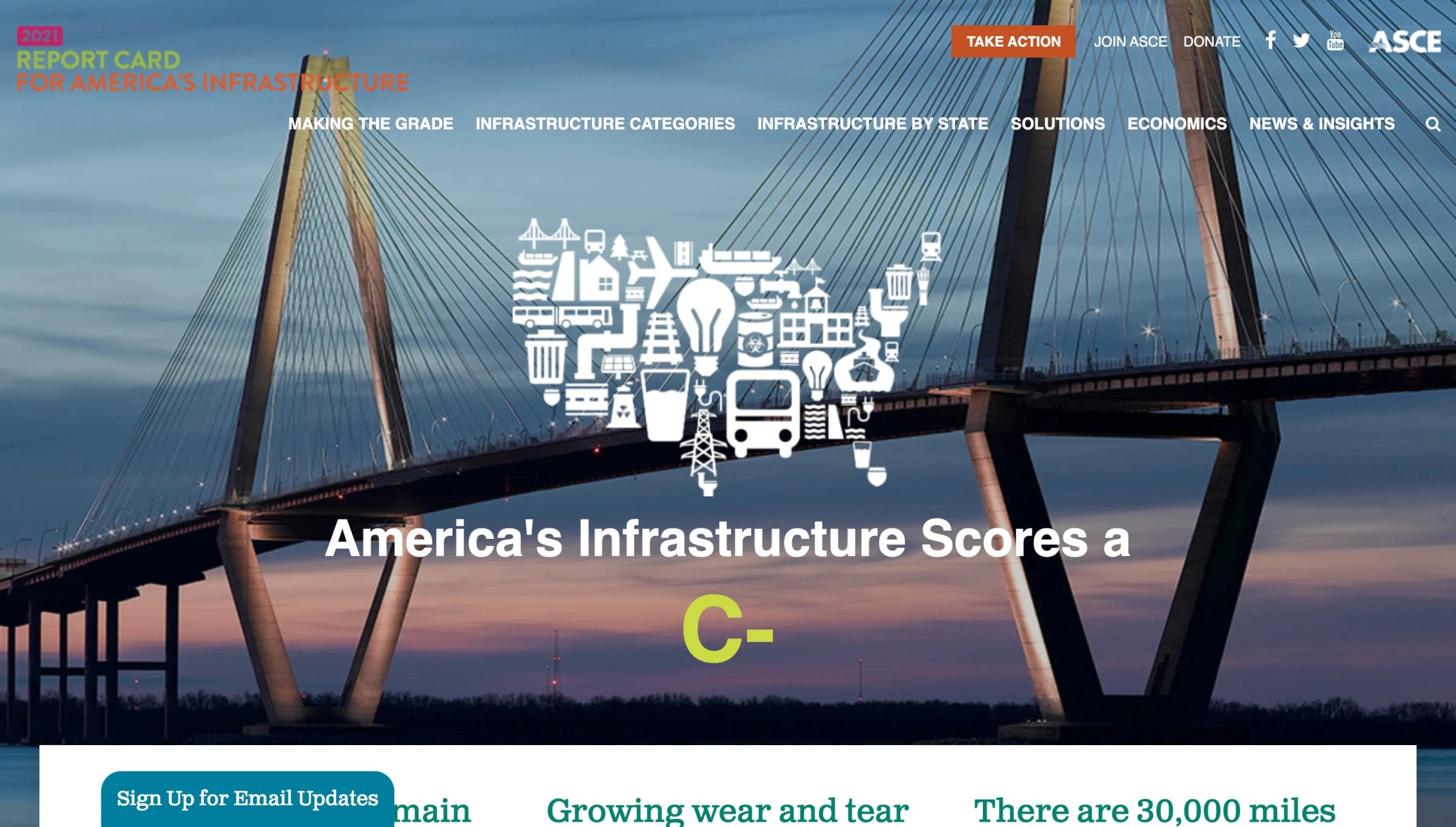
Standout Features:
- Detailed mission messaging
- Interactive state map
- Neatly divided segments
The American Society of Civil Engineers (ASCE) has long advocated for the care of US infrastructure. Starting in 1998, they issued the Report Card for America’s current state of infrastructure every four years. With almost a decade-long partnership with ASCE under their belts, Ironistic was a natural choice for the 2021 report card website redesign.
The main goal of the updated website was to modernize the design and audit the content to best display the report’s critical information to its target audiences, aligning with the best government website design practices for effective communication and engagement.
Ironistic opted for a content-focused layout, with colorful visual elements and messaging interspersed on all the primary landing pages. The goal was to present data simply and efficiently.
The sticky main menu navigation switches to white once the user starts scrolling, revealing all kinds of information, blocks of text, CTAs, and other insightful elements. However, one of the most remarkable elements is ASCE’s interactive state map — where visitors can click on their state and learn more about its infrastructure facts.
The site renders well for both desktop and mobile users. Its responsive, modern look and feel and a careful balance of design and usability result in an interactive and stylish product.
10. Elementary Teachers' Federation of Ontario by Inorbital
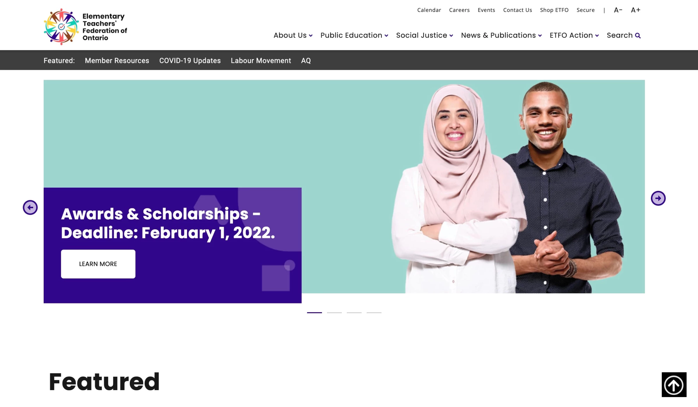
Standout Features:
- Vibrant photographs
- Multicolored website
- Clean and simple
The Elementary Teachers’ Federation of Ontario (ETFO) is a professional and protective organization representing over 83,000 teachers and educators employed in Ontario's public elementary schools.
Their government website, designed by Inorbital, is an essential communication platform for informing members and engaging the media, parents, and the public on Ontario's critical public education issues.
While targeting a particular audience, the ETFO’s website is enjoyable. In addition to its fresh and accessible design, it utilizes a simple layout and content hierarchy that makes navigating through every page a breeze.
The design flaunts bright purple, yellow, blue, and red hues, displaying the organization's website as a cheerful and colorful place. It embodies the institution’s logo and reflects the union's diverse nature.
To reduce bounce rate and keep users glued to the ETFO website, Inorbital built a custom smart search with intuitive filters and tagging. This search section was customized based on user journeys and the content users sought most. It is part of the sticky navigation menu.
Talk about learning, huh? Straight As in our book, for sure!
11. Umag by ALT
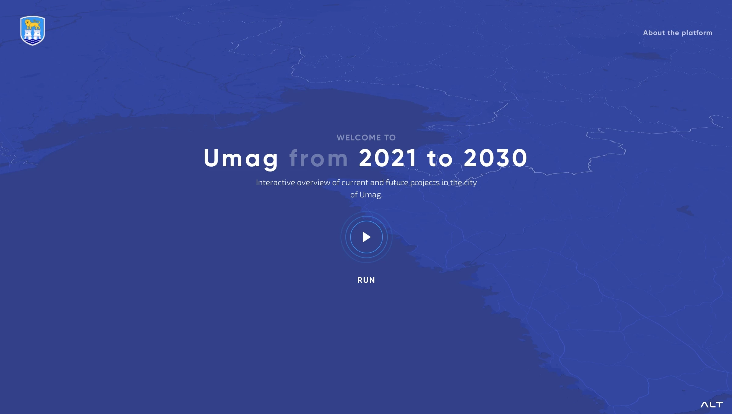
Standout Features:
- Interactive 3D map
- Modern and future-proof
- Fluid transitions
Future of Umag, an interactive showcase of government projects made by ALT for the City of Umag, showcases the plans to develop the Croatian seaside area in the coming decade. With this platform, local authorities wanted to present all future steps in detail visually and engagingly, providing residents and tourists with the most realistic insight into the plans.
The main goal of this platform is to communicate with citizens, following best practices in creating website designs for the government, to enhance people's engagement and transparency.
The platform aims to involve citizens in each project, encouraging them to share their thoughts and suggestions and fostering a collaborative environment between the government and its constituents. All in all, the impressive 3D interface engages interested parties and casual visitors, providing a unique interactive experience.
12. Callshop Radio by Kilian van de Water
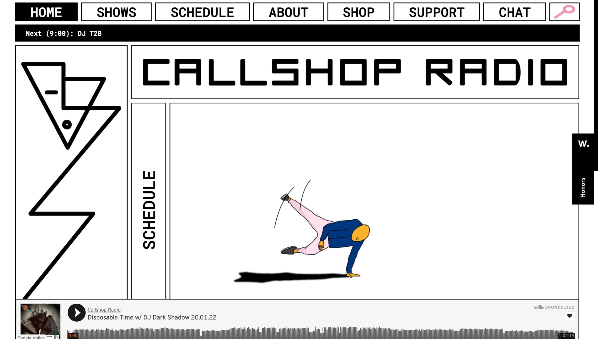
Standout Features:
- Motion graphics
- Fun and creative execution
- Live chat feature
Callshop Radio is an independently operated community radio station based in Dusseldorf, Leipzig, and Paris. Focusing on local indie artists in each city, the station aims to leave all rules and boundaries behind.
This "express yourself" attitude permeates every facet of their website or online radio station, designed by the equally artsy graphic and motion designer Kilian van de Water. Visually, the highly original design approach evokes different aesthetics: sharp, angular lines associated with industrial music artists of the 80s and colorful and smooth motion graphics.
This unique style sets it apart from typical government website designs, creating a memorable and engaging experience. The whole website looks more like an animated, clickable poster than a website, adding to its uniqueness.
Not conforming to norms and conventions helps Callshop Radio stay as close as possible to its listeners. Aside from live sessions and a show calendar/timetable, the page sports a dedicated chat room that entices its growing community members to interact and stay engaged between "gigs."
13. Frontline by Olson
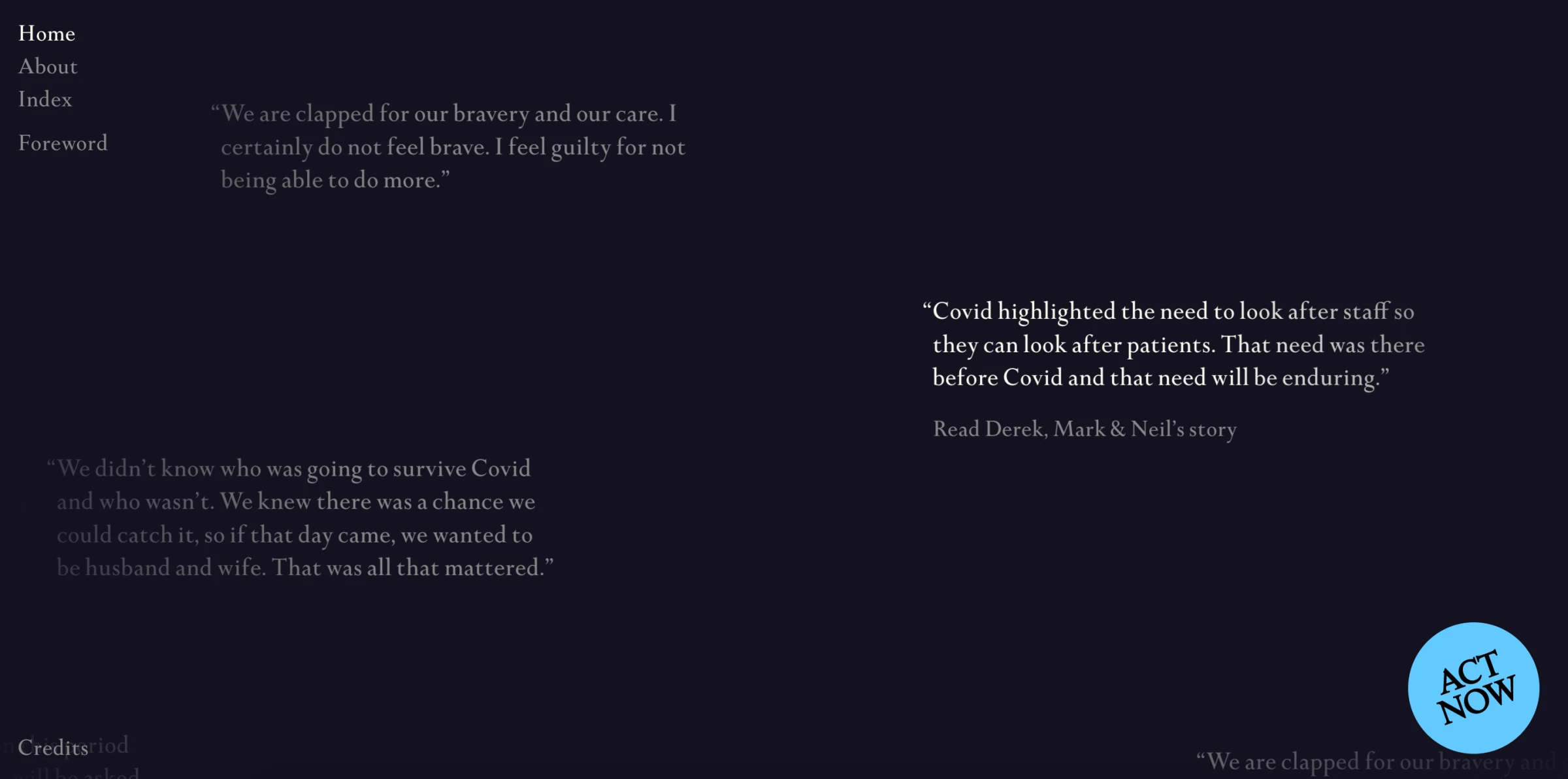
Standout Features:
- Story-oriented layout
- Emotional impact
- Minimal content, except for stories
Frontline, a website developed by the Olson agency, tells the untold stories of doctors and medical workers working on the first line of COVID-19 defense and suffering from physical and emotional burnout. The website's layout puts their stories front and center, which the users can list simply by dragging their mouse cursor over the screen and picking a story.
Clicking on a single story's first lines opens a pop-up window with the complete story. The quotes from each story are in a classy serif font against a dark blue background. The About and Index pages present the website's awareness-raising purpose and the list of featured doctors.
This thoughtful design, particularly typography and color, aligns with some of the best government website design principles for creating an informative and engaging user experience.
Explore how these government website design principles can be adapted to create engaging and informative finance website design.
14. Minnesota State Transportation Center of Excellence by 8bitstudio
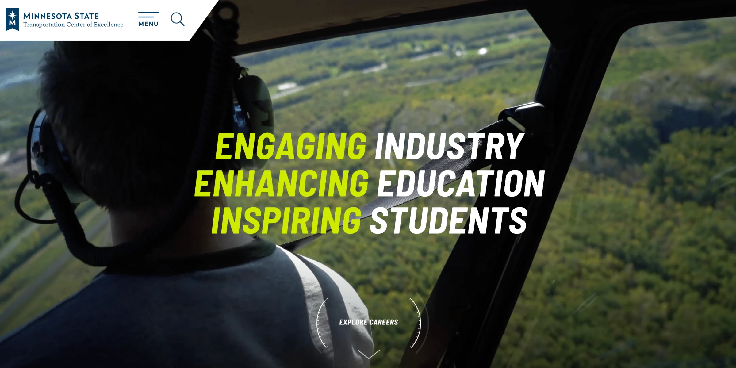
Standout Features:
- Creative main menu
- Large fonts, images, and videos
- Layout that relies on the element of surprise
Designed by 8bitstudio, the website for the Minnesota State Transportation Center of Excellence opens with a full-screen, hi-res video with a prominent tagline and display of UVPs across. The main menu on top of the screen opens a visually stunning screen with airplane navigation instruments at the center.
Down the homepage is a mix of visual and textual elements presented in a modern fashion, with large fonts, huge images, and diagonally cut sections. This creative approach aligns with some of the best government website designs that aim to engage users through visual appeal.
The website's use of the "element of surprise" ensures visitors never know what's coming next regarding content, visuals, CTAs, or anything else, making the experience more dynamic and memorable.
15. Hukoomi by Lollypop Design
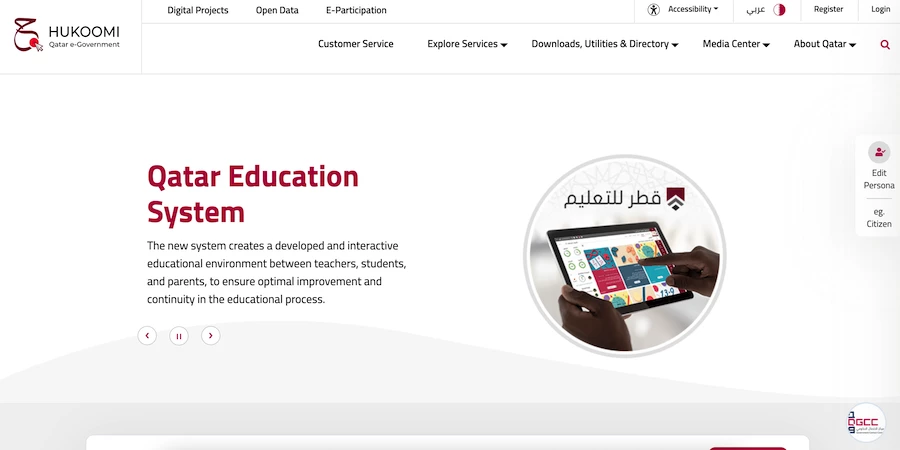
Standout Features:
- Good use of national colors
- Two-level menu navigation
- User options hovering to the right
The Hukoomi Qatar eGovernment website by Lollypop Design uses the national colors of the Qatari flag — dark red and white — as a foundation for the appearance. White dominates and makes up the website's legibility and understandability, with red being the accent color on buttons.
The complexity of citizen services is well reflected in a two-level main menu that stays on the page all the time. This approach, often seen in compelling website designs for government, aims to ensure easy navigation through vast information. The website offers a neat overview of all the major factors that concern the country's citizens and presents it in a well-articulated manner.
The user profile options remain on the right side of the screen, giving users unique and handy access to personal data and documents at a moment's notice.


-preview-webp.webp)