Scrollable websites are certainly not a novelty, as the scrolling feature has been an integral part of any respectable website from the concept's inception. However, what you do with it differentiates greats from those we often deem “not bad.”
Recently, leading web designers have opted for long-scrolling websites that offer clean, creative, and fluid navigation and it has become quite a trend in recent years. On the other hand, many abandon your typical top-down, vertical scrolling in favor of horizontal navigation, developing poignant and linear narratives embodied in the layout.
Many examples stick to the landing by not sticking to the "rules," but we’ve made sure to sift through the best and bring you the seven best scrollable website designs on the World Wide Web. Get inspired!
7. Tiger Group by Qream Design Agency
[source:theqream.com]
Standout Features:
- Interactive
- Monochromatic
- Elegant typography
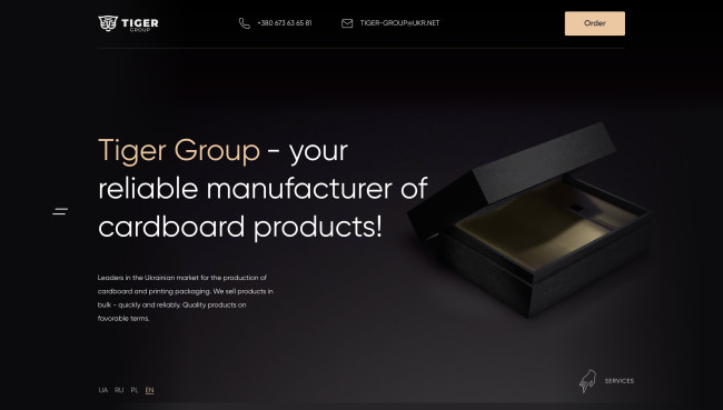
Being sleek and smart is one thing, but emanating class is something else. You don't have to flaunt your qualities, they're evident in your every step or scroll in this case. Tiger Group's new website, courtesy of Qream Design Agency, is one such example.
Just like its namesake, it doesn't rely on rich colors, stripes, and garish visuals, but rather a stealthy, seamless approach. It's subtle, elegant, semi-interactive, and easy to navigate - traits worthy of the best in this ever-expanding online jungle.
While basic the color palette reflects the brand's USP, playing on trendy "dark mode" appeal to accentuate the product and spotlight the key qualities of luxury box packaging.
6. Oxymoron

Standout features:
- Infinite scroll feature
- Zany and interactive illustrations
- Humorous messaging
Oxymoron stay true to their name, as this is definitely something you don’t see every day.
It is as if the agency heard William Blake’s famous verse: If the doors of perception were cleansed, everything would be as it is - infinite and turned it on its head by adding a slew of playful and interactive illustrations and zany antics but retaining the essence – straightforward, on-point messaging and a play on infinity
The homepage comprises full-height sections with an infinite vertical scroll that does not only act as an appealing gimmick. In fact, it reflects Oxymoron’s approach. “Might go up” communicates that your typical conventions aren’t always the only route for threading. If you will, Oxymoron is here to adjust your perception, and masterfully so.
Additionally, micro animations and advanced responsive logic are key features that make this website effortlessly stand out among competitors.
5. MagicMarinac

Standout features:
- Engaging services/portfolio carousel
- Bold typography
- Animated elements
MagicMarinac is a Zagrab-based creative studio specializing in web design & development, and branding. Developing brands and building online experiences focusing on the end user is the name of the game, and MagićMarinac proves to be the MVP of the Balkan region and beyond.
The studio’s passionate approach is best encapsulated in its website. It’s clean, simple, and streamlined, but most importantly, a joy to scroll through. Each visual element has a specific purpose; none are over the top, including the subtle animation.
You don’t have to look far to find MagićMarinac’s “exploits” (i.e., portfolio) as the homepage offers a convenient carousel that helps visitors browse through various projects.
Appealing visuals aside, what stands out the most is the buttery-smooth transitions and lightning-fast page load speed – an achievement by itself, considering the site’s rich content.

4. fourpillars

Standout features:
- Striking parallax effects
- Interactive navigation
- Arcade game mode
Just glancing at fourpillars’ minimalist logo and its values calls to mind the agency’s national history as it represents the streamlined depiction of the ancient Greek (Doric) columns – the primary building blocks of great European architectural wonders.
Right from the start, it’s safe to say that fourpillars’ website takes scrolling effects to new heights while taking you down the rabbit hole. It is, in fact, the perfect example of how a fairly monochromatic, simplistic design, paired with creative parallax effects, creates an outstanding user experience and a genuinely satisfying escapade.
The site’s user journey is dominated by morphing illustrations formed by the four lines and five squares that continuously jumble around to form new figures.
As visitors begin scrolling down, the four vertical words representing the agency‘s brand messaging (or foundation pillars) start to descend, revealing the complete logo. This is quite possibly one of the most creative and unique scrolling effects out there. Not to mention that a rewarding surprise awaits every visitor who takes the ride ‘till the end, so keep scrolling.
3. Isoduct by Mandelo

Standout features:
- Product-focused
- Parallax effects
- On-point messaging
Isoduct is a premium manufacturer and supplier of fire-safe flue ducts in the Netherlands. The company primarily centers on safety, pristine user experiences, and contributing to the betterment of the environment by using the absolute best materials on the market.
To emphasize the product’s first-class properties and the brand’s years of experience, Isoduct approached Mandelo to bring its image to the same level. The result?
A stunning website focused on smooth navigation and motion effects creates a first-rate brand and user experience.
Rather than going into all the technical specs and parts, the site spotlights the benefits. Additionally, the agency turned the flue duct into a stunning 3D object that constructs (or deconstructs) as users scroll through the product page.
2. Delibroom by EVNE Developers
[Source:delibroom.com]
Standout Features:
- Unusual scroll
- The tranquil and evocative color palette
- Animation
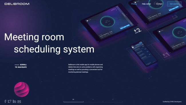
Delibroom was created to simplify the meeting room booking process. The streamlined process translated well to the software’s appealing website, designed by EVNE Developers.
Along with its well-designed tech logos, the website is simple, cohesive, and beautiful to look at. But what makes it rise above is its unusual scroll feature, or the combination of horizontal and vertical scrolling, which symbolizes that communication, by its definition, isn’t a one-way street, but a complex, intersected path.
Fortunately, Delibroom is here to find the optimal route and provide a convenient, customized “vehicle” to drive through.
1. FC Nantes by LATELIER

[Source:fcnantes.com]
Standout Features:
- The masterful use of a club color scheme
- Horizontal layout
- Bold typography
When designing the website for their home team, LATELIER thought about the supporters' needs first and for them to have easy and convenient access to crucial, live information in a more graphic, faster, and ergonomic way.
Strengthening the club’s digital identity by drawing the atmosphere from the stands, the agency redesigned FC Nantes’ “online pitch” and added features like the latest news, calendar, rankings, stats, social wall, connection space, etc.
While all these features were masterfully implemented, LATELIER scored a “beautiful goal” with a Museum page! It stands out not solely for its atypical horizontal scroll but for its use to lead visitors through the club’s rich history, ups and downs, trophies, prominent heroes, and more.
It’s safe to say that the fluid, compelling journey through FC Nantes’ archives is bound to turn the uninitiated into “ultras” (fanatic soccer supporters) in no time.

