-account-photo_listing.jpg)
-account-photo_listing.jpg)


Our Jury has worked with Prada, Nike, Chanel, Google, and Apple.
Best Visually Striking Website Designs of 2026
View the Top Visually Striking Website Designs Below
Best Visually Striking Website Designs
4,200+ Submitted Designs- Advertising
- Aerospace
- Agriculture
- AI
- Architecture
- Arts & Recreation
- Automotive
- Banking & Finance
- Community
- Construction Company
- Content & News
- Digital Agencies
- Distribution
- E-Commerce & Retail
- Education
- Engineering
- Entertainment
- Fashion & Beauty
- Film Production Company
- Food & Beverage
- Games and Entertainment
- Government
- Health & Wellness
- Hobby
- Hospitality
- Jewelry
- Legal & Insurance
- Luxury
- Manufacturing
- Medical & Pharmacy
- Museum
- Music
- News Magazine
- Non-Profit
- Professional Services
- Real Estate
- Restaurant
- Roofing
- Sports & Leisure
- Startup Business
- Tech Startup
- Technology
- Travel
- Wedding Planning
- Zoo
- 3D
- 404
- About Page
- Artisan
- Artistic
- Black and White
- Blog
- Bold Color
- Bold Font
- Book App
- Check Out Page
- Chinese
- Clean / Minimal
- Colorful
- Contact Page
- Corporate
- Custom
- Experimental
- Flat
- Footer
- Form
- Fullscreen
- Futuristic
- Green
- Horizontal Layout
- HTML5
- Illustrated
- Images / Gallery
- Innovative
- Inspiring
- Interactive
- Landing Page
- Menu
- Microinteractions
- Mobile Websites
- Motion Effects
- One-Page
- Parallax Effects
- Personal
- Pet Store
- Photographer
- Playful
- Podcast
- Pop Ups
- Portfolio
- Pregnancy
- Pro-loaders
- Product Listing Page
- Purple
- Retro
- Services Page
- Simple
- Slider / Module
- Small Business
- Soft Colors
- Sound / Music
- Storytelling
- Tech Online Store
- Typography
- Unusual Layout
- Use of Infographics
- User-Friendly
- UX Designs
- Virtual Reality
- Visible Borders
- Visually Striking
- Webflow
- Welcome Page
- WordPress
View Design
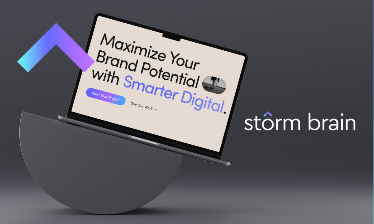
Storm Brain
View Design
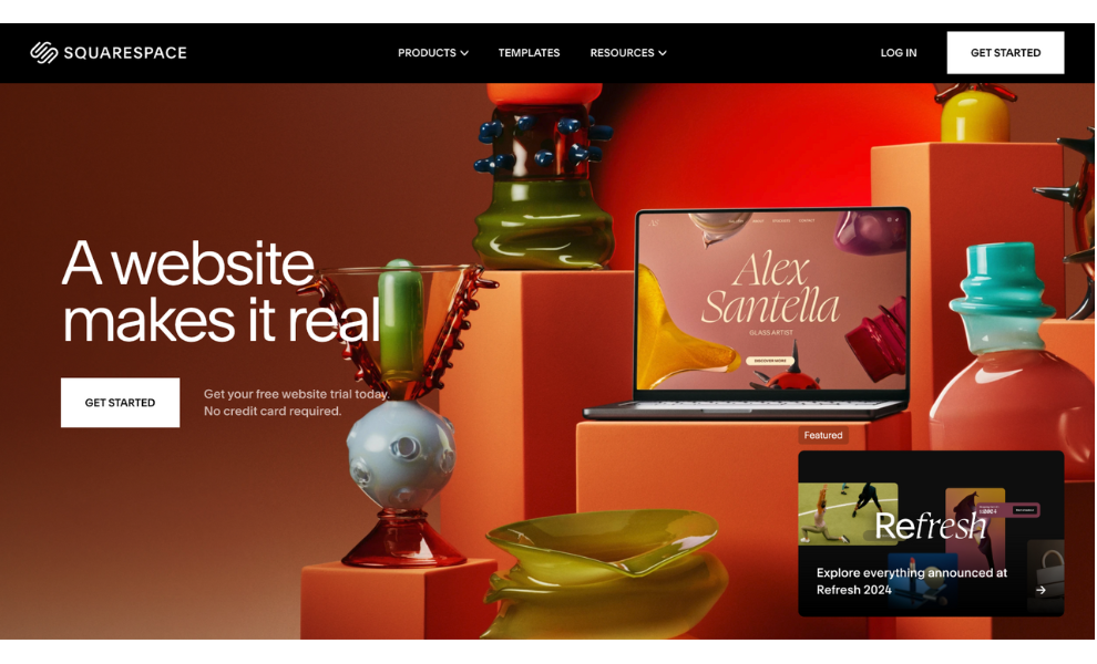
Squarespace
View Design
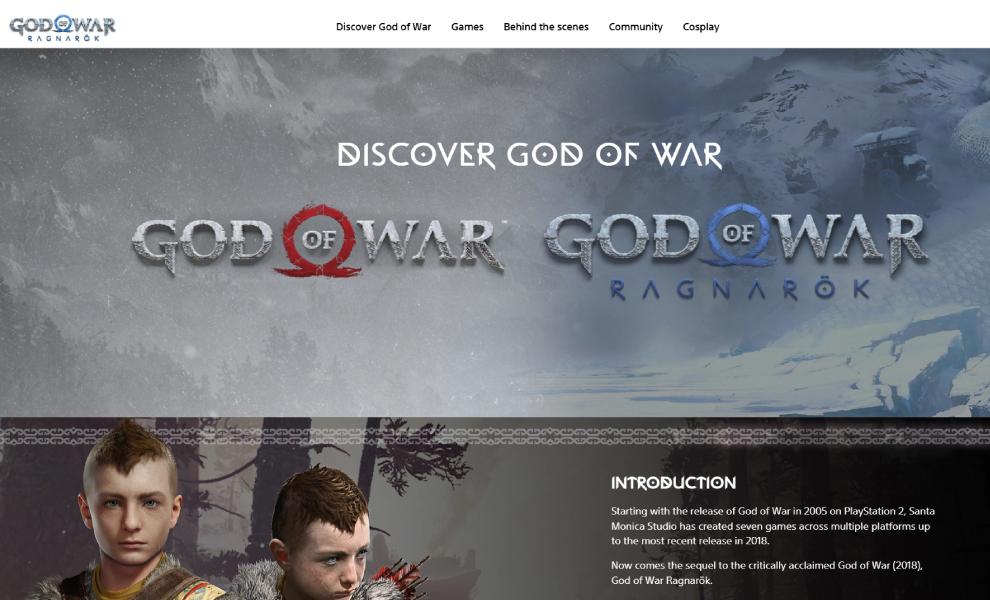
God of War
View Design
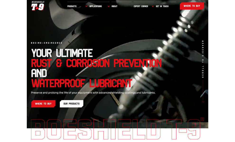
Boeshield T-9®
View Design
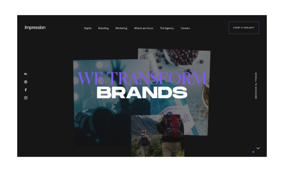
Impression
View Design
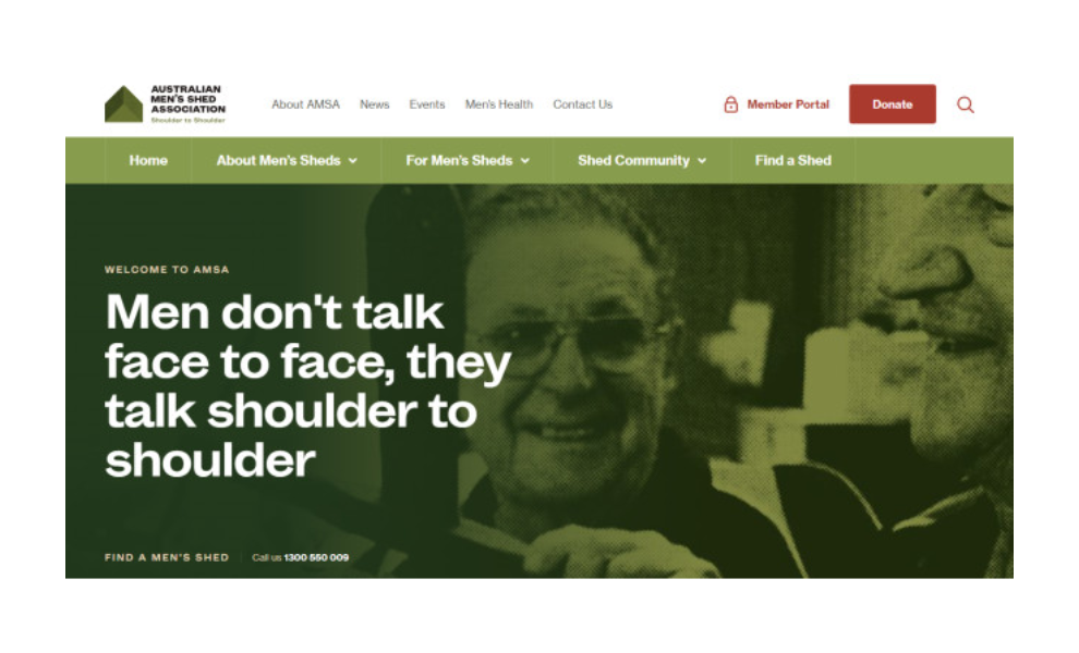
Australian Men's Shed Assoc.
View Design
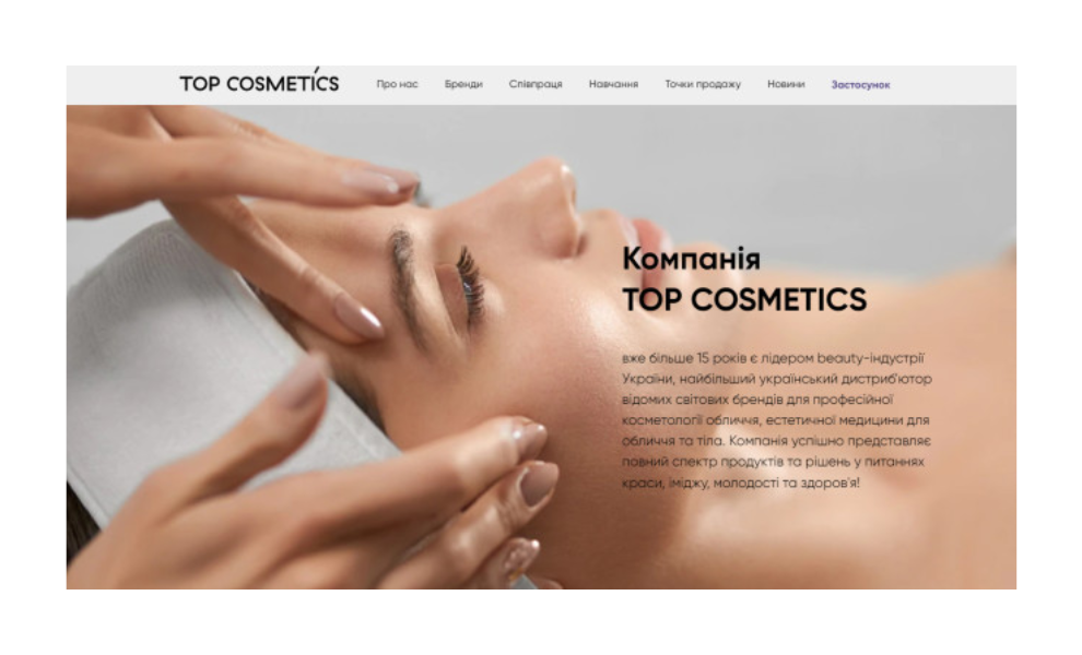
Top Cosmetics
View Design