- Agency:GoingClear
- Client: VC Platform
- Category: Website Design — Landing Page
- Location: New York, New York, United States
- Project Brief: Design and develop a single, modern sponsorship guide page that walks a prospective partner from audience proof to priced tiers, with no full-site rebuild in scope for this phase.
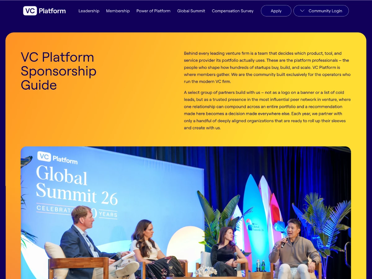
A sponsorship landing page lives or dies on how quickly its layout earns trust. GoingClear designed the VC Platform sponsorship guide to do that on a single scroll, ordering every section so proof arrives before the pitch.
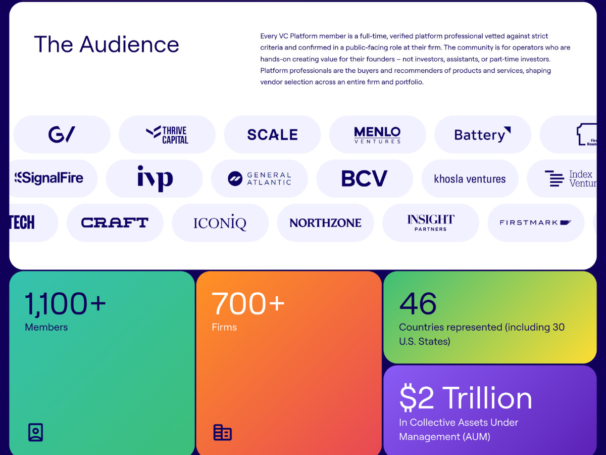
An audience claim only holds up if the layout sells it. A scrolling wall of firm logos, from a16z to Sequoia, runs directly above four oversized stat blocks, giving figures like 1,100-plus members and $2 trillion in assets a visual weight that plain text could not carry.
Raw membership numbers can read as marketing. The "Breaking it down" section renders geography, fund size, and job title as clean data breakdowns, so the community's shape is shown rather than asserted.
The Summit is the page's densest sales argument and needs room to breathe. Full-bleed event photography and stated dates for Amsterdam and Boston anchor the Summit block, lifting it above the surrounding copy without a hard break in rhythm.
Benefit lists tend to blur together. Three icon-led cards split the offer into an exclusive directory, premium insights, and an active member platform, each one readable at a glance.
Pricing tables fail when a partner has to compare across screens. A single comparison table lines up Bronze, Silver, and Gold side by side, benefit by benefit, from $25,000 to $100,000, with a call to action fixed beneath each column.
Consistency across a long scroll is a development problem as much as a design one. The Webflow build keeps the page fast and visually uniform from hero to final call to action, so the experience does not fray as the sections stack up.
Results & Impact
The design turns a sponsorship decision into a self-guided read. Layout, data visualization, and a fixed comparison table carry a partner from who is in the community to what a tier costs in a single pass, so the offer explains itself before any conversation starts.
- One-page architecture: audience proof through priced tiers on a single scroll, no full-site navigation required
- Comparison-table pricing: three tiers shown side by side at $25,000, $50,000, and $100,000
- Data-driven audience section: geography, fund size, and title presented as visual breakdowns