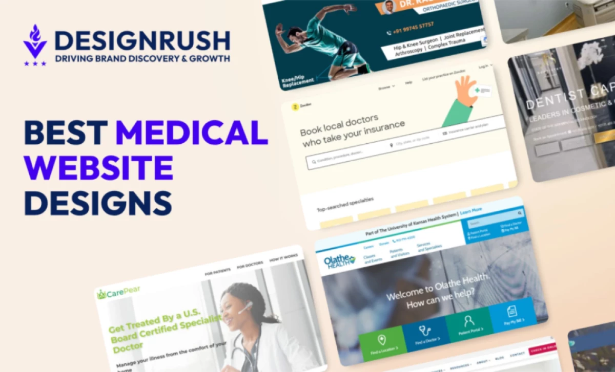
The best medical website designs serve as digital gateways to patient care, setting the stage for a positive healthcare experience.
While the quality of healthcare services ultimately relies on in-person interaction, a well-crafted website plays a critical role as the first impression, offering a glimpse into the institution's capabilities and expertise.
To show you exactly what we mean by that, we’ve listed the 10 best medical website designs developed by top-notch web designers.
Explore these standout designs and see how they capture the essence of medical care.
Key Insights:
- Build Trust Through Design and Content: Clean layouts, clear messaging, and visible credentials help patients feel confident right away. Testimonials and real imagery add reassurance, especially when users are making sensitive health decisions.
- Deliver Essential Information Clearly: Patients need quick access to services, conditions, and provider details. Structured content, intuitive navigation, and clear contact points reduce confusion and support informed choices.
- Guide Patients Toward Care: Strong healthcare sites make next steps obvious. Clear calls-to-action and simple pathways help users book appointments or reach providers without friction.
1. Direct Ear Care by Quixta

Direct Ear Care offers professional hearing care tailored to patient needs, including ear wax removal, hearing tests, hearing aids, and hearing protection. The website, designed by Quixta, immediately establishes clarity and purpose by guiding users toward booking an appointment from the very first screen.
The homepage hero section communicates the brand’s value proposition with confidence, supported by a clean layout and a prominent call-to-action button. Quixta ensures that visitors can quickly understand the services offered and take the next step without friction, whether booking a clinic visit or arranging a home appointment.
One of the most effective design decisions is the structured presentation of services. Each offering is broken down into digestible sections with supporting visuals, making complex medical information easy to understand. This clarity is reinforced by intuitive navigation and location-based browsing, allowing users to quickly find nearby clinics.
Quixta also integrates strong trust signals throughout the website. Patient reviews, professional credentials, and recognizable healthcare affiliations are prominently displayed, helping to build credibility and reassure visitors. The inclusion of a simple three-step process further enhances usability by clearly outlining the patient journey from booking to treatment.
Another standout feature is the consistent use of color and spacing. The calming blue palette evokes trust and professionalism, while generous white space keeps the interface uncluttered and easy to navigate. Combined with authentic imagery and friendly messaging, the overall experience feels both clinical and approachable.
Other services by Quixta:
- Website Design & Development
- Web Application Development
- Search Engine Optimization
2. CariFree by Gravitate Design

Standout Features:
- High-quality imagery
- Easy menu navigation
- Complementary on-brand color schemes
CariFree offers science-based solutions to common oral health problems. Its medical website, designed by Gravitate Design, displays authority and expertise through informative copy and high-resolution images.
The colors used in this example of best medical website design are easy on the eyes, making browsing through the content-heavy site as easy as a breeze. A complementary blend of blue and white invokes trust and comfort among site visitors.
CariFree and Gravitate Design go way back to 2016. The client-agency relationship stays intact because of the web design company’s commitment to creating effective web designs that don’t just look good, but also drive awareness, encourage patient appointments, and bring results.
You’ll notice a graceful scatter of Call to Action (CTA) buttons around the site. The first CTA is placed right below the main brand promise on the top of the fold, header area, and links to the Shop. Alongside this, is a video play button that allows you to watch the video whenever you please. It’s lighter than most CTAs on the site, but noticeable nonetheless.
Another notable design move is the cartoonish icons for common oral conditions like bad breath, white spots, dry mouth, and sensitive teeth. These icons are also clickable and redirect users to respective pages.
Gravitate Design is a full-service web design and digital marketing company that caters to medical websites, travel and hospitality, technology, education, and so on. It focuses on four key online marketing points of success: web design, website optimization, maintenance and hosting, and digital marketing.
Other Services by Gravitate Design:
- Strategy
- Analysis
- Development
- Branding and messaging
- Content
- Search Engine Optimization (SEO)
- Social media
- Email marketing
3. Springfield Dental Solutions by O360®

Standout Features:
- Distinctive CTAs
- Organized category menu
- Design accessibility tools for readability preferences
Scrolling through the pages of Springfield Dental Solutions is like watching a beautiful slideshow. O360®, the partner web design company for this website, created an elegant, modern design with enough attractive photography. These hi-res images bring the human element to another level while giving the website visitors a homey user experience.
On the homepage, you’ll see a variety of distinctive CTAs. More than anything, O360® came up with this web design to drive results for its clients. These eye-catching CTAs are cleverly positioned across the page, urging visitors to click on them.
Check out our article on the best dental web designs here.
Out of all the features in this medical web design, O360® outdid itself with the Accessibility Tools positioned to the right, giving visitors the freedom to personalize some parts of the website (font size, background, contrast, and links) for better readability.
O360® has been in the business of helping healthcare professionals for over 20 years. It designs, optimizes, and strategizes marketing efforts for the healthcare niche – dental, medical, and other specialties. It prides itself on creating custom website design for companies that are wholly owned by clients.
Other services by O360®:
- Web design
- Search Engine Optimization
- Pay-per-click services
- Social media marketing
- Reputation management
4. Village Emergency Centers by Versa Creative

Standout Features:
- Interactive content
- Full-screen welcome video
- Great patient testimonial section
Village Emergency Centers is all about providing access to trusted emergency rooms in Houston, Texas 24/7. Its website, designed by Versa Creative, welcomes visitors with a full-screen video on-loop.
The Village Emergency Centers website contains a lot of information about different emergency rooms across the state, and Versa Creative did a great job presenting those without overwhelming the users. Its design approach aligns with some of the best designed medical websites that prioritize clear communication and ease of navigation. The interactive web design and content, on the homepage especially, steal the show.
The sticky menu at the top-most part of the page is organized according to categories: Locations, Services, and Resources. With this, navigating through its pages is easier.
Upon entering the website, you’ll see a full-screen map with the brand logos (blue and white hospital icons with a red heart at the center of the cross) as location pins. Clicking on these pins will display a somewhat callout bubble that has the complete address of your chosen pin.
Versa Creative is a creative marketing and advertising agency. Its grit to meet and surpass clients’ goals is shown in its web design for Village Emergency Centers. Blocked sections, adorable heart symbols (a key representation of the brand), and convenient submission forms, all contribute to the client’s online presence.
Other services by Versa Creative:
- Brand positioning
- Account management
- Web design
- Copywriting
- Photography and Videography
- Website development
- Search Engine Optimization
- Content marketing
- Amazon services
- Email marketing
- Public relations
5. JJS Dentistry by Avily

Standout Features:
- Sleek and elegant CTAs
- Embedded Instagram grid
- Great balance between content and graphics
If elegance has a face, it’ll most certainly be JJS Dentistry’s website.
Designed by Avily, the overall look of this website embodies the client’s (JJS Dentistry) branding of state-of-the-art dental care. It’s hard to ignore the CTA buttons on this website because each of them looks like fine gold.
Unlike the earlier web designs presented in this list, Avily made use of JJS Dentistry’s video assets. There’s a full-screen video header on loop upon visiting the site, and two other videos embedded on different sections of the homepage.
This move hits two birds with one stone: keeping their visitors engaged and generating higher website traffic. According to a study released by Wyzowl in 2025, 87% of digital marketers say that their website traffic increased when they started adding videos to their pages.
Avily is on a roll in using unique and brand-tailored features on this project. Instead of a usual color block or an image divider to separate content, Avily incorporated JJS Dentistry’s Instagram profile.
Scroll through the homepage and you’ll see an image grid with photographs fished from the client’s gallery and Instagram account. This section balances the elegant image with friendly photographs of Dr. JJ Serfontein with his patients and friends.
Avily banks on the use of market-leading technology and their talented team of website designers to create a medical website that improves the patient journey. Their agenda is to deliver web designs that are clean, purposeful, and user-focused.
Other services by Avily:
- Website design
- Social media marketing
- Practice branding
- Reputation management
- Complete marketing management
6. CareTalk Health by Ken Drab

Standout Features:
- Clean and modern interface
- Strong visual hierarchy and readability
- Data-driven credibility elements
CareTalk Health is a Clinical Process Outsourcing (CPO) company delivering virtual health solutions nationwide. The website, designed by Ken Drab, simplifies this complex offering through a clean layout that prioritizes clarity and usability.
The homepage communicates the brand’s value with bold typography and a well-balanced structure. Ken Drab uses a clear visual hierarchy to highlight key messaging such as nationwide coverage and clinical capabilities, making information easy to scan and understand.
A standout feature is the use of data-driven sections. Metrics like coverage across 50 states, access to 1,000+ providers, and 24/7 availability reinforce credibility while creating immediate impact.
The design also incorporates real-life telehealth imagery, helping users quickly grasp the service experience. Paired with concise copy and intuitive navigation, the website ensures that different user groups can easily find relevant information.
Other Services by Ken Drab:
- Web Design
- Branding
- Creative Services
- Design Services
6. Blister Pack by BrainStorm Digital

Standout Features:
- On-brand colors
- Clean and effortless interface
- Smooth horizontal transition within pages
Who says medical websites can’t look fun?
The Blister Pack website, designed by BrainStorm Digital, looks vibrant with sprinkles of color here and there!
Upon landing on the homepage, pills in various shapes and colors scattered on a muted blue background greet the visitors. This playful yet professional touch, often seen in effective medical web design, creates an inviting first impression. While the rest of the page is white, the blue color adds a cooling effect on the eyes of any viewer.
Another thing worth mentioning about this web design is its smooth transition. Navigating through the pages is like turning the pages of a book with its unique horizontal transition effect.
Brand colors are masterfully utilized in this medical web design, too. BrainStorm Digital emphasizes certain information by adding solid color linings on some content blocks (see packaging rates) or changing the text color.
As a web design company, BrainStorm Digital believes in the power of technology and its effects on graphics, design, costs, and marketing.
They strive to foster long-term relationships with clients by delivering scalable solutions that quickly adapt to the changing market.
Other services by BrainStorm Digital:
- Responsive web design and development
- Graphic design
- Brand identity
- Search engine optimization
- Digital Marketing
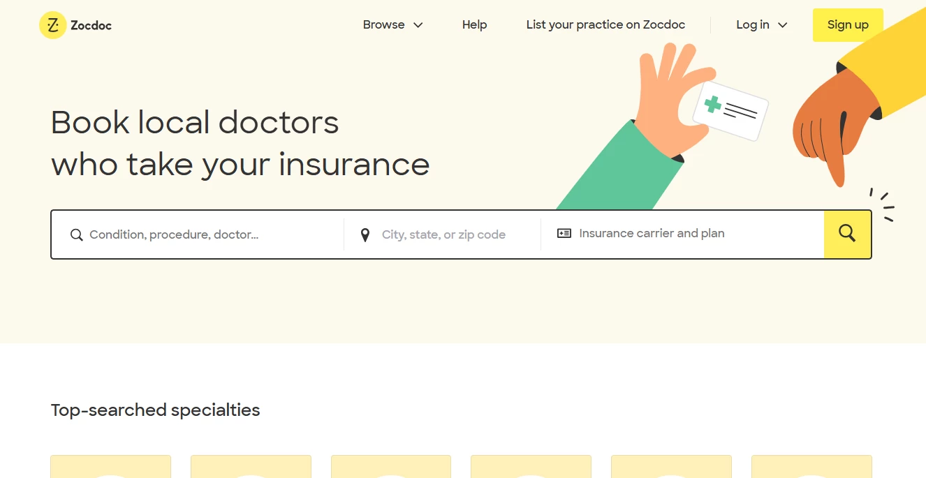
7. Zocdoc by Daffodil Software
Standout Features:
- Uncluttered layout
- Friendly illustrations
- Sans-serif typography
Zocdoc's medical web design, courtesy of Daffodil Software, prioritizes user experience, making it easy and intuitive for patients to find and book appointments with healthcare providers.
The website's design incorporates ample white space, creating a clean, uncluttered look. This improves readability, allowing users to focus on the essential information.
Zocdoc utilizes friendly, playful illustrations that humanize the healthcare experience and alleviate anxieties associated with medical appointments.
The choice of a sans-serif typeface contributes to the website's modern, clean aesthetic. It's easy to read on both desktop and mobile devices, ensuring a seamless user experience.
Other services offered by Daffodil Software:
- Product Engineering
- Discover & Frame Workshop
- Software Development
- Software Testing
- Managed Cloud Services Support & Maintenance
- Smart Teams
- Dedicated Teams
- Offshore Development Center
- Enterprise Services
- Technology Consulting
- Robotic Process
- Automation Legacy Modernization
- Enterprise Mobility
- ECM Solutions
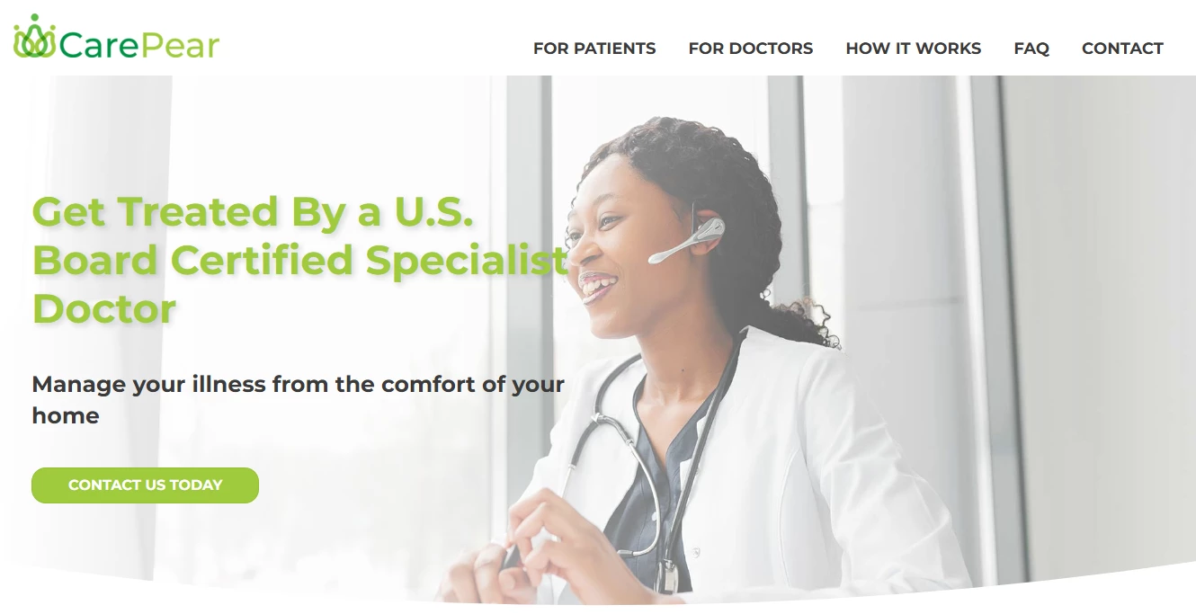
8. CarePear by Gelfand Design
Standout Features:
- Empathetic visual elements
- Green as an accent color
- Simple, sans-serif font
CarePear’s web design offers a professional and informative platform for patients managing their chronic illnesses from home.
This medical website designed by Gelfand Design, welcomes visitors with a homepage full of serene images of a smiling doctor, instantly putting them at ease and instilling trust and confidence. This visual sets a warm and emphatic tone for the entire website.
The layout provides a seamless scrolling experience, while the simple sans-serif font maintains a professional look, ensuring visitors can easily access important information.
The green accent color also plays an essential role in the design. This subtle hue evokes feelings of vitality and renewal, embodying CarePear’s message of empowerment and healing.
Other services by Gelfand Design:
- Web Design
- Web Development
- WordPress Website Design
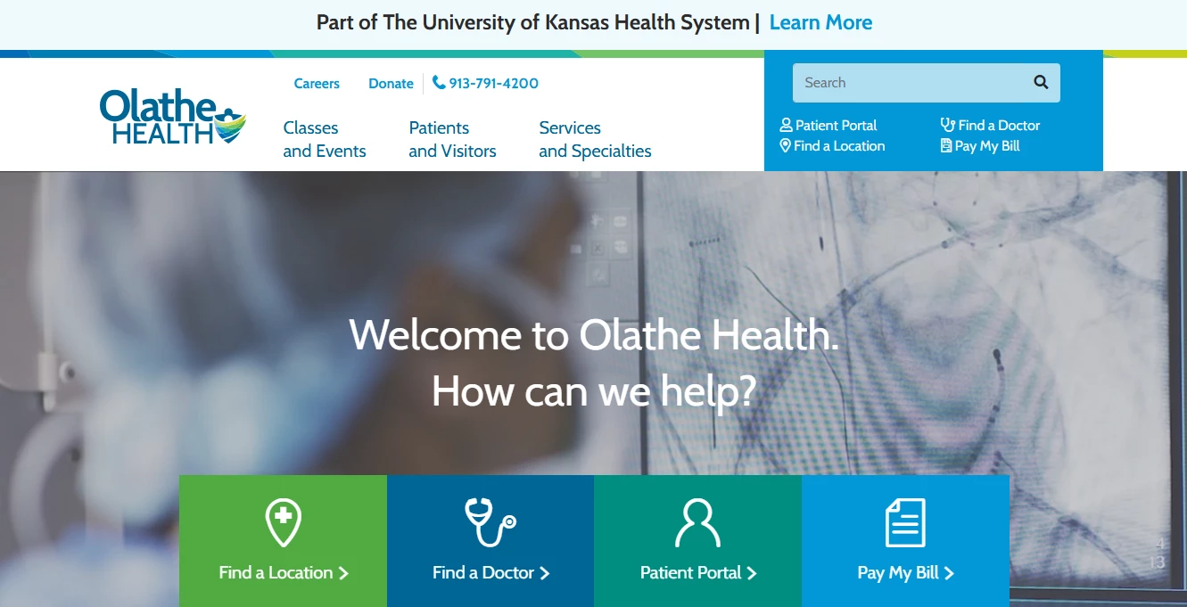
9. Olathe Health by Just Digital
Standout Features:
- Important sections on the hero image
- Search option
- Sans-serif typography
Olathe Health's website design prioritizes user needs, offering an accessible and informative platform for patients to engage with their healthcare journey.
The medical web design by Just Digital Inc features a hero image that presents four key features: location finder, appointment booking, patient portal, and online bill paying. This immediate access to crucial information streamlines the user experience.
The search bar at the top of the website empowers users to quickly find specific information, whether it's a particular doctor, service, or health topic. This feature enhances navigation and caters to the diverse needs of visitors.
The use of sans-serif fonts throughout the website reinforces a modern and clean aesthetic. Additionally, it ensures readability across various devices.
Other services by Just Digital Inc:
- Email Marketing
- SEO Marketing Agency
- Social Media Marketing Agency
- Marketing Tech Support
- Marketing Consulting
- Google Ads
- Facebook Ads
- Website Design & Development
- Shopify Website Design
- Branding Identity
10. Dr. Rachit Sheth by Twitchtime
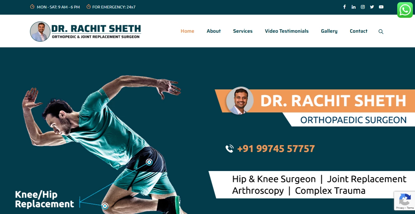
Standout Features:
- Thoughtful CTAs
- Fully device-responsive design
- Dynamic UI
Dr. Rachit Sheth’s web design combines functional and engaging elements, creating an informative and enjoyable user experience.
Twitchtime designed this website with a strong emphasis on the placement of call-to-actions (CTA). These are strategically placed buttons and links to ensure easy navigation through various services, expertise, and Dr. Sheth's personal profile.
Thanks to its responsive design, Dr. Sheth's website performs flawlessly across all devices. Whether accessed on a smartphone, tablet, or desktop, the site adjusts seamlessly to provide an optimal viewing experience. This ensures that all users have a consistent and high-quality interaction with the website.
As the user scrolls through the main page, they can see hero images with captions appearing through transitions, numbers loading from zero to their value, icons popping out when the cursor hovers over them, and much more. All these elements capture the user's attention, enhancing the interactive experience of this medical web design.
Other services by Twitchtime:
- Digital Marketing
- WordPress Website Design
- Web Design
- Web Development
- eCommerce Development
- SEO
- Social Media Marketing
- Branding
- Creative
- Mobile App Development


-preview-webp.webp)