Your logo used to be perfect. It captured everything your brand stood for. But now, when you look at it, something feels off. To us, it’s a sign that the brand's identity and its business reality are out of sync.
When we see this happen, our advice is always the same: you have to treat your logo as the hard-working business asset it is and face the big question: is it time for a redesign?
Making that call is a major strategic choice. A new logo can signal a fresh direction to the market, pulling in a new generation of customers. It can also unify your company after a period of change.
But there are risks. A clumsy redesign can easily confuse and alienate your best customers, wiping out years of brand equity.
The real challenge is figuring out how to evolve your identity without losing what made you successful in the first place.
When I analyzed these top redesigns, I noticed a common thread: the most successful updates were rooted in simplicity, clarity, and respect for brand heritage.
In this article, we’ll look at 12 of the best logo redesigns to understand the strategic thinking behind their success.
The Best Logo Redesigns: Key Points
1. Google
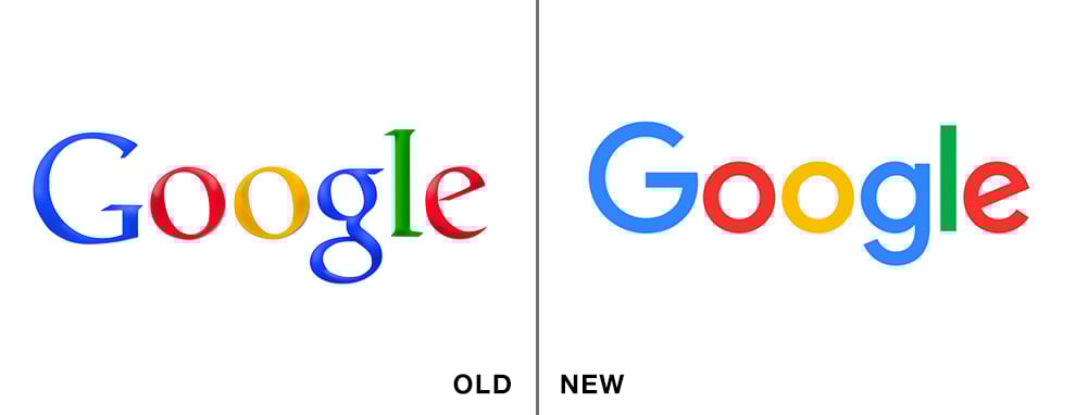
Google's logo redesign was presented to the public in 2015. This marked a significant investment in brand identity for a company whose first logo, designed in 1997, famously cost nothing, as reported by Business Insider.
When you have a wordmark logo, the safest way to execute a redesign is with fonts.
For SaaS and tech companies in particular, we often recommend focusing on typography to refresh a wordmark without losing brand recognition.
Google’s design team knew this, changing their serif Catull typeface into a custom, geometric sans-serif font called Product Sans.
The goal, as the design team stated in a 2015 blog post, was to combine "the mathematical purity of geometric forms with the childlike simplicity of schoolbook letter printing."
This achieved a lighter, more modern look that was scalable across countless devices — a critical need for a digital-first enterprise.
Plus, the minimalist typography and color clarity reflect the platform’s increasingly clean, accessible user interface.
From our perspective, this redesign was a masterclass in evolving for a multi-platform world.
But it wasn't just the wordmark. Google also introduced the four-color, single-letter "G" to make branding simpler on a responsive scale.
This dynamic element, derived from the main logo, provides a well-designed emblem for everything from app icons to stationery.
2. Coca-Cola
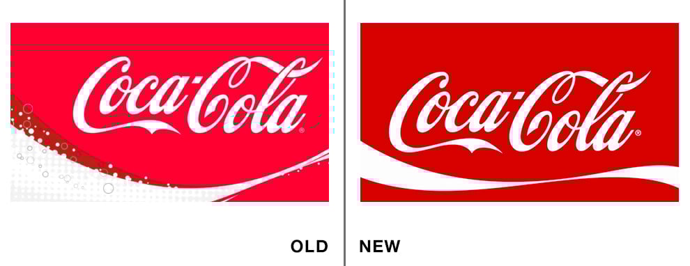
So far, Coca-Cola has had 12 different company logo redesigns. The brand’s story began in 1886, and the iconic script logo, which still forms the basis of the brand today, was designed for free.
Let's take a look at the last two logo designs, the one introduced in 2003, and the last logo redesign they did in 2007, which is what we see today.
In 1969, Coca-Cola's logo rebrand introduced its iconic white wave, the "Dynamic Ribbon Device," which is still in use today. The 2003 version added a yellow ribbon and bubbles to emphasize the drink's refreshing qualities as part of the massive “…Real” campaign.
The 2007 logo, however, was simplified to keep up with minimalist trends while paying homage to its classic heritage. The brand wanted to stay recognizable but make a powerful impact.
This logo redesign is sleeker, cleaner, and more minimalistic, with more breathing room in the design.
This is a key distinction for consumer retail brands like Coke. Unlike a tech brand that lives on screens, Coke's logo has to maintain its iconic recognition on cans, bottles, and billboards globally.
For a legacy brand with immense global equity, this was a smart, conservative move that refreshed the look without risking its iconic status.
3. Starbucks
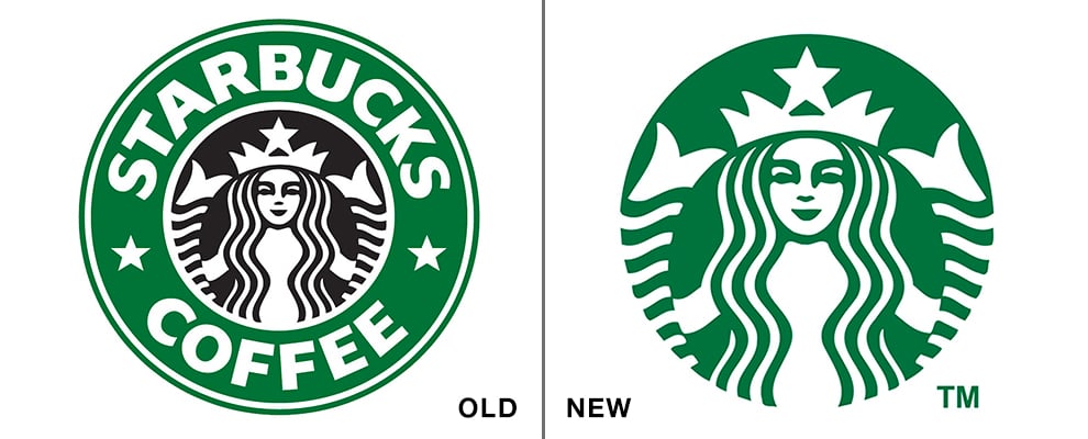
Starbucks is a huge, multinational brand, so any changes made to the logo will directly affect its customer base. That can be a slippery slope, especially with an iconic brand.
However, from our analysis, Starbucks achieved success by anchoring its redesign to a major milestone: its 40th anniversary.
The old logo had the wordmark “Starbucks Coffee” circling the siren. In the new logo, this wordmark is completely gone. We believe this was a strategic power move.
It sent a clear message: the siren itself is so recognizable that it needs no other introduction.
Another major change is in the color scheme. The mermaid is now the signature Starbucks green, and the background is white. This decision aligns the design well with minimalistic trends and focuses the brand identity on its most powerful asset.
Despite initial criticism from some loyal customers, the move proved successful, demonstrating the brand's confidence in its global recognition.
This was perfectly captured by one Reddit user’s comment back in 2011, which reflected the anxiety of many fans:
“I think they're dropping an important part of their branding. My eyes are (were) always drawn to the 'Starbucks Coffee' lettering, never to the doodle it circumfences. The new logo lacks gravitas.”
4. Instagram

For years, Instagram’s identity was tied to its original logo: a detailed, real-world object.
The design was a prime example of skeuomorphism, mimicking a vintage Polaroid camera complete with a textured brown leather top, a multi-layered glass lens, and a small rainbow stripe.
This approach worked perfectly when the app’s main purpose was applying retro filters to photos.
But as the platform grew to include video, stories, and messaging, the logo began to feel like a limitation. It represented a single feature, not the entire, vibrant community it had become.
The 2016 redesign addressed this by trading the nostalgic object for a modern, digital-first symbol. The change was built on two core decisions. First, the designers simplified the camera into a minimal white glyph: a clean outline of a rounded square, a circle, and a dot.
Second, they took the old rainbow stripe and expanded it into the icon’s defining feature: a bright, energetic gradient. The background blends warm sunset colors, from a deep magenta and purple to a bright orange and yellow.
As then-Head of Design Ian Spalter explained, the team wanted to "create a look that would represent the community's full range of expression — past, present, and future."
The initial public reaction was famously divided. In 2016, the New York Magazine even quipped that it "bears a striking resemblance to one of Microsoft PowerPoint’s preset slide backgrounds," capturing the sentiment of many who were attached to the old design.
Even so, I found Instagram’s shift to a digital-first glyph brilliant because it created a flexible, adaptable asset that could be used across a growing family of apps like Layout and Boomerang, something the old, detailed logo could never do.
However, the new logo’s scalability and vibrancy were undeniable. For modern DTC (direct-to-consumer) brands, this is a key lesson: a logo must be flexible enough to represent a multi-faceted digital community, not just a single product feature.
5. Netflix
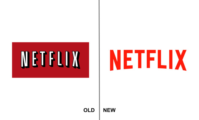
Netflix’s original logo was a product of its time — that of physical movie rentals. The design borrowed from classic cinema, with its bold, arched typography, heavy drop shadow, and a deep red background reminiscent of a theater curtain or a DVD case.
This nostalgic look served the company well when its primary business was mailing discs. But as Netflix aggressively pivoted to become a digital-first streaming service and a producer of original content, the logo was tying the brand to a business model it had outgrown.
With its 2014 redesign, instead of a complete overhaul, Netflix chose to simplify. It removed the two most dated elements: the heavy background box and the thick drop shadow.
This single move "freed" the wordmark, making it feel lighter, more modern, and far more versatile for digital applications.
The logo now works seamlessly on any background, from a dark TV screen to a bright promotional poster. They kept the two core assets that held all their brand equity: the signature "Netflix Red," now updated to a brighter, screen-friendly hue, and the unique cinematic arch.
We see this as a critical lesson for subscription-based businesses: as your service model evolves, your visual identity must evolve with it.
By shedding the visual language of physical media, Netflix repositioned itself from a movie distributor to a confident, leading-edge content studio.
It’s a key example of how reducing a logo to its strongest elements can modernize a brand without sacrificing years of recognition.
6. Airbnb
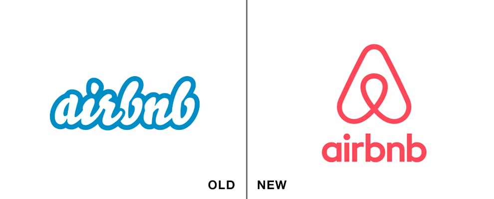
Airbnb has a complete story behind its logo redesign, and it’s nice to see how a brand can make a story out of the redesign process.
Brand core values are used for logo inspiration, and they fit perfectly together in a simple illustration. The logo comprises smaller parts that form a big picture: People, Places, Love, and Airbnb.
The result is a simple and easily recognizable logo, with a cute color that’s neither red nor pink (it’s called Rausch).
While the logo naturally symbolizes the brand, it’s also a nice way of showing people that they care more about the inner workings and their vision than just brand recognizability.
Also, many brands like to choose blue as their main logo color (Facebook, Twitter, and the rest are just some of the logo redesign examples).
It’s always nice to see when brands go bold with their main color, and Airbnb certainly did that with their color choice.
7. Mozilla
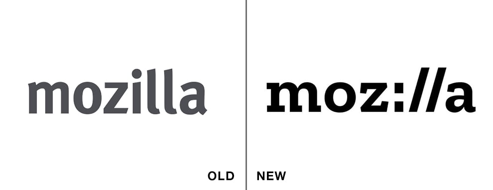
Even though a logo redesign can enhance brand identity, there will always be negative reactions. From our perspective, Mozilla made one of the smartest moves in logo redesign history: they invited the public to participate.
The logo creation process spanned five months, with each step shared publicly for comment.
Firstly, this generated an online interest in the process, with people commenting on each proposed design. And they actually listened. In the end, Mozilla created a logo using typeface and typeface only, creating a pun in the process. Mozilla became Moz://a.
With this simple change, Mozilla accentuates the user-centric approach and also puts its consumers at the core of its business.
Furthermore, they created a logo that is somewhere between a wordmark and an icon with the introduction of the M:// symbol.
8. Facebook
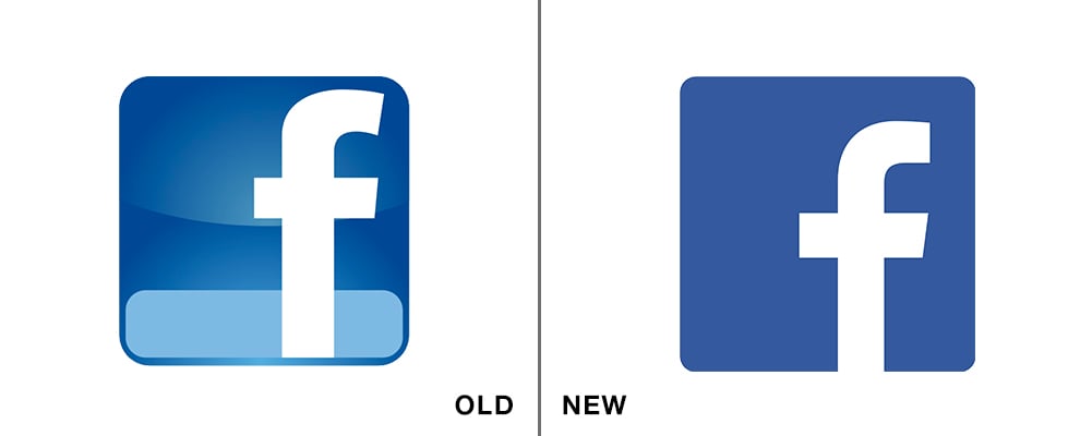
Facebook also had a minimal redesign. Facebook’s previous logo had a small light blue line as a baseline for the F letter. When they wanted to freshen the logo and make it flatter, they did it simply and subtly.
By removing the light blue line, their logo achieved a more elegant and simplistic look. Also, now the letter F doesn’t sit atop anything, and its bottom section connects to the white space outside the logo.
Facebook’s subtlety in its redesign has greatly supported the successful end results it's achieved. Now, we have a logo that is sleeker but still recognizable. The letter F is just enhanced in the process, and the fact that it's connected to the background has a deeper meaning.
After all, Facebook connects people from all walks of life.
9. Qantas

Qantas (Queensland and Northern Territory Aerial Services) is one of the biggest airline companies in Australia. They have an established brand — a combined logo with a kangaroo mascot on top.
And by introducing this triangle shape, the company cleverly inspired flight, showcasing an airplane’s tail. It's a nice example of how a physical shape can be used as a reference to the product in a subtle, creative way.
The name Qantas and the image of a kangaroo alone don’t resemble anything remotely connected to an airline, but this twist makes that connection.
When the company introduced new aircraft, they understood that the logo had to be redesigned to better fit the new airplane tails. The changes here were so subtle that unless you compared the two logos side by side, you wouldn’t even know what changed.
Again, that's the perfect path to a successful logo redesign — keeping all the good and important elements and just making them better. Qantas did it by changing the typography and making it sleeker. It's a similar story to what Coca-Cola did.
These brands followed popular trends that kept them relevant, gravitating towards a thicker typography and bolded letters. Even the kangaroo was made sleeker so that its legs appeared longer and more powerful.
Explore the best airline logo designs.
10. Olive Garden
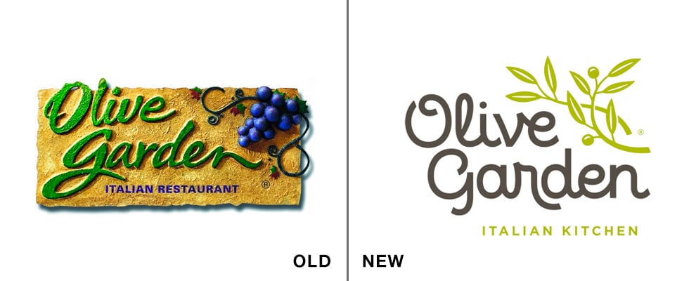
Olive Garden is a famous Italian restaurant that's changed its identity completely with the help of a logo redesign.
Olive Garden originally embodied its brand using a wordmark logo embedded in a Tuscan-esque background. The redesign kept some of these elements, keeping the brand name and its integrity, but adding a modern twist.
The old logo was cute and had a certain charm. Its thick letters in green color correspond to the brand’s name, Olive Garden, and the grapevine with grapes provides that Italian cuisine charm.
But the new logo completely modernized the restaurant and changed its identity.
The elements are similar: olive branches replace the grapevine, and a handwritten script is still used, but it's cleaner and more refined.
The Olive Garden redesign is a great example for brick-and-mortar hospitality brands, where the logo is a key signal of the dining experience itself, showing how to evolve an identity to meet new market demands while retaining a core sense of heritage.
Why Invest in a Logo Redesign?
Successful company logo redesigns are almost always a direct response to a major business event. You might be targeting new markets, trying to shed a negative image, or simply growing beyond your original identity.
For example, a merger or acquisition often forces the issue. A Landor M&A Brand Study of S&P 100 companies found that 74% rebranded a company they acquired within seven years.
They do this to create a single, unified brand that customers and investors can easily understand.
However, the process for many logo rebrands comes with a significant challenge you must prepare for: your most committed customers may dislike the change.
Research states that while casual customers often see a redesign as a positive update, your most loyal fans are the most likely to react negatively. This is why many businesses partner with top logo design companies to navigate the process.
So, how do you manage that risk and bring your best customers along? A logo redesign can strengthen brand loyalty as long as the new logo is perceived as both appropriate and familiar to consumers (Maree et al., 2024).
When you get that mix right, you improve your customers' overall attitude toward your brand, which is what builds true loyalty.
The investment pays off when you refine the core elements people already love, presenting them in a way that feels fresh and ready for the future.
The Best Logo Redesigns: Wrap-Up
What we can learn from the best logo redesigns is that they are a clear signal that your business is evolving. As the examples show, this process is a powerful tool for growth when it's tied directly to your brand's strategy.
It’s your chance to realign your visual identity with your future ambitions, ensuring the face you present to the world matches the company you’ve become.
The execution itself can range from subtle refinements to a complete transformation, depending on your goals. Subtle changes often work best, especially if your current identity holds strong equity.
But when market positioning changes dramatically, bold updates like Airbnb’s or Mozilla’s can create a distinct brand moment.
Ultimately, every choice must be deliberate. A great redesign moves beyond just aesthetics to become one of the best logo designs because it is also a smart, functional asset.
It gives a company a new face that can pave the way for audiences to perceive your brand positively for years to come.
The Best Logo Redesign FAQs
1. When is the right time to redesign a logo?
There is no magic formula, but the need for a redesign is almost always triggered by a major business change. The key signals are strategic, not just cosmetic.
It's time to consider a redesign if your business model has fundamentally changed, you're targeting a new audience, your logo looks visually dated next to competitors, or you've gone through a merger or acquisition and need to present a unified brand.
2. How can you avoid a failed logo redesign?
A redesign fails when it ignores strategy. The most infamous logo failures almost always happen because the company didn't have a clear answer to "why" they were changing.
To avoid this, focus on three things:
- Have a clear business goal for the change
- Deeply understand what your audience values about your brand
- And don't stray so far from your core identity that you become unrecognizable
The goal is to evolve, not alienate.
3. Is a subtle change better than a complete overhaul?
Neither is better — the right choice depends entirely on your strategic goal. A subtle evolution, like Netflix’s, is the right path when you have strong brand equity you want to protect. The goal is to modernize what people already know and love.
A complete overhaul, like Instagram’s, is necessary when your company has transformed so completely that the old logo is no longer relevant and is actively holding your brand back.
-details.jpg)
-preview.jpg)

-preview.jpg)


-preview.jpg)